Visual app designer
SvStudioDesigner is the grid-centric visual data-app designer - compose a
multi-entity app by arranging data-bound blocks on a canvas, then generate a
runnable SvelteKit project. It's the app-level companion to the single-entity
schema designer: where that authors one EntitySchema, this
composes screens across many entities.
Grid-centric by design: the blocks are schema-driven and data-bound (a grid, a chart, a pivot, a dashboard, a KPI, master-detail, a faceted filter panel, a record panel, a lookup) - not arbitrary layout components. Point it at a database, get a CRUD app - kept to data views.
Just want to open it?
npx @svgrid/studio designerlaunches this designer in your browser, auto-saves your work tostudio.config.json, and writes the generated app to a folder - no host app needed. See Launch the designer.
Starting a new app
New app in the top bar walks you from nothing to a working CRUD app: pick where the data comes from, choose the tables, choose the pages, open the result.
- Start - sample data, your own data, or a blank set of tables you name.
- Data - connect a database (the table picker shows row counts and lets you preview rows before importing), read a Supabase project, pick a starter dataset, point at a REST endpoint, or paste an OpenAPI document.
- Screens - tick which pages each table gets (list, form, record page, dashboard) and how rows are edited: a popup form, in the grid, or on the record page.
- Done - name it and open it. It arrives as one undo step, so Ctrl+Z puts the previous design back.
Connecting to a live SQL database needs the local designer
(npx @svgrid/studio dev) because database drivers run on your machine, not in a
browser tab. Supabase is the exception: it serves its own REST API, so the
wizard reads your tables with just the project URL and the anon key - it is the
one real database that works from
svgrid.com/studio with nothing installed. Row-level
security still applies, so the app sees exactly what the browser may see. The
other paths work there too, and you can rebind to any database later with
Use my data.
The terminal equivalent is svgrid-studio init - the same
generator, the same app. The questions differ slightly: the CLI also asks for a
theme and light/dark, while the wizard offers a dashboard page per table (pick
your theme in the designer afterwards).
How the screen is laid out
Here is the real designer with a small Sales App open:
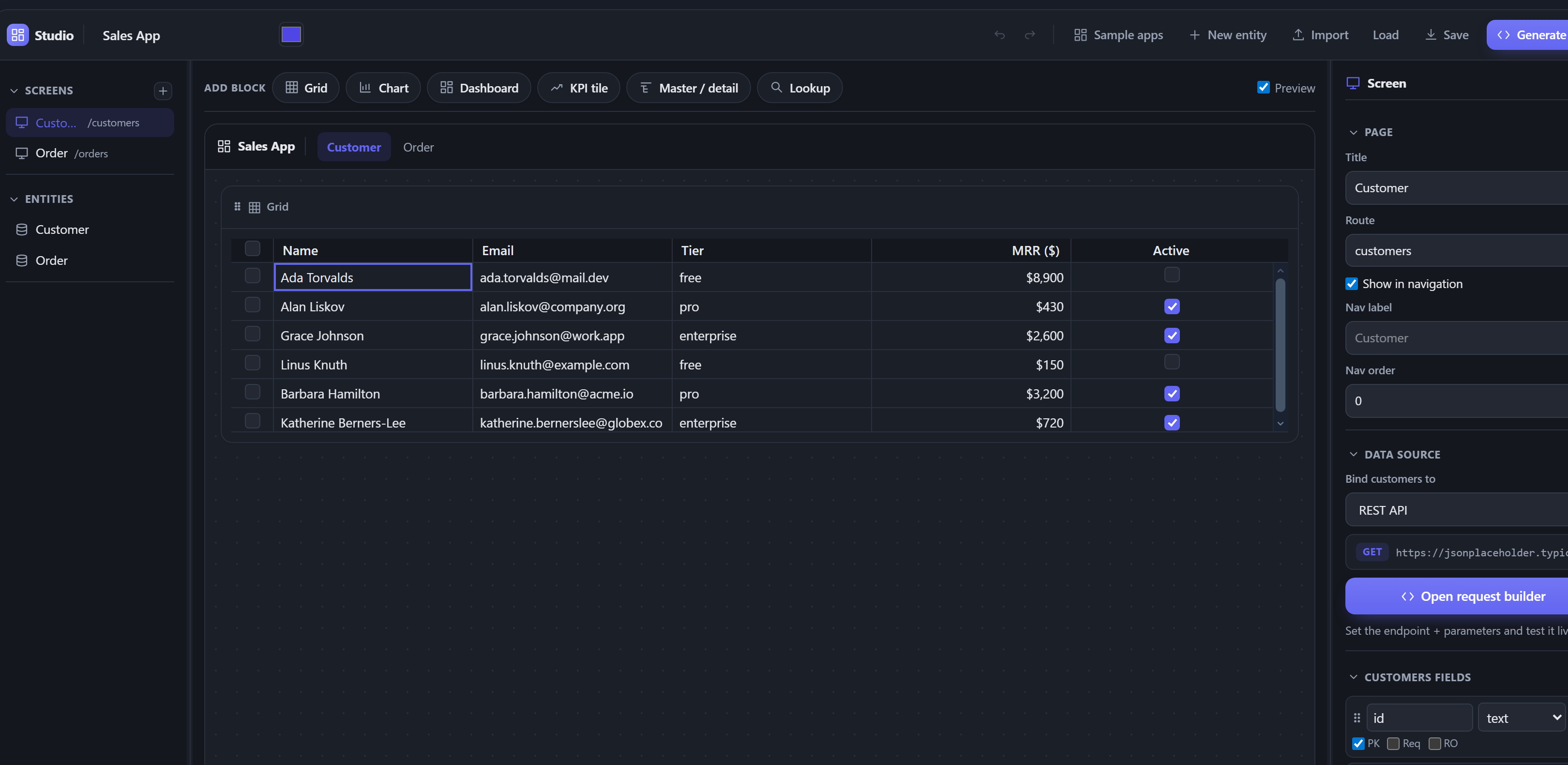
You do not need to understand the internals to use it. The same layout, labelled:
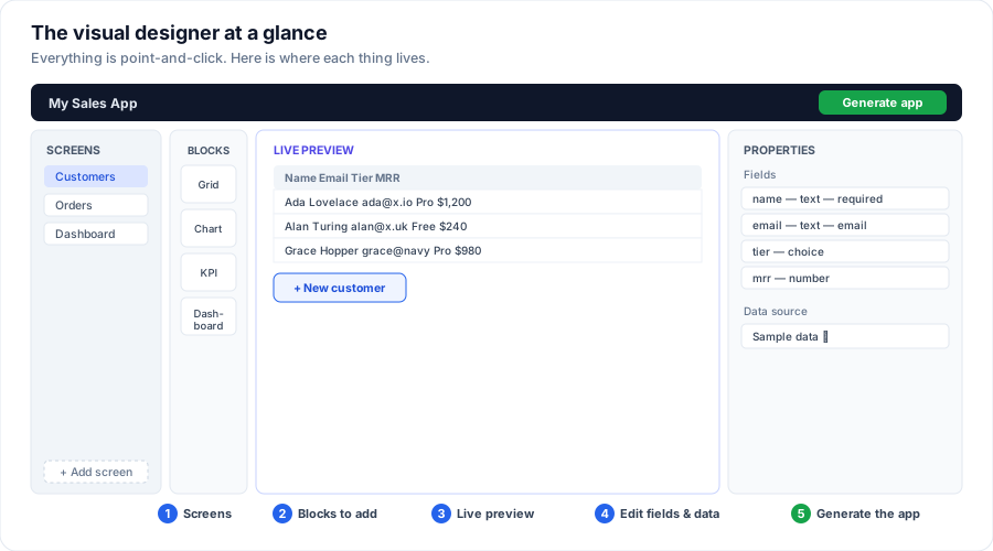
- Screens (far left) - the pages of your app. Click one to edit it; + Add screen makes a new one.
- Blocks - the pieces you drop onto a screen: a grid (a table of records), a chart, a pivot, a KPI number, a dashboard, a filter panel, and a record panel. Click or drag one onto the preview.
- Live preview (middle) - your screen with real data, updating as you change things. What you see is what the app will look like.
- Properties (right) - tune the selected block, or - with nothing selected - edit the entity's fields and pick its data source.
- Generate app (top right) - when it looks right, one click writes the whole, runnable app.
The rest of this page is the detailed reference for each area, aimed at developers embedding or scripting the designer. If you just want to build an app, everything above is done by pointing and clicking - see Launch the designer.
What it edits: the project model
The designer reads and writes a StudioProject - the declarative model behind
the whole app:
import { createProject } from '@svgrid/enterprise'

// One default screen (grid + edit form) per entity, in-memory.
let project = $state(createProject([customerSchema, orderSchema], { title: 'Sales App' }))
<script lang="ts">
  import { SvStudioDesigner } from '@svgrid/enterprise'
</script>

<SvStudioDesigner {project} onChange={(p) => (project = p)} />
The designer is a single IDE-style frame: a title bar (app name + accent + undo/redo + Import/Load/Save/Generate), a screen tab strip (switch, close, or add a screen), the three work panels, and a status bar (validity, entity / screen / block counts, current selection, data source).
- Rail (left) - switch and add screens; each screen is bound to an entity.
- Screen tabs - the open screens as a document strip; click to switch, the x to remove one, the + to add one (from the current template).
- Palette - the block kinds. Drag one onto the canvas to add it (or click).
- Canvas - the screen's blocks in a responsive 12-column grid, previewed live with the real components. Drag a block to reorder it; drag its right edge to set its width (1-12 columns), use the ⅓ / ½ / ⅔ / full quick buttons in its header, or the Layout > Width slider. Drag a block's bottom edge to make its region taller or shorter - grid, chart, pivot, and master-detail blocks are height-resizable, and the chosen height flows through to the generated app (also set it precisely under Layout > Height in the inspector).
- Inspector (right) - edit the selected block: a grid's editing mode + behavior + column config (see below), a chart's group-by / measure / reduce / type. With no block selected, edit the page (title / route / nav settings), the entity's data source (see below), and the entity's fields - add, rename, retype, flag (PK / required / read-only), pick a relation's target entity + label field, and drag to reorder. The rail sets the default source kind for new entities, the app layout, and adds screens from a template (CRUD, dashboard, master-detail, empty).
- Top bar - rename the app, set an accent color (themes the whole app),
add a New entity from scratch, Import CSV (drop in a spreadsheet - see
below), Connect DB (the launcher's live-database wizard - see
Launch the designer), Import schema (paste a Drizzle / Prisma
schema to add its entities), Save / Load the design as
studio.config.json, and Generate app. With no entities yet, the canvas shows an onboarding screen offering the same ways to start. - ✨ Copilot (when the host wires it) - describe a change in plain English
("add an orders screen with a revenue chart", "make mrr required") and the AI
edits your project. It's a host hook:
<SvStudioDesigner onCopilot={...} />receives{ prompt, project }and returns the editedStudioProject- your AI keys stay server-side. The result is validated before it applies, and it's one Ctrl/Cmd+Z away.
The three panels are resizable (drag the dividers). Every edit is undoable
(Ctrl/Cmd+Z, Ctrl+Shift+Z / Ctrl+Y to redo); Delete removes the selected
block, Ctrl/Cmd+D (or the ⧉ header button) duplicates it, and
Escape deselects. Preview app opens the whole app full-screen with a
Desktop / Tablet / Mobile device-width toggle to check responsiveness. Generate app opens the output in a
file-tree viewer modal (scrollable, Copy per file) and a Download .zip of
the complete runnable SvelteKit + Vite project - unzip, npm install,
npm run dev. The zip includes package.json (with the right driver deps),
vite.config.ts, svelte.config.js, tsconfig.json, the app shell, and every
generated screen.
The grid (and how it edits)
The grid is the core block, so editing is a grid property, not a separate block. Select a grid and set its Editing mode:
- Popup form - double-click a row to edit it in a modal / drawer / inline panel (pick the Form style); a + New button adds rows. This is the default.
- Inline - edit cells right in the grid (Excel-style); each change saves via the data source.
- Read-only - no editing.
The grid's property editor also covers Behavior (Sortable, Filtering + search, Row selection, Cell range selection, Striped rows, Totals footer row, Density), Paging (Paginate on / off, Page size, Pager position - bottom / top / both, and the Page size options for the selector), and per-Column settings - expand a column to set its header, width, alignment, pin (left / right), plus show / hide + reorder.
Editing an existing record is a grid property, not a block - the grid owns it end to end. The one thing a grid cannot give you is a form with no grid behind it, which is what the Form block is for (see below).
Form builder
Open form builder - on the grid's Form tab, and on the entity's Form layout section - opens the form in a room of its own. The canvas draws the form as it will look, with real labels, control shapes, and column spans, and you drag the fields around on it directly. Click a field to rename it, change its control, add help text, span it across the row, or give it a rule so it only appears (or only becomes required, or locks) once another answer calls for it. Group these for me sections an unarranged form in one click, and Try it swaps in the live panel so you can type into the form and watch a condition fire.
It edits the entity, not the block, so the arrangement follows the entity everywhere it is rendered - including a server-rendered screen. See edit forms.
Export toolbar
Export toolbar adds a button bar above the grid. Six options, in two groups:
| Button | Runs through | Adds to the generated app |
|---|---|---|
| Export CSV / Export JSON / Copy | the free grid API | nothing |
| Export Excel (.xlsx) | @svgrid/enterprise |
jszip |
| Export PDF | @svgrid/enterprise |
pdfmake |
@svgrid/enterprise |
nothing |
The Excel export is real OOXML - typed number and date cells, styled headers, a frozen header row - not a renamed CSV. PDF is paginated with a repeating header, and Print opens the browser's print dialog on a paginated layout.
All six export what the user currently sees: the visible columns, in their current order, over the filtered and sorted rows. The optional dependencies are declared only for the buttons you switch on, so a CSV-only app installs neither. The canvas preview runs the same code the generated app does, so you can try a real export before generating.
The analytical + companion blocks
Beyond the grid, every block is still bound to the EntitySchema - these are data
views, not generic widgets:
| Block | What it renders | Inspector |
|---|---|---|
| Form | A standalone create form (SvGridEditPanel, inline and blank) - a "New ticket" page, an intake screen. Its fields, sections and rules come from the entity, so a form you designed once renders the same anywhere. |
Heading, submit label, and what happens after saving: blank it for another entry, or go to a screen. Plus Open form builder. |
| Chart | A chart (SvSchemaChart) - bar, pie, line, area, radar, funnel, waterfall, or treemap. |
Group-by dimension, measure, reduce, type. |
| Pivot | A full pivot table (SvPivotDesigner) the end user can re-pivot live. |
Row + column dimensions (checkboxes), a measure, and its aggregate. |
| Dashboard | A schema-driven KPI + chart board (SvSchemaDashboard). |
- |
| KPI | A single reduced metric tile. | Label, measure, reduce. |
| Gauge | A radial gauge (SvGauge) of one reduced measure within a range - utilization, progress, scores. |
Label, measure, reduce, min / max, unit. |
| Tree | A hierarchical tree (SvTree) built from the entity's own rows via a self-referential parent. |
A label field + a parent field (a row's link to its parent row). |
| Tabs | A tabbed container (SvTabs) that groups display blocks into tabs - e.g. an Overview tab of KPIs + a Details tab with a chart. |
Add / rename / remove tabs; per tab, add child blocks (charts, KPIs, gauges, pivots, trees). |
| Accordion | A collapsible-sections container (like Tabs, stacked vertically). | Add / rename / remove sections; child blocks per section. |
| Master / detail | A row that expands into a nested grid of related records. | Child entity + foreign key. |
| Board | A kanban board of the entity's rows, one lane per value of a group-by field, with drag between lanes. | Group-by, card title / subtitle / badge fields, open-screen drill. |
| Calendar | A month event-calendar: each row with a date lands on its day, labelled and optionally color-coded. | Date field, title field, color field, open-screen drill. |
| Detail | A full record "detail page": header, metric row, field sections, and related-record tabs - the 360 view a row action or drill-through opens. | Title / subtitle / status / metric fields, sections, related child entities. |
| Spreadsheet | The entity's rows on the Excel-style sheet (SvSheet): a header row, a row per record, and a SUM row under every numeric column, so the reader can add formulas, filter, format and save an xlsx. |
Which fields, totals on / off. |
| Form | A standalone create / edit form for the entity. | Presentation (drawer / modal / inline). |
| Filter panel | A faceted sidebar that filters the screen's grid - enum / boolean facets pick a value, text facets search. | Title + which fields become facets. |
| Record panel | Shows the row selected in the grid - a read-only field list, or an inline edit form. | Editable on / off, and (read-only) which fields to show. |
| Lookup | Marks a relation field as a searchable picker in the edit form. | The relation field. |
| UI component | A component from the SvGrid UI kit dropped from the toolbox - entity-agnostic, works on freestanding pages too. Grouped as Actions, Inputs, Display, Feedback, Layout, and Navigation, and covering headings and prose (heading, text, link, quote, code, keyboard key, list) as well as controls, pickers, and date/time inputs. | The component's own props (extracted from the component's own types, with its JSDoc as the tooltip), plus data bindings. |
The filter and record panels wire to the grid on the same screen: the
filter panel calls the grid controller's setFilter, and clicking a grid row
publishes it to the record panel. So a common layout is a filter panel + grid +
record panel three-up - list, narrow, inspect - all generated for you.
The grid, chart, pivot, and master-detail blocks are height-resizable (drag the block's bottom edge, or set Layout > Height), and the chosen height flows into the generated app. The filter and record panels size to their content.
Conditional formatting
A grid's inspector has a Conditional formatting section: add no-code rules
that style a cell by its value - pick a field, a comparison (=, <, >,
contains, is empty, ...), a value, and a text color / fill / bold. Rules
render live in the canvas and compile to the grid's built-in
conditionalFormats rule engine in the generated app (e.g. negative mrr red,
status = overdue filled). It's the same engine you'd use by hand - the designer
just authors the rules.
Navigation & row actions
The grid's Navigation & actions section wires flow between screens: drill-through (row click opens another screen, filtered to the clicked value) and row action buttons (Edit / Delete / Open). A chart can drill too. See Navigation & row actions for the full picture.
Data sources (per entity)
Each entity binds to its own backend - the designer is not limited to one data source per app. In the inspector (no block selected), the Data source section binds the screen's entity to:
In-memory - seeded sample rows, runs with no backend (the default).
Local database (no setup) - a real, persistent Postgres (PGlite) running in the browser and saved to IndexedDB, so rows survive reloads with zero backend. Same SQL as production - swap to a hosted SQL source later without touching the schema. See Local database. The builder is a draggable, resizable, maximizable panel, and you can open it for any entity straight from the Data model dialog's Configure button.
REST API - a request builder: method, base URL, path (path params auto-derive from
{tokens}), and Query / Path / Header tabs. Send runs it live and shows a response table plus the real rows in the canvas grid; Import fields rewrites the entity's schema to match the response keys. An API format picker (Manual / Offset + Limit / DummyJSON / json-server) wires a wire-format adapter so the grid does real server-side paging and sort; Manual keeps the rows-path / total-path mapping for a single fetched page.Supabase - List tables reads your project's tables so you pick one, and Import schema pulls its real columns, primary key, foreign keys, and enums into the entity; Preview shows live rows (works in the online designer, since Supabase is HTTP). The project URL + anon key are a shared connection you set once for every Supabase entity. A Live updates (Realtime) toggle emits a live subscription. Generate app emits
createClientinconnections.tsreadingPUBLIC_SUPABASE_URL/PUBLIC_SUPABASE_ANON_KEYfrom.env(the key is never inlined) and adds@supabase/supabase-js; access is protected by your RLS policies.SQL - paste a connection string (the dialect is auto-detected) or fill the guided form, set the Schema (Postgres search path). In the local designer (
npx @svgrid/studio designer) Preview data runs a realSELECTand shows your actual rows on the canvas, and a missingpg/mysql2/ ... driver is a one-click install. Generate app emits a connectedsrc/routes/api/<table>/+server.ts(the dialect's driver, readingDATABASE_URL) and points the grid at it; the driver dep is added for you. In the online designer, bind the entity and generate - the app connects for real at runtime. To scaffold from an existing DB via CLI: `npx @svgrid/studio add--db
--url …`. Generate app then emits the matching adapter per entity in
src/lib/data.ts(createRestDataSource/createSqlDataSource/createSupabaseDataSource/createInMemoryDataSource). SQL and Supabase entities read their connection from a generatedsrc/lib/connections.ts(or the+server.tsroute) - the SQL driver and the Supabase client are wired for you; the only manual step is setting the connection in.env(the bundle ships a.env.example). See Databases and REST API.Import a CSV / spreadsheet
The fastest way to start from your own data: Import CSV in the top bar takes a
.csvfile and turns it into a running screen. The designer parses the file (quoted fields, embedded newlines, and CRLF included), infers a type per column from its values (number, boolean, date, or text - thousands separators andyes/no/true/falseare understood), ensures a primary key (it reuses anidcolumn or synthesizes one), and adds an entity with a full CRUD screen, seeded with the real rows. Unsafe headers (First Name,E-mail) become safe field keys and the note tells you what was renamed.Imported rows ship in-memory by default (no dependencies), so the app runs immediately. Switch that entity's Data source to Local database to make the same imported rows persist across reloads - the seed carries over. This is all client-side:
csvToEntity(name, text)is a pure function exported from@svgrid/enterprise, so the same import works in the CLI and your own tools.Large files: the imported rows are stored as the entity's seed, so they are embedded in
studio.config.jsonwhen you Save the design. That is fine for reference data and samples; for a large dataset, import a representative sample and point the entity at a database (Local database / SQL) for the full data.Pages and layout
- Pages - each screen is a route. In the inspector's Page section, toggle Show in navigation, set a nav label and nav order, or start a page from the Empty template. Hidden pages stay routable but drop out of the nav.
- Render mode - eligible screens (a single plain grid, or read-only block
screens, on a memory / SQL source) can switch from the default client page to
SSR: an idiomatic
+page.server.tswithload+ form actions. The rules are in Code generation. - App layout - the rail's App layout section themes the generated shell:
Sidebar or Top navigation, a brand name, a company logo
(uploaded - stored inline and shown in the nav in place of the brand text), a
footer, and (for the sidebar) the nav position (left / right). This
drives the generated
src/routes/+layout.svelte. The generated shell is responsive: on phones the sidebar collapses to a hamburger drawer, the top-nav links scroll, and each screen's block grid stacks to one column.
Save, regenerate, round-trip
The
StudioProjectis the persisted design. Save config exports astudio.config.json; regenerate the app from it any time:npm create @svgrid/studio@latest my-app -- --project ./studio.config.jsonOr programmatically:
import { serializeProject, parseProject, emitStudioProject } from '@svgrid/enterprise'

const json = serializeProject(project)      // save the design
const project2 = parseProject(json)         // reopen it
const files = emitStudioProject(project2)   // -> the app's source files
The exported app carries its own design. The downloaded zip includes a
studio.config.jsonat its root. To keep editing the app visually after you've worked on it locally, open the designer and Load that file - entities, screens, blocks, theme, RBAC, i18n, and now the logo all come back exactly as generated. Because the designer regenerates the files undersrc/, keep any hand-written code in new files/modules you import, so a re-generate never overwrites it (or use the CLI'ssvgrid:managedmarkers - see Code generation).Generate the app
Generate app emits
src/lib/schemas.ts,src/lib/data.ts(the right adapter per entity, plussrc/lib/connections.tswhen any entity is SQL / Supabase-bound), and onesrc/routes/<route>/+page.svelteper screen that composes that screen's blocks with their config - a grid (with your visible columns, in order) + edit modal, plus any charts / pivots / dashboard / KPI tiles, and filter / record panels wired to the grid, all bound to the data - and the nav layout (sidebar or top-nav) + home. The pages are self-contained (they use@svgrid/grid+@svgrid/enterprisedirectly), so the output runs as a standard SvelteKit app.import { emitStudioProject } from '@svgrid/enterprise' const files = emitStudioProject(project) // [{ path, contents, description }, ...]See also
- Code behind (Code view) - write TypeScript against a typed
ctx(grid API, events,ctx.grid.sortable = true, lifecycle) - Sample apps + bind your data - start from a ready-made app, then point it at your database
- Launch the designer -
npx @svgrid/studio designer(auto-save + generate to a folder) - Schema designer - author a single entity
- Dashboards · Databases - the blocks + data sources
- CLI / Drizzle / Prisma - import a schema to design from
Related articles
- SvGrid Studio Tips and Tricks: Build Svelte Data Apps, Fast - Practical SvGrid Studio tips - AI app generation, a designer that emits real SvelteKit, schema-driven edit forms, code-behind with ctx.grid, production auth/data/deploy toggles, and real data-source binding - each with a snippet.