Edit forms & validation
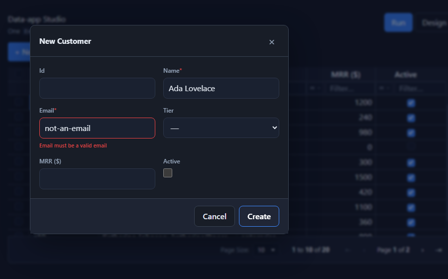
SvGridEditPanel is the create / edit form for a row. It renders itself from an
EntitySchema, validates input, and hands you a ready payload to save. It
presents as a right-hand drawer, a centered modal, or inline, and
follows the grid's light / dark theme.
Usage
<script lang="ts">
  import { SvGridEditPanel } from '@svgrid/enterprise'
  let editing = $state<Customer | null | undefined>(undefined) // undefined = closed, null = create

  async function save({ mode, id, values }) {
    if (mode === 'create') await controller.createRow(values)
    else if (id) await controller.updateRow(id, values)
    editing = undefined
  }
</script>

{#if editing !== undefined}
  <SvGridEditPanel
    {schema}
    row={editing}
    presentation="modal"
    onSubmit={save}
    onCancel={() => (editing = undefined)}
  />
{/if}
Props
| Prop | Type | Description |
|---|---|---|
schema |
EntitySchema<TData> |
Drives the fields, validation, and payload. |
row |
TData | null |
Row to edit; null to create. |
presentation |
'drawer' | 'modal' | 'inline' |
Default 'drawer' (right slide-over). |
title |
string |
Heading override. |
submitLabel |
string |
Save-button label override. |
onSubmit |
(payload) => void | Promise |
Called with a validated { mode, id, values }. Throw to surface an error. |
onCancel |
() => void |
Called on cancel / close (Esc, backdrop, or the X). |
Presentation
drawer(default) - slides in from the right, full height.modal- centered popup with a blurred backdrop.inline- renders in the page flow (used by the designer preview).
Drawer and modal animate in / out, close on Esc or backdrop click, and trap to a dialog role.
Validation
When it speaks up. A field is checked when the user leaves it, not while they are still typing, so a form never scolds you for a value you have not finished entering. Once a field is showing an error it re-checks on every keystroke, so a correction clears the message straight away instead of making you submit again to find out. A failed submit marks every field as visited, focuses the first one that needs fixing, and lists them all in a summary at the top of the form that jumps to a field when clicked.
Each control carries aria-invalid, and its message (or its hint, when there is
no error) is wired up with aria-describedby, so a screen reader announces the
problem with the field rather than leaving it to be discovered.
Closing a form with unsaved edits asks first. Cancel, Escape, or a click on the backdrop shows Discard your changes? in the footer, with Keep editing and Discard; a second Escape confirms. An untouched form closes immediately.
The save is blocked while anything fails. Three layers, in order:
- Required - non-empty for
requiredfields. - Built-in constraints - number validity +
min/max,minLength/maxLength,format: 'email' | 'url', andpattern(see The EntitySchema). - Standard Schema - any Zod / Valibot / ArkType validator on
field.validate.
{ field: 'email', type: 'text', required: true, format: 'email' }
{ field: 'mrr',   type: 'number', min: 0 }
{ field: 'name',  type: 'text', minLength: 2, maxLength: 60 }
No external library is required for the built-in rules - add a Standard Schema validator only when you need custom logic.
No-code rules
EntitySchema.validations states cross-field rules as data, so the same rule
runs in the form and in a generated app's server route:
validations: [
  { field: 'endsAt', op: 'gte', compareTo: 'startsAt', message: 'End must be after start' },
  { field: 'code', op: 'minLen', value: 4, message: 'Code needs 4+ characters' },
]
Operators: eq, ne, lt, lte, gt, gte, required, minLen, maxLen.
Use compareTo to compare against another field instead of a fixed value.
Where a form comes from
Three places, and which one you want depends on the record:
| You want to | Use |
|---|---|
| Edit an existing row from a list | A grid with Editing mode: Popup form. Double-click a row. |
| Edit whichever row is selected on the screen | A record panel with editing on - inline, drawer, or modal. |
| Create a new record, with no grid behind it | A Form block, dragged from the Components rail. |
All three render the same SvGridEditPanel against the same EntitySchema.form,
so a form designed once looks the same in every one of them.
The Form block is create-only by design. It is blank on load, submits, and creates a row; after saving it either blanks itself for the next entry (the default, with a "Saved" confirmation) or opens another screen. Give it a heading and a submit label in the inspector - "Report a problem" / "Send it" reads better than "New Ticket" / "Create" on a page somebody was sent to.
An inline form fills whatever it is placed in, so a form block is as wide as
its block. Set the block's Width to Narrow or Wide when a full-width form
is more than a reader wants to cross; in code that is SvGridEditPanel's
formSize.
Building one without writing it
Everything below this line is authorable in the visual designer. Select the entity and open Form layout -> Open form builder (the grid block's Form tab has the same button). It edits the entity, so what you build there is what a generated app and a server-rendered screen render.
Once it is open the entity name in the title is a picker, so you can build any entity's form without going back out to find a page that uses it.
The canvas is the form. It draws real labels, real control shapes, and the
real column grid, so arranging the form and looking at it are the same act - a
field you span shows as spanned, a textarea is tall, a switch is small.
- Drag a field anywhere on the canvas, or select one and use ↑ / ↓ (announced for screen readers). Fields no section claims sit in a trailing Not in a section group, because that is exactly where the form puts them.
- Sections take a title, a line of guidance, and their own column count. Hover one for its tools: columns, Rule (show the whole section only when a condition holds), Fold, reorder, and remove - which removes the heading only, never the fields under it. On an unarranged form, Group these for me proposes a grouping from the field names; it only appears when there is a real grouping to make.
- Click a field and the right pane fills, in two tabs. Field: label,
control, an
enum's choices, default value, placeholder, help text, span the full row, always required, and Remove from this form. Controls that need more say so - a mask gets its pattern, a number or slider gets its range, step, decimals and affixes - and nothing else is shown, so picking a control never leaves you with nowhere to configure it. Rules: the Shown when / Required when / Locked when conditions plus the cross-field checks that blame this field - the samevalidationsrules, edited here because they are form logic. The tab carries a count, and so does the field on the canvas. - Ctrl-click adds a field to the selection and Shift-click takes a range within one lane; dragging any of them moves the whole set together, as does ↑ / ↓. With more than one selected the right pane offers what is genuinely bulk - move them all to a section, or remove them all - because the Field and Rules editors are single-field by nature. Escape drops back to one.
- + Add field builds a form from nothing without leaving for the schema inspector. Name and type up front; a name already on the entity is refused. Each section has its own + Field that drops straight into it.
- Remove from this form is reversible. Removed fields collect in a Hidden from this form tray under the canvas, and Restore puts one back where it was - removing never edited the section, only the field's visibility.
- Show rules (on whenever the form has any) plays the conditions against the sample record right on the canvas: a field a rule hides goes dim with a hidden badge, a locked one gets a padlock, and a rule-required one gets the asterisk. Dimmed fields stay selectable and draggable - you are arranging the design, not the record. Existing / New switches which record you are simulating.
- Width draws the form at the size it will really have. The window itself drags by its header, resizes from its corner, and maximizes on a double-click.
Folding a long form
Fold on a section cycles through three states: not foldable, foldable, and foldable-and-starts-folded. A foldable section's heading becomes a disclosure button carrying a count, so a long form opens at a readable length instead of a wall of inputs.
Folding is a display state, not a condition. The fields are still filled in
and still validated - use visibleWhen when you actually want them gone. If a
folded section holds an error the form opens it, so a rejected submit can never
point at something the user cannot see.
Server-rendered screens get the same thing as a native <details>, so it folds
with JavaScript off, and a section that starts folded opens itself when the
server sends back an error for one of its fields.
sections: [
  { title: 'Contact', fields: ['name', 'email'] },
  { title: 'Billing', fields: ['vatNumber', 'poNumber'], collapsible: true, collapsed: true },
]
Asking one step at a time
form.steps turns the sections into a wizard - Ask one step at a time in the
builder. Each section is a step, so the sections are the design; there is no
second list to keep in sync.
form: {
  steps: true,
  sections: [
    { title: 'Who', fields: ['name', 'email'] },
    { title: 'Company', fields: ['company', 'role'] },
    { title: 'Billing', fields: ['vatNumber'] },
  ],
}
Four things make it behave:
- Next validates only the step you are on, so a long form fails early and locally instead of dumping every error at the end. Back never validates - going backwards is always allowed.
- A section hidden by
visibleWhenis skipped, so the step count follows the answers rather than showing an empty step. - Fields in no section join the last step rather than becoming an untitled one of their own. Every step should be deliberate.
- A submit that fails on an earlier step jumps back to it, so the focus never lands off-screen.
One section is a page, not a one-step wizard, and collapsible is ignored while
stepping - a step is already one group at a time.
Server-rendered screens render the steps as ordinary sections. Stepping
through a <form> without JavaScript would mean a round-trip per step and
somewhere to hold the half-finished record. The server validates everything
either way.
Try it swaps the canvas for the live edit panel, so you can type into the form and watch a condition fire. Toggle Existing / New: the values differ, so the conditions do too.
Note that a grid block can still override the arrangement for one screen. When it does, the builder says so and offers to drop the override.
From an agent
Two MCP tools drive the same model, so an agent can build the form too:
| Tool | What it does |
|---|---|
studio_set_form_layout |
Set the column count and the sections. Pass "suggest": true instead of sections to have them proposed from the field names. The reply reports what actually landed, including anything that fell through to the trailing group. |
studio_set_field_conditions |
Set a field's visible / required / disabled conditions. A condition you do not name is left alone; pass null to clear one. |
See the MCP server for the rest of the studio_* tools.
Laying the form out
EntitySchema.form says how the form is arranged. It lives on the schema, not on
the component, so a form you have built travels with the entity: it round-trips
through studio.config.json, generates into an app, and draws the same in the
edit panel and in a server-rendered form.
const customers: EntitySchema = {
  name: 'customers',
  fields: [/* ... */],
  form: {
    columns: 2,
    sections: [
      { title: 'Contact', description: 'How we reach them.', fields: ['name', 'email', 'phone'] },
      { title: 'Billing', columns: 1, fields: ['plan', 'vatNumber'] },
      // A whole section can be conditional, the same way a field is.
      { title: 'Cancellation', fields: ['reason', 'notes'],
        visibleWhen: { kind: 'cmp', column: 'status', op: 'equals', value: 'cancelled' } },
    ],
  },
}
fieldsgives both the grouping and the order.- A field in no section still renders, in a trailing untitled group. A form never silently drops one.
- A section whose fields are all hidden disappears with them, heading included.
columnson a section overrides the form's for that group alone; a field withinput.span = 2spans the full width.
SvGridEditPanel's columns and sections props still win when passed, for a
one-off arrangement of an otherwise shared schema.
Server-rendered screens follow the same layout. A screen with
renderMode: 'ssr' renders its sections, descriptions and column counts, marks
span: 2 fields full-width, shows each field's hint, and states the field's own
constraints (minlength, maxlength, min, max, pattern, and an email /
url input type) as native HTML attributes so the browser catches an obvious
mistake before a round-trip. The action re-checks all of it server-side
regardless, so the attributes save a trip but never decide anything.
Fields that react to the answers
A field can appear, lock, or become required based on what the user has already entered - the form asks for a reason only when it needs one, and never asks twice.
Each condition is a PredicateExpr: data, not a function, so it survives a
round-trip through studio.config.json, generates into an app unchanged, and can
be edited in a UI.
{
  field: 'otherReason',
  type: 'text',
  when: {
    // Only asked for - and only demanded - when the reason is "other".
    visible: { kind: 'cmp', column: 'reason', op: 'equals', value: 'other' },
    required: { kind: 'cmp', column: 'reason', op: 'equals', value: 'other' },
  },
}
{
  field: 'approver',
  type: 'text',
  // Locked until the order is big enough to need sign-off.
  when: { disabled: { kind: 'cmp', column: 'total', op: 'lessThan', value: 1000 } },
}
Three rules make this safe to rely on:
- A field hidden by
visibleis skipped by validation and left out of the submitted payload. It can never block a save the user cannot fix, and a value they can no longer see is never written back. The generated SSR route applies the same rule to a posted form, so both paths save the same fields. requiredreplaces the staticrequiredflag rather than adding to it, so a rule can make a normally required field optional as well as the reverse.- A malformed condition falls back to showing and enabling the field. A broken rule degrades to an ordinary form instead of hiding data.
Conditions are the same expressions the alert rules use, so parsePredicate and
the SvExpressionEditor component both work on them:
import { parsePredicate } from '@svgrid/enterprise'
when: { visible: parsePredicate('reason = "other"') }
A section whose fields are all hidden disappears along with them, heading included.
Three sample apps ship this, so you can open one and watch it work: CRM asks a lost deal what it lost to, Support desk demands a resolution before a ticket can be resolved or closed (and only then asks for a CSAT rating), and Insurance Claims requires a justification to deny a claim and freezes the amount and deductible once it has been paid.
Controls
The form renders each field with a control from the editor suite, not a bare
native input: numbers use SvNumberInput (spinners, min/max/step), booleans a
SvSwitchButton, colors SvColorInput, passwords SvPasswordInput (strength
meter), ratings a SvSlider, dates and date-times a SvDateTimePicker (masked
input + calendar dropdown), enums a themed dropdown (SvGridDropdown), and
JSON a textarea. The default follows the field type; override per field with
input.editorType.
Beyond the grid's cell editors, the form also offers a few form-only controls
via input.editorType: phone (SvPhoneInput), country (SvCountryInput),
mask (SvMaskedInput, with an input.mask pattern like '(999) 000-0000'),
and slider. In the visual designer each field has a
Control picker (scoped to what fits its type) plus a Wide toggle
(input.span = 2), so you pick the editor without touching code.
{ field: 'mrr',     type: 'number', input: { editorType: 'slider' } }
{ field: 'brand',   type: 'text',   input: { editorType: 'color' } }
{ field: 'phone',   type: 'text',   input: { editorType: 'phone' } }
{ field: 'ssn',     type: 'text',   input: { editorType: 'mask', mask: '999-99-9999' } }
Form-only editors degrade to a safe in-cell editor when the same field shows in a
grid (slider → number, phone/country/mask → text), so columns stay valid.
File / image upload. Give a field an upload config and it renders
SvFileInput (a picker with an image preview). With no handler it stores an
inline data URL (no backend needed); pass an uploads handler that pushes to
storage and returns the URL:
{ field: 'avatar', type: 'text', upload: { image: true, accept: 'image/*' } }

<SvGridEditPanel {schema} row={editing}
  uploads={{ avatar: async (file) => await putToStorage(file) }} onSubmit={save} />
Cascading (dependent) fields. Compute a field's options from the current
values with dependentOptions - the field clears when it stops being valid
(e.g. City depends on Country):
<SvGridEditPanel {schema} row={editing}
  dependentOptions={{ city: (values) => citiesByCountry[values.country] ?? [] }}
  onSubmit={save} />
See the rich fields demo.
Enum and relation fields use a custom dropdown whose panel portals to
document.body (position: fixed), so it opens above a drawer or modal and
never grows the form (no scrollbar) - unlike a native <select> or an in-flow
popup.
The modal is a movable window
With presentation="modal", the panel is a floating window: drag it by the
header, resize it from its edges (the content resizes with it), maximize /
restore, and pin it to any edge (left / top / bottom / right) - handy for
keeping the form docked beside the grid while you work. Pin again to unpin.
Set persistKey to remember the window layout (pin / size / maximized) in
localStorage, so it reopens where the user left it:
<SvGridEditPanel {schema} row={editing} presentation="modal" persistKey="customers" ... />
Open the editor on double-click (onRowDoubleClick), not single-click, so a
click can still select or interact with a row without popping the form.
See also
- The EntitySchema - fields + validation constraints
- Master-detail · Data binding
Related articles
- SvGrid Studio Tips and Tricks: Build Svelte Data Apps, Fast - Practical SvGrid Studio tips - AI app generation, a designer that emits real SvelteKit, schema-driven edit forms, code-behind with ctx.grid, production auth/data/deploy toggles, and real data-source binding - each with a snippet.