Views for every team
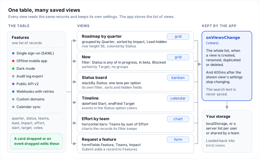
One table of records, many ways to look at it. Product reads the roadmap grouped by quarter, engineering works off a status board, the leads check a timeline, and anyone in the company files a request through a form. Each of those is a saved view: a name, a type, and the filter, sorts, groups, hidden fields, row height and colors it had when someone last left it.
SvGrid Base is part of the Suite edition of
@svgrid/enterprise. Without a key it runs with a watermark.
This page builds the Features table of that roadmap one view at a time. Each
step adds to the views list from the step before and works on its own.
1. The table
<script lang="ts">
  import { SvBase, enableBase, setFieldUsers, type FieldView } from '@svgrid/enterprise/base'

  enableBase()
  setFieldUsers([
    { id: 'u1', name: 'Ana Ruiz' },
    { id: 'u2', name: 'Ben Okafor' },
    { id: 'u3', name: 'Cleo Park' },
  ])

  type Feature = {
    id: number; feature: string; quarter: string; status: string; teams: string[]
    lead: string; impact: number; effort: number; start: string; target: string; votes: number
  }

  const QUARTERS = [
    { value: 'Q4 2026', color: '#2d7ff9' },
    { value: 'Q1 2027', color: '#18bfff' },
    { value: 'Later', color: '#94a3b8' },
  ]
  const STATUS = [
    { value: 'Planned', color: '#94a3b8' },
    { value: 'In progress', color: '#2d7ff9' },
    { value: 'In beta', color: '#8b46ff' },
    { value: 'Shipped', color: '#20c933' },
    { value: 'Blocked', color: '#f82b60' },
  ]
  const TEAMS = [
    { value: 'Web', color: '#2d7ff9' },
    { value: 'Mobile', color: '#ff6f2c' },
    { value: 'Platform', color: '#8b46ff' },
  ]

  let rows = $state.raw<Feature[]>([
    { id: 1, feature: 'Single sign-on with SAML', quarter: 'Q4 2026', status: 'In progress', teams: ['Platform'], lead: 'u2', impact: 5, effort: 12, start: '2026-10-05', target: '2026-11-13', votes: 182 },
    { id: 2, feature: 'Offline mode for the mobile app', quarter: 'Q4 2026', status: 'Blocked', teams: ['Mobile'], lead: 'u3', impact: 4, effort: 13, start: '2026-10-12', target: '2026-12-04', votes: 96 },
    { id: 3, feature: 'Dark mode', quarter: 'Q4 2026', status: 'Shipped', teams: ['Web'], lead: 'u1', impact: 2, effort: 4, start: '2026-10-01', target: '2026-10-16', votes: 154 },
    { id: 4, feature: 'Audit log export', quarter: 'Q1 2027', status: 'Planned', teams: ['Platform', 'Web'], lead: 'u1', impact: 3, effort: 5, start: '2027-01-11', target: '2027-01-29', votes: 41 },
  ])

  const columns = [
    { field: 'feature', header: 'Feature', width: 260, fieldType: 'text' },
    { field: 'quarter', header: 'Quarter', fieldType: 'singleSelect', fieldProps: { options: QUARTERS } },
    { field: 'status', header: 'Status', fieldType: 'singleSelect', fieldProps: { options: STATUS } },
    { field: 'teams', header: 'Teams', fieldType: 'multiSelect', fieldProps: { options: TEAMS } },
    { field: 'lead', header: 'Lead', fieldType: 'user' },
    { field: 'impact', header: 'Impact', fieldType: 'rating', fieldProps: { max: 5 } },
    { field: 'effort', header: 'Effort (days)', fieldType: 'number', fieldProps: { format: 'integer', summary: 'sum' } },
    { field: 'start', header: 'Start', fieldType: 'date', fieldProps: { dateFormat: 'friendly' } },
    { field: 'target', header: 'Target', fieldType: 'date', fieldProps: { dateFormat: 'friendly' } },
    { field: 'votes', header: 'Votes', fieldType: 'number', fieldProps: { format: 'integer', summary: 'sum' } },
  ]

  let views = $state<FieldView[]>([{ id: 'all', name: 'All features', type: 'grid' }])
</script>

<SvBase data={rows} {columns} bind:views primaryField="feature"
  editable sortable showRowNumbers expandRows summary containerHeight={640}
  rowAdder={{ label: 'Add feature', defaults: () => ({ id: Date.now(), status: 'Planned', quarter: 'Later', teams: [] }) }} />
The view bar over the grid has "All features" on the left, then Hide
fields, Filter, Group, Sort, Color and a row height button, and "4 records"
with a search button on the right. The footer row shows "Sum 34" under Effort
and "Sum 473" under Votes, because those fields set fieldProps.summary.
Every view key that names a field (stackBy, dateField, a filter
condition's column, a chart's x) takes the column id. A column without an
id uses its field, so in this table the two are the same.
2. A roadmap grouped by quarter
A view can start with settings. state is the grid's own state, the same
object api.getState() returns; color says how rows are colored.
const roadmap: FieldView = {
  id: 'roadmap',
  name: 'Roadmap by quarter',
  type: 'grid',
  color: { mode: 'field', field: 'status' },
  rowHeight: 56,
  state: {
    grouping: ['quarter'],
    sorting: [{ id: 'quarter', desc: false }, { id: 'impact', desc: true }],
    hiddenColumns: ['lead'],
  },
}
Groups and sorts share the grid's sorting list: a grouped field's
direction is an entry ahead of the sorts. The view bar writes them that way,
so write them that way too. Here the bar reads "1 hidden field", "Grouped by
1 field" and "Sorted by 1 field": the quarter entry belongs to the group,
not to Sort.
Each group header shows "Quarter" over the option's pill, the number of
records, the summaries the fields picked for that group ("Effort (days) 29",
"Votes 432"), and "+" to add a feature that already has that quarter. Groups
come in the select's option order, not alphabetically. Group rows are at
least 52px tall so the field's name fits over the value; with
rowHeight: 56 they match the records. Each row has a status color stripe
on its row header. 56 is the row height menu's "Medium": from 48px, text and
select pills wrap.
3. A view that starts filtered
The filter is the grid's advanced filter with its own kind, fieldFilter.
Put it in state.advancedFilter:
import { describeFieldFilter, type FieldFilter } from '@svgrid/enterprise/base'

const activeWork: FieldFilter = {
  kind: 'fieldFilter',
  conjunction: 'and',
  conditions: [
    { column: 'status', kind: 'select', op: 'isAnyOf', value: ['In progress', 'In beta', 'Blocked'] },
    {
      conjunction: 'or',
      conditions: [
        { column: 'target', kind: 'date', op: 'isWithin', value: { span: 'nextDays', days: 30 } },
        { column: 'impact', kind: 'number', op: 'gte', value: 4 },
      ],
    },
  ],
}

const now: FieldView = {
  id: 'now',
  name: 'Now',
  type: 'grid',
  state: { sorting: [{ id: 'target', desc: false }], advancedFilter: activeWork },
}

const header = (id: string) => columns.find((c) => c.field === id)?.header ?? id
describeFieldFilter(activeWork, header)
// "Status is any of In progress, In beta, Blocked and (Target is within the next 30 days or Impact ≥ 4)"
The Filter button reads "Filtered by 3 fields" (one field reads "Filtered by
Status") and the record count drops to what the filter keeps.
describeFieldFilter writes a filter in the words the panel uses, for a page
subtitle or an audit line. It returns "every record" for a filter with no
complete conditions.
A condition is a field, an operator and a value; a group is one level deep. Filters in code below lists the operators per kind.
One view can serve every lead. ME (the string '@me') in a person
condition stands for whoever setCurrentUser names when the filter runs; the
Filter panel lists it as "Me", first among the people.
import { ME, setCurrentUser } from '@svgrid/enterprise/base'

setCurrentUser({ id: 'u2', name: 'Ben Okafor' })

const mine: FieldView = {
  id: 'mine',
  name: 'My features',
  type: 'grid',
  state: {
    advancedFilter: {
      kind: 'fieldFilter',
      conjunction: 'and',
      conditions: [{ column: 'lead', kind: 'select', op: 'is', value: ME }],
    },
  },
}
Ben sees "Single sign-on with SAML"; Ana, signed in, sees her two. With
nobody signed in the condition matches no one. describeFieldFilter writes
it as "Lead is me".
4. A status board
const board: FieldView = { id: 'board', name: 'Status board', type: 'kanban', stackBy: 'status' }
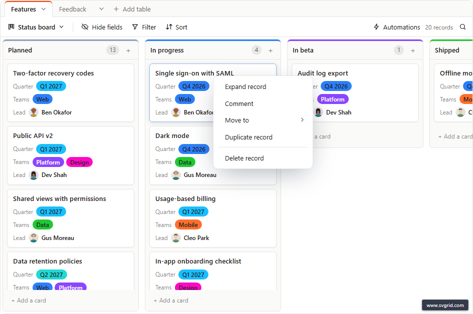
stackBy takes a single select or a user field that holds one person. You
get one lane per option, in option order and color, plus "Uncategorized",
which shows only while a record has no status. Stack by lead instead and
the lanes are the people from setFieldUsers.
Drop a card in another lane and the status changes through the grid's edit
path, so undo, validation and onCellValueChange all see it. "+ Add a card"
adds a record already in that lane, named by the primary field.
A card shows the record's name, then the next three fields the view shows,
in column order (the stacked field left out), each drawn as its cell draws
it. Hide a field in Hide fields and it leaves the cards; drag it up there to
put it on them. Cards are read, not edited: a rating shows its stars
but does not take a click. Double-click a card or press F2 to open the
record. Right-click it for its menu: Expand record, Comment, and, when the
base is editable, Move to (a submenu of the lanes), Duplicate record and
Delete record, which asks "Delete record?" first. A card with comments shows
their count; click it to open the record at its comment box.
5. A timeline
const timeline: FieldView = {
  id: 'timeline',
  name: 'Timeline',
  type: 'calendar',
  dateField: 'start',
  endField: 'target',
  color: { mode: 'field', field: 'status' },
}
Each feature spans its start to its target date. A date field without a time
shows as all-day events. Drag an event to move both dates; drag its edge to
change the target. The calendar's end is exclusive, so the record keeps the
last day: a feature dragged to cover the 19th to the 21st gets
target: '2026-10-21'.
With only dateField, events move but cannot be resized. Pick a day (or a
range) on the calendar and a new record lands on it, opened with its name
ready to type. Colored by a single select, the events take the option colors
and the options appear above the calendar as a legend that hides and shows
them.
Moving and resizing need editable on the base. Without it the calendar is
read-only.
6. Effort by team
const effort: FieldView = { id: 'effort', name: 'Effort by team', type: 'chart', chart: { kind: 'barH', x: 'teams', y: 'effort' } }
const mix: FieldView = { id: 'mix', name: 'Features per quarter', type: 'chart', chart: { kind: 'donut', x: 'quarter' } }
A chart groups the records the view shows by x and adds up y (or counts
records when there is no y). aggregation: 'avg' averages instead of
summing. Kinds are 'bar', 'barH', 'line', 'pie' and 'donut'.
How x groups:
- A single or multiple select keeps its options' order and colors. A multiple select counts a record in each of its options, so "Audit log export" adds 5 days to both Platform and Web.
- A person or a linked record shows by name.
- A date groups by month ("Oct 2026").
- Records with no value go in an "Empty" bar, last.
Values read as the summed field writes them, and a count as a whole number.
The series is labeled "Sum of Effort (days)", "Average of ..." or "Records".
The bar shows Filter, which narrows what is charted, and "Customize chart",
whose Type, Group by, Value and Combine (sum or average) are kept in chart.
A chart view declared without chart draws "Choose a field to chart in
Customize chart." until a field is picked there.
7. A gallery of mockups
Add an attachment field, then a gallery view with it as the cover:
const mockupField = { field: 'mockups', header: 'Mockups', fieldType: 'attachment' }
const gallery: FieldView = { id: 'mockups', name: 'Mockups', type: 'gallery', coverField: 'mockups' }
Each card shows the first image of mockups, the primary field as its title,
then the fields the grid shows, each drawn as its cell draws it. Hide a field
in this view and it leaves the cards; drag fields in Hide fields to reorder
them. A click on a card opens the record. Without coverField the cards have
no cover.
8. A request form
const request: FieldView = {
  id: 'request',
  name: 'Request a feature',
  type: 'form',
  formFields: ['feature', 'teams', 'impact'],
  formRequired: ['feature'],
  formTitle: 'Request a feature',
  formDescription: 'What should we build, and who is it for? Product reviews requests every Friday.',
  formSubmitLabel: 'Send request',
}
The form asks for the fields in formFields (column ids, in order), each with
the editor its cell uses. Without it, the form asks for every field a person
can fill in, the primary field first; computed fields are left out. A field
in formRequired must be filled before the form sends. formTitle defaults
to the view's name, formSubmitLabel to "Submit". A sent form adds a record
the way "+ Add row" does: rowAdder.defaults first, so a request starts as
Planned in Later, then what was typed, then onRowAdd. The bar shows only
the view switcher on a form.
All the views so far, in one list:
let views = $state<FieldView[]>([roadmap, board, timeline, effort, now, mine, gallery, request])
9. Keep the views
onViewsChange fires with the whole list when a view is created, renamed,
duplicated or deleted, and about 400ms after the shown view's settings stop
changing. Switching views stores the one being left first. Store the list
wherever the app stores things.
In the browser:
<script lang="ts">
  import { SvBase, enableBase, type FieldView } from '@svgrid/enterprise/base'

  enableBase()
  const KEY = 'roadmap:views'
  const DEFAULT_VIEWS: FieldView[] = [{ id: 'all', name: 'All features', type: 'grid' }]

  function read<T>(key: string, fallback: T): T {
    try {
      const raw = localStorage.getItem(key)
      return raw ? (JSON.parse(raw) as T) : fallback
    } catch {
      return fallback
    }
  }
  function write(key: string, value: unknown) {
    try {
      localStorage.setItem(key, JSON.stringify(value))
    } catch {
      // Private mode or a full quota: the views still work, unsaved.
    }
  }

  let views = $state<FieldView[]>(read(KEY, DEFAULT_VIEWS))
  let activeView = $state<string>(read(`${KEY}:active`, ''))

  $effect(() => write(`${KEY}:active`, activeView))
</script>

<SvBase data={rows} {columns} primaryField="feature" editable
  bind:views bind:activeView onViewsChange={(v: FieldView[]) => write(KEY, v)} />
On a server, decide who owns a list.
- Per user. Each person keeps their own list, so one lead's filter does not change another's. Seed it from the team's defaults the first time.
- Shared. One list per table that everyone reads. Write it only for the
people you allow; for everyone else, keep their changes in memory or in
their own list. A shared "My features" view built on
MEstill shows each person their own records.
type Scope = 'me' | 'team'

async function loadViews(scope: Scope): Promise<FieldView[]> {
  const res = await fetch(`/api/tables/features/views?scope=${scope}`)
  return res.ok ? ((await res.json()) as FieldView[]) : DEFAULT_VIEWS
}

function saveViews(scope: Scope, next: FieldView[]) {
  void fetch(`/api/tables/features/views?scope=${scope}`, {
    method: 'PUT',
    headers: { 'content-type': 'application/json' },
    body: JSON.stringify(next),
  })
}
{#await loadViews('me') then loaded}
  <SvBase data={rows} {columns} primaryField="feature" editable
    views={loaded} onViewsChange={(v: FieldView[]) => saveViews('me', v)} />
{/await}
Or mount at once and swap the list in when it arrives. When views or
activeView changes from outside and the shown view is not the one the grid
has, the bar applies it. It never stores the grid's settings into a view it
has not applied yet.
<script lang="ts">
  let views = $state<FieldView[]>(DEFAULT_VIEWS)
  let loaded = false
  loadViews('me').then((v) => {
    views = v
    loaded = true
  })
</script>

<SvBase data={rows} {columns} primaryField="feature" editable
  bind:views onViewsChange={(v: FieldView[]) => loaded && saveViews('me', v)} />
The loaded check matters: about 400ms after mount the bar stores the
default view's settings, and that save must not replace the list on the
server before the real one is in.
With several tables (<SvBase bind:tables>), each table keeps its own
views, and onTablesChange hands back the whole list of tables, views
included.
View types and the keys they read
| Type | Keys | View bar buttons |
|---|---|---|
'grid' |
state, rowHeight, color |
Hide fields, Filter, Group, Sort, Color, Row height |
'kanban' |
stackBy: a single select, or a user field with one person |
Hide fields, Filter, Sort |
'calendar' |
dateField, endField (optional), color |
Hide fields, Filter, Sort, Color |
'gantt' |
dateField, endField, progressField, dependencyField, zoom, color |
Hide fields, Filter, Sort, Color, Customize timeline |
'gallery' |
coverField: an attachment field |
Hide fields, Filter, Sort |
'chart' |
chart: kind, x, y, aggregation |
Filter, Customize chart |
'form' |
formFields, formRequired, formTitle, formDescription, formSubmitLabel |
none |
Every type also keeps state (filter, sorts, groups, hidden fields, column
order, widths, pinning) and switches with the grid's own state, so a filter
set on the board is still there when you come back to it. The search text is
not part of it. The views menu's "Create" offers each type SvBase can show
and greys out one the table cannot: a Kanban needs a single select, a
calendar a date field, a chart a field to group by. A new view starts with no
filter, sorts or groups and every field shown.
viewTypes={['grid', 'kanban', 'calendar']} on SvBase limits what
"Create" offers.
A Gantt is a calendar with a task table beside the bars. It is offered once
the app has called enableGanttView() from @svgrid/enterprise. Its bars
take the view's colors, progressField is a percent field drawn as each
bar's fill, and dependencyField is a link field to the same table naming
what each record waits for, drawn as arrows.
The view bar, panel by panel
- Views menu (the view's name): switch, rename, duplicate ("Roadmap by quarter copy") and delete. The last view cannot be deleted.
- Hide fields: a switch per field, a search, hide all and show all, and drag to reorder. The primary field is always shown.
- Filter: "Where [field] [operator] [value]" rows joined by "and" or "or", and condition groups. Each change filters at once. A condition still missing its value filters nothing.
- Group: up to three fields, each with a direction.
- Sort: fields in order, each with a direction labeled for its type ("1 → 9", "A → Z", "first → last" for a single select). Attachment and button fields are not offered.
- Color: None, Select field (a single select's option colors) or Conditions in order.
- Row height: Short 34, Medium 56, Tall 88, Extra tall 128.
rowHeightsonSvBaseorSvBaseViewBarsets the list. - Search: in a grid view, the grid's find bar (Ctrl+F) that marks every match. In a board, calendar or gallery, a "Find a record" box that narrows the records. Switching views clears it.
A button with something set says so and is tinted. With fieldMenu on, each
column's menu adds "Filter by this field" and "Group by this field", which
open the bar's panel with the new condition or group in it.
Filters in code
filterKindOf(columnDef) gives the kind a field filters as, and
operatorsFor(kind) the operators the panel offers for it, in menu order.
Filter conditions maps each field type to
its kind.
kind |
op values |
value |
|---|---|---|
'text', 'link' |
contains, notContains, is, isNot |
a string; a link compares the linked records' names |
'number' |
eq, neq, lt, gt, lte, gte |
a number |
'select' |
is, isNot |
one option value, or a person's id (or ME) for a user field |
'select' |
isAnyOf, isNoneOf |
an array of them |
'multi' |
hasAnyOf, hasAllOf, isExactly, hasNoneOf |
an array of option values or ids |
'checkbox' |
is |
true or false |
'date' |
is, isBefore, isAfter, isOnOrBefore, isOnOrAfter |
{ mode: 'today' }, with mode also 'tomorrow', 'yesterday', 'oneWeekAgo', 'oneWeekFromNow', 'oneMonthAgo', 'oneMonthFromNow'; or { mode: 'exactDate', date: '2026-11-01' } |
'date' |
isWithin |
{ span: 'pastWeek' }, with span also 'pastMonth', 'pastYear', 'nextWeek', 'nextMonth', 'nextYear'; or { span: 'pastDays', days: 14 }, { span: 'nextDays', days: 14 } |
'files' |
contains (file name contains) |
a string |
Every kind except checkbox also takes isEmpty and isNotEmpty, with no
value. A few rules from the code:
- An empty number cell is no number: it matches only
neq. - Dates compare whole days. A bare
'2026-11-01'is that day where the user is, and "within the past week" runs from 7 days ago to today. - A user condition holds the person's id (
'u2'), not the name, orMEfor whoever is signed in. - A link condition sets
tableto the linked table's id, so it can match records by name.
Set a filter on the shown view with api.setAdvancedFilter(filter); the
view keeps it like one set in the panel.
Row colors: by field or by conditions
import type { ColorSetting } from '@svgrid/enterprise/base'

const byStatus: ColorSetting = { mode: 'field', field: 'status' }
const byRisk: ColorSetting = {
  mode: 'conditions',
  rules: [
    { color: '#f82b60', condition: { column: 'status', kind: 'select', op: 'is', value: 'Blocked' } },
    { color: '#fcb400', condition: { column: 'target', kind: 'date', op: 'isBefore', value: { mode: 'today' } } },
  ],
}
By field, each row takes its option's color, and the row header's title says the option, so the color is never the only signal. A multiple select colors by its first value. By conditions, the first rule that matches wins: a blocked feature is red even when it is also late. A condition is tested as the filter tests it: on the value the cell shows, so a formula, lookup, rollup or count field works, and a condition still missing its value colors nothing. A calendar colors its events by a single select only; a Gantt's bars take either kind.
The color is a 3px stripe on the row header, unless the rowColor prop on
SvBase sets a target ('bar' or 'row'): a view's colors use it too. A
view without color shows the rowColor prop's colors until someone picks
colors for it in Color. { mode: 'none' } turns the colors off in that view.
Summaries in the footer and in group headers
With summary on, a click on a field's footer cell picks its summary: sum,
average, median, min, max or range for numbers; checked, unchecked or percent
checked for a checkbox; earliest, latest or the date range in days for dates;
empty, filled, unique, percent empty or percent filled for any field. The
result is written as the field writes values. The choice is stored in the
field's fieldProps.summary and reported through onColumnChange; see
Summaries at the bottom.
Group headers show the same summaries over that group's records. Both leave out records the filter hides, even in a collapsed group.
The view bar over your own grid
SvBaseViewBar is the bar alone, for a page that lays out its own
<SvGrid>:
<script lang="ts">
  import { SvGrid } from '@svgrid/grid'
  import { SvBaseViewBar, enableBase, type FieldView } from '@svgrid/enterprise/base'

  enableBase()
  // Raw: the bar finds its grid by the api object itself, and a proxy is another object.
  let api = $state.raw<any>(null)
  let views = $state<FieldView[]>([
    { id: 'all', name: 'All features', type: 'grid' },
    { id: 'board', name: 'Status board', type: 'kanban', stackBy: 'status' },
  ])
  let activeView = $state('all')
</script>

{#if api}
  <SvBaseViewBar {api} bind:views bind:activeView
    rowHeights={[{ label: 'Compact', height: 32 }, { label: 'Roomy', height: 64 }]} />
{/if}
<SvGrid data={rows} {columns} primaryField="feature" editable containerHeight={600}
  onApiReady={(a) => (api = a)} />
Its "Create" offers grid, Kanban and calendar (and Gantt once enabled). It
loads the board, calendar and gallery renderers the first time a view of
that type is shown, and opens the record and the "Delete record?" question
for a card's menu. Chart and form views are drawn by SvBase, not by the
bar, so leave them out of viewTypes here, or draw SvBaseForm yourself
when a form view is active.
Pitfalls
- A new view from "Create" starts with
color: { mode: 'none' }, so it hides therowColorprop's colors. A new calendar or Gantt is the exception: it starts colored by the first single select. Pick colors in Color, or declare the view in code withoutcolor. color.fieldis the data field; the other keys are column ids. They differ only when a column sets anid.- Summaries belong to the field, not the view. Picking "Average" in one view changes every view's footer and group headers.
- Save views only after they load. See the
loadedcheck in step 9.
Next
- Linked records: link Features to Feedback and chart or filter by the linked names.
- Formulas: computed fields a view can sort, group and chart by.
- Forms: required fields, the thank-you screen and forms outside the base.
- Collaboration: comments, people and who changed what.
- Automations: conditions written with this same filter.
- Keep a base in a database: load the tables from Postgres, Supabase or your API and write every change back.
Related articles
- We Asked Claude Code for a Svelte Table. It Wrote Its Own Every Time, Until the Project Said Otherwise - Ten fresh Claude Code sessions, one prompt, a bare SvelteKit app. With no hint it hand-wrote a DataTable component, even for 10,000 rows. One paragraph in AGENTS.md changed that.
- Saved Views - Persist Grid Layout and Filters - Give users named, switchable snapshots of column order, sorting, filters, and grouping - persisted to localStorage or a server adapter - using SvGrid's createNamedViews API.
- Why Svelte 5 Changed Everything for Data Grids - Svelte 5 runes introduced signal-based, property-level reactivity. That single shift made a genuinely fast Svelte-native data grid possible in a way it never was before.