4. Features
Step 4 of 6 · ← Data and columns · Next: Theme and density →
Every capability is off by default - a bare <SvGrid> is a plain,
read-only table. Opt in with boolean props. No imports, no feature
constants:
The examples on this page run against these rows:
<script lang="ts">
  import { SvGrid, type GridColumns, tableFeatures, rowSortingFeature, columnFilteringFeature } from '@svgrid/grid'

  type Person = {
    id: number
    name: string
    email: string
    department: string
    age: number
    salary: number
    city: string
    startDate: string
    active: boolean
  }

  const features = tableFeatures({ rowSortingFeature, columnFilteringFeature })

  const people: Person[] = [
    { id: 1, name: 'Ada Lovelace',   email: '[email protected]',   department: 'Engineering', age: 36, salary: 142000, city: 'London',   startDate: '2021-03-01', active: true },
    { id: 2, name: 'Grace Hopper',   email: '[email protected]', department: 'Engineering', age: 45, salary: 168000, city: 'New York', startDate: '2019-07-15', active: true },
    { id: 3, name: 'Linus Torvalds', email: '[email protected]', department: 'Platform',    age: 54, salary: 155000, city: 'Portland', startDate: '2020-01-20', active: false },
    { id: 4, name: 'Radia Perlman',  email: '[email protected]', department: 'Networking',  age: 49, salary: 161000, city: 'Seattle',  startDate: '2022-09-05', active: true },
    { id: 5, name: 'Barbara Liskov', email: '[email protected]', department: 'Platform',  age: 52, salary: 172000, city: 'Boston',   startDate: '2018-11-11', active: true },
  ]

  const data = people

  let rows = $state<Person[]>(people)

  const columns: GridColumns<Person> = [
    { field: 'name',       header: 'Name',       width: 200 },
    { field: 'department', header: 'Department', width: 150 },
    { field: 'city',       header: 'City',       width: 140 },
    { field: 'age',        header: 'Age',        width: 90 },
    { field: 'salary',     header: 'Salary',     width: 130, format: { type: 'currency', currency: 'USD' } },
  ]
</script>
<SvGrid
  data={rows}
  columns={columns}
  sortable
  filterable
  editable
  groupable
  pageable
/>
selectable completes the set - see
the exception below, since selection
is already on:
<SvGrid data={rows} columns={columns} selectable={false} />
| Shortcut | Turns on | Equivalent to |
|---|---|---|
sortable |
Click headers to sort | injects rowSortingFeature |
filterable |
Per-column filter menu | injects columnFilteringFeature |
editable |
Inline cell editing (text editor unless editorType) |
enableInlineEditing |
selectable |
Cell selection (click a cell, drag for a range) | enableCellSelection |
groupable |
"Group by this column" in the column menu | showGroupingControls |
pageable |
Pagination footer | showPagination |
Each shortcut is an override: omit it (or set false) to leave the
capability off; set it true to opt in. See the live
Shortcut config demo.
The exception: selection is already on
selectable is the one shortcut that starts on. Selection is governed by
selectionMode, which defaults to 'both', so a bare grid already has both
surfaces:
| Surface | Controlled by | Default |
|---|---|---|
| Cell / range selection | selectable -> enableCellSelection |
on |
| Selection checkbox column | showRowSelection |
on |
Neither needs a feature import. selectable is listed with the shortcuts so
the capability has a name next to the others, and so selectable={false} is a
one-word way to switch cell selection off. To move both surfaces at once, use
selectionMode="none" (or "row" / "cell").
For most grids this is the whole story - skip to Theme and density. The rest of this page is the explicit form underneath, worth reading when you want finer control.
The explicit form: registering features
The engine is feature-gated: out of the box you get the core row model (rows in their original order), and each capability is a feature you register. The shortcut props above just inject these for you.
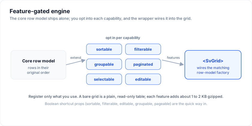
Register them yourself when you need the fine-grained props alongside -
filterMode, pageSize, per-column sortable: false:
<script lang="ts">
  import {
    SvGrid,
    tableFeatures,
    rowSortingFeature,
    columnFilteringFeature,
    rowSelectionFeature,
    type GridColumns,
  } from '@svgrid/grid'

  const features = tableFeatures({
    rowSortingFeature,
    columnFilteringFeature,
    rowSelectionFeature,
  })
</script>

<SvGrid
  data={rows}
  columns={columns}
  features={features}
  filterMode="menu"
  showPagination={true}
  pageSize={25}
/>
If you need the headless pipeline directly - say, a custom renderer - drop
down to createSvGrid from the same package. See
Why headless?.
The feature catalogue
| Feature | What it enables | Doc |
|---|---|---|
rowSortingFeature |
Click headers to sort; Shift-click for multi-sort. | Row sorting |
columnFilteringFeature |
Per-column filter menu + filter row + global search. | Filter overview |
rowPaginationFeature |
Page slicing + footer with page-size selector. | Row pagination |
rowSelectionFeature |
Checkbox column + Shift / Ctrl multi-select. | Row selection |
columnGroupingFeature |
Group-by-column + aggregated footer summaries. | Grouping & aggregation |
rowExpandingFeature |
Tree / master-detail expand-collapse. | Tree rows |
Rule of thumb: only register the features you use. Each one ships about 1-2 KB gzipped and adds a small per-update cost.
The three operating modes
There's one decision per dimension (sort, filter): uncontrolled (default), observable (callbacks), or external (you own the row ordering).
Uncontrolled (the default)
The wrapper owns the state. Pass the start config via props:
<SvGrid
  data={rows}
  columns={columns}
  features={features}
  showPagination={true}
  pageSize={50}
  filterMode="menu"
/>
Observable - callbacks fire on every change
The wrapper still owns the state, but emits callbacks. Use this when something outside the grid needs to react (a "X rows selected" pill, URL sync, a server fetch).
<script lang="ts">
  let sorting = $state<Array<{ id: string; desc: boolean }>>([])
  let filters = $state<Array<{ id: string; operator: string; value: string }>>([])
</script>

<SvGrid
  data={rows}
  columns={columns}
  features={features}
  filterMode="menu"
  onSortingChange={(next) => (sorting = next)}
  onFiltersChange={(next) => (filters = next.columns)}
/>
External - you own the row ordering
For server-side data or tree data the wrapper records the sort + filter UI state but does not re-order the rows - you do. See Going to production §1.
Selection + editing
Both are off by default. Two top-level umbrella props turn them on:
<SvGrid
  data={rows}
  columns={columns}
  features={features}
  selectionMode="both"
  showRowSelection={true}
  enableInlineEditing={true}
  enableCellSelection={true}
  onRowSelectionChange={(state, selectedRows) => /* … */}
  onCellValueChange={(event) => /* event: { rowIndex, columnId, oldValue, newValue, row } */}
/>
selectionMode choices:
'row'- checkbox column only'cell'- click-and-drag range selection only'both'- both (default)'none'- both off
Cell editing falls back to a text editor, so editable works on plain
columns; declare editorType on a column to get the right control for its
type (number, date, checkbox, list, ...).
See Editing overview.
Keyboard map
| Action | Keys |
|---|---|
| Move active cell | Arrow keys |
| First / last in row | Home / End |
| First / last in grid | Ctrl + Home / Ctrl + End |
| Move by viewport | Page Up / Page Down |
| Extend range | Shift + arrows / Shift + Home / End |
| Start editing | Enter, F2, or double-click |
| Commit edit | Enter, Tab |
| Cancel edit | Esc |
| Toggle row selection | Space |
| Copy / paste range | Ctrl/Cmd + C / V (TSV) |
The full a11y model is in Accessibility.
Related articles
- What's New in SvGrid Enterprise - Export, Pivot, Import, Print, and AI - A practical look at @svgrid/enterprise - pivot tables, Excel and PDF export, data import, printing, and an AI assistant. Covers when each feature earns its place and what to watch out for in production.