Accessibility
SvGrid implements the WAI-ARIA 1.2 grid pattern with full keyboard navigation and a screen-reader announcement layer. This page documents exactly what the grid does, where the responsibility line sits between the library and your code, and how to verify conformance.
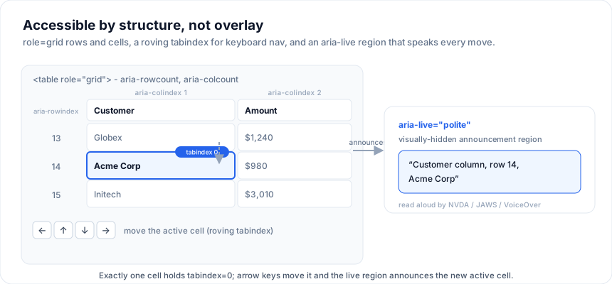
Live demo - high-contrast toggle, aria-live log, and a focus-trap
walk-through:
Open the live example: Accessibility (Keyboard & Accessibility)
TL;DR
| Standard | Status |
|---|---|
| WAI-ARIA 1.2 grid pattern | Implemented (see Roles & properties). |
| WCAG 2.1 AA | Structure is audited by axe-core in CI. Contrast is enforced in CI for all 20 built-in presets, light and dark; a custom theme is yours to verify. |
| Keyboard navigation | Full coverage; see Keyboard map. |
| Screen-reader announcements | Filter results and bulk selection changes, via a single aria-live=polite region. See What the grid announces. |
| Reduced motion | Honored: scroll animations + chevron transitions disable when prefers-reduced-motion: reduce. |
| Forced colors / high contrast | Supported: borders + focus rings use currentColor; no hardcoded border-color. |
Roles & properties
| Element | Role | Notable attributes |
|---|---|---|
<table> root |
grid |
aria-rowcount, aria-colcount |
<thead>, <tbody> |
rowgroup |
|
Every <tr> (header + body) |
row |
aria-rowindex (1-based); selected rows get aria-selected="true" |
Header <th> |
columnheader |
aria-sort ("ascending" / "descending" / "none") |
Body <td> |
gridcell |
aria-colindex, aria-selected, aria-readonly (when the column is non-editable) |
| Active cell | gridcell |
tabindex="0"; every other cell tabindex="-1" (roving tabindex pattern) |
| Filter popover | dialog |
aria-label derived from the column header |
| Cell editor input | textbox / combobox / checkbox (depending on editorType) |
aria-label mirrors the column header |
| Live announcement region | none (uses aria-live="polite" on a visually-hidden <div>) |
The grid never sets role="presentation" on table elements - screen
readers receive a fully-structured grid.
Keyboard map
Standard ARIA grid navigation, plus a handful of grid-specific shortcuts:
Navigation
| Key | Action |
|---|---|
| Tab | Move focus out of the grid to the next focusable element. |
| Shift+Tab | Move focus into the grid from the previous focusable element. |
| Arrow Up/Down | Move active cell one row. |
| Arrow Left/Right | Move active cell one column. |
| Home | Active cell → first column in the row. |
| End | Active cell → last column in the row. |
| Ctrl/Cmd + Home | Active cell → top-left of the grid. |
| Ctrl/Cmd + End | Active cell → bottom-right. |
| Page Up / Page Down | Scroll a viewport's worth of rows. |
Selection (when rowSelectionFeature is on)
| Key | Action |
|---|---|
| Space | Toggle the active row's selection. |
| Ctrl/Cmd + A | Select all rows on the current page. |
| Shift + Arrow Up/Down | Extend the row selection. |
| Ctrl/Cmd + Click on a row | Toggle that row's selection without affecting others. |
Sort + filter
| Key | Action |
|---|---|
| Enter (on a header) | Toggle sort: none → asc → desc → none. |
| Shift + Enter (on a header) | Add to multi-sort. |
| Alt + Down (on a header) | Open the filter menu (when filterMode='menu'). |
| Escape (in a filter menu) | Close the menu. |
Editing
| Key | Action |
|---|---|
| Enter / F2 / double-click | Enter edit mode on the active cell. |
| Type any character | Start editing with that character as the first input. |
| Enter / Tab (while editing) | Commit and move to the next cell / row. |
| Escape (while editing) | Cancel; revert the cell. |
| Delete / Backspace | Clear the active cell (for cells whose editor supports clearing). |
Tree rows (when you build them)
The keyboard handler in Tree rows adds:
| Key | Action (active cell in name column) |
|---|---|
| Arrow Right | Expand a collapsed node. |
| Arrow Left | Collapse an expanded node. |
| Enter / Space | Toggle. |
Screen-reader announcements
The grid shares one visually-hidden aria-live="polite" region with the rest of
the component library, and is deliberately sparing about what it puts there.
What the grid announces
| Event | What is said |
|---|---|
| A filter changes the matching rows | "12 of 250 rows match the current filters", or "No rows match the current filters" |
| Every filter is cleared | "Filters cleared, showing all 250 rows" |
| A bulk selection change | "250 rows selected" / "Selection cleared" |
Filter announcements are debounced by 400 ms, so typing in the search box
announces the count you stopped on rather than one for every prefix. They are
also skipped entirely under externalFilter, because there the server decides
what matched and the local count would describe only the page in hand.
What it deliberately does not announce
This is the more important half. A live region is not the only way a screen reader learns something, and announcing what the accessibility tree already carries makes the grid talk over itself:
- The cell you moved to. Focus moves there (roving tabindex), so the reader announces the cell, its column header and its row position natively.
- Sort state. Carried by
aria-sorton the column header, read when focus lands on it. - Whether the row you are on is selected. Carried by
aria-selected. - Selecting or deselecting a single row. The focused row is announced with
its new selected state; adding
"1 row selected"on top would be a second, redundant utterance. Only changes of more than one row, which cannot have come from a single focus move, are announced.
Translating them
Announcements are full sentences, so unlike the single-word labels elsewhere in
localeText they take {placeholders} and you control the word order:
The examples on this page run against these rows:
<script lang="ts">
  import { SvGrid, type GridColumns, type SvGridApi } from '@svgrid/grid'

  type Person = {
    id: number
    name: string
    department: string
    city: string
    age: number
    salary: number
  }

  const people: Person[] = [
    { id: 1, name: 'Ada Lovelace',   department: 'Engineering', city: 'London',   age: 36, salary: 142000 },
    { id: 2, name: 'Grace Hopper',   department: 'Engineering', city: 'New York', age: 45, salary: 168000 },
    { id: 3, name: 'Linus Torvalds', department: 'Platform',    city: 'Portland', age: 54, salary: 155000 },
    { id: 4, name: 'Radia Perlman',  department: 'Networking',  city: 'Seattle',  age: 49, salary: 161000 },
    { id: 5, name: 'Barbara Liskov', department: 'Platform',    city: 'Boston',   age: 52, salary: 172000 },
  ]

  const columns: GridColumns<Person> = [
    { field: 'name',       header: 'Name',       width: 190 },
    { field: 'department', header: 'Department', width: 150 },
    { field: 'city',       header: 'City',       width: 130 },
    { field: 'age',        header: 'Age',        width: 80 },
    { field: 'salary',     header: 'Salary',     width: 130, format: { type: 'currency', currency: 'USD' } },
  ]
</script>
<SvGrid
  localization={{
    text: {
      announceFilterResults: '{visible} van de {total} rijen komen overeen',
      announceNoMatches: 'Geen rijen komen overeen',
      announceFiltersCleared: 'Filters gewist, alle {total} rijen worden getoond',
      announceRowsSelected: '{count} rijen geselecteerd',
      announceSelectionCleared: 'Selectie gewist',
    },
  }}
/>
An unknown placeholder is left in the output rather than blanked, so a typo in an override is visible instead of silently eating the number.
Focus management
- The grid uses a roving tabindex: at most one cell at a time has
tabindex="0", every other hastabindex="-1". This puts the grid in the tab order exactly once. - The "active cell" is the focused cell. It's tracked through every navigation, editing, and selection action.
- Editing transfers focus to the editor
<input>; committing returns focus to the cell. - Modals (filter menu, save dialog) use a focus trap that returns focus to the originating header/cell on close.
High-contrast / forced-colors mode
Windows High Contrast mode (forced-colors: active) is respected. The
grid uses currentColor for every border and focus ring, so the
system's color tokens take over without overrides leaking. We test
against the W3C forced-colors test page.
Reduced motion
When prefers-reduced-motion: reduce matches:
- Smooth-scroll calls become
behavior: 'instant'. - Chevron rotations (used in tree demos) are instant rather than 160 ms ease.
- Sparkline + KPI bar transitions are disabled.
You don't need to opt in - the grid checks the media query on every animation entry point.
What you're responsible for
The grid can't know:
- Contrast of your custom CSS variables. Use the Tailwind
integration page's contrast notes when picking
--sg-fg/--sg-bgpairs. - Labels for cells whose content is purely visual (e.g. a status
pill that's just a coloured dot). Set
aria-labelon the cell content yourself. - Reading order of header groups. The grid emits group headers
with
aria-colspancorrectly, but if your group label is "Q1" alone, screen readers say "Q1" - consider "Q1 2025" to give context. - The wording of validation messages. A cell failing a column's
validatehook is markedaria-invalidand the returned string is carried to assistive technology, so return a message that says how to fix it ("Score must be at least 90"), not just that something is wrong ("Invalid"). Returningfalsemarks the cell invalid with no message at all, which leaves a screen-reader user without a reason.
How to verify
Keyboard sweep. Unplug your mouse. Tab in, navigate every cell, sort, filter, edit, undo. If any action is unreachable, file an issue.
NVDA + VoiceOver. Each makes different choices about announcement verbosity. Test both.
Lighthouse accessibility audit. Run it against your own build. Most deltas are contrast issues in your theme rather than grid markup, so check those first.
We run
axe-coreagainst a rendered grid in CI (a11y.axe.test.ts), covering the plain grid, the filter row, row selection and pagination. That suite runs in jsdom, which does no layout, so axe's own colour-contrast rule is disabled there.Contrast is covered separately and more thoroughly:
themes/contrast.test.tscomputes WCAG ratios for every built-in preset in both light and dark and fails the build below AA. Body text, secondary text, header text, text on zebra / hovered / selected rows, and text on accent-filled controls all have to clear 4.5:1, and the accent has to clear 3:1 where it signals focus or selection. So the presets are checked exhaustively rather than whichever one a browser test happened to load. What is still yours to verify is a custom theme.axe-core in your e2e suite.
import { injectAxe, checkA11y } from 'axe-playwright'
await injectAxe(page)
await checkA11y(page, '.sv-grid-shell', { detailedReport: false })
Frequently asked questions
Is SvGrid accessible / WCAG compliant?
SvGrid implements the WAI-ARIA 1.2 grid pattern: role="grid" structure, full
keyboard navigation (arrows, Home/End, Page Up/Down, Ctrl+Home/End), a focus
ring on the active cell, and an aria-live announcement layer. Final WCAG
conformance also depends on your own cell content and color choices - this page
documents exactly where that line sits.
Does SvGrid work with screen readers?
Yes. The grid exposes proper roles and emits aria-live announcements for
sorting, filtering, and selection changes, so NVDA, JAWS, and VoiceOver can
read the grid state. Because it renders real DOM (not canvas), the content is
also selectable and machine-readable.
How do I verify accessibility in my app?
Run axe-core against the rendered grid (recipe in the testing guide) and test
keyboard-only navigation. Pair it with the high-contrast focus toggle and the
--sg-* contrast tokens to meet your target contrast ratios.
More examples
Keyboard shortcuts + a11y
Ctrl+K command palette, Ctrl+/ cheat sheet, vim-style gg / G chord nav. Layers on top of the grid's WAI-ARIA grid pattern + roving tabindex.
Open the live example: Keyboard shortcuts + a11y (Keyboard & Accessibility)
High-contrast theme
WCAG 2.2 AAA-grade preset for accessibility procurement. Token block opts a subtree into the high-contrast skin while the rest of the page stays standard. Light + dark.
Open the live example: High-contrast theme (Themes & Styling)
Try the keyboard
Everything below is keyboard-reachable. Tab once to enter the grid, then arrow between cells - the grid is a single tab stop, not one per cell, which is what makes a 10,000-row table usable without a mouse.
<SvGrid data={people} {columns} sortable filterable enableCellSelection editable />
Try: Tab in, arrows to move, Enter to edit, Escape to cancel, Shift+arrows to extend a range, Ctrl/Cmd+C to copy it.
What a screen reader is told
The grid root carries role="grid" with aria-rowcount and aria-colcount,
headers carry aria-sort, and rows and cells carry their index. Sort a column
in the example above and inspect the header: the aria-sort attribute flips
with it, which is how a screen reader user knows the order changed at all.
<script lang="ts">
  let report = $state('(sort a column)')

  function inspect() {
    const grid = document.querySelector('[role="grid"], [role="treegrid"]')
    const sorted = document.querySelectorAll('[role="columnheader"][aria-sort]')
    report =
      'role=' + (grid?.getAttribute('role') ?? 'missing') +
      ' | aria-rowcount=' + (grid?.getAttribute('aria-rowcount') ?? 'missing') +
      ' | headers with aria-sort: ' + sorted.length
  }
</script>

<SvGrid data={people} {columns} sortable />

<button type="button" onclick={inspect}>Inspect the ARIA</button>
<p><code>{report}</code></p>
See also
- Browser support - the
ResizeObserver/ Pointer Events floor every assistive-tech tool relies on. - Tailwind integration - the
--sg-*tokens that control contrast. - Testing your grid - includes an axe-core recipe.
Live examples
- Accessibility - WAI-ARIA grid, keyboard navigation, aria-live announcements, focus toggle.
- Keyboard shortcuts + a11y - Ctrl+K command palette, Ctrl+/ cheat sheet, vim-style gg / G chord nav. Layers on top of the grid's WAI-ARIA grid pattern + roving tabindex.
- High-contrast theme - WCAG 2.2 AAA-grade preset for accessibility procurement. Token block opts a subtree into the high-contrast skin while the rest of the page stays standard. Light + dark.
Related articles
- Choosing the Most Accessible Svelte Data Grid - A practical guide to testing data grid accessibility - ARIA roles, keyboard navigation, focus management under virtualization, and screen-reader behavior - so you can verify claims yourself.
- Cell Tooltips Done Right in a Data Grid - Tooltips in a data grid are either cheap and effective or an accessibility and performance trap. Here is how to build them correctly in SvGrid.
- Accessibility from the Ground Up - How SvGrid bakes WAI-ARIA roles and keyboard navigation into the core - not as a post-launch checkbox, but as a design constraint that shaped every feature.