Choosing the Most Accessible Svelte Data Grid
A practical guide to testing data grid accessibility - ARIA roles, keyboard navigation, focus management under virtualization, and screen-reader behavior - so you can verify claims yourself.
Most data grid accessibility stories go like this: a vendor's feature page has a green checkbox next to "WCAG 2.1 AA". A procurement team checks the box. Six months later, a screen-reader user files a support ticket because they cannot navigate past column 3.
Accessibility claims are cheap. The real question is how to verify them before you commit to a component.
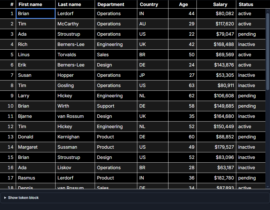 A high-contrast, accessible SvGrid theme.
What the WAI-ARIA grid pattern actually requires
The W3C defines a composite widget called grid that is meant for grids of interactive cells - not for static data tables. The DOM requirements are specific:
- The container gets
role="grid" - Each row gets
role="row" - Header cells get
role="columnheader" - Data cells get
role="gridcell"
Inspect any Svelte grid candidate with DevTools before trusting the docs. A library that renders <div class="cell"> with no ARIA role fails this immediately - assistive technology has nothing to announce.
Beyond roles, the pattern requires that the grid function as a single tab stop. You Tab into it, arrow keys move focus between cells, and Tab again takes you out. If Tab walks through every cell in a 1000-row table, that is a keyboard trap by a different name, and it fails WCAG 2.1 criterion 2.1.2.
The four things you must test yourself
Feature pages lie by omission. These four tests take under ten minutes and tell you almost everything:
1. Keyboard navigation without a mouse. Open the grid, tab into it, and try to reach the last cell using only arrow keys, Home, End, Page Up, Page Down, Ctrl+Home, and Ctrl+End. Try editing with F2 or Enter and cancelling with Escape. A grid that supports only arrow movement but drops the rest fails in practice.
2. Focus survival under virtualization. This is where most grids quietly break. Virtualization recycles DOM nodes as you scroll - when a focused row leaves the viewport, the grid may destroy the node that held focus. Navigate to a row near the bottom of the viewport, scroll it off screen, then scroll back. Is the focused cell still focused, or did focus silently move to <body>?
3. Screen-reader announcements. With VoiceOver or NVDA running, navigate with arrow keys. You should hear the cell content, the column header, and the row/column position (e.g. "row 5, column 3"). Sort state changes should be announced via aria-sort. Row selection should be announced via aria-selected.
4. Custom cell accessibility. This one is your responsibility, but the grid shapes how easy or hard it is. Render an action column with a button in each cell, then keyboard-navigate to it. Does focus land inside the cell correctly? Does pressing Space or Enter activate the button? A grid that puts interactive elements inside gridcell correctly will make this straightforward.
How to build accessible custom cells in SvGrid
Even a grid with perfect built-in accessibility can be broken by the cells you write. Here is the pattern that keeps things correct:
<script lang="ts">
  import SvGrid from '@svgrid/grid'
  import type { ColumnDef } from '@svgrid/grid'

  const columns: ColumnDef[] = [
    { id: 'name', field: 'name', header: 'Name', width: 200 },
    { id: 'status', field: 'status', header: 'Status', width: 120, cell: statusCell },
    { id: 'actions', header: 'Actions', width: 100, cell: actionsCell },
  ]
</script>

{#snippet statusCell({ value })}
  <!-- Use semantic text, not color alone - WCAG 1.4.1 -->
  <span
    class="badge"
    class:active={value === 'active'}
    aria-label={value === 'active' ? 'Status: active' : 'Status: inactive'}
  >
    {value}
  </span>
{/snippet}

{#snippet actionsCell({ row })}
  <!-- Real <button> elements, not divs with click handlers -->
  <button
    type="button"
    aria-label={`Edit ${row.name}`}
    onclick={() => openEditor(row)}
  >
    Edit
  </button>
{/snippet}

<SvGrid
  {data}
  {columns}
  enableCellSelection={true}
/>
The two rules that matter: use real <button> and <a> elements for interactive content inside cells (not <div onclick>), and label icon-only controls so a screen reader has something to announce. The grid handles focus movement between cells; you handle what lives inside them.
Conditional formatting without accessibility regression
Visual formatting is common in grids - red for negative numbers, yellow for warnings. The accessibility risk is relying on color alone to convey meaning (WCAG 1.4.1 fails). Here is the correct approach:
<script lang="ts">
  import SvGrid from '@svgrid/grid'
  import type { ColumnDef } from '@svgrid/grid'

  const columns: ColumnDef[] = [
    { id: 'name', field: 'name', header: 'Name', width: 200 },
    {
      id: 'score',
      field: 'score',
      header: 'Score',
      width: 100,
      type: 'number',
      conditionalFormat: [
        {
          condition: ({ value }) => value < 50,
          style: { color: 'var(--color-danger)', fontWeight: 'bold' },
        },
        {
          condition: ({ value }) => value >= 90,
          style: { color: 'var(--color-success)' },
        },
      ],
      // Provide a text suffix so color is not the only signal
      cell: scoreCell,
    },
  ]
</script>

{#snippet scoreCell({ value })}
  <span aria-label={`${value} ${value < 50 ? '(below threshold)' : value >= 90 ? '(excellent)' : ''}`}>
    {value}
    {#if value < 50}
      <span aria-hidden="true"> ↓</span>
    {:else if value >= 90}
      <span aria-hidden="true"> ↑</span>
    {/if}
  </span>
{/snippet}

<SvGrid {data} {columns} />
The pattern: use aria-hidden="true" on decorative icons, and provide an aria-label that includes the meaning in text, not just the value. The visual arrow is supplementary, not the only signal.
The focus-under-virtualization problem in detail
Virtualization is where grids most commonly break accessibility silently. When you have 100,000 rows, the grid only renders the visible slice - maybe 30 rows at a time. As you scroll, rows leaving the viewport are unmounted and their DOM nodes are reused.
If a focused cell's row gets unmounted, the browser moves focus to <body>. The user pressing an arrow key next gets no response, or focus jumps somewhere unexpected. They might not even notice immediately - it just feels broken.
The correct implementation maintains a virtual focus position separate from the DOM focus. When a previously-focused row re-enters the viewport, the grid restores focus to the right DOM node automatically. Testing this is simple: Tab into the grid, arrow down to a row near the bottom of the visible area, then hold the down arrow until that row scrolls off screen. If focus survives, the implementation is correct.
A keyboard navigation test script
Run this directly on any grid you are evaluating:
1. Tab into the grid - focus should land on the first cell, not a container div.
2. Arrow right/left/up/down - focus should move one cell at a time.
3. Home - focus should move to column 1 of the current row.
4. End - focus should move to the last column.
5. Ctrl+Home - focus should move to row 1, column 1.
6. Ctrl+End - focus should move to the last row, last column.
7. F2 or Enter on an editable cell - cell should enter edit mode.
8. Escape - cell should exit edit mode without saving.
9. Tab out of the grid - focus should leave the grid to the next element in page order.
10. Scroll a focused row off screen and back - focus should be preserved.
A grid that passes all ten is doing accessibility correctly at the structural level. Most fail on 6 (Ctrl+End in large datasets requires virtualized focus tracking) and 10 (focus survival).
SvGrid's approach
SvGrid renders the WAI-ARIA grid pattern from the first render - role="grid", role="row", role="columnheader", role="gridcell" - with roving focus managed via tabindex shifting. Keyboard navigation covers the full shortcut set including Ctrl+Home/End, F2/Escape for editing, and Page Up/Down. Focus is tracked as a virtual position independent of the DOM, so virtualized scrolling does not drop it.
That said: run the ten-step test above against SvGrid and against any alternative you are considering. Accessibility is too important to take on a vendor's word. The test takes ten minutes and the results are definitive.
For government, healthcare, or finance procurement where WCAG 2.1 AA is a hard requirement, test with an actual screen reader too - NVDA on Windows and VoiceOver on macOS are both free. What you hear is what your users experience.
Related reading
- SvGrid vs TanStack Table - A Deep Dive
- SvGrid vs svelte-headless-table
- Evaluating SVAR Svelte DataGrid? What Changes if You Pick SvGrid
- Bundle Size of Svelte Data Grids - How to Compare
- Porting a React MUI X DataGrid Screen to Svelte
Tagged: Accessibility