3. Data and columns
Step 3 of 6 · ← First grid · Next: Features →
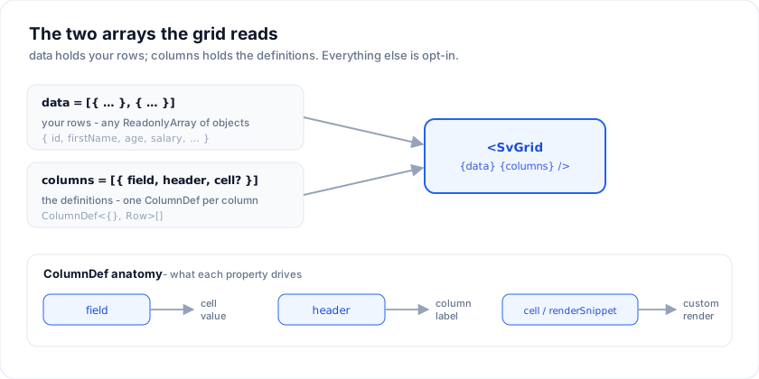
SvGrid reads two arrays: data (your rows) and columns (the
column-definition list). Everything else is opt-in.
Row data
The data prop is any ReadonlyArray<TRow>. A Svelte 5 $state
array, a derived store, an SWR/TanStack-Query cache, a +page.ts load
result, a plain literal - the grid doesn't care, as long as the array
reference changes when the rows change.
<script lang="ts">
  import { SvGrid, type GridColumns } from '@svgrid/grid'

  type Staff = { id: string; firstName: string; age: number }

  // Reactive: pushing into `rows` updates the grid automatically.
  let rows = $state<Staff[]>([
    { id: '1', firstName: 'Ada',   age: 36 },
    { id: '2', firstName: 'Linus', age: 54 },
  ])

  const staffColumns: GridColumns<Staff> = [
    { field: 'firstName', header: 'First name', width: 180 },
    { field: 'age',       header: 'Age',        width: 90 },
  ]

  function addRow() {
    rows.push({ id: crypto.randomUUID(), firstName: 'New', age: 0 })
  }
</script>

<button onclick={addRow}>Add row</button>
<SvGrid data={rows} columns={staffColumns} />
Identity
Today the wrapper uses each row's array index as its id. That's fine
for read-only views; if you mutate rows, prefer keeping the same
object references for rows that didn't change so selection and edit
state line up. A getRowId prop on the wrapper is tracked in
Missing features and supported by the
headless createSvGrid core today.
Immutability
SvGrid does not mutate your data. When the user commits an edit the
grid emits an onCellValueChange event; you decide whether to mutate
in place or copy. See Saving values.
Column definitions
A column definition tells SvGrid how to read a value out of a row, how to render it, and how to format it.
import type { ColumnDef } from '@svgrid/grid'

type Person = {
  id: string
  firstName: string
  lastName: string
  age: number
  joinedAt: string  // ISO date
  salary: number
  active: boolean
}

const columns: GridColumns<Person> = [
  // `field`: read a key straight off the row
  { field: 'firstName', header: 'First name' },

  // `fieldFn`: compute the value; needs an explicit `id`
  {
    id: 'fullName',
    header: 'Full name',
    fieldFn: (row) => `${row.firstName} ${row.lastName}`,
  },

  // Numeric, with locale-aware formatting
  {
    field: 'age',
    header: 'Age',
    format: { type: 'number', options: { maximumFractionDigits: 0 } },
  },

  // Date with explicit pattern
  {
    field: 'joinedAt',
    header: 'Joined',
    format: { type: 'date', pattern: 'y-m-d' },
  },

  // Currency
  {
    field: 'salary',
    header: 'Salary',
    format: { type: 'currency', currency: 'USD' },
  },

  // Boolean rendered as a checkbox
  {
    field: 'active',
    header: 'Active',
    editorType: 'checkbox',
  },
]
Common properties
| Property | Purpose |
|---|---|
field |
Reads row[key]. |
fieldFn |
Computes the value from the row. Required when there's no underlying field. |
id |
Stable column id. Required when you use fieldFn (no field to derive from). |
header |
String or render snippet for the header. |
footer |
String or render snippet for the footer row. |
cell |
Render snippet / component for the body cell. See Cell components. |
format |
Locale-aware formatter: number, currency, percent, date, datetime. |
formatter |
Function form for one-off custom value formatting. |
editorType |
Inline editor: text | number | checkbox | date | datetime. |
width |
Initial column width in pixels. Default comes from the columnWidth prop on <SvGrid>. |
align |
Header + body alignment: 'left' | 'right' | 'center'. Inferred from editorType when omitted. |
columns |
Child column defs for column groups (multi-level header). |
Sorting / filtering / grouping are toggled per-grid via the registered
features. Per-column flags (enableSorting: false, etc.) are on the
Missing features list.
Custom cells
For anything beyond a stringified value, render with renderSnippet:
<script lang="ts">
  import { SvGrid, renderSnippet, type GridColumns } from '@svgrid/grid'

  type Named = { firstName: string; lastName: string; age: number }

  const named: Named[] = [
    { firstName: 'Ada',   lastName: 'Lovelace', age: 36 },
    { firstName: 'Grace', lastName: 'Hopper',   age: 45 },
    { firstName: 'Linus', lastName: 'Torvalds', age: 54 },
  ]
</script>

{#snippet PersonCell(props: { row: Named })}
  <span class="inline-flex items-center gap-2">
    <span class="initials">{props.row.firstName[0]}{props.row.lastName[0]}</span>
    <span>{props.row.firstName} {props.row.lastName}</span>
  </span>
{/snippet}

<SvGrid
  data={named}
  columns={[
    {
      id: 'person',
      header: 'Person',
      fieldFn: (r) => `${r.firstName} ${r.lastName}`,
      cell: (ctx) => renderSnippet(PersonCell, { row: ctx.row.original }),
    },
    { field: 'age', header: 'Age' },
  ] satisfies GridColumns<Named>}
/>
Cell components has the full patterns: avatars, sparklines, progress bars, status badges.
Formats on the columns you already have
format is declarative and locale-aware, so a currency, a percentage and a
date all come from the same place rather than from three helper functions.
<script lang="ts">
  import { SvGrid, type GridColumns } from '@svgrid/grid'

  type Person = {
    id: number
    name: string
    city: string
    age: number
    salary: number
  }

  const seed: Person[] = [
    { id: 1, name: 'Ada Lovelace',   city: 'London',   age: 36, salary: 142000 },
    { id: 2, name: 'Grace Hopper',   city: 'New York', age: 45, salary: 168000 },
    { id: 3, name: 'Linus Torvalds', city: 'Portland', age: 54, salary: 155000 },
  ]

  type Row = { product: string; price: number; margin: number; shipped: string }

  const rows: Row[] = [
    { product: 'Cycling cap',  price: 29,  margin: 0.42, shipped: '2026-05-02' },
    { product: 'Patch kit',    price: 12.8, margin: 0.31, shipped: '2026-05-11' },
    { product: 'Road bottle',  price: 8.5, margin: 0.55, shipped: '2026-05-19' },
  ]

  const columns: GridColumns<Row> = [
    { field: 'product', header: 'Product', width: 170 },
    { field: 'price',   header: 'Price',   width: 120,
      format: { type: 'currency', currency: 'USD' } },
    { field: 'margin',  header: 'Margin',  width: 110,
      format: { type: 'percent' } },
    { field: 'shipped', header: 'Shipped', width: 150, cellDataType: 'dateString',
      format: { type: 'date', options: { dateStyle: 'medium' } } },
  ]
</script>

<SvGrid data={rows} {columns} sortable />
Related articles
- Multi-Level (Grouped) Column Headers in SvGrid - Band related columns under a shared parent header using SvGrid's nested column definition - how to nest, pin, combine with sorting and filtering, and when NOT to use grouping.
- A Custom Column Header Menu in SvGrid - Build a per-column header menu for sort, hide, pin, and custom actions using header snippets and your own dropdown component.
- A Column Show/Hide Toggle in SvGrid - Build a column chooser panel that lets users show or hide columns at runtime, with persistence across page loads and a guard against hiding everything.