Multi-Level (Grouped) Column Headers in SvGrid
Band related columns under a shared parent header using SvGrid's nested column definition - how to nest, pin, combine with sorting and filtering, and when NOT to use grouping.
Twenty columns in a flat header is a navigation problem disguised as a data problem. Users scan left to right looking for meaning, and a wall of equal-weight labels gives them nothing to anchor on. Grouped headers - a parent band spanning several child columns - solve this by creating visual hierarchy before the user has to think.
SvGrid handles grouped headers through nested column definitions. There is no separate API call, no post-setup configuration. You nest a columns array inside a parent column object and the grid renders a spanning header above the children. That simplicity has real implications for how you can compose things.
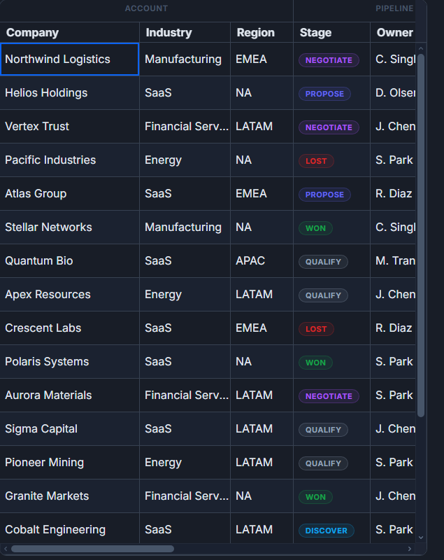 Grouped, multi-level column headers in SvGrid.
The nesting model
The core idea is that any column object can have a columns property. When it does, SvGrid treats it as a group header - it spans the full width of its children and cannot itself hold data. The children are ordinary leaf columns with all the usual properties: field, width, type, editable, pinned, and so on.
import SvGrid from '@svgrid/grid'
import type { ColumnDef } from '@svgrid/grid'

type Row = {
  product: string
  q1_revenue: number
  q2_revenue: number
  q3_revenue: number
  q4_revenue: number
  q1_units: number
  q2_units: number
}

const columns: ColumnDef<{}, Row>[] = [
  {
    id: 'product',
    field: 'product',
    header: 'Product',
    width: 200,
    pinned: 'left',
  },
  {
    header: '2026 Revenue',
    columns: [
      { id: 'q1_rev', field: 'q1_revenue', header: 'Q1', width: 110, type: 'number', format: { type: 'currency', currency: 'USD' } },
      { id: 'q2_rev', field: 'q2_revenue', header: 'Q2', width: 110, type: 'number', format: { type: 'currency', currency: 'USD' } },
      { id: 'q3_rev', field: 'q3_revenue', header: 'Q3', width: 110, type: 'number', format: { type: 'currency', currency: 'USD' } },
      { id: 'q4_rev', field: 'q4_revenue', header: 'Q4', width: 110, type: 'number', format: { type: 'currency', currency: 'USD' } },
    ],
  },
  {
    header: '2026 Units',
    columns: [
      { id: 'q1_units', field: 'q1_units', header: 'Q1', width: 90, type: 'number' },
      { id: 'q2_units', field: 'q2_units', header: 'Q2', width: 90, type: 'number' },
    ],
  },
]
The "2026 Revenue" band spans four columns. "2026 Units" spans two. The product column is pinned left and stands alone. The grid takes care of the rowspan and colspan math, so you do not write any HTML by hand.
Sorting and filtering still work on leaf columns
A common concern with multi-level headers is whether interactive features break down. They do not. Sorting, filtering, and resizing all operate on the leaf columns exactly as they would in a flat header. The group bands are display-only.
<script lang="ts">
  import SvGrid from '@svgrid/grid'
  import type { SvGridApi } from '@svgrid/grid'

  let api: SvGridApi | undefined

  const data = $state(rows)

  // Sort by Q1 revenue programmatically after mount
  function sortByBestQuarter() {
    api?.setSort('q1_rev', 'desc')
  }
</script>

<SvGrid
  {data}
  {columns}
  sortable
  filterable
  showFilterRow={true}
  rowHeight={32}
  onApiReady={(a) => { api = a }}
/>

<button onclick={sortByBestQuarter}>Sort by Q1</button>
Filter rows appear under the leaf headers, not under the group bands, which is exactly where users expect to type. If you have showFilterRow={true}, the group bands get an empty cell spanning the group width - the filter inputs sit in the next row aligned to their columns.
Three levels and why you probably want two
Nesting can go deeper. Year > Half > Quarter is a legitimate structure and SvGrid will render all three rows:
const columns: ColumnDef<{}, Row>[] = [
  { id: 'region', field: 'region', header: 'Region', width: 160, pinned: 'left' },
  {
    header: '2025',
    columns: [
      {
        header: 'H1',
        columns: [
          { id: 'q1_25', field: 'q1_2025', header: 'Q1', width: 100, type: 'number' },
          { id: 'q2_25', field: 'q2_2025', header: 'Q2', width: 100, type: 'number' },
        ],
      },
      {
        header: 'H2',
        columns: [
          { id: 'q3_25', field: 'q3_2025', header: 'Q3', width: 100, type: 'number' },
          { id: 'q4_25', field: 'q4_2025', header: 'Q4', width: 100, type: 'number' },
        ],
      },
    ],
  },
  {
    header: '2026',
    columns: [
      {
        header: 'H1',
        columns: [
          { id: 'q1_26', field: 'q1_2026', header: 'Q1', width: 100, type: 'number' },
          { id: 'q2_26', field: 'q2_2026', header: 'Q2', width: 100, type: 'number' },
        ],
      },
    ],
  },
]
Three levels is technically fine. Four is where it starts costing users more in visual effort than it saves in organization. My rule of thumb: if the group label is more than five words, or if you are approaching four rows of headers, consider whether a column chooser or a tab-based view would serve better.
Combining grouped headers with column grouping and aggregation
These are two different things that the same word ("grouping") can confuse. Column header groups organize the header display. Row grouping (via groupable and setGroupBy) aggregates rows by a field value. They compose cleanly:
<script lang="ts">
  import SvGrid from '@svgrid/grid'
  import type { SvGridApi } from '@svgrid/grid'

  let api: SvGridApi | undefined
  const data = $state(salesRows)
</script>

<SvGrid
  {data}
  {columns}
  sortable
  filterable
  groupable
  showFilterRow={true}
  rowHeight={32}
  onApiReady={(a) => {
    api = a
    // Group rows by region; column header bands are separate
    api.setGroupBy(['region'])
  }}
/>
The header bands ("2026 Revenue", "2026 Units") remain visible and unchanged while rows are grouped by region. Aggregated totals appear per group and in the footer, tied to whichever leaf columns have aggregate configured. This is the combination that makes financial dashboards work - you want both the organizational structure in the header and the roll-up structure in the rows.
When flat headers are actually better
Grouped headers add cognitive load even when they add clarity. A few situations where I reach for flat columns instead:
- Fewer than six columns. Grouping three columns under one band is visual overhead with no payoff.
- Heterogeneous data where columns do not share a natural parent dimension. Forcing them into a group gives users a false taxonomy.
- Heavy filtering workflows. When users are constantly showing and hiding columns via a column chooser, a deep header hierarchy gets confusing as columns come and go and group bands collapse.
When the data genuinely has a parent-child relationship between header concepts, though, grouped headers communicate that relationship immediately. A year with quarters underneath reads as "these four things belong to 2026" in a way that four separate "2026 Q1", "2026 Q2" flat headers do not.
Column visibility with grouped headers
If all children of a group are hidden, the group band itself collapses and disappears. If some children are hidden, the band narrows to span only the visible ones. This means you can safely wire a column chooser to leaf columns without writing any special logic for group visibility:
// Hide all revenue columns - the "2026 Revenue" band disappears automatically
api.setColumnVisible('q1_rev', false)
api.setColumnVisible('q2_rev', false)
api.setColumnVisible('q3_rev', false)
api.setColumnVisible('q4_rev', false)

// Show one back - the band reappears, spanning only q4_rev
api.setColumnVisible('q4_rev', true)
This behavior is one of the places where having the group structure encoded in the column definition (rather than set up through a separate API) pays off. The grid always knows which leaves belong to which band and can recompute spans reactively.
Related reading
- A Custom Column Header Menu in SvGrid
- A Column Show/Hide Toggle in SvGrid
- Column Definitions in SvGrid - Fields, Accessors, and Formatting
- Saved Views - Persist Grid Layout and Filters
- Row Drag-and-Drop Reordering in a Svelte Data Grid
Tagged: Columns