2. First grid in 60 seconds
Step 2 of 6 · ← Install · Next: Data and columns →
<script lang="ts">
  import { SvGrid, type GridColumns } from '@svgrid/grid'

  type Person = { firstName: string; age: number; status: string }

  const rows: Person[] = [
    { firstName: 'Ada',   age: 36, status: 'active' },
    { firstName: 'Linus', age: 54, status: 'active' },
    { firstName: 'Grace', age: 85, status: 'inactive' },
  ]

  const columns: GridColumns<Person> = [
    { field: 'firstName', header: 'First name' },
    { field: 'age',       header: 'Age' },
    { field: 'status',    header: 'Status' },
  ]
</script>

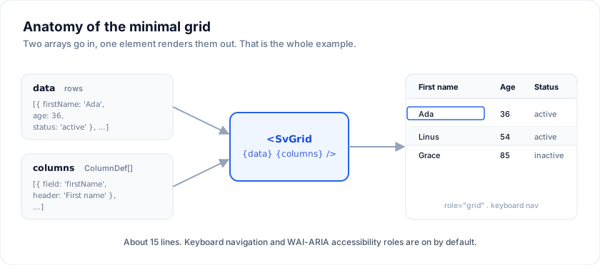
<SvGrid data={rows} columns={columns} />
That's a complete, working grid.
What you got out of the box
- A semantic
<table>with WAI-ARIArole="grid"/role="row"/role="columnheader"/role="gridcell"on every node. - Keyboard navigation: arrow keys move the active cell, Home/End jump to row edges, Page Up/Down move by a page, Ctrl+Home / Ctrl+End jump to the grid corners.
- A focus ring on the active cell. Selection on click. F2 / double-click
to edit (no-op here because no column has
editorType). - Auto-sized columns; explicit
widthon the column def overrides. - The default
--sg-*theme: borders, header background, zebra rows, hover, selection - all on tokens you can swap.
What you didn't get yet
Sort, filter, pagination, grouping, expansion, selection are off until you register the matching features. That's the next step.
<!-- after registering rowSortingFeature + columnFilteringFeature -->
<SvGrid
  data={rows}
  columns={columns}
  features={features}
  filterMode="menu"
/>
Step 3 → covers how data and columns
work in detail; step 4 → lights up everything else.
See it run
The quick-start demo is a slightly fancier version (more columns, inline editing, range selection):
Open the live example: Quick start (Getting Started)
Source: examples/src/demos/01-quick-start.svelte.
Adding the three common features
Each capability is one boolean. Turn on what the screen needs and nothing else ships - which is why the first grid stays small.
<script lang="ts">
  import { SvGrid, type GridColumns, type SvGridApi } from '@svgrid/grid'

  type Person = {
    id: number
    name: string
    email: string
    city: string
    age: number
    salary: number
  }

  const seed: Person[] = [
    { id: 1, name: 'Ada Lovelace',   email: '[email protected]',   city: 'London',   age: 36, salary: 142000 },
    { id: 2, name: 'Grace Hopper',   email: '[email protected]', city: 'New York', age: 45, salary: 168000 },
    { id: 3, name: 'Linus Torvalds', email: '[email protected]', city: 'Portland', age: 54, salary: 155000 },
  ]

  const columns: GridColumns<Person> = [
    { field: 'name',   header: 'Name',   width: 180 },
    { field: 'city',   header: 'City',   width: 140 },
    { field: 'age',    header: 'Age',    width: 90 },
    { field: 'salary', header: 'Salary', width: 140,
      format: { type: 'currency', currency: 'USD' } },
  ]
</script>

<SvGrid data={seed} {columns} sortable filterable pageable pageSize={2} />
Related articles
- First Light - Pointing SvGrid at 100,000 Rows - When we first fed SvGrid a hundred thousand rows, we were testing more than performance - we were testing whether building native on Svelte 5 runes was the right call from the start.
- Render Your First Svelte Data Grid in Under 5 Minutes - How to add a fast, accessible, sortable data grid to a Svelte 5 app with SvGrid - covering data, typed columns, feature composition, and the imperative API.