1. Install
Step 1 of 6 · Next: First grid →
SvGrid is a single npm package. There is no peer dependency on a CSS framework - bring your own, or import one of the 20 themes that ship with it. Each theme carries a light and a dark palette, so dark mode is an attribute, not a second stylesheet.
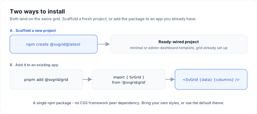
Fastest start: scaffold a project
Starting fresh? Skip the manual wiring and scaffold a project with the grid already set up:
npm create @svgrid@latest                                   # interactive
npm create @svgrid@latest my-admin -- --template admin-dashboard
See Starters & scaffolding for the templates (minimal
Vite app or a full SvelteKit admin dashboard) and the Deploy-to-Vercel
flow. Building with SvelteKit? SvGrid with SvelteKit is the
end-to-end path: sv add, server loads, URL-driven sort, form actions and SSR.
To add SvGrid to an existing app, install it directly:
# pnpm (recommended)
pnpm add @svgrid/grid

# npm
npm install @svgrid/grid

# yarn
yarn add @svgrid/grid
Requirements
| Tool | Version | Why |
|---|---|---|
| Svelte | 5.x | Uses runes: $state, $derived, $effect. |
| TypeScript | 5.4+ | Optional but strongly recommended. The column-def types pay for themselves. |
| Node | 18+ | For tooling (vite, svelte-check, the example gallery). |
The bundle is tree-shakeable: features you don't import don't ship. There's no monolithic entry that pulls everything.
Verify the install
A 5-line smoke test:
<script lang="ts">
  import { SvGrid, type GridColumns } from '@svgrid/grid'

  type Person = { name: string }

  const rows: Person[] = [{ name: 'Ada' }, { name: 'Linus' }]

  // Annotate the array. Without `GridColumns<Person>` TypeScript widens `field`
  // to `string`, and the grid - which types `field` as a key of your row - then
  // rejects it. This is the one type annotation worth writing every time.
  const columns: GridColumns<Person> = [{ field: 'name', header: 'Name' }]
</script>

<SvGrid data={rows} {columns} />
If you see a styled <table> with two rows, you're done.
Pick a theme
The render component ships its own styles, so the grid is readable the moment it mounts. It is deliberately plain, though: no preset is applied until you ask for one. Import a theme to change that.
import '@svgrid/grid/themes/shadcn.css'
Twenty are available: ember (SvGrid's own look), shadcn, tailwind,
material, fluent, carbon, antd, bootstrap, atlassian,
salesforce, sap, github, linear, notion, vercel, excel,
nord, dracula, catppuccin, ag-alpine.
Each one declares the whole --sg-* token set twice: once on :root and
once under :root[data-theme='dark']. So dark mode is one attribute on
the document, and the grid follows:
document.documentElement.dataset.theme = 'dark'
Two things worth knowing before you wire this into an existing app:
- Set
color-schemetoo. Without it the browser keeps painting native scrollbars, form controls and the page canvas light, so a dark grid sits in a light frame.:root { color-scheme: light }plus:root[data-theme='dark'] { color-scheme: dark }is the whole fix. - Apply the attribute before the first paint. Setting it from a
component means the page renders in the wrong palette for a frame. An
inline script in
index.html(orapp.htmlin SvelteKit) that readslocalStorageavoids the flash.
The scaffolded starters do both already. Step 5 covers overriding individual tokens, per-instance theming and density.
Enterprise add-on (optional)
If you need data export (Excel / PDF / CSV), data import, the AI assistant, or built-in pivot tables, install the paid Enterprise pack alongside the Community package:
pnpm add @svgrid/enterprise
See Enterprise features for what ships and how to license.
Where the rest of this guide goes
- Install ← you're here
- First grid - the minimum runnable example explained
- Data and columns - the two arrays the grid actually reads
- Features - opt into sort, filter, pagination, grouping, etc.
- Theme and density -
--sg-*tokens, dark mode, row height - Going to production - server-side data, virtualization, a11y, SSR
The combined "everything in one page" version is at ../getting-started-full.md - useful for printing or single-tab reading.