5. Theme and density
Step 5 of 6 · ← Features · Next: Going to production →
Start with a preset
Before hand-writing any tokens: 20 design-system presets ship with the package, each a single stylesheet with a full light + dark palette. One import re-themes the whole grid.
The examples on this page run against these rows:
<script lang="ts">
  import { SvGrid, type GridColumns, type SvGridApi } from '@svgrid/grid'

  type Person = {
    id: number
    name: string
    department: string
    city: string
    age: number
    salary: number
  }

  const people: Person[] = [
    { id: 1, name: 'Ada Lovelace',   department: 'Engineering', city: 'London',   age: 36, salary: 142000 },
    { id: 2, name: 'Grace Hopper',   department: 'Engineering', city: 'New York', age: 45, salary: 168000 },
    { id: 3, name: 'Linus Torvalds', department: 'Platform',    city: 'Portland', age: 54, salary: 155000 },
    { id: 4, name: 'Radia Perlman',  department: 'Networking',  city: 'Seattle',  age: 49, salary: 161000 },
    { id: 5, name: 'Barbara Liskov', department: 'Platform',    city: 'Boston',   age: 52, salary: 172000 },
  ]

  const columns: GridColumns<Person> = [
    { field: 'name',       header: 'Name',       width: 190 },
    { field: 'department', header: 'Department', width: 150 },
    { field: 'city',       header: 'City',       width: 130 },
    { field: 'age',        header: 'Age',        width: 80 },
    { field: 'salary',     header: 'Salary',     width: 130, format: { type: 'currency', currency: 'USD' } },
  ]
</script>
import '@svgrid/grid/themes/shadcn.css'
Available: ember (SvGrid's own look), shadcn, tailwind, material,
fluent, carbon, antd, bootstrap, atlassian, salesforce, sap,
github, linear, notion, vercel, excel, nord, dracula,
catppuccin, ag-alpine.
Each preset defines every token the grid and the UI components read - including
the semantic status colors (--sg-danger, --sg-success, --sg-warning,
--sg-info) and the focus ring, which follows the preset's accent. Presets
flip with data-theme="dark" automatically (see below).
Override individual tokens after the import to adjust a preset, or skip presets entirely and declare the tokens yourself - that is the rest of this page.
Declaring tokens yourself
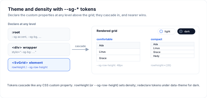
The render component (<SvGrid>) ships its own scoped styles. You
re-theme it by declaring --sg-* CSS custom properties at any level
above the grid - :root for the whole app, a wrapper <div> for one
instance, or directly on the <SvGrid> element itself.
Token surface
The 20-odd tokens the renderer reads:
| Token | What it paints |
|---|---|
--sg-bg |
Cell background |
--sg-fg |
Cell text |
--sg-muted |
Secondary text (footers, subtitles) |
--sg-border |
Cell + header borders |
--sg-header-bg / --sg-header-fg |
Header row |
--sg-row-alt-bg |
Zebra rows |
--sg-row-hover-bg |
Row + cell hover |
--sg-selection-bg |
Selected cell / row tint |
--sg-accent |
Sort indicator, focus ring, primary buttons |
--sg-focus-ring |
Keyboard focus outline |
--sg-input-bg / --sg-input-border |
Inline editor + filter inputs |
--sg-pill-active / -fg |
"Active" status pills |
--sg-pill-pending / -fg |
"Pending" status pills |
--sg-pill-inactive / -fg |
"Inactive" status pills |
--sg-scrollbar-* (10 tokens) |
Custom-painted scrollbars |
Light + dark via data-theme
The gallery flips themes by writing dark or light to
html[data-theme]. Every token redeclares under that selector:
:root {
  --sg-bg:          #ffffff;
  --sg-fg:          #0f172a;
  --sg-border:      #e2e8f0;
  --sg-header-bg:   #f1f5f9;
  --sg-row-alt-bg:  #f8fafc;
  --sg-row-hover-bg: #eef2ff;
  --sg-accent:      #2563eb;
}

html[data-theme='dark'] {
  --sg-bg:          #0f172a;
  --sg-fg:          #f1f5f9;
  --sg-border:      #334155;
  --sg-header-bg:   #1e2433;
  --sg-row-alt-bg:  #1b2230;
  --sg-row-hover-bg: #232b3c;
  --sg-accent:      #3b82f6;
  color-scheme: dark;
}
Toggling is one line in the app shell:
<script lang="ts">
  let theme = $state<'light' | 'dark'>('dark')
  $effect(() => document.documentElement.setAttribute('data-theme', theme))
</script>

<button onclick={() => (theme = theme === 'dark' ? 'light' : 'dark')}>
  Toggle theme
</button>
Per-instance theming
Because the tokens are plain custom properties they cascade. To style a
single grid, wrap it in a <div> that sets its own values:
<div style="--sg-bg: #fff8f0; --sg-accent: #db2777;">
  <SvGrid {data} {columns} features={features} />
</div>
The 10-custom-cells-and-themes
demo applies three full palettes (light / dark / high-contrast) this way.
Open the live example: Custom cells + themes (Rows & Cells)
Density
Density is a prop, not a token. The virtualizer has to know each row's height as a number before it can position rows, so it cannot be resolved from CSS - the grid writes the height as an inline style on every row, which would override a stylesheet rule anyway.
Set rowHeight on <SvGrid>. Numeric, in pixels; drives the row
height and the active-cell hit box. The default is 30.
<SvGrid {data} {columns} features={features} rowHeight={28} />
Common steps: 28 compact, 30 normal, 46-48 comfortable. For
rows whose height depends on their content, set autoRowHeight
instead and the grid measures each row.
A user-facing "density selector" is half a dozen lines:
<script lang="ts">
  let density = $state<'compact' | 'normal' | 'comfortable'>('normal')
  const height = $derived(
    density === 'compact' ? 28 : density === 'comfortable' ? 48 : 30,
  )
</script>

<select bind:value={density}>
  <option value="compact">Compact</option>
  <option value="normal">Normal</option>
  <option value="comfortable">Comfortable</option>
</select>

<SvGrid {data} {columns} features={features} rowHeight={height} />
Sizing the grid
The wrapper renders inside whatever container you give it. The
containerHeight prop sets the scrollable shell height:
<!-- Numeric: px -->
<SvGrid {data} {columns} features={features} containerHeight={520} />

<!-- String: passed through to CSS -->
<SvGrid {data} {columns} features={features} containerHeight="100%" />
<SvGrid {data} {columns} features={features} containerHeight="auto" />
For a flex-grow layout the canonical recipe is:
<div class="flex flex-col h-screen">
  <header>…</header>
  <div class="flex-1 min-h-0">
    <SvGrid {data} {columns} features={features} containerHeight="100%" />
  </div>
</div>
The min-h-0 is the bit that bites. Flex children default to
min-height: auto, which prevents the inner scroll container from
shrinking, which makes the whole page scroll instead of the grid.
Full Tailwind integration
If your app uses Tailwind, see Tailwind integration
for: install + PostCSS config, @custom-variant so the dark:
modifier follows data-theme, the override hooks for the stable
.sv-grid-* class names, and the anti-patterns (don't @apply inside
grid selectors, don't put utility classes on grid children, don't
fight column widths in CSS).
Try it
There is no density prop - row height is the density control, and it is one
number. Compact for a screen someone scans all day, comfortable for one they
read.
<SvGrid data={people} {columns} rowHeight={28} showRowNumbers />

<SvGrid data={people} {columns} rowHeight={48} showRowNumbers />
Re-theming with tokens
The grid reads --sg-* custom properties, so a theme is a block of variables on
any ancestor - no theme file, no build step.
<div class="midnight">
  <SvGrid data={people} {columns} sortable />
</div>

<style>
  .midnight {
    --sg-bg: #0f172a;
    --sg-fg: #e2e8f0;
    --sg-border: #1e293b;
    --sg-header-bg: #111c33;
    --sg-header-fg: #93c5fd;
    --sg-accent: #38bdf8;
    --sg-row-hover: #16233d;
  }
</style>
Related articles
- SvGrid Tips and Tricks: Get More from Your Svelte Data Grid - Practical SvGrid tips - fitColumns, cellFlash, Kanban board mode, server-side data, theming tokens and headless rendering - each with a code snippet and docs link.