Grouping & aggregation
Roll rows up by one or more columns and compute aggregates (sum, avg,
count, min, max, custom) at each group level. Powered by
columnGroupingFeature plus per-column aggregate config.
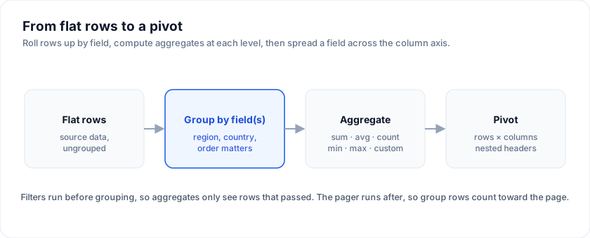
Try it: drag a column into the group-by lane, then change aggregators per column:
Open the live example: Grouping + aggregation (Sorting & Grouping)
Minimal example
The examples on this page run against these rows:
<script lang="ts">
  import { SvGrid, type GridColumns, type SvGridApi } from '@svgrid/grid'

  type Person = {
    id: number
    name: string
    department: string
    city: string
    age: number
    salary: number
  }

  const people: Person[] = [
    { id: 1, name: 'Ada Lovelace',   department: 'Engineering', city: 'London',   age: 36, salary: 142000 },
    { id: 2, name: 'Grace Hopper',   department: 'Engineering', city: 'New York', age: 45, salary: 168000 },
    { id: 3, name: 'Linus Torvalds', department: 'Platform',    city: 'Portland', age: 54, salary: 155000 },
    { id: 4, name: 'Radia Perlman',  department: 'Networking',  city: 'Seattle',  age: 49, salary: 161000 },
    { id: 5, name: 'Barbara Liskov', department: 'Platform',    city: 'Boston',   age: 52, salary: 172000 },
  ]

  const columns: GridColumns<Person> = [
    { field: 'name',       header: 'Name',       width: 190 },
    { field: 'department', header: 'Department', width: 150 },
    { field: 'city',       header: 'City',       width: 130 },
    { field: 'age',        header: 'Age',        width: 80 },
    { field: 'salary',     header: 'Salary',     width: 130, format: { type: 'currency', currency: 'USD' } },
  ]
</script>
<script lang="ts">
  import {
    SvGrid, tableFeatures, rowSortingFeature, columnGroupingFeature,
    type ColumnDef,
  } from '@svgrid/grid'

  type Employee = {
    id: number; name: string; department: string;
    salary: number; performance: number
  }

  const features = tableFeatures({ rowSortingFeature, columnGroupingFeature })

  const columns: ColumnDef<typeof features, Employee>[] = [
    { field: 'department', header: 'Department' },
    { field: 'name',       header: 'Name' },
    { field: 'salary',     header: 'Salary',
      aggregate: 'sum',
      format: { type: 'currency', currency: 'USD' } },
    { field: 'performance', header: 'Performance',
      aggregate: 'avg' },
  ]

  const rows: Employee[] = [
    { id: 1, name: 'Ada',   department: 'Engineering', salary: 180_000, performance: 4.8 },
    { id: 2, name: 'Linus', department: 'Engineering', salary: 195_000, performance: 4.6 },
    { id: 3, name: 'Grace', department: 'Operations',  salary: 165_000, performance: 4.9 },
  ]
</script>

<SvGrid
  data={rows}
  columns={columns}
  features={features}
  groupBy={['department']}
/>
The grid emits one group row per unique department value, with the group cell showing the rolled-up salary sum + average performance. Click the chevron on a group row to expand its children.
Setting the group-by
Three ways, ranked by ergonomic order:
- The column menu. When the user opens a header's menu, "Group by this column" toggles that column in/out of the group-by list.
- The
groupByprop. Seeds the group-by list and re-applies whenever the prop's own value changes, so it works both as initial state and as a controlled value. A group-by set from the menu or the API is not clobbered while the prop stays put. - The imperative API.
api.setGroupBy(['department', 'role'])for toolbars / saved views.
groupBy is ignored when treeData is set - a row cannot be both a
hierarchy node and bucketed under a group banner.
The group order is significant - ['region', 'country'] rolls up
country inside region; reverse the array to flip the hierarchy.
Built-in aggregators
| Aggregator | Returns | Behaviour on empty groups |
|---|---|---|
'sum' |
Sum of numeric cell values | 0 |
'avg' |
Arithmetic mean (with safe divide-by-zero) | null |
'count' |
Number of leaf rows | 0 |
'min' |
Smallest value (numeric or Intl.Collator-comparable) |
null |
'max' |
Largest value | null |
'sum' / 'avg' / 'min' / 'max' cast values to Number. If the
column has non-numeric values mixed in, those rows are skipped.
Custom aggregator
Pass a function instead of a string for any group-aware computation:
{
  field: 'orders',
  header: 'Top customer',
  aggregate: (rows) => {
    const top = rows.reduce<Employee | null>(
      (acc, r) => !acc || r.orders > acc.orders ? r : acc,
      null,
    )
    return top?.name ?? '-'
  },
}
The callback gets every leaf row in the group (already filtered). Return whatever the cell should display - string, number, or a formatted value.
Custom group cell rendering
By default the group cell shows key (n) - e.g. "Engineering (12)".
Override via the column's cell template:
{#snippet GroupCell(props: { row: GroupRow<Employee> })}
  <span class="font-semibold">
    {props.row.groupKey}
    <span class="text-sm opacity-60">({props.row.subRows.length} reports)</span>
  </span>
{/snippet}
The row.groupKey is the unique group value (the department name in
the example). row.subRows is the children. row.depth is the
nesting level (useful for indentation when you group by multiple
columns).
Aggregating string columns
Strings work with 'count', 'min', 'max', and any custom
aggregator. For sum / avg you'll get NaN because the cast to
Number fails - the grid renders this as - by default.
A useful custom aggregator for strings:
{
  field: 'tags',
  aggregate: (rows) => {
    const set = new Set<string>()
    for (const r of rows) for (const t of r.tags) set.add(t)
    return Array.from(set).join(', ')
  },
}
Performance
Aggregation runs once per group-by change, NOT per scroll frame. The
cost is O(n) for count / sum / avg, O(n log n) for min / max
because the engine sorts to find the extreme.
For a 100k-row dataset grouped by two columns with three aggregators, the pipeline adds ~36 ms to the initial paint (see Performance benchmarks). After that, scroll is unaffected - the renderer hands each visible group its precomputed value.
Group expansion state
expanded is owned by the engine by default; you can hoist it for
saved-views purposes:
<SvGrid
  ...
  expanded={controlledExpanded}
  onExpandedChange={(next) => (controlledExpanded = next)}
/>
onExpandedChange fires for every path that changes expansion: a click
on a group banner, api.setRowExpanded(), and
api.expandAllGroups() / api.collapseAllGroups(). It receives the
full next map, so writing it straight back into expanded (as above) is
safe and will not loop.
The shape is Record<rowId, boolean>. Group row ids are built from the
grouping path rather than the display label - grouping by department
gives group_department_Engineering, and adding role beneath it gives
group_department_Engineering_role_Senior. Tree rows key off the
engine's row id instead, so set getRowId if you want those keys to be
your own ids. Capture the map from onExpandedChange rather than
hand-building the keys.
Group sort vs leaf sort
The sort UI sorts within the active sort scope:
- When grouping is OFF, sort applies to all rows.
- When grouping is ON, sort applies WITHIN each group - groups stay in alphabetical (or group-aggregator) order; only the leaves inside each group reorder.
To sort the groups themselves by their rolled-up value, set the sort on the aggregated column AFTER setting the group-by. The grid recognises that the column is aggregated and sorts the group rows instead of the leaves.
Filtering vs grouping
Filters run BEFORE grouping (see Architecture for the pipeline order). The aggregator only sees rows that passed the filter. This is what makes "department salary sum, filtered to active employees only" work without any extra config.
Pivot vs group-by
When the question is "group by row dimensions, also group by column dimensions, also pick aggregators per measure" - that's a pivot. The pivot helpers build a different data structure optimised for that shape. Use group-by when you only roll up rows; use pivot when you also roll up columns.
Display modes
groupDisplayMode decides where group state is drawn:
| Mode | Result |
|---|---|
groupRows (default) |
A full-width banner row per group. Unchanged behaviour. |
singleColumn |
One synthetic Group column holding every level, indented by depth. |
multipleColumns |
One synthetic column per grouped field. |
<SvGrid {data} {columns} groupable groupDisplayMode="singleColumn" />
Both column modes hide the grouped source columns, because their values move into the auto column - showing both would just duplicate them. They also render the group row as an ordinary row, which is the real reason to use them: its aggregate cells then line up under the columns they belong to instead of sitting in a full-width strip.
Tune the combined column with autoGroupColumnHeader (default "Group") and
autoGroupColumnWidth (default 220). In multipleColumns each column takes
its name from the source column's header.
Group footers (subtotal rows)
groupFooters closes each group with a subtotal row:
<SvGrid {data} {columns} groupable groupFooters />
The footer is a clone of the group banner, so it already carries that group's aggregates and renders through the normal cell path - each total lands under its own column instead of in a full-width strip. It is not expandable and has no expander.
Only columns with an aggregate produce a value, the same ones that populate
the banner.
Grand total row
grandTotalRow appends a single totals row for the whole filtered set:
<SvGrid {data} {columns} grandTotalRow />
It is independent of groupFooters - use it on a flat grid for a bottom totals
line, or together for subtotals and a total:
<SvGrid {data} {columns} groupable groupFooters grandTotalRow />
Three things to know:
- It aggregates the leaf rows, so turning grouping on does not double-count (the group banners already carry subtotals).
- It follows the filtered set, not the raw data - filter the grid and the total moves with it.
- With
pageable, it is appended only on the last page, so a total never appears mid-dataset. The value still covers every row, not just that page.
Columns without an aggregate render blank, and if no column declares one the
row is skipped entirely.
Grouping with pagination
pageSize budgets data rows. Group banners and footers do not count
against it:
<SvGrid {data} {columns} groupable groupFooters pageable pageSize={10} />
A page holds pageSize real rows and reprints the banners those rows sit
under, so a group split across a page boundary is labelled on both pages - the
way a spreadsheet repeats group headers across a page break. Footers are
inserted after paging, so switching them on never pushes data onto the next
page.
A collapsed group is the visible unit and takes one page slot itself; an expanded one is a header and takes none.
Frequently asked questions
How do I group rows in SvGrid?
Register columnGroupingFeature and group by one or more columns. Each group
renders a collapsible header row, and you attach an aggregate per column to
compute sum, avg, count, min, max, or a custom reducer at every group level.
What aggregation functions does SvGrid support?
Built-in sum, avg, count, min, and max, plus custom aggregators -
any function that reduces a group's rows to a single value. Aggregates compute
at each group level and at the grand-total footer.
Is grouping the same as a pivot table?
No. Grouping rolls rows up along the row axis. A pivot table also spreads a
field across the column axis with nested headers - that is the @svgrid/enterprise
pivot model. See Pivot tables for the column-axis version.
More examples
Group display modes + footers
Switch between groupRows banners, a single combined Group column, and one column per grouped field. groupFooters closes each group with a subtotal row under the real columns. Paging counts DATA rows, so pageSize means what it says: a page reprints the banners its rows sit under, and footers never eat the budget.
Open the live example: Group display modes + footers (Sorting & Grouping)
Group panel (drag & drop)
DevExpress / Kendo-style Group Panel: drag chips into the panel to group, drag inside to reorder grouping levels, × to ungroup. Drives api.setGroupBy() under the hood.
Open the live example: Group panel (drag & drop) (Sorting & Grouping)
Try it
Grouping is a prop, and the aggregate shown on each group header comes from the
column. Add summary and the same reducers total the whole filtered set in the
footer.
<script lang="ts">
  const agg: GridColumns<Person> = [
    { field: 'name',       header: 'Name',       width: 190 },
    { field: 'department', header: 'Department', width: 150 },
    { field: 'city',       header: 'City',       width: 130 },
    { field: 'age',        header: 'Age',        width: 80,  aggregate: 'avg', summary: 'avg' },
    { field: 'salary',     header: 'Salary',     width: 130, aggregate: 'sum', summary: 'sum',
      format: { type: 'currency', currency: 'USD' } },
  ]
</script>

<SvGrid data={people} columns={agg} groupBy={['department']} groupable summary sortable />
Two levels deep
groupBy is an array, and the order is the nesting order. Every level gets its
own aggregate row, computed over the leaf rows beneath it rather than over the
level above.
<script lang="ts">
  const nested: GridColumns<Person> = [
    { field: 'name',   header: 'Name',   width: 190 },
    { field: 'age',    header: 'Age',    width: 80,  aggregate: 'avg' },
    { field: 'salary', header: 'Salary', width: 130, aggregate: 'sum',
      format: { type: 'currency', currency: 'USD' } },
  ]
</script>

<SvGrid data={people} columns={nested} groupBy={['department', 'city']} groupable summary />
See also
- Architecture overview - where grouping sits in the pipeline.
- Pivot tables - the column-axis version.
- Row pagination - the paging stage runs AFTER grouping, so group rows count toward the page size.
- Demo #07 Grouping + aggregation
- the source for the example above.
Live examples
- Grouping + aggregation - Group by department, sum salaries, average performance, expand/collapse keys.
- Group display modes + footers - Switch between groupRows banners, a single combined Group column, and one column per grouped field. groupFooters closes each group with a subtotal row under the real columns. Paging counts DATA rows, so pageSize means what it says: a page reprints the banners its rows sit under, and footers never eat the budget.
- Group panel (drag & drop) - A Group Panel: drag chips into the panel to group, drag inside to reorder grouping levels, × to ungroup. Drives api.setGroupBy() under the hood.
Related articles
- SvGrid Tips and Tricks: Get More from Your Svelte Data Grid - Practical SvGrid tips - fitColumns, cellFlash, Kanban board mode, server-side data, theming tokens and headless rendering - each with a code snippet and docs link.