Build your own field type
A field type decides what a column holds and how it behaves: what the cell
shows, which editor opens, how pasted text is read, what the footer can sum.
The built-in types are registered with registerFieldType, the same call
you will use, so your type gets the field editor, the views and the
expanded record the way they do.
SvGrid Base is part of the Suite edition of
@svgrid/enterprise. Without a key it runs with a watermark.
This page builds two types. Phone (international) stores numbers as
E.164 text (+14155550123), shows them the local way, dials on click and
reads whatever people paste. Traffic light stores a score from 0 to 100
and draws a green, amber or red light with its own cell and its own editor.
The field types page has the short
version.
1. Decide what the field stores
Settle the stored value before you write the type. Filters, sorting, copy,
the database and your API all see the stored value; only the cell and the
formatter see the text on screen. A phone number stored as +14155550123
dials from any app, sorts by country and compares exactly.
// phone-field.ts
export type PhoneProps = { country: string; display: 'national' | 'international' }

const E164 = /^\+[1-9]\d{6,14}$/

/** Typed or pasted text as E.164 ("+14155550123"), or null when it is no phone number. */
export function toE164(text: string, country: string): string | null {
  let s = text.trim().replace(/^tel:/i, '').replace(/[\s().\-\/]/g, '')
  if (s.startsWith('00')) s = '+' + s.slice(2)
  if (!s.startsWith('+')) {
    // A national number: drop the trunk prefix (1 in North America, 0 elsewhere).
    s = country === '1' ? s.replace(/^1(?=\d{10}$)/, '') : s.replace(/^0/, '')
    // North American numbers need all ten digits: no guessing an area code.
    if (country === '1' && !/^\d{10}$/.test(s)) return null
    s = `+${country}${s}`
  }
  return E164.test(s) ? s : null
}

/** A stored value as the field shows it. A number from another country shows as stored. */
export function showPhone(value: unknown, p: PhoneProps): string {
  const s = value == null ? '' : String(value)
  const home = `+${p.country}`
  if (!E164.test(s) || !s.startsWith(home)) return s
  const rest = s.slice(home.length)
  if (p.country === '1' && rest.length === 10) {
    const local = `(${rest.slice(0, 3)}) ${rest.slice(3, 6)}-${rest.slice(6)}`
    return p.display === 'national' ? local : `+1 ${local}`
  }
  const grouped = rest.replace(/\B(?=(\d{4})+$)/g, ' ')
  return p.display === 'national' ? `0${grouped}` : `${home} ${grouped}`
}
| Typed, home country | Stored | Shown (national) |
|---|---|---|
(415) 555-0123, +1 |
+14155550123 |
(415) 555-0123 |
1 415 555 0123, +1 |
+14155550123 |
(415) 555-0123 |
020 7946 0958, +44 |
+442079460958 |
020 7946 0958 |
0044 20 7946 0958, +1 |
+442079460958 |
+442079460958 |
555-0123, +1 |
refused | |
n/a |
refused |
Both are plain functions, so you can unit-test them without a grid.
2. Register the type
// phone-field.ts, continued
import { registerFieldType, type FieldTypeDef } from '@svgrid/enterprise/base'

export const phoneType: FieldTypeDef<PhoneProps> = {
  id: 'intlPhone',
  label: 'Phone (international)',
  description: 'Stored as +14155550123, shown in the local format, dialed with a click.',
  icon: 'M5 4h4l2 5-2.5 1.5a11 11 0 0 0 5 5L15 13l5 2v4a2 2 0 0 1-2 2A16 16 0 0 1 3 6a2 2 0 0 1 2-2',
  group: 'basic',
  width: 170,
  defaults: { country: '1', display: 'national' },
  fill: (def, props) => ({
    ...def,
    editorType: def.editorType ?? 'text',
    formatter: def.formatter ?? ((ctx: { value: unknown }) => showPhone(ctx.value, props)),
    // Typed and pasted text is stored as E.164; text that is no number keeps the old value.
    valueParser: def.valueParser ?? ((x: { newValue: unknown; oldValue: unknown; rawInput?: unknown }) => {
      const text = String((typeof x.rawInput === 'string' ? x.rawInput : x.newValue) ?? '').trim()
      if (!text) return null
      return toE164(text, props.country) ?? x.oldValue
    }),
    // Values that never went through the parser (loaded data, an API write) are flagged.
    validate: def.validate ?? ((ctx: { value: unknown }) =>
      ctx.value == null || ctx.value === '' || E164.test(String(ctx.value)) ? null : 'Not a +country phone number'),
  }),
}

registerFieldType(phoneType)
Import the file once at app start, next to enableBase(), and name the type
in a column:
import { enableBase } from '@svgrid/enterprise/base'
import './phone-field'

enableBase()

const columns = [
  { field: 'name', header: 'Name', fieldType: 'text' },
  { field: 'phone', header: 'Phone', fieldType: 'intlPhone', fieldProps: { country: '44' } },
]
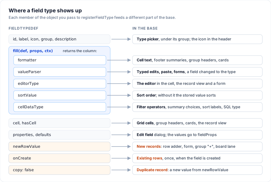
fill is where a type turns into grid behavior. It receives the column as
the app declared it, the type's defaults with the column's fieldProps on
top (props), and a context with every column. It returns the column the
grid sees: editorType, formatter, valueParser, validate, align,
cellDataType, sortValue, editable. Write each key as
def.key ?? yours, so a column that sets formatter itself keeps it. The
built-ins in builtin-types.ts follow that rule.
With this registered, the header shows the phone icon before "Phone", cells
read 020 7946 0958, and "Phone (international)" appears in the field
editor's type picker under "Fields", with its description under the picker
once it is chosen. width is the width a new field of this type starts
with when someone adds it there.
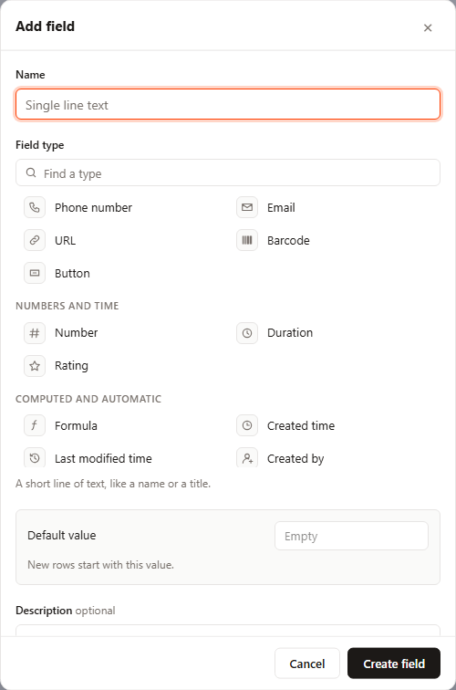
The picker draws a section per group, in a fixed order, and skips a
section no type uses. The built-ins fill only Fields, Numbers and time,
Computed and automatic, and Other tables (Date and User sit under Fields),
so "Dates" and "People" appear only once a type of yours names them. A
group the list does not know puts the type under Fields. Once more than
eight types are on offer, a "Find a type" box sits above the list.
3. Read what people type and paste
valueParser gets newValue (after the grid's own coercion for the
editor type), oldValue, rawInput (the text as typed or pasted), the
row as data and the columnId. It runs on a cell edit, a paste (one
value pasted over a range included), a full-row edit, an edit in the
expanded record and a form field. Returning oldValue refuses the input
quietly: paste n/a over a number and the number stays. The text editor
opens on the stored +442079460958, and whatever the user leaves in it
goes back through the parser.
validate runs for every rendered cell, so a bad value gets the red mark
and the message as its tooltip even when it was loaded that way. While the
cell's editor is open, it checks the draft before valueParser has read
it, so (415) 555-0123 shows red until Enter stores it as E.164. Add
rejectInvalid: def.rejectInvalid ?? true to refuse a flagged edit
outright; a paste is not checked against it, which is why the parser does
the refusing here.
Check the filled column without mounting anything:
import { fillFieldColumn } from '@svgrid/enterprise/base'

const col = fillFieldColumn({ field: 'phone', fieldType: 'intlPhone', fieldProps: { country: '44' } })
const show = col.formatter as (ctx: { value: unknown }) => string
const parse = col.valueParser as (x: { newValue: unknown; oldValue: unknown; rawInput: string }) => unknown

show({ value: '+442079460958' }) // '020 7946 0958'
parse({ newValue: '020 7946 0958', oldValue: null, rawInput: '020 7946 0958' }) // '+442079460958'
parse({ newValue: 'n/a', oldValue: '+442079460958', rawInput: 'n/a' }) // '+442079460958'
4. Draw the cell
Without cell, the grid draws the formatter's text. A cell component can
draw anything; this one is a tel: link, so a click dials.
<!-- PhoneCell.svelte -->
<script lang="ts">
  import { linkHref, type FieldCellProps } from '@svgrid/enterprise/base'
  import { showPhone, type PhoneProps } from './phone-field'

  let { value, props }: FieldCellProps<PhoneProps> = $props()
  // 'tel:+14155550123'; null unless the value is 3 to 20 digits with an optional +.
  const href = $derived(linkHref('phone', value))
  const text = $derived(showPhone(value, props))
</script>

{#if href}
  <!-- Stop pointerdown: a click on the number dials, a click beside it selects the cell. -->
  <a class="phone" {href} onpointerdown={(e) => e.stopPropagation()}>{text}</a>
{:else}
  <span class="phone is-bad">{text}</span>
{/if}

<style>
  .phone { overflow: hidden; text-overflow: ellipsis; white-space: nowrap; color: inherit; }
  a.phone { text-decoration: underline; text-decoration-color: var(--sg-muted, #94a3b8); text-underline-offset: 2px; }
  .is-bad { color: var(--sg-muted, #64748b); }
</style>
import { registerFieldType } from '@svgrid/enterprise/base'
import { phoneType } from './phone-field'
import PhoneCell from './PhoneCell.svelte'

registerFieldType({ ...phoneType, cell: PhoneCell })
Registering an id again replaces the type and keeps its place in the
picker; in your own file, add cell: PhoneCell to phoneType instead.
The cell receives FieldCellProps: value, props (defaults merged with
fieldProps), row ({ id, original }), column ({ id, columnDef })
and ctrl, the grid. linkHref is the helper the built-in URL, email and
phone cells use; it returns an href only for the scheme the kind allows,
so a value like javascript:alert(1) never becomes a link.
5. Add properties to the field editor
properties is what "Edit field" shows for the type. Each property is
kept under its key in the column's fieldProps.
import { registerFieldType, type FieldPropertyDef } from '@svgrid/enterprise/base'
import { phoneType } from './phone-field'
import PhoneCell from './PhoneCell.svelte'

export const PHONE_PROPERTIES: FieldPropertyDef[] = [
  {
    key: 'country', label: 'Home country', kind: 'choice',
    choices: [
      { value: '1', label: 'United States, Canada (+1)' },
      { value: '44', label: 'United Kingdom (+44)' },
      { value: '49', label: 'Germany (+49)' },
      { value: '359', label: 'Bulgaria (+359)' },
    ],
    hint: 'Numbers typed without a + are read as this country\'s.',
  },
  {
    key: 'display', label: 'Show numbers of that country', kind: 'segmented',
    choices: [{ value: 'national', label: '(415) 555-0123' }, { value: 'international', label: '+1 (415) 555-0123' }],
  },
]

registerFieldType({ ...phoneType, cell: PhoneCell, properties: PHONE_PROPERTIES })
The dialog draws a dropdown with the hint under it, then a row of two
buttons. A property the column has not set shows the type's default.
Picking your type in the dialog starts the draft from your defaults and
keeps only the values of properties your type also lists, so a field made
there saves your defaults into its fieldProps; changing defaults later
does not move it. On save, empty strings, empty lists (other than
options) and undefined are dropped. A choice hands back the option's
value string; a number hands back a number, or undefined when
cleared.
6. A type with its own cell: Traffic light
The second type stores a number and draws a light. Its properties set the thresholds, the direction and the green color.
// traffic-light.ts
import { registerFieldType, formatNumber, BRIGHT, type FieldTypeDef } from '@svgrid/enterprise/base'
import TrafficLightCell from './TrafficLightCell.svelte'

export type LightProps = {
  green: number
  amber: number
  higherIsBetter: boolean
  goodColor: string
  show: 'light' | 'number'
  showNumber: boolean
  default?: number | string
}

export const LIGHT_DEFAULTS: LightProps = {
  green: 80, amber: 50, higherIsBetter: true, goodColor: '#20c933', show: 'light', showNumber: true,
}

export type Light = { band: 'green' | 'amber' | 'red'; color: string; label: string }

/** The light a score gets under the field's thresholds. */
export function lightOf(n: number, p: LightProps): Light {
  const reaches = (limit: number) => (p.higherIsBetter ? n >= limit : n <= limit)
  if (reaches(Number(p.green))) return { band: 'green', color: p.goodColor, label: 'On track' }
  if (reaches(Number(p.amber))) return { band: 'amber', color: '#fcb400', label: 'At risk' }
  return { band: 'red', color: '#f82b60', label: 'Off track' }
}

/** A stored value as a score, or null. Old data may hold "72" or "72%" as text. */
export function scoreOf(value: unknown): number | null {
  if (value == null || value === '') return null
  const n = typeof value === 'number' ? value : Number(String(value).replace(/[%\s]/g, ''))
  return Number.isFinite(n) ? Math.max(0, Math.min(100, n)) : null
}

export const trafficLightType: FieldTypeDef<LightProps> = {
  id: 'trafficLight',
  label: 'Traffic light',
  description: 'A score from 0 to 100, shown as a green, amber or red light.',
  icon: 'M9 2h6v20H9zM12 6h.01M12 12h.01M12 18h.01',
  group: 'number',
  width: 120,
  defaults: LIGHT_DEFAULTS,
  properties: [
    { key: 'green', label: 'Green at', kind: 'number', min: 0, max: 100, hint: 'With "Higher is better" off, green is at or below this value.' },
    { key: 'amber', label: 'Amber at', kind: 'number', min: 0, max: 100, hint: 'Past amber the light is red.' },
    {
      key: 'higherIsBetter', label: 'Higher is better', kind: 'checkbox',
      // Flipping the direction swaps the thresholds. `p` is the draft with
      // the type's defaults filled in, as `visible` sees it.
      alsoSets: (_v, p) => ({ green: p.amber, amber: p.green }),
    },
    { key: 'goodColor', label: 'Green color', kind: 'color', palette: BRIGHT },
    { key: 'show', label: 'Show as', kind: 'segmented', choices: [{ value: 'light', label: 'Light' }, { value: 'number', label: 'Number' }] },
    { key: 'showNumber', label: 'Number next to the light', kind: 'checkbox', visible: (p) => p.show !== 'number' },
    { key: 'default', label: 'Default value', kind: 'default', hint: 'New rows start with this score.' },
  ],
  fill: (def) => ({
    ...def,
    cellDataType: def.cellDataType ?? 'number',
    editorType: def.editorType ?? 'trafficLight',
    align: def.align ?? 'left',
    formatter: def.formatter ?? ((ctx: { value: unknown }) => {
      const n = scoreOf(ctx.value)
      return n == null ? '' : formatNumber(n, { precision: 0 })
    }),
    valueParser: def.valueParser ?? ((x: { newValue: unknown; oldValue: unknown; rawInput?: unknown }) => {
      if (typeof x.rawInput !== 'string') return scoreOf(x.newValue)
      if (!x.rawInput.trim()) return null
      return scoreOf(x.rawInput) ?? x.oldValue
    }),
  }),
  cell: TrafficLightCell,
  // "Show as: Number" hands the cell back to the grid, which draws the formatter's text.
  hasCell: (p) => p.show !== 'number',
  newRowValue: ({ props }) => (props.default == null ? undefined : scoreOf(props.default)),
}

registerFieldType(trafficLightType)
<!-- TrafficLightCell.svelte -->
<script lang="ts">
  import type { FieldCellProps } from '@svgrid/enterprise/base'
  import { lightOf, scoreOf, type LightProps } from './traffic-light'

  let { value, props }: FieldCellProps<LightProps> = $props()
  const n = $derived(scoreOf(value))
  const light = $derived(n == null ? null : lightOf(n, props))
  const number = $derived(n == null ? '' : String(Math.round(n)))
</script>

{#if light}
  <span class="tl" title={`${light.label}: ${number}`}>
    <span class="tl-dot" style:background={light.color} role="img" aria-label={light.label}></span>
    {#if props.showNumber}<span class="tl-num">{number}</span>{/if}
  </span>
{/if}

<style>
  .tl { display: inline-flex; align-items: center; gap: 6px; min-width: 0; }
  .tl-dot { flex: none; width: 10px; height: 10px; border-radius: 50%; }
  .tl-num { font-variant-numeric: tabular-nums; color: var(--sg-fg, #0f172a); }
</style>
cellDataType: 'number' makes it a number column to the rest of the base:
the footer offers Sum, Average, Median, Min, Max and Range, each formatted
by your formatter; the column menu labels its sorts "1 → 9" and
"9 → 1"; the view bar filters it with =, <, > and the other number
operators. The light has an aria-label, so a screen reader user gets the
band as a word, not only a color.
In "Edit field" the type shows two number boxes, a checkbox, ten color
swatches, a Light / Number switch, a second checkbox and the default box.
"Number next to the light" disappears while the switch is on Number,
because visible reads the draft. Group by this field and each score is a
group of its own: the grid groups by the stored value, and the group
header draws its light.
Until step 7 registers an editor named trafficLight, the cell edits in a
plain text box and the parser reads the text: type 72% and 72 is stored.
7. Give it its own editor
An editor is a Svelte component registered with registerCellEditor from
@svgrid/grid under the name your fill puts in editorType.
<!-- TrafficLightEditor.svelte -->
<script lang="ts">
  import { fieldPropsOf } from '@svgrid/enterprise/base'
  import { lightOf, scoreOf, type LightProps } from './traffic-light'

  let {
    value,
    columnDef,
    onChange,
    onCommit,
    onCommitAndMove,
    onCancel,
  }: {
    value: unknown
    columnDef?: Record<string, unknown>
    onChange: (v: unknown) => void
    onCommit: (v?: unknown) => void
    onCommitAndMove: (v: unknown, direction: 1 | -1) => void
    onCancel: () => void
  } = $props()

  // The column's properties: the type's defaults under its fieldProps.
  const props = $derived(fieldPropsOf(columnDef ?? {}) as LightProps)
  // svelte-ignore state_referenced_locally
  let n = $state(scoreOf(value) ?? 0)
  const light = $derived(lightOf(n, props))

  function focusOnMount(el: HTMLElement) {
    queueMicrotask(() => el.focus())
  }
  function slide(e: Event & { currentTarget: HTMLInputElement }) {
    n = Number(e.currentTarget.value)
    // Keep the grid's draft in step, so a click elsewhere saves what is shown.
    onChange(n)
  }
  function onKey(e: KeyboardEvent) {
    if (e.key.startsWith('Arrow') || e.key === 'Home' || e.key === 'End') {
      // The slider moves; the grid's active cell stays put.
      e.stopPropagation()
      return
    }
    if (e.key === 'Enter') onCommit(n)
    else if (e.key === 'Tab') onCommitAndMove(n, e.shiftKey ? -1 : 1)
    else if (e.key === 'Escape') onCancel()
    else return
    e.preventDefault()
    e.stopPropagation()
  }
</script>

<span class="tle">
  <input type="range" min="0" max="100" step="1" value={n} aria-label="Score"
    style:accent-color={light.color} use:focusOnMount oninput={slide} onkeydown={onKey} />
  <output>{n}</output>
</span>

<style>
  .tle { display: flex; align-items: center; gap: 8px; height: 100%; padding: 0 8px; background: var(--sg-bg, #fff); }
  .tle input { flex: 1; min-width: 0; }
  .tle output { width: 3ch; text-align: end; font-variant-numeric: tabular-nums; }
</style>
import { registerCellEditor } from '@svgrid/grid'
import TrafficLightEditor from './TrafficLightEditor.svelte'

registerCellEditor('trafficLight', {
  component: TrafficLightEditor,
  props: (ctx) => ({
    value: ctx.value,
    columnDef: ctx.columnDef,
    onChange: ctx.onChange,
    onCommit: ctx.onCommit,
    onCommitAndMove: ctx.onCommitAndMove,
    onCancel: ctx.onCancel,
  }),
  typeToEdit: false,
})
Double-click or F2 opens the slider in the cell. Arrows move it, Enter
saves, Tab saves and moves to the next cell, Escape leaves the cell as it
was. typeToEdit: false keeps typed keys from opening it; a function such
as (c) => /^[0-9]$/.test(c) would open it on a digit, with typed: true
and the digit as value on the context. Without props, the grid passes
value, onChange, onCommit, onCancel, onCommitAndMove,
onRequestClose and inCell. The context also carries rowId,
columnId, columnDef, row, grid, typed and onCommitAndMoveDown.
The expanded record and a form open the same registered editor, with
inCell: false. A value from a registered editor reaches valueParser as
it is, with rawInput set to that same value rather than to text.
8. Values the type writes itself
newRowValue gives each new row a value: from the row adder, a group's
"+", a form, a board lane. Return undefined to fall back to the field's
default property. onCreate fills every existing row once, when someone
creates the field in the field editor. Both get a FieldRowContext: the
field's props, its field key and the table's rows.
import { registerFieldType } from '@svgrid/enterprise/base'

const ticket = (prefix: string, n: number) => `${prefix}${String(n).padStart(4, '0')}`
/** The number in "T-0042", or 0. */
const numberIn = (v: unknown) => Number(/(\d+)$/.exec(String(v ?? ''))?.[1] ?? 0)

registerFieldType({
  id: 'ticketId',
  label: 'Ticket ID',
  description: 'T-0001, T-0002 and on. Set automatically.',
  icon: 'M4 7h16v10H4zM9 7v10',
  group: 'computed',
  width: 100,
  defaults: { prefix: 'T-' },
  properties: [{ key: 'prefix', label: 'Prefix', kind: 'text', placeholder: 'T-' }],
  fill: (def) => ({ ...def, editable: def.editable ?? false }),
  onCreate: ({ rows, props }) => rows.map((_, i) => ticket(String(props.prefix), i + 1)),
  newRowValue: ({ rows, field, props }) =>
    ticket(String(props.prefix), rows.reduce((max, r) => Math.max(max, numberIn(r?.[field])), 0) + 1),
  copy: false,
})
When onCreate returns values, onColumnAdd hands your app the new rows
as data next to the columns, so store both. editable: false also keeps
the field out of a form. "Duplicate record" copies every stored field into
the copy. copy: false opts a type out: the copy gets a new value from
newRowValue (the next ticket number here), or the field's default when
the type has no newRowValue. Leave it out and two records share a ticket
number. The built-in autonumber, created and last-modified fields always
get fresh values. The traffic light in step
6 reads its default property in newRowValue because a default
property on a custom type is drawn as a text box and saved as a string.
Replace a built-in type
Register a type with a built-in id before calling enableBase():
enableBase() registers each built-in only when no type has its id yet.
import { enableBase, registerFieldType } from '@svgrid/enterprise/base'
import { phoneType, PHONE_PROPERTIES } from './phone-field'
import PhoneCell from './PhoneCell.svelte'

registerFieldType({ ...phoneType, id: 'phone', label: 'Phone number', cell: PhoneCell, properties: PHONE_PROPERTIES })
enableBase()
Every column with fieldType: 'phone' now uses yours, and it is listed
first in its picker section, since the picker keeps registration order.
Some behavior stays keyed to the id rather than to your definition: changing a
field to phone converts its values as text without your parser, the
filter treats it as text, and a form checks it as a phone number.
baseToSql follows your fill's cellDataType, as for any registered
type. Override a number type such as rating and the type change, the
filter and baseToSql keep treating it as a number.
Keep an old type id
Rename a type without breaking saved columns: register the old id with
editAs, pointing at the new one.
import { registerFieldType } from '@svgrid/enterprise/base'
import { phoneType } from './phone-field'
import PhoneCell from './PhoneCell.svelte'

registerFieldType({ ...phoneType, id: 'mobile', label: 'Mobile', cell: PhoneCell, editAs: { type: 'intlPhone', props: { display: 'international' } } })
Columns that say fieldType: 'mobile' still draw, and the type picker
leaves mobile out. "Edit field" opens such a column as Phone
(international) with display: 'international' on top of its properties.
Saving writes fieldType: 'intlPhone' and converts the stored values as
any type change does, through the intlPhone parser, which keeps every
valid E.164 number. The conversion starts from the stored type, mobile,
so the editor warns before you save when it would clear cells: "Mobile to
Phone (international) converts the values. 2 cells will be cleared or cut
short." When
every value converts it says nothing, since you did not pick a new type.
The built-in Currency and Percent types work this way: both open as Number.
Where your type shows up
| Place | What it uses |
|---|---|
| Grid cell | cell when hasCell allows it, else the filled column's formatter and align |
| Header, type picker, record view and form labels, view bar panels, gallery labels | icon, drawn as a 24x24 stroke path |
| Group header | cell, given the group's first record as row; else formatter |
| Gallery and Kanban cards | cell, with ctrl the grid at the card's width and editing off; else formatter |
| Expanded record | cell for a non-empty value; a click opens the editor editorType names (a registered one, the date picker or a text box) and saves through the grid, so valueParser and rejectInvalid apply |
| Form view | The same cells and editors; the editor's value goes through the grid's coercion and valueParser, as in a cell edit. On submit the form runs validate and refuses the record while it fails, with or without rejectInvalid |
| Footer summary | Number summaries for cellDataType: 'number', date ones for 'date' and 'dateString', checked, unchecked and percent checked for 'boolean', as a checkbox gets; counts for the rest; see Summaries at the bottom |
| View bar filter | By the filled column's cellDataType: the number operators for 'number', the date ones for 'date' and 'dateString', "is" checked / unchecked for 'boolean'; otherwise the text operators (contains, does not contain, is, is not, is empty, is not empty) on the stored value |
| Sort | The stored value; a sortValue in fill sorts by a number of your own, as a single select sorts by option order |
| Copy | String(value): an array copies as a,b, an object as [object Object], so keep stored values to strings, numbers and arrays of them. In a base, people, links and attachments copy as names and URLs; a custom type does not get that |
| Paste | valueParser with the pasted text as rawInput; rejectInvalid does not refuse it |
| Changing a field to your type | Each value as text through your valueParser, as a paste with oldValue: null; what it refuses or throws on is cleared and counted in the editor's warning. Without a parser, a list becomes its text and a plain value stays |
| Changing your type to a built-in | The built-in's conversion, reading your value as text (convertValue) |
baseToSql |
By the filled column's cellDataType, as the built-ins map: double precision for 'number', boolean for 'boolean', timestamptz for 'date', date for 'dateString'; otherwise text |
convertValue(value, from, to, toProps) and
countCleared(values, from, to, toProps) are exported, so a migration
script can preview a type change the way the field editor's warning does.
toProps is the new field's fieldProps, which your fill sees when the
parser is made. filterKindOf(def) returns 'number', 'date' or
'checkbox' from the filled column's cellDataType for an id it does not
know, and 'text' when cellDataType says nothing; formula, lookup and
rollup fields follow their cellDataType the same way. operatorsFor(kind)
lists the operators a kind offers.
FieldTypeDef
| Member | Type | What it does |
|---|---|---|
id |
string |
The name columns use in fieldType |
label |
string |
Name in the type picker; a new unnamed field is named after it |
description |
string |
One line under the type list once the type is chosen |
icon |
string |
SVG path data, 24x24 viewBox, drawn as a stroke |
group |
'basic' | 'number' | 'date' | 'people' | 'computed' | 'relation' |
Picker section, in this order: Fields, Numbers and time, Dates, People, Computed and automatic, Other tables; default 'basic' |
defaults |
P |
Property values a column gets when its fieldProps leave them out |
fill |
(def, props: P, ctx: FieldFillContext) => Record<string, unknown> |
Turns the declared column into the column the grid sees. Optional: without it the column stays as declared and still gets its footer summary |
cell |
Component<FieldCellProps<P>> |
Draws the cell |
hasCell |
(props: P) => boolean |
Whether cell draws; default always |
properties |
ReadonlyArray<FieldPropertyDef> |
What the field editor lets a user set |
width |
number |
Width of a new field made in the field editor (else 150) |
newRowValue |
(ctx: FieldRowContext) => unknown |
The value a new row gets |
onCreate |
(ctx: FieldRowContext) => unknown[] | null |
Values for every existing row when the field is created |
copy |
false |
A duplicated record gets a new value from newRowValue (else the field's default) instead of a copy |
editAs |
{ type: string; props: Record<string, unknown> } |
Keeps an old id drawing; edited as type and left out of the picker |
Property kinds
Every FieldPropertyDef has key, label and kind, and may have
visible(props) (shown only when it returns true), hint (a line under the
control, for every kind) and alsoSets(value, props) (other keys to change
with this one). visible and alsoSets get the same props: the draft
with the type's defaults filled in, before this change.
kind |
Extra keys | Draws | Hands back |
|---|---|---|---|
number |
min, max |
Number box | number, or undefined when cleared |
text |
placeholder |
Text box | string |
checkbox |
Checkbox with the label beside it | boolean |
|
choice |
choices: a list, or (ctx: FieldEditorContext) => list |
Dropdown, with "Choose..." while the value is not in the list | The option's value |
segmented |
choices |
Row of buttons | The option's value |
color |
palette |
Swatches; BRIGHT is the ten-color set the built-ins use |
Hex string |
icon |
icons (value, label, path) |
Icon buttons, the picked one in the color property's color |
The icon's value |
options |
The select options editor | Option list | |
default |
A checkbox, select, person or number input for those built-in types; a text box for every other type, yours included | Depends on the type; a string for yours |
|
formula |
Formula box with field buttons, a functions list and error checking; a formula that does not compile blocks Save | string |
|
columns |
Chips for the other fields | Column ids |
A choice whose options depend on the table passes a function, as the
built-in Lookup and Rollup do to list the table's link fields:
import type { FieldEditorContext, FieldPropertyDef } from '@svgrid/enterprise/base'

const numberFields = (ctx: FieldEditorContext) =>
  ctx.columns.filter((c) => c.fieldType === 'number').map((c) => ({ value: String(c.id ?? c.field), label: String(c.header ?? c.field) }))

export const TARGET: FieldPropertyDef = { key: 'target', label: 'Compare with', kind: 'choice', choices: numberFields }
The contexts
| Type | Members | Given to |
|---|---|---|
FieldCellProps<P> |
ctrl, row: { id, original }, column: { id, columnDef }, value, props: P |
cell |
FieldEditorContext |
ctrl, props (draft with defaults), columns (every other field, as declared), self (the field's own key, id, saved header and draft name, which its formula may not read) |
choices functions |
FieldFillContext |
columns (every column, as declared, this one included) |
fill |
FieldRowContext |
props, field, rows |
newRowValue, onCreate |
Look up registered types
getFieldType(id) returns a registered type or undefined;
listFieldTypes() returns them all in registration order. To offer only
some types in the "+" column, pass their ids; the picker lists them in
that order within each section:
<SvBase data={rows} {columns} columnAdder={{ types: ['text', 'intlPhone', 'trafficLight', 'date'] }} fieldMenu editable />
Pitfalls
- Always spread
definfill, or the column loses itsfieldandfieldProps. - A formatter should read only
value. A grid cell passes{ value, row, column, table }withrowthe grid's row, and a pinned row passesrow: null. The group header (its first record), the expanded record, a form, and gallery and Kanban cards pass{ value, row, column }withrowshaped as the grid's,{ id, original }; in a formidis''. A linked record's preview, automation messages and alert text pass the plain record asrow. The footer summary and the chart view's axis and tooltips pass{ value }alone. - On a card, editing is off. In a base's gallery and Kanban views,
ctrlis the grid with the card's width as the column's (220 px on a Kanban card) andeditingEnabledfalse: a cell that edits in place should check it, since the card opens its record for editing. A plain<SvGrid>gallery or board without a base passes a stand-in with onlygetColumnWidth. In a form,row.originalis the record being filled in. - Converting into your type is only as good as your parser. Changing a
text field to Phone stores
(415) 555-0123as+14155550123; a multiple select changed to Traffic light reaches the parser as"Design, Backend", which is no score, so the cell is cleared. Data loaded from elsewhere never goes through the parser: read stored values defensively, asscoreOfdoes. onCreateruns only when the field is created, not when an existing field changes to your type.- A numeric type needs
cellDataType. The filter, the footer summaries, the sort labels andbaseToSqlread it from the filled column. Without it, Traffic light filters as text, "contains 7" is what a user can write, and its Postgres column istext.
Next
- Field types: every built-in type and its properties.
- Linked records: fields that point at records of another table.
- Formulas: computed fields written as formulas.
- Views: grid, Kanban, calendar, gallery and chart views of the same records.
- Forms: a form view that adds records.
- Keep a base in a database: load the tables and write every change back.
Related articles
- Build vs Buy - Should You Build Your Own Svelte Data Table? - A working engineer's breakdown of when a hand-rolled Svelte table is the right call, when it will cost you three sprints, and what the headless middle path actually looks like in code.
- Building a SaaS Billing and Usage Table in Svelte - How to build a production billing grid with locale-aware currency formatting, grouped subtotals by cost category, and CSV export that matches what is on screen.
- A Right-Click Context Menu for Your Svelte Data Grid - Build a right-click context menu that wires row actions, handles multi-row selection, and stays out of the way of SvGrid's own event handling.