Master / detail (nested grids)
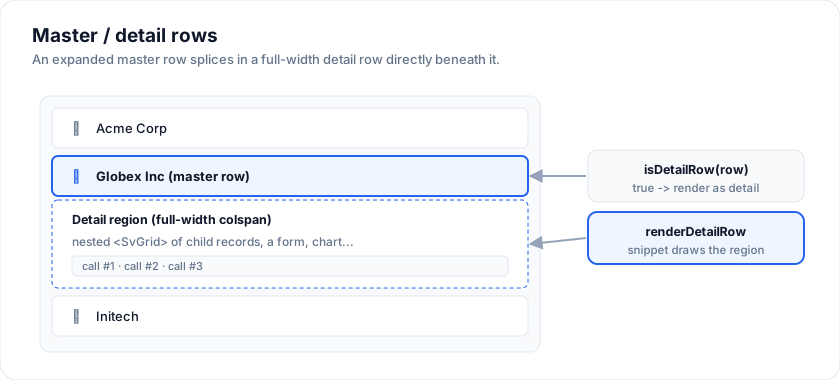
Master/detail is the pattern where each master row expands to reveal
a detail panel - most often a nested grid of the row's child records. SvGrid
builds it from two props on <SvGrid>:
isDetailRow(row, rowIndex)- returntruefor the rows that should render as a full-width detail row (a realcolspanrow spanning every column),renderDetailRow- a snippet that renders that row's content. Put another<SvGrid>inside it and you have a nested grid.
Open the live example: Master / detail (nested grid) (Master-Detail & Forms)
Transcript
Master detail in SvGrid is two props. isDetailRow marks a row as a detail, and renderDetailRow draws whatever you like inside it.
Click the chevron on an account to expand its call records, a nested grid with its own sorting.
Expand as many as you like. Each detail is a real row in the grid, so keyboard navigation and virtualization keep working.
Click the chevron again to collapse. The expanded set is plain state, so you can save and restore it.
Pattern
Keep an expanded set, and splice a "detail" sentinel row into the data right
after each expanded master row. isDetailRow recognises the sentinels;
renderDetailRow renders the child grid.
The examples on this page run against these rows:
<script lang="ts">
  import { SvGrid, type GridColumns, type SvGridApi } from '@svgrid/grid'

  type Person = {
    id: number
    name: string
    department: string
    city: string
    age: number
    salary: number
  }

  const people: Person[] = [
    { id: 1, name: 'Ada Lovelace',   department: 'Engineering', city: 'London',   age: 36, salary: 142000 },
    { id: 2, name: 'Grace Hopper',   department: 'Engineering', city: 'New York', age: 45, salary: 168000 },
    { id: 3, name: 'Linus Torvalds', department: 'Platform',    city: 'Portland', age: 54, salary: 155000 },
    { id: 4, name: 'Radia Perlman',  department: 'Networking',  city: 'Seattle',  age: 49, salary: 161000 },
    { id: 5, name: 'Barbara Liskov', department: 'Platform',    city: 'Boston',   age: 52, salary: 172000 },
  ]

  const columns: GridColumns<Person> = [
    { field: 'name',       header: 'Name',       width: 190 },
    { field: 'department', header: 'Department', width: 150 },
    { field: 'city',       header: 'City',       width: 130 },
    { field: 'age',        header: 'Age',        width: 80 },
    { field: 'salary',     header: 'Salary',     width: 130, format: { type: 'currency', currency: 'USD' } },
  ]
</script>
<script lang="ts">
  type Row = Account | { kind: 'detail'; parentId: string; children: Call[] }

  let expanded = $state(new Set<string>())
  const toggle = (id: string) => {
    const next = new Set(expanded)
    next.has(id) ? next.delete(id) : next.add(id)
    expanded = next
  }

  // Master rows + a detail sentinel after each expanded one.
  const visible = $derived.by(() => {
    const out: Row[] = []
    for (const a of accounts) {
      out.push(a)
      if (expanded.has(a.id)) out.push({ kind: 'detail', parentId: a.id, children: a.callRecords })
    }
    return out
  })
</script>

{#snippet DetailGrid(p: { row: Row })}
  {#if p.row.kind === 'detail'}
    <div style="height: 200px;">
      <SvGrid data={p.row.children} columns={detailColumns} containerHeight="100%" />
    </div>
  {/if}
{/snippet}

<SvGrid
  data={visible}
  {columns}
  isDetailRow={(row) => row.kind === 'detail'}
  renderDetailRow={DetailGrid}
  showDetailToggle
  onDetailToggle={(row) => toggle(row.id)}
  isDetailOpen={(row) => expanded.has(row.id)}
/>
The toggle column
showDetailToggle adds the chevrons as a row-header column, beside the
row numbers and the selection checkbox: sticky at the left, on the
header band's colour, with no column menu, no resize handle, and outside
the active cell and the selection. A chevron calls onDetailToggle(row, rowIndex) and points down while isDetailOpen(row) is true; hasDetail
leaves it out on rows with nothing to open, and a detail row gets an
empty cell. Ctrl+Enter on a row does what the chevron does. Before the
column existed, demos drew the chevron in a data column of their own,
which took the menu, the resize handle and the active cell along with it.
Notes
- The detail row is a genuine full-width
colspancell, so the nested grid gets the full width regardless of the master's column layout. - Give the detail container a fixed height (e.g.
200px) so the nested grid scrolls internally instead of pushing the master layout around. - Under
virtualization(the default) give the griddetailRowHeight, a number or a function of the row: the virtualizer then sizes detail rows and the panel scrolls inside its cell when taller. Without it a detail row is auto height, which needsvirtualization={false}so the fixed-row-height virtualizer does not fight it. - On a server-side row model
the model inserts the detail row for you:
ctl.toggleDetail(id), the toggle column reads the model (noonDetailToggleneeded), and Ctrl+Enter on a leaf opens or closes it from the keyboard. - The detail content is arbitrary - a nested grid, a form, timelines, charts. See detail rows for a multi-panel (non-grid) detail.
More examples
Tree + master/detail
Hierarchical file-system rows and an order/line-item master-detail view.
Open the live example: Tree + master/detail (Tree & Hierarchy)
Try it
A detail row is an ordinary row that isDetailRow identifies and
renderDetailRow draws. Because it is a row, virtualization and scrolling treat
it like any other - which is also why a variable-height panel wants
virtualization={false}.
<script lang="ts">
  type Row = { kind: 'master' | 'detail'; name?: string; city?: string; note?: string }

  const rows: Row[] = [
    { kind: 'master', name: 'Ada Lovelace', city: 'London' },
    { kind: 'detail', note: 'Joined 2021. Works on the compiler team.' },
    { kind: 'master', name: 'Grace Hopper', city: 'New York' },
    { kind: 'detail', note: 'Joined 2019. Owns the release process.' },
  ]

  const cols: GridColumns<Row> = [
    { field: 'name', header: 'Name', width: 200 },
    { field: 'city', header: 'City', width: 160 },
  ]
</script>

<SvGrid
  data={rows}
  columns={cols}
  virtualization={false}
  isDetailRow={(row) => row.kind === 'detail'}
>
  {#snippet renderDetailRow(p)}
    <div class="detail">{p.row.note}</div>
  {/snippet}
</SvGrid>

<style>
  .detail { padding: 10px 16px; font-size: 13px; opacity: 0.85; }
</style>
See also
- Full-width rows
- Tree rows - for hierarchy within a single grid
Live examples
- Master / detail (nested grid) - The classic master/detail: expand any account row to reveal a full nested SvGrid of its call records. Built on isDetailRow + renderDetailRow - a real full-width detail row hosting another grid.
- Tree + master/detail - Hierarchical file-system rows and an order/line-item master-detail view.
- Detail rows (expandable) - Stripe / GitHub-style inline row expansion: click the chevron to reveal a 4-panel detail (line items, shipping, payments, support thread).
Related articles
- Master-Detail Rows - Expandable Detail Panels in SvGrid - How to wire expandable master-detail rows in SvGrid, from a nested grid of line items to lazy-fetched panels and programmatic expand on deep-link.
- Building an Order Management Dashboard in Svelte - How to wire up an order management grid with master-detail line items, status workflows, server-side data, and bulk fulfillment actions using SvGrid.
- Lazy-Loading Master-Detail Content in SvGrid - Fetch detail-panel data only when a row is expanded, cache the results, and cancel abandoned requests - keeping a large grid fast without paying for panels no one views.