Docking layout
By default a screen arranges its blocks in a responsive 12-column grid. For
dashboards, consoles, and analyst tools you can switch a screen to a docking
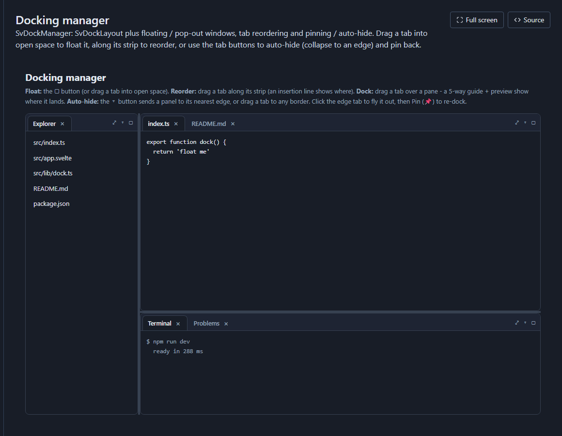
workspace instead: the same blocks become dockable, floatable, pinnable
panes (an SvDockManager). Drag a tab to split a
region, pull it out into a floating window, or pin it to an edge - and the
arrangement is saved per user.
It is a per-screen choice: a data-heavy console can dock while your simple CRUD screens stay on the grid.
Turn it on
In the visual designer, select a screen (click empty canvas), open the inspector, and set Layout to Docking manager. The screen's blocks are laid out automatically by role:
- Filters dock to the left.
- Record / detail panels dock to the right.
- KPIs / gauges form a strip across the top.
- The main content (grid, board, calendar, chart, ...) fills the centre.
From there, drag pane tabs to rearrange, split, float, or pin them. Rename a pane's tab in the inspector under Dock pane -> Tab title. Closing a pane's tab removes that block from the screen.
The live preview renders the real docking manager too, so what you arrange is exactly how the app runs.
What it generates
The screen body becomes an <SvDockManager> whose workspace is your serialized
layout; each block is a pane rendered by id. The rest of the screen - data
source, editing, actions - is unchanged, so a grid in a pane keeps all its
features (sorting, editing, its own data):
The examples on this page import from @svgrid/grid:
<script lang="ts">
  import { SvDockManager, SvGrid } from '@svgrid/grid'
</script>
<script lang="ts">
  import { SvDockManager, type DockManagerState } from '@svgrid/grid'
  let dockWorkspace = $state<DockManagerState>(/* your saved layout */)
  // ... controller / rows / editing, exactly as a grid-layout screen ...
</script>

{#if dockNarrow}
  <div class="st-screen"> … blocks stacked … </div>   <!-- mobile fall-back -->
{:else}
  <SvDockManager bind:workspace={dockWorkspace} onChange={saveLayout}>
    {#snippet pane(p)}
      {#if p.id === 'grid-1'}<SvGrid … containerHeight="100%" />{/if}
      {#if p.id === 'filter-1'}…{/if}
    {/snippet}
  </SvDockManager>
{/if}
- Persistence - the layout is restored from
localStorageper screen and re-saved whenever the user rearranges panes. - Mobile - below a narrow breakpoint the workspace falls back to a single stacked column (floating / tiling is impractical on a phone).
When to use it
- Use docking for consoles and workbenches: a support queue beside the selected ticket and its history; an analyst view with a grid, a chart, and a pivot the user tears off into their own windows.
- Stay on the grid for straightforward list / form / detail screens, and anything that should read top-to-bottom on mobile.
The other screen layouts
Dock is one of five per-screen layout modes in the designer:
- Grid (default) - blocks flow in a 12-column grid; presets like two-column, sidebar, and KPI-row arrange them in one click.
- Stack - one block per row, top to bottom.
- Split - the dock engine with the panes locked in place: users can resize the splits but not rearrange or float them.
- Dock - this page: rearrangeable, floatable, persistent.
- Canvas - free-form placement: each block gets explicit cell coordinates and spans on a 12-column grid of fixed-height rows, so blocks sit exactly where you drop them.
See also
- App designer - the block palette and inspector.
- Scheduler / calendar view and the Kanban board - other ways the same grid data can be presented.
- The underlying component: docking layout demo.
Related articles
- Saved Views - Persist Grid Layout and Filters - Give users named, switchable snapshots of column order, sorting, filters, and grouping - persisted to localStorage or a server adapter - using SvGrid's createNamedViews API.
- Avoiding Layout Thrash in Custom Grid Cells - Layout thrash from interleaved DOM reads and writes is the most common cause of scroll jank in grids with custom cells - here is how to find it and design your way out of it.
- Column Resizing and Reordering - Let Users Shape the Grid - How to wire drag-to-resize and drag-to-reorder in SvGrid, then persist the layout to localStorage so it survives page reloads.