Scheduler / calendar view
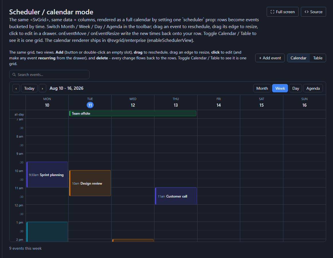
Any grid whose rows carry a date can render as a calendar instead of a table - a Month / Week / Day / Agenda (and Timeline) view where each row becomes an event placed by time. It is a view of the grid, exactly like the Kanban board: same rows, same data source, same edit form - only the presentation changes. Drag an event to reschedule it and the new time is written back through the data source.
The calendar renderer ships in @svgrid/enterprise; the generated app registers it
once with enableSchedulerView() and then renders <SvGrid scheduler={...}>.
Turn it on
In the visual designer, select a grid block and expand Scheduler / calendar in the inspector. Tick Render rows as a calendar / scheduler and map the fields:
- Start (date) field - required; the event's start (a
date/datetimefield). - End field - optional; omit and each event uses a default duration.
- Title - the event label (defaults to the first column).
- Color - a field whose value tints the event (e.g. a status or priority enum).
- Resource - optional; splits the Week / Day grid into one column per value (per person, room, or machine) - a resource scheduler.
- Opens on - Month, Week, Day, Agenda, or a Timeline view.
- Drag to move / resize - turns on drag-to-reschedule and edge-resize, writing the new start / end back through the data source (optimistic, then persisted).
- Event detail drawer - a built-in panel to view / edit an event's fields.
The canvas preview switches to the live calendar as soon as you map a start field, so you can try Month / Week / Day and drag events right in the designer.
The scheduler is a render mode: it is mutually exclusive with row grouping and tree data on the same grid. Pick one.
What it generates
The block compiles to the grid's own scheduler prop plus write-back handlers -
real, typed Svelte, not a black box:
<script lang="ts">
  import { enableSchedulerView } from '@svgrid/enterprise'
  enableSchedulerView()
  // ... load allRows ...
</script>

<SvGrid
  data={allRows}
  columns={columns}
  getRowId={(r) => String(r.id)}
  scheduler={{
    startField: 'startedAt',
    endField: 'dueDate',
    titleField: 'title',
    colorField: 'priority',
    resourceField: 'assignee',
    initialView: 'week',
    editable: true,
    drawer: true,
    onEventMove: (e) => { /* patch start/end on the row, persist */ },
    onEventCommit: (e) => { /* save the drawer's edits */ },
  }}
/>
A resource / title / color field that points at a relation is resolved to its
display column automatically (e.g. assigneeId renders as the assignee's name).
The calendar block
The standalone calendar block (a dedicated "Schedule" screen) uses the same renderer - a Month calendar with a detail drawer, read-first. Use it for a simple "events on a month grid" screen; use the grid Scheduler view above when you want Week / Day time-grids, per-resource columns, timelines, or drag-to-reschedule.
In the sample apps
Several starter apps ship a scheduler so you can see it end to end:
- Projects - a task timeline (start -> due) with one row per assignee, tinted by priority.
- People Ops (HR) - a leave calendar: time-off as a per-employee resource scheduler.
- HireDesk (ATS) - interviews on a Week grid, colored by pipeline stage.
- Evently, HealthClinic, FitClub, and the restaurant app - month event calendars.
See also
- The underlying grid feature and its live demos: Scheduler / calendar mode, timeline views, and the real-world apps built on it - Horizon calendar client, Meridian Clinic, Dispatch board, Portfolio roadmap, and Broadcast content calendar.
- App designer - the block palette and inspector.
- Kanban board - the other "view of the grid".
Live examples
- Scheduler / calendar mode - The same <SvGrid>, same data + columns, rendered as a full calendar by setting one `scheduler` prop: rows become events bucketed by time. Switch Month / Week / Day / Agenda in the toolbar; drag an event to reschedule, drag its edge to resize, click to edit in a drawer. onEventMove / onEventResize write the new times back onto your row. Toggle Calendar / Table to see it is one grid. The calendar renderer ships in @svgrid/enterprise.
- Timeline views (Day / Week) - A horizontal resource timeline: teams are rows, time runs left→right on a scrollable axis, work items are bars sized to real durations (half-day blocks up to multi-day tasks). Switch Day (hour ticks) or Week (day ticks); drag a bar to re-time it, to another team's row to reassign, or an edge to resize. Click / drag empty space to select a range (arrows move, Shift+arrows extend, Enter creates); Ctrl-click bars to multi-select. Bar fill = team, left strip = status.
- Horizon - Outlook-style calendar app - A full calendar client on the Scheduler + SvDockManager: NavPane module rail + mini date-picker + calendar toggles, and a dockable workspace (drag / resize / float panes) with the calendar over an Upcoming grid and an Inbox. Recurring events with per-occurrence edits, a second time-zone ruler, iCal import/export and undo.
- Meridian Clinic - appointment scheduling - A front-desk appointment console: providers with their own hours as day columns, a drag-in patient waitlist, a utilization gauge, and a live patient-flow pipeline (Waiting / Checked in / In room / Completed) that updates as you work.
- Dispatch - field-service operations board - A map-first field-service operations console: a live ops map with technician pins by status and job markers, an unassigned queue you drag onto the crew timeline, and SLA countdowns. No double-booking.
- Portfolio roadmap - initiatives across squads - A dashboard-forward portfolio planner: a live portfolio-health strip (status mix, capacity by squad, delivery trend, on-track gauge) over a Gantt of squads x initiatives with progress bars and milestones.
- Broadcast - content & marketing calendar - A content command center: one grid, two views - a Calendar / Board toggle over the same posts. The Board is the approval pipeline (Idea / Draft / In review / Scheduled / Published) with per-card engagement sparklines.