Visual app designer
SvStudioDesigner is the grid-centric visual data-app designer - compose a
multi-entity app by arranging data-bound blocks on a canvas, then generate a
runnable SvelteKit project. It's the app-level companion to the single-entity
schema designer: where that authors one EntitySchema, this
composes screens across many entities.
Grid-centric by design: the blocks are schema-driven and data-bound (a grid, a chart, a pivot, a dashboard, a KPI, master-detail, a faceted filter panel, a record panel, a lookup) - not arbitrary layout components. It's the Radzen "database → CRUD app" idea, kept to data views.
Just want to open it?
npx @svgrid/studio designerlaunches this designer in your browser, auto-saves your work tostudio.config.json, and writes the generated app to a folder - no host app needed. See Launch the designer.
How the screen is laid out
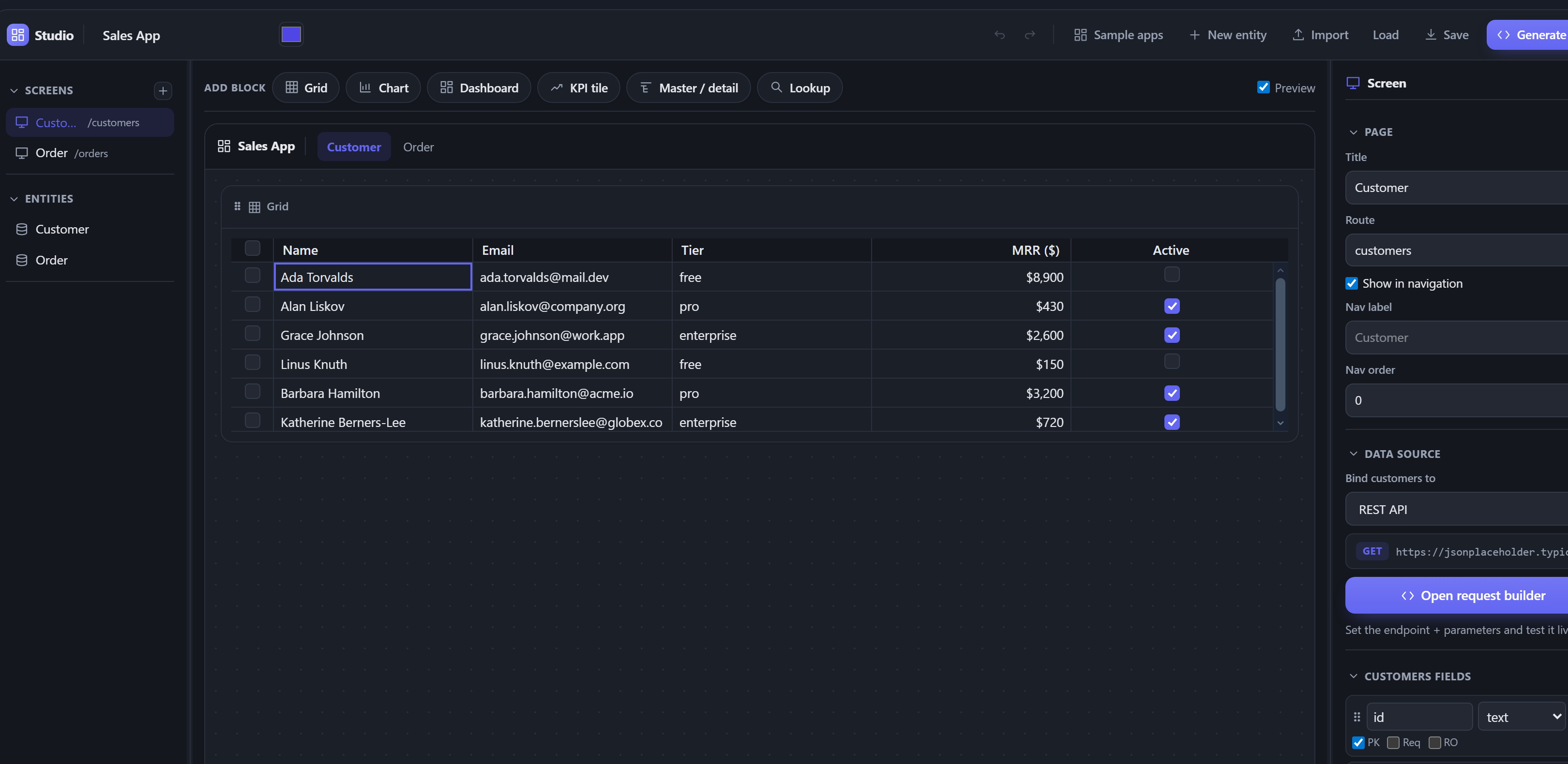
Here is the real designer with a small Sales App open:
You do not need to understand the internals to use it. The same layout, labelled:
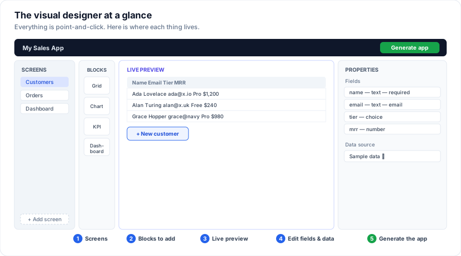
- Screens (far left) - the pages of your app. Click one to edit it; + Add screen makes a new one.
- Blocks - the pieces you drop onto a screen: a grid (a table of records), a chart, a pivot, a KPI number, a dashboard, a filter panel, and a record panel. Click or drag one onto the preview.
- Live preview (middle) - your screen with real data, updating as you change things. What you see is what the app will look like.
- Properties (right) - tune the selected block, or - with nothing selected - edit the entity's fields and pick its data source.
- Generate app (top right) - when it looks right, one click writes the whole, runnable app.
The rest of this page is the detailed reference for each area, aimed at developers embedding or scripting the designer. If you just want to build an app, everything above is done by pointing and clicking - see Launch the designer.
What it edits: the project model
The designer reads and writes a StudioProject - the declarative model behind
the whole app:
import { createProject } from '@svgrid/enterprise'

// One default screen (grid + edit form) per entity, in-memory.
let project = $state(createProject([customerSchema, orderSchema], { title: 'Sales App' }))
<script lang="ts">
  import { SvStudioDesigner } from '@svgrid/enterprise'
</script>

<SvStudioDesigner {project} onChange={(p) => (project = p)} />
The designer is a single IDE-style frame: a title bar (app name + accent + undo/redo + Import/Load/Save/Generate), a screen tab strip (switch, close, or add a screen), the three work panels, and a status bar (validity, entity / screen / block counts, current selection, data source).
- Rail (left) - switch and add screens; each screen is bound to an entity.
- Screen tabs - the open screens as a document strip; click to switch, the x to remove one, the + to add one (from the current template).
- Palette - the block kinds. Drag one onto the canvas to add it (or click).
- Canvas - the screen's blocks in a responsive 12-column grid, previewed live with the real components. Drag a block to reorder it; drag its right edge to set its width (1-12 columns), use the ⅓ / ½ / ⅔ / full quick buttons in its header, or the Layout > Width slider. Drag a block's bottom edge to make its region taller or shorter - grid, chart, pivot, and master-detail blocks are height-resizable, and the chosen height flows through to the generated app (also set it precisely under Layout > Height in the inspector).
- Inspector (right) - edit the selected block: a grid's editing mode + behavior + column config (see below), a chart's group-by / measure / reduce / type. With no block selected, edit the page (title / route / nav settings), the entity's data source (see below), and the entity's fields - add, rename, retype, flag (PK / required / read-only), pick a relation's target entity + label field, and drag to reorder. The rail sets the default source kind for new entities, the app layout, and adds screens from a template (CRUD, dashboard, master-detail, empty).
- Top bar - rename the app, set an accent color (themes the whole app),
add a New entity from scratch, Connect DB (the launcher's live-database
wizard - see Launch the designer), Import schema (paste a
Drizzle / Prisma schema to add its entities), Save / Load the design as
studio.config.json, and Generate app. With no entities yet, the canvas shows an onboarding screen offering the same three ways to start. - ✨ Copilot (when the host wires it) - describe a change in plain English
("add an orders screen with a revenue chart", "make mrr required") and the AI
edits your project. It's a host hook:
<SvStudioDesigner onCopilot={...} />receives{ prompt, project }and returns the editedStudioProject- your AI keys stay server-side. The result is validated before it applies, and it's one Ctrl/Cmd+Z away.
The three panels are resizable (drag the dividers). Every edit is undoable
(Ctrl/Cmd+Z, Ctrl+Shift+Z / Ctrl+Y to redo); Delete removes the selected
block, Ctrl/Cmd+D (or the ⧉ header button) duplicates it, and
Escape deselects. Preview app opens the whole app full-screen with a
Desktop / Tablet / Mobile device-width toggle to check responsiveness. Generate app opens the output in a
file-tree viewer modal (scrollable, Copy per file) and a Download .zip of
the complete runnable SvelteKit + Vite project - unzip, npm install,
npm run dev. The zip includes package.json (with the right driver deps),
vite.config.ts, svelte.config.js, tsconfig.json, the app shell, and every
generated screen.
The grid (and how it edits)
The grid is the core block, so editing is a grid property, not a separate block. Select a grid and set its Editing mode:
- Popup form - double-click a row to edit it in a modal / drawer / inline panel (pick the Form style); a + New button adds rows. This is the default.
- Inline - edit cells right in the grid (Excel-style); each change saves via the data source.
- Read-only - no editing.
The grid's property editor also covers Behavior (Sortable, Filtering + search, Row selection, Cell range selection, Striped rows, Totals footer row, Density), Paging (Paginate on / off, Page size, Pager position - bottom / top / both, and the Page size options for the selector), and per-Column settings - expand a column to set its header, width, alignment, pin (left / right), plus show / hide + reorder. There is no standalone "Edit form" block - the grid owns editing end to end.
The analytical + companion blocks
Beyond the grid, every block is still bound to the EntitySchema - these are data
views, not generic widgets:
| Block | What it renders | Inspector |
|---|---|---|
| Chart | A chart (SvSchemaChart) - bar, pie, line, area, radar, funnel, waterfall, or treemap. |
Group-by dimension, measure, reduce, type. |
| Pivot | A full pivot table (SvPivotDesigner) the end user can re-pivot live. |
Row + column dimensions (checkboxes), a measure, and its aggregate. |
| Dashboard | A schema-driven KPI + chart board (SvSchemaDashboard). |
- |
| KPI | A single reduced metric tile. | Label, measure, reduce. |
| Master / detail | A row that expands into a nested grid of related records. | Child entity + foreign key. |
| Filter panel | A faceted sidebar that filters the screen's grid - enum / boolean facets pick a value, text facets search. | Title + which fields become facets. |
| Record panel | Shows the row selected in the grid - a read-only field list, or an inline edit form. | Editable on / off, and (read-only) which fields to show. |
| Lookup | Marks a relation field as a searchable picker in the edit form. | The relation field. |
The filter and record panels wire to the grid on the same screen: the
filter panel calls the grid controller's setFilter, and clicking a grid row
publishes it to the record panel. So a common layout is a filter panel + grid +
record panel three-up - list, narrow, inspect - all generated for you.
The grid, chart, pivot, and master-detail blocks are height-resizable (drag the block's bottom edge, or set Layout > Height), and the chosen height flows into the generated app. The filter and record panels size to their content.
Conditional formatting
A grid's inspector has a Conditional formatting section: add no-code rules
that style a cell by its value - pick a field, a comparison (=, <, >,
contains, is empty, ...), a value, and a text color / fill / bold. Rules
render live in the canvas and compile to the grid's built-in
conditionalFormats rule engine in the generated app (e.g. negative mrr red,
status = overdue filled). It's the same engine you'd use by hand - the designer
just authors the rules.
Navigation & row actions
The grid's Navigation & actions section wires flow between screens: drill-through (row click opens another screen, filtered to the clicked value) and row action buttons (Edit / Delete / Open). A chart can drill too. See Navigation & row actions for the full picture.
Data sources (per entity)
Each entity binds to its own backend - the designer is not limited to one data source per app. In the inspector (no block selected), the Data source section binds the screen's entity to:
- In-memory - seeded sample rows, runs with no backend (the default).
- REST API - a spacious request builder (Open request builder): method,
base URL, path (path params auto-derive from
{tokens}), and Query / Path / Header tabs. Send runs it live and shows a response table plus the real rows in the canvas grid; Import fields rewrites the entity's schema to match the response keys. A rows path / total path maps a nested body. - Supabase - its own builder dialog (Open Supabase builder): project URL +
anon key + table, with the same Fetch sample / Import fields flow (reads
rows via the public anon key, browser-safe). Generate app emits a real
createClient(url, anonKey)inconnections.tsand adds@supabase/supabase-jsto the app, so it runs against Supabase with no manual wiring (access is protected by your RLS policies). - SQL - its own builder dialog (Open SQL builder): table + dialect. SQL runs
server-side (a driver + credentials can't live in the browser), so there's no
live preview. Generate app emits a connected
src/routes/api/<table>/+server.ts(the dialect's driver, readingDATABASE_URL) and points the grid at it; the driver dep is added for you. SetDATABASE_URLin.env. To scaffold from an existing DB instead:npx @svgrid/studio add <table> --db <dialect> --url ….
Generate app then emits the matching adapter per entity in src/lib/data.ts
(createRestDataSource / createSqlDataSource / createSupabaseDataSource /
createInMemoryDataSource). SQL and Supabase entities read their connection from
a generated src/lib/connections.ts - the one manual step is wiring a real
SqlExecutor / Supabase client there (you can't ship DB credentials to the
browser). See Databases and REST API.
Pages and layout
- Pages - each screen is a route. In the inspector's Page section, toggle Show in navigation, set a nav label and nav order, or start a page from the Empty template. Hidden pages stay routable but drop out of the nav.
- App layout - the rail's App layout section themes the generated shell:
Sidebar or Top navigation, a brand name, a footer, and (for the
sidebar) the nav position (left / right). This drives the generated
src/routes/+layout.svelte.
Save, regenerate, round-trip
The StudioProject is the persisted design. Save config exports a
studio.config.json; regenerate the app from it any time:
npm create @svgrid/studio@latest my-app -- --project ./studio.config.json
Or programmatically:
import { serializeProject, parseProject, emitStudioProject } from '@svgrid/enterprise'

const json = serializeProject(project)      // save the design
const project2 = parseProject(json)         // reopen it
const files = emitStudioProject(project2)   // -> the app's source files
Generate the app
Generate app emits src/lib/schemas.ts, src/lib/data.ts (the right adapter
per entity, plus src/lib/connections.ts when any entity is SQL / Supabase-bound),
and one src/routes/<route>/+page.svelte per screen that composes that
screen's blocks with their config - a grid (with your visible columns, in order) +
edit modal, plus any charts / pivots / dashboard / KPI tiles, and filter / record
panels wired to the grid, all bound to the data - and the
nav layout (sidebar or top-nav) + home. The pages are self-contained (they use
@svgrid/grid + @svgrid/enterprise directly), so the output runs as a standard
SvelteKit app.
import { emitStudioProject } from '@svgrid/enterprise'
const files = emitStudioProject(project) // [{ path, contents, description }, ...]
See also
- Sample apps + bind your data - start from a ready-made app, then point it at your database
- Launch the designer -
npx @svgrid/studio designer(auto-save + generate to a folder) - Schema designer - author a single entity
- Dashboards · Databases - the blocks + data sources
- CLI / Drizzle / Prisma - import a schema to design from