Accessibility
A Studio screen is accessible out of the box, because it is built from the grid and the edit form - both designed to the WAI-ARIA patterns. This page is what you get for free, what you own, and how to verify it.
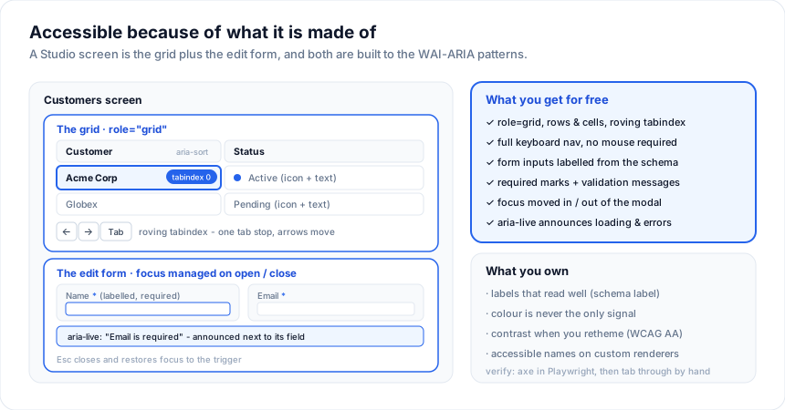
What you get for free
- The grid is a WAI-ARIA grid -
role="grid"with rows and cells, a roving tabindex (one tab stop for the whole grid; arrow keys move the active cell), andaria-sorton sorted headers. Full keyboard navigation, no mouse required. See Accessibility for the grid's complete a11y behaviour and the live demo. - The edit form labels every input from the schema's
label(or a title-cased field name), marks required fields, and surfaces validation messages next to the field they belong to. - Focus is managed - opening the create / edit modal moves focus into it and
restores focus on close;
Esccancels. - Live announcements - loading, row counts, and validation errors are exposed
through
aria-liveregions so screen-reader users hear state changes.
What you own
The generated code is yours, so a few things are on you to keep accessible:
- Labels that read well. The column header and form label both come from the
schema
label. Set it to human text ({ field: 'mrr', label: 'MRR ($)' }), not a raw column name. - Colour is never the only signal. If you use a
cellClassor an enumcolorto convey status, pair it with text or an icon so it survives for colour-blind users and in high contrast. - Contrast. The default theme meets WCAG AA. If you retheme
with your brand tokens, re-check the
--sg-fg/--sg-bgand--sg-accent/--sg-on-accentpairs against a contrast checker. A ready-made high-contrast preset is in the Theme Builder. - Custom cell renderers. If you drop in your own cell content (buttons, links), give it an accessible name and make it keyboard-reachable.
Keyboard reference
| Key | Action |
|---|---|
Tab |
Move into / out of the grid (one stop), then to the toolbar and pager |
| Arrow keys | Move the active cell |
Enter / F2 |
Start editing the active cell (inline mode) |
Esc |
Cancel the current edit or close the modal |
Space |
Toggle a row checkbox (when selection is on) |
Home / End, PageUp / PageDown |
Jump within the grid |
Verify it
Automated checks catch the regressions. Run axe against the running screen in a Playwright test:
import { test, expect } from '@playwright/test'
import { injectAxe, checkA11y } from 'axe-playwright'

test('customers screen has no a11y violations', async ({ page }) => {
  await page.goto('/customers')
  await injectAxe(page)
  await checkA11y(page, undefined, { detailedReport: true })
})
Automated tools find roughly half of issues - also tab through the screen with no mouse, and try it with a screen reader (VoiceOver / NVDA) once. Both take a couple of minutes and catch what axe cannot.
See also
- Accessibility - the grid's full a11y behaviour
- Testing a Studio app - where the axe test fits
- Themes & styling - contrast + the high-contrast preset
Related articles
- Choosing the Most Accessible Svelte Data Grid - A practical guide to testing data grid accessibility - ARIA roles, keyboard navigation, focus management under virtualization, and screen-reader behavior - so you can verify claims yourself.
- Cell Tooltips Done Right in a Data Grid - Tooltips in a data grid are either cheap and effective or an accessibility and performance trap. Here is how to build them correctly in SvGrid.
- Accessibility from the Ground Up - How SvGrid bakes WAI-ARIA roles and keyboard navigation into the core - not as a post-launch checkbox, but as a design constraint that shaped every feature.