Themes & styling
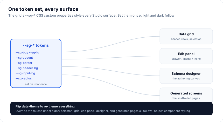
Every Studio surface - the grid, the edit panel (drawer / modal / inline), the
schema designer, and the generated screens - is styled with the grid's --sg-*
CSS custom properties. Set the tokens once and everything follows, including
light / dark. No per-component styling required.
How it works
The components read tokens like --sg-bg, --sg-fg, and --sg-accent with
sensible light-mode fallbacks. Define the tokens on a wrapper (or :root) and
override them under a dark selector - the grid, forms, and generated pages all
pick them up.
:root {
  --sg-bg: #ffffff;
  --sg-fg: #0f172a;
  --sg-muted: #64748b;
  --sg-border: #e2e8f0;
  --sg-header-bg: #f1f5f9;
  --sg-input-bg: #ffffff;
  --sg-input-border: #cbd5e1;
  --sg-accent: #2563eb;
  --sg-on-accent: #ffffff;
  --sg-radius: 10px;
}

[data-theme='dark'] {
  --sg-bg: #181d27;
  --sg-fg: #e2e8f0;
  --sg-muted: #94a3b8;
  --sg-border: #374151;
  --sg-header-bg: #1e2433;
  --sg-input-bg: #0f141c;
  --sg-input-border: #374151;
  --sg-accent: #3b82f6;
}
Toggle the theme by flipping data-theme (or swapping the token values) - the
edit modal, designer, and generated grid re-theme instantly.
A runtime theme toggle
Flip data-theme on <html> and every Studio surface re-themes with no component
re-render:
<script lang="ts">
  let dark = $state(false)
  $effect(() => {
    document.documentElement.dataset.theme = dark ? 'dark' : 'light'
  })
</script>

<button onclick={() => (dark = !dark)}>{dark ? 'Light' : 'Dark'} mode</button>
Persist the choice (localStorage) and apply it before first paint to avoid a
flash - SvelteKit apps usually do this with a tiny inline script in app.html or
a root +layout.
Key tokens
| Token | Used for |
|---|---|
--sg-bg / --sg-fg |
surface background / text |
--sg-muted |
secondary text (labels, hints) |
--sg-border |
borders, dividers |
--sg-header-bg |
grid header, panel header / footer bars |
--sg-input-bg / --sg-input-border |
form inputs |
--sg-accent / --sg-on-accent |
primary buttons, focus, selection |
--sg-row-hover-bg |
row hover |
--sg-radius |
corner radius |
The full token reference lives in Layout & styling / tokens.
Matching your design system
Point the tokens at your design system's variables so Studio inherits your brand:
:root {
  --sg-bg: hsl(var(--background));      /* shadcn / Tailwind */
  --sg-fg: hsl(var(--foreground));
  --sg-accent: hsl(var(--primary));
  --sg-border: hsl(var(--border));
  --sg-radius: var(--radius);
}
The playground's Theme Builder has ready presets (shadcn, Material, Fluent, Carbon, and more) you can copy.
Edit panel specifics
SvGridEditPanel also honors these tokens, so the drawer / modal match the grid
automatically. There is nothing extra to theme - the same tokens drive the
inputs, the primary Save button (--sg-accent), and the header / footer bars
(--sg-header-bg).
Icons
Tokens change the grid's colours; the icon picker changes its glyphs. Select a grid, open Icons in the inspector, and click Customize icons for the full catalogue: sort arrows, the filter funnel, expanders, pager arrows, tool-panel buttons, and one name per filter operator.
Each row takes either a character or markup:
- A character or emoji, typed straight in:
▲,→,⌄. - An inline
<svg>, pasted. UsecurrentColorfor the stroke or fill and it picks up hover, muted and accent states the way the built-in does.
Leave a row empty and that icon keeps its default, so you only fill in the ones you actually want to change. Reset all puts every glyph back.
Each override is generated as its own snippet next to the grid:
{#snippet icon_grid_1_sort_asc()}{'▲'}{/snippet}

<SvGrid
  ...
  icons={{ 'sort-asc': icon_grid_1_sort_asc }}
/>
That is the same icons prop the grid takes by hand, so anything you set here
you can also edit afterwards in the generated code, and two grids on one screen
can override the same icon differently.
Two marks are not in the picker, for reasons that are not going to change: the
scrollbar's stepper arrows are built inside a shadow root to stay usable under a
strict CSP, and the checkbox tick is drawn from borders rather than a glyph.
Both are themeable with the --sg-scrollbar-* and checkbox tokens. See the
grid's Icons guide for the full catalogue and the
hand-written API.
See also
- Layout & styling / tokens - the complete token list
- Icons - the icon catalogue and the
iconsprop - Edit forms & validation · Deploying a Studio app
Related articles
- Conditional Row Styling in SvGrid - Drive row-level background tints, classes, and styles from your data - overdue invoices, failed jobs, VIP records - without touching the DOM directly.