Documenting SvGrid in Storybook
Set up a living component catalog for your SvGrid configurations - bounded containers, reactive story args, and play functions that drive the API.
Most data grid bugs are reported with a screenshot and the phrase "it looked different before." Storybook doesn't eliminate that, but it gives you a shared reference point - a rendered, interactive catalog where reviewers can flip feature flags instead of asking a developer to reproduce a specific state. For a grid that ships with sorting, filtering, pagination, and virtualization, that matters more than it does for a button or a modal.
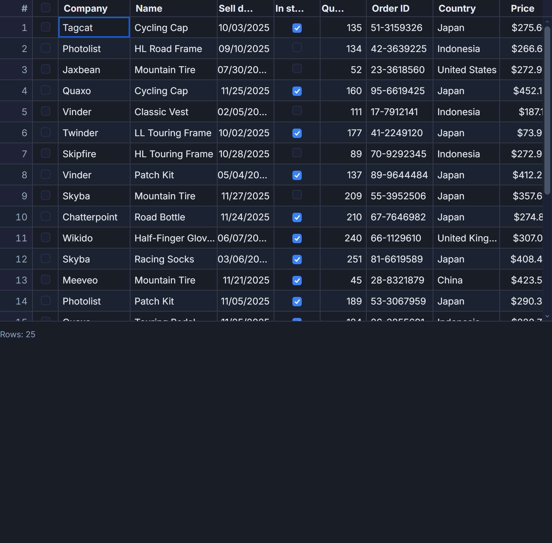
Two things break Storybook setups for virtualized grids faster than anything else: missing height constraints and data generated in the wrong place. Get those right and the rest is straightforward wiring.
Why the height constraint is load-bearing
SvGrid uses a virtual row model. It renders only the rows visible inside the scroll container plus a small buffer - roughly 5 rows above and below the viewport edge. The scroll container must have a bounded height at render time for this to engage. If the container can grow to fit its content, the grid sees unlimited vertical space and renders every row.
At 200 rows that's tolerable. At 5,000 rows the story iframe locks up for 2-3 seconds. At 50,000 rows the browser tab can hang long enough that a reviewer thinks the story is broken.
The fix is a wrapper div with an explicit height. The display: flex; flex-direction: column pairing is important because SvGrid sizes itself by filling available flex space - it doesn't need height: 100% cascaded through every ancestor:
<!-- This is the minimum correct wrapper for any SvGrid Storybook story -->
<div style="height: 520px; display: flex; flex-direction: column;">
  <SvGrid {features} {columns} {data} />
</div>
Alternatively, use a Storybook decorator to apply this to every story in the file without repeating the wrapper. Either way, the div must be there.
Wiring the story file
The example below uses @storybook/addon-svelte-csf. It registers a PeopleGrid wrapper component and exposes the most commonly toggled props as Storybook controls. Args are plain serializable values - numbers, booleans, strings - because Storybook serializes them to JSON between the controls panel and the story.
<!-- src/stories/PeopleGrid.stories.svelte -->
<script module>
  import { defineMeta } from '@storybook/addon-svelte-csf'
  import PeopleGrid from './PeopleGrid.svelte'

  const { Story } = defineMeta({
    title: 'Data/PeopleGrid',
    component: PeopleGrid,
    argTypes: {
      rowCount:            { control: { type: 'number' } },
      pageSize:            { control: { type: 'select' }, options: [25, 50, 100, 250] },
      showPagination:      { control: 'boolean' },
      selectionMode:       { control: { type: 'select' }, options: ['none', 'single', 'multi'] },
      enableInlineEditing: { control: 'boolean' },
      showFilterRow:       { control: 'boolean' },
      loading:             { control: 'boolean' },
    },
    args: {
      rowCount: 200,
      pageSize: 50,
      showPagination: true,
      selectionMode: 'multi',
      enableInlineEditing: false,
      showFilterRow: true,
      loading: false,
    },
  })
</script>

<!-- Four stories cover the states that matter most during design review -->
<Story name="Default"     args={{ rowCount: 200 }} />
<Story name="Empty"       args={{ rowCount: 0, loading: false }} />
<Story name="Loading"     args={{ rowCount: 0, loading: true }} />
<Story name="Large 50k"   args={{ rowCount: 50000, showPagination: false }} />
Keep "Empty" and "Loading" as separate stories. They look visually similar - both show no rows - but they communicate different UX states. Empty means "query returned zero results" and should display an empty-state message. Loading means "fetch is in flight" and should show a skeleton. If you merge them into one story, reviewers can't validate that the grid handles both correctly during a design pass.
The wrapper component
The wrapper component owns feature composition, column definitions, and data generation. This is the component Storybook actually renders. It accepts the serializable args as props and handles the reactive parts internally:
<!-- src/stories/PeopleGrid.svelte -->
<script lang="ts">
  import {
    SvGrid,
    tableFeatures,
    rowSortingFeature,
    columnFilteringFeature,
    rowSelectionFeature,
    rowPaginationFeature,
    type ColumnDef,
    type SvGridApi,
  } from '@svgrid/grid'

  type Person = {
    id: number
    firstName: string
    lastName: string
    department: string
    salary: number
    age: number
  }

  type Props = {
    rowCount?: number
    pageSize?: number
    showPagination?: boolean
    selectionMode?: 'none' | 'single' | 'multi'
    enableInlineEditing?: boolean
    showFilterRow?: boolean
    loading?: boolean
  }

  let {
    rowCount = 200,
    pageSize = 50,
    showPagination = true,
    selectionMode = 'multi',
    enableInlineEditing = false,
    showFilterRow = true,
    loading = false,
  }: Props = $props()

  // Feature composition must be stable - define at component scope,
  // not inline in a reactive expression or it will remount on every arg change.
  const features = tableFeatures({
    rowSortingFeature,
    columnFilteringFeature,
    rowSelectionFeature,
    rowPaginationFeature,
  })

  const columns: ColumnDef<typeof features, Person>[] = [
    { id: 'firstName',  field: 'firstName',  header: 'First name',  width: 130 },
    { id: 'lastName',   field: 'lastName',   header: 'Last name',   width: 130 },
    { id: 'department', field: 'department', header: 'Department',   width: 150 },
    { id: 'age',        field: 'age',        header: 'Age',          width: 80,  type: 'number' },
    {
      id: 'salary',
      field: 'salary',
      header: 'Salary',
      width: 130,
      type: 'number',
      editable: true,
    },
  ]

  // Data generation happens here, not in args. $derived means the grid
  // updates reactively when rowCount changes via Storybook controls.
  const depts = ['Engineering', 'Sales', 'Finance', 'HR', 'Legal']
  const data = $derived(
    Array.from({ length: rowCount }, (_, i): Person => ({
      id: i + 1,
      firstName: 'First' + i,
      lastName: 'Last' + i,
      department: depts[i % depts.length]!,
      age: 22 + (i % 40),
      salary: 45_000 + (i % 80) * 1_000,
    }))
  )

  let api = $state<SvGridApi | null>(null)

  function onApiReady(ready: SvGridApi) {
    api = ready
  }
</script>

<div style="height: 520px; display: flex; flex-direction: column;">
  <SvGrid
    {features}
    {columns}
    {data}
    {pageSize}
    pageable={showPagination}
    sortable
    filterable={showFilterRow}
    showFilterRow={showFilterRow}
    editable={enableInlineEditing}
    {loading}
    {onApiReady}
  />
</div>
One thing that trips people up: calling tableFeatures(...) inside a $derived or inside the story args will cause the grid to fully unmount and remount whenever any arg changes, losing scroll position and edit state. Define it at component scope where it's created once.
Driving the grid from play functions
The SvGridApi instance from onApiReady is useful inside Storybook play functions. You can use it to set up a specific grid state before an automated assertion - pre-sorting a column, pre-filtering to a subset, or selecting a row - without simulating clicks that depend on column position or header text.
Store the reference somewhere the play function can reach it:
<!-- Add to the PeopleGrid.svelte script block -->
<script lang="ts">
  // Expose api for Storybook play functions via a module-level ref
  export let __storyApi: SvGridApi | null = null
</script>
Then in the story file:
<Story
  name="Pre-sorted by salary"
  args={{ rowCount: 200 }}
  play={async ({ canvasElement }) => {
    // Wait for onApiReady to fire
    const grid = canvasElement.querySelector('[data-svgrid]').__svelte_component__
    // Or use a shared ref pattern - depends on your wrapper approach
    // Once you have the api:
    // api.setSort('salary', 'desc')
    // api.setFilter('department', { operator: 'equals', value: 'Engineering' })
    await new Promise(r => setTimeout(r, 100))
  }}
/>
In practice, the cleanest pattern is to store the api on a module-level variable in the wrapper component and export it, then import it in the play function. The exact wiring depends on how your Storybook CSF setup handles cross-file references, but the point stands: clicking column headers in a play function is fragile. The API is the stable surface.
Accessibility output from the addon
The Storybook a11y addon will likely pass on the grid shell itself. SvGrid emits correct role="grid", role="row", and role="gridcell" ARIA attributes. Violations almost always come from custom cell content - an icon button without aria-label, a status badge with insufficient contrast, a link that only has an icon child.
When you add a custom cell snippet, audit it separately. The addon reports violations at the element level so the source is usually obvious in the output. The grid's own ARIA structure is not the place to look first.
What the "Large 50k" story actually proves
The rowCount: 50000 story is not just for performance bragging. It validates that virtualization is correctly engaged in the story environment, that scrolling works inside the iframe, and that pagination is off (so the full virtual list is active). If that story renders in under 150 ms and scrolls smoothly at 60 fps, your height constraint and feature setup are correct. If it hangs, something is wrong with the container height or with feature composition being recreated on each render.
Run the large story against every significant configuration change. It's a fast integration check that catches more than it looks like it should.
Related reading
- Unit-Testing SvGrid with Vitest
- Using SvGrid with TanStack Query in Svelte
- A Svelte Data Grid with SvelteKit and Supabase
- Using SvGrid in Astro with Svelte Islands
- SvGrid drops into your shadcn-svelte app
Tagged: Testing