SvGrid drops into your shadcn-svelte app
A side-by-side look at how little it takes to swap a hand-written shadcn Table for a full SvGrid - same tokens, same dark mode, plus sorting, filtering, and virtualization for free.
You already have a shadcn-svelte app. The palette, the radius, the
font, the dark-mode toggle - all of it lives in a flat set of CSS
variables (--background, --foreground, --primary, ...) that every
Button, Input, and Table reads from. The question is never "will
a data grid look right in here" - it is "how much work is it to make it
look right".
With SvGrid the answer is: one import, or one CSS block. The grid
themes off its own flat set of variables (--sg-*), and those map onto
your shadcn tokens one for one. Here is the whole story in one picture.
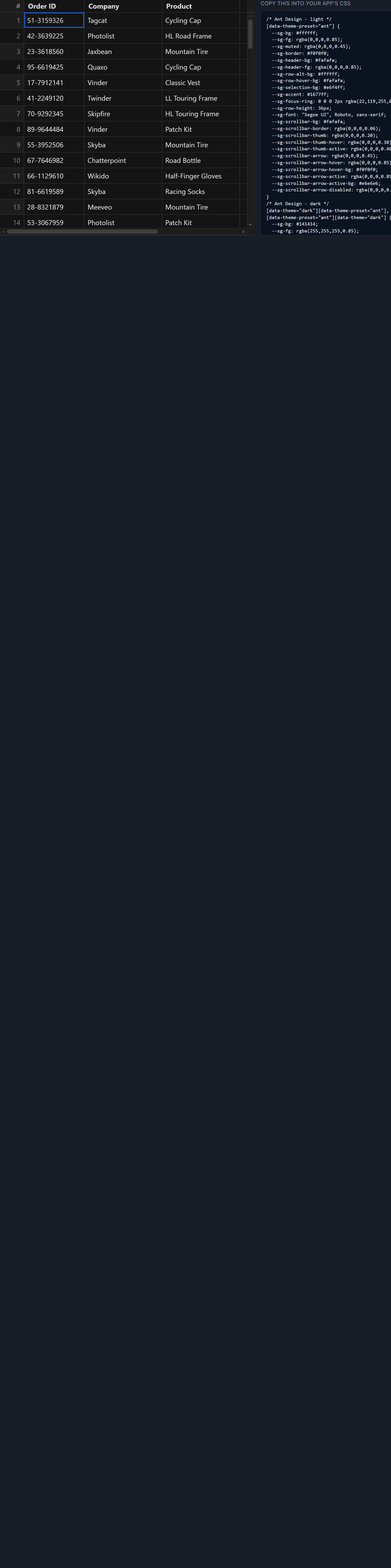
The swap, side by side
Left: what a shadcn app already has - a hand-written Table. Right:
the same region as a full <SvGrid>. The data and the look are
identical; the difference is that the right-hand version sorts,
filters, and virtualizes 100,000 rows without you writing any of it.
Table
<script lang="ts">
  import * as Table from '$lib/components/ui/table'
  let rows = [/* ...orders... */]
</script>

<Table.Root>
  <Table.Header>
    <Table.Row>
      <Table.Head>Order</Table.Head>
      <Table.Head>Customer</Table.Head>
      <Table.Head class="text-right">Amount</Table.Head>
    </Table.Row>
  </Table.Header>
  <Table.Body>
    {#each rows as r}
      <Table.Row>
        <Table.Cell>{r.id}</Table.Cell>
        <Table.Cell>{r.customer}</Table.Cell>
        <Table.Cell class="text-right">{r.amount}</Table.Cell>
      </Table.Row>
    {/each}
  </Table.Body>
</Table.Root>
<!-- static: no sort, no filter, no virtualization -->
<SvGrid>, same tokens
<script lang="ts">
  import { SvGrid, type ColumnDef } from '@svgrid/grid'
  import '@svgrid/grid/themes/shadcn.css'  // 1 line to match shadcn
  let rows = [/* ...same orders... */]
  const columns: ColumnDef[] = [
    { id: 'id',       field: 'id',       header: 'Order' },
    { id: 'customer', field: 'customer', header: 'Customer' },
    { id: 'amount',   field: 'amount',   header: 'Amount', type: 'number' },
  ]
</script>
<SvGrid
  data={rows}
  {columns}
  sortable
  filterable
  class="rounded-md border" />
<!-- sortable, filterable, virtualized, keyboard + a11y -->
That @svgrid/grid/themes/shadcn.css import is a shipped preset - a
zinc-neutral palette that mirrors shadcn's defaults in light and dark,
toggled by the same [data-theme='dark'] attribute you already flip.
For most apps that single line is the entire integration.
When you have customized your theme
The preset matches the default shadcn look. If you have swapped the primary colour, widened the radius, or set a brand font, don't copy those values into the grid - point the grid at your variables instead. One CSS block bridges SvGrid's tokens to shadcn's, and from then on the grid tracks whatever your theme resolves to:
/* Scope to a wrapper; move to :root in app.css to theme every grid. */
.sg-shadcn {
  --sg-bg:           hsl(var(--background));
  --sg-fg:           hsl(var(--foreground));
  --sg-border:       hsl(var(--border));
  --sg-header-bg:    hsl(var(--muted));
  --sg-row-hover-bg: hsl(var(--accent));
  --sg-selection-bg: hsl(var(--primary) / 0.15);
  --sg-accent:       hsl(var(--primary));
  --sg-focus-ring:   0 0 0 2px hsl(var(--ring));
  --sg-font:         var(--font-sans, sans-serif);
  --sg-radius:       var(--radius);
}
shadcn stores its palette as bare HSL channels (0 0% 100%, not a full
hsl(...) value), so you wrap each one in hsl() at assignment. The
one trap: --sg-accent: var(--primary) without the wrapper passes raw
channels to the grid and produces an invalid colour - usually
transparent. Always wrap.
Dark mode falls out for free
Because every --sg-* value is written in terms of a shadcn token,
and shadcn already redefines those tokens under .dark, the grid flips
the moment you toggle dark mode - no listener, no reactive statement,
no API call. SvGrid reads its tokens from the DOM at paint time, so
even a mid-session theme switch repaints the grid instantly. You can
even nest themes: drop .dark on one panel and grids inside it go dark
while the rest of the page stays light.
Cells are still shadcn
Custom cells are plain Svelte snippets, so shadcn components render
right inside the grid - a Badge for status, a Button for row
actions, anything from your kit:
{#snippet StatusCell({ value }: { value: string })}
  <Badge variant={value === 'delivered' ? 'default' : 'secondary'}>
    {value}
  </Badge>
{/snippet}
Assign it to a column's cell field and every row renders your
component in the current theme context. The grid owns the layout,
virtualization, and keyboard model; your design system owns the pixels.
The takeaway
Dropping a data grid into a design-system app is usually the part that turns into a week of overrides. With SvGrid it is a preset import for the common case, or a dozen-line token bridge if you have customized your theme - and dark mode, focus rings, and hover states come along without a second thought.
For the full token reference, the OKLCH migration note, and a production orders table with a shadcn toolbar, see the deep-dive: Using SvGrid with shadcn-svelte.
Related reading
- Using SvGrid with shadcn-svelte
- Using SvGrid with Flowbite Svelte
- Using SvGrid with Skeleton UI
- Theming SvGrid with Tailwind CSS v4
- Theming a Svelte Data Grid with CSS Variables and Dark Mode
- SvGrid vs Flowbite / Skeleton / shadcn-svelte tables - the comparison page, with a source and date for every claim