Theming SvGrid with Tailwind CSS v4
SvGrid's --sg-* tokens and Tailwind v4's CSS custom properties live in the same cascade. Wire them together in one CSS file and dark mode, rebranding, and multi-theme pages all become trivial.
Tailwind v4 dropped the JavaScript config file and moved its entire token system into CSS custom properties. That single architectural decision makes it significantly easier to theme SvGrid, because SvGrid's visual system is also CSS custom properties all the way down. Two systems that speak the same language - no build plugins, no wrapper components, no @apply gymnastics.
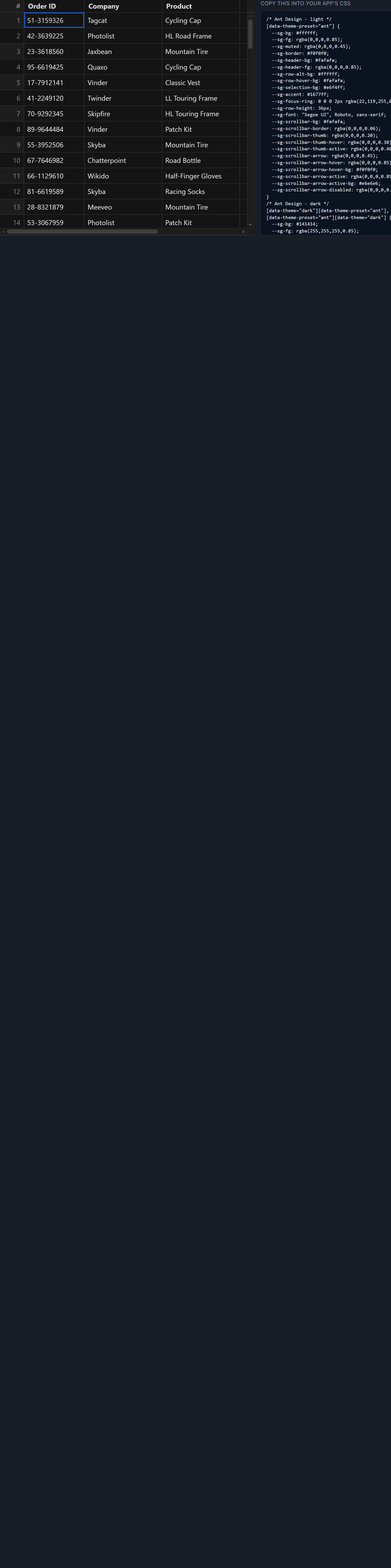
The connection is a direct CSS assignment. --sg-accent: var(--color-brand-500) is all it takes to wire the grid's selection highlight, sort arrows, filter chips, and checkbox ticks to your Tailwind palette. Rebrand --color-brand-500 anywhere and the grid follows.
Why token-to-token beats selector overrides
The naive approach is to target SvGrid's structural class names with Tailwind utilities or custom CSS rules. This breaks because the grid's internal markup is not a public API - class names exist to organize the component's internals, not to serve as theming hooks. They change across minor versions. Selector overrides also tend to lose specificity fights with the grid's own styles, requiring increasing amounts of !important escalation.
SvGrid's --sg-* tokens are the public theming API. Every visual property the grid controls - background, foreground, header color, border, row height, selection highlight, focus ring, scrollbar thumb - has a token. Set the token on a wrapping element and it cascades into every nested cell, header, and overlay without touching a single class name. Updates to the grid internals leave your theme intact.
The CSS wiring
Here is a complete theme file for a gray-neutral design system with an orange brand accent, including dark mode:
/* app.css - imported once at your app root */
@import 'tailwindcss';

@theme {
  --color-brand-500: #ea580c;
  --color-brand-600: #c2410c;
  --color-gray-50:   #f9fafb;
  --color-gray-100:  #f3f4f6;
  --color-gray-200:  #e5e7eb;
  --color-gray-400:  #9ca3af;
  --color-gray-700:  #374151;
  --color-gray-900:  #111827;
}

/* Light mode */
.sg-theme {
  --sg-bg:            #ffffff;
  --sg-fg:            var(--color-gray-900);
  --sg-border:        var(--color-gray-200);
  --sg-header-bg:     var(--color-gray-50);
  --sg-header-fg:     var(--color-gray-900);
  --sg-row-alt-bg:    var(--color-gray-50);
  --sg-row-hover-bg:  var(--color-gray-100);
  --sg-selection-bg:  color-mix(in srgb, var(--color-brand-500) 15%, transparent);
  --sg-accent:        var(--color-brand-500);
  --sg-focus-ring:    0 0 0 2px color-mix(in srgb, var(--color-brand-500) 35%, transparent);
  --sg-cell-px:       12px;
  --sg-radius:        4px;
}

/* Dark mode - higher specificity wins when .dark is on a parent */
.dark .sg-theme {
  --sg-bg:            #0f172a;
  --sg-fg:            #e2e8f0;
  --sg-border:        #1e293b;
  --sg-header-bg:     #1e293b;
  --sg-header-fg:     #f1f5f9;
  --sg-row-alt-bg:    #0f172a;
  --sg-row-hover-bg:  #1e293b;
  --sg-selection-bg:  color-mix(in srgb, var(--color-brand-500) 22%, transparent);
  --sg-accent:        var(--color-brand-500);
}
Nothing here is SvGrid-specific except the --sg- prefix. The @theme block is standard Tailwind v4. Tailwind emits those declarations into :root at compile time, making them available to anything else on the page - including the grid token assignments.
color-mix() for --sg-selection-bg requires Chrome 111+, Firefox 113+, Safari 16.2+. If you need to support older targets, replace it with a hardcoded rgba value: rgba(234, 88, 12, 0.15) for light and rgba(234, 88, 12, 0.22) for dark.
A real grid component
The Svelte component below uses sorting and filtering features. The theme is applied by putting sg-theme on the wrapper div. Everything else is standard SvGrid setup.
<script lang="ts">
  import SvGrid, {
    tableFeatures,
    rowSortingFeature,
    columnFilteringFeature,
    resolveCellFormat,
    type ColumnDef,
    type SvGridApi,
  } from '@svgrid/grid'

  type Order = {
    id:       string
    customer: string
    status:   'open' | 'processing' | 'shipped' | 'closed'
    region:   string
    revenue:  number
  }

  const STATUS_LABEL: Record<Order['status'], string> = {
    open:       'Open',
    processing: 'Processing',
    shipped:    'Shipped',
    closed:     'Closed',
  }

  // Deterministic fake data - no network required
  let seed = 0xdeadbeef
  const rng = () => ((seed = (seed * 1664525 + 1013904223) >>> 0) / 0xffffffff)
  const pick = <T>(a: T[]): T => a[Math.floor(rng() * a.length)]!

  const CUSTOMERS = ['Acme Corp', 'Globex', 'Initech', 'Umbrella Ltd', 'Stark Ind']
  const REGIONS   = ['AMER', 'EMEA', 'APAC', 'LATAM']
  const STATUSES: Order['status'][] = ['open', 'processing', 'shipped', 'closed']

  const rows: Order[] = Array.from({ length: 500 }, (_, i) => ({
    id:       `ORD-${10000 + i}`,
    customer: pick(CUSTOMERS),
    status:   pick(STATUSES),
    region:   pick(REGIONS),
    revenue:  Math.round(500 + rng() * 49500),
  }))

  const features = tableFeatures({ rowSortingFeature, columnFilteringFeature })

  const fmt = new Intl.NumberFormat('en-US', {
    style: 'currency', currency: 'USD', maximumFractionDigits: 0,
  })

  const columns: ColumnDef<typeof features, Order>[] = [
    { id: 'id',       field: 'id',       header: 'Order',    width: 130 },
    { id: 'customer', field: 'customer', header: 'Customer', width: 180 },
    {
      id: 'status',
      field: 'status',
      header: 'Status',
      width: 140,
      conditionalFormat: [
        { condition: ({ value }) => value === 'open',       style: { color: '#2563eb' } },
        { condition: ({ value }) => value === 'processing', style: { color: '#d97706' } },
        { condition: ({ value }) => value === 'shipped',    style: { color: '#16a34a' } },
        { condition: ({ value }) => value === 'closed',     style: { color: '#6b7280' } },
      ],
    },
    { id: 'region',  field: 'region',  header: 'Region',  width: 100 },
    {
      id: 'revenue',
      field: 'revenue',
      header: 'Revenue',
      width: 130,
      type: 'number',
      cell: ({ value }) => fmt.format(value as number),
    },
  ]

  let api = $state<SvGridApi<typeof features, Order> | null>(null)
</script>

<div class="flex h-screen flex-col bg-white dark:bg-slate-950">
  <header class="flex items-center gap-3 border-b border-gray-200 px-4 py-3 dark:border-slate-800">
    <h2 class="text-lg font-semibold text-gray-900 dark:text-slate-100">Orders</h2>
    <span class="text-sm text-gray-500 dark:text-slate-400">500 rows</span>
    <button
      class="ml-auto rounded-md bg-orange-600 px-3 py-1.5 text-sm font-medium text-white hover:bg-orange-700"
      onclick={() => api?.clearAllFilters()}
    >
      Clear filters
    </button>
  </header>

  <!-- sg-theme wrapper applies all --sg-* tokens; min-h-0 keeps virtualization healthy -->
  <div class="sg-theme min-h-0 flex-1">
    <SvGrid
      {features}
      data={rows}
      {columns}
      sortable
      filterable
      showFilterRow
      virtualization={true}
      onApiReady={(g) => (api = g)}
    />
  </div>
</div>
min-h-0 on the grid's direct parent is not optional when that parent is a flex child. Without it, a flex item defaults to min-height: auto, which lets it grow past the available viewport. The virtualizer measures the wrapper height to decide how many rows to render - if the wrapper has no bounded height, every row renders and the page scrolls outside the grid rather than inside it.
One wrapper class per grid
If you have two grids on the same page with different visual styles - say, a compact settings table next to a full-featured data view - you need two separate wrapper classes, not a single global override on body or :root.
/* Compact grid for settings panels */
.sg-compact {
  --sg-bg:         #f8fafc;
  --sg-cell-px:    8px;
  --sg-radius:     2px;
  --sg-accent:     var(--color-gray-700);
  --sg-header-bg:  var(--color-gray-100);
  --sg-border:     var(--color-gray-200);
}

/* Full-featured grid with brand accent */
.sg-data {
  --sg-bg:           #ffffff;
  --sg-cell-px:      14px;
  --sg-radius:       6px;
  --sg-accent:       var(--color-brand-500);
  --sg-header-bg:    var(--color-gray-50);
  --sg-border:       var(--color-gray-200);
  --sg-selection-bg: color-mix(in srgb, var(--color-brand-500) 15%, transparent);
}
CSS scoping by wrapper class is simple and predictable. It also means theme presets are composable - you can ship .sg-compact, .sg-data, and .sg-minimal as a small CSS library and let the wrapper class determine which one applies.
Tokens vs. Tailwind utilities inside cells
Tailwind utilities work fine inside custom cell snippets for content you control. Status badges, sparklines, progress bars, avatars - all of those can use class="rounded-full bg-blue-100 text-blue-700" without any conflict. The grid does not care what your cell content looks like internally.
The distinction is structural vs. content. Structural styles - the header background, row borders, hover color, selection highlight - are what the --sg-* tokens control. Cell content is yours to style however you want, including Tailwind utilities, component styles, or inline styles.
Trying to flip the approach - using Tailwind utilities to control structural grid styles - does not work reliably, because those styles are applied inside the grid component where external utilities cannot reach without fighting specificity rules you do not control.
Discovering the full token list
The tokens used above cover the common cases. SvGrid has additional tokens for less common surfaces: --sg-scrollbar-thumb, --sg-scrollbar-thumb-active, --sg-scrollbar-track, --sg-group-row-bg, --sg-group-row-fg, and a handful of others. The authoritative list lives in packages/grid/src/SvGrid.css in the source distribution - search for --sg- and every token appears with its default value.
The interactive theming demo at /demos/37-theming-studio lets you adjust tokens in real time against a live grid and copy the resulting CSS block. That is the fastest way to explore tokens you have not used before.
Related reading
- Theming a Svelte Data Grid with CSS Variables and Dark Mode
- SvGrid drops into your shadcn-svelte app
- Using SvGrid with shadcn-svelte
- Using SvGrid with Flowbite Svelte
- Using SvGrid with Skeleton UI
Tagged: Theming