Theming a Svelte Data Grid with CSS Variables and Dark Mode
How SvGrid's --sg-* CSS custom properties let you remap colors, density, and accent in plain CSS - with a full light/dark/accent switcher wired in Svelte 5.
Most data grids treat their visual design as an implementation detail you work around: override a class here, patch a stylesheet there, accept that the selection highlight will always be that specific shade of cornflower blue the vendor chose in 2019. SvGrid takes the opposite approach. Every surface - headers, rows, borders, selection rings, active cells - reads from --sg-* CSS custom properties. There is no compiled-in palette to fight.
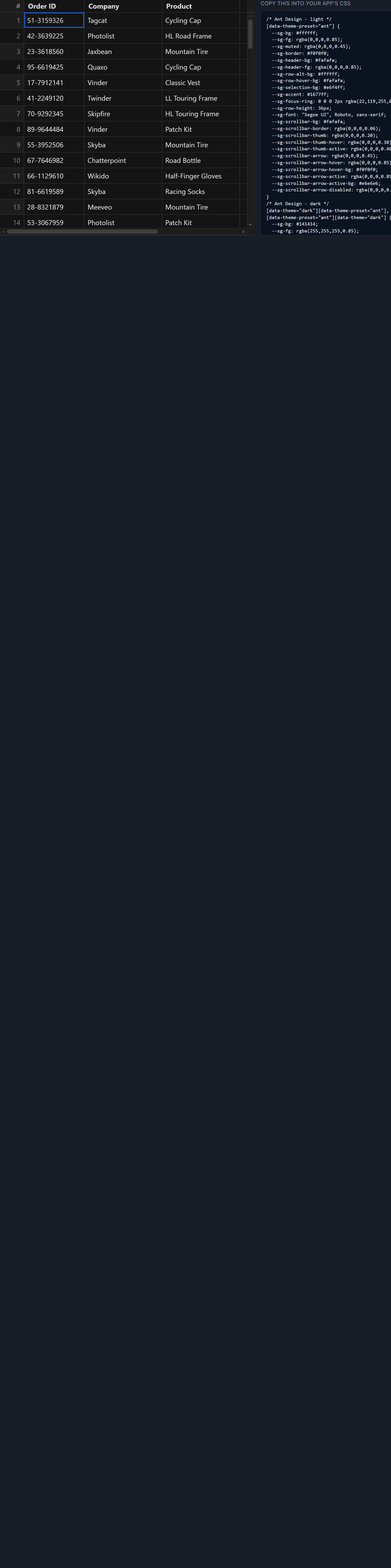
The practical consequence: you can theme an entire grid by setting a handful of CSS variables on a wrapper element. No build step, no JavaScript config object, no shadow DOM piercers.
What the token set covers
SvGrid exposes tokens for every visual surface that matters:
| Token | Controls |
|---|---|
--sg-bg |
Row background (also the fallback base for headers) |
--sg-fg |
Default cell text color |
--sg-header-bg |
Header row background |
--sg-border |
All internal and outer borders |
--sg-accent |
Selection rings, active cell outline, focus indicators |
--sg-cell-px |
Horizontal cell padding |
--sg-thead-h |
Header row height |
--sg-radius |
Border radius on the outer container |
--sg-row-height is special - it controls both the CSS height of each row and the integer the virtualizer uses to compute total scroll area. Change it and the virtual scroll container recalculates immediately; no data reload, no flicker, just a rapid layout pass.
The tokens cascade by inheritance. Setting only --sg-bg on the wrapper shifts the entire grid's base color; individual surfaces that don't have their own token explicitly set fall through to --sg-bg via the fallback chain baked into SvGrid's internal CSS.
Scoping tokens to a single grid
The important mechanic is where you apply the tokens. Setting them on :root works, but it means every grid on the page shares the same theme. If you want per-instance control, apply them to a wrapper element via inline style or element-scoped CSS. SvGrid's internal components read from the nearest ancestor that defines each property - standard CSS inheritance.
<script lang="ts">
  import SvGrid, {
    tableFeatures,
    rowSortingFeature,
    columnFilteringFeature,
    type ColumnDef,
    type SvGridApi,
  } from '@svgrid/grid'

  type Employee = {
    id: string
    name: string
    department: string
    salary: number
    status: 'active' | 'pending' | 'inactive'
  }

  // Minimal seeded data - no random() so output is deterministic
  const data: Employee[] = [
    { id: 'E001', name: 'Alex Park',      department: 'Engineering', salary: 112000, status: 'active'   },
    { id: 'E002', name: 'Jamie Cohen',    department: 'Design',      salary:  94000, status: 'active'   },
    { id: 'E003', name: 'Casey Mehta',    department: 'Data',        salary: 128000, status: 'inactive' },
    { id: 'E004', name: 'Morgan Silva',   department: 'Engineering', salary:  98000, status: 'pending'  },
    { id: 'E005', name: 'Riley Nakamura', department: 'Growth',      salary: 105000, status: 'active'   },
    // ... extend to 40+ rows in production
  ]

  const features = tableFeatures({ rowSortingFeature, columnFilteringFeature })

  const columns: ColumnDef<typeof features, Employee>[] = [
    { id: 'id',         field: 'id',         header: 'ID',         width: 90  },
    { id: 'name',       field: 'name',       header: 'Name',       width: 180 },
    { id: 'department', field: 'department', header: 'Department', width: 140 },
    { id: 'salary',     field: 'salary',     header: 'Salary',     width: 120, type: 'number' },
    { id: 'status',     field: 'status',     header: 'Status',     width: 110 },
  ]

  let api = $state<SvGridApi<typeof features, Employee> | null>(null)
</script>

<!-- Tokens scoped to this wrapper only. Other grids on the page are unaffected. -->
<div
  class="grid-host"
  style="
    --sg-bg:        #0f172a;
    --sg-fg:        #e2e8f0;
    --sg-header-bg: #1e293b;
    --sg-border:    #334155;
    --sg-accent:    #60a5fa;
  "
>
  <SvGrid
    {data}
    {columns}
    {features}
    sortable
    filterable
    virtualization={true}
    onApiReady={(a) => (api = a)}
  />
</div>

<style>
  .grid-host {
    height: 400px;
    border-radius: 8px;
    overflow: hidden;
  }
</style>
That is a permanent dark theme for exactly this grid instance. The wrapper's inline style wins the cascade against any stylesheet rule, including component-scoped styles from SvelteKit.
Building a live light/dark/accent switcher
Static tokens are useful. Reactive tokens are better. The pattern below keeps a dark boolean and an accent color in Svelte 5 $state, then uses $effect to write the correct token set to the wrapper element whenever either changes. The cost per switch is about 10 setProperty calls - one per token - flushed in a single microtask before the next paint.
<script lang="ts">
  import SvGrid, {
    tableFeatures,
    rowSortingFeature,
    columnFilteringFeature,
    type ColumnDef,
    type SvGridApi,
  } from '@svgrid/grid'

  // Re-use Employee type and data from the snippet above
  type Employee = { id: string; name: string; department: string; salary: number; status: string }
  const data: Employee[] = [ /* 40 rows */ ] as Employee[]

  const features = tableFeatures({ rowSortingFeature, columnFilteringFeature })
  const columns: ColumnDef<typeof features, Employee>[] = [
    { id: 'id',         field: 'id',         header: 'ID',         width: 90  },
    { id: 'name',       field: 'name',       header: 'Name',       width: 180 },
    { id: 'department', field: 'department', header: 'Department', width: 140 },
    { id: 'salary',     field: 'salary',     header: 'Salary',     width: 120, type: 'number' },
    { id: 'status',     field: 'status',     header: 'Status',     width: 110 },
  ]

  // ---- theme state ----
  let dark    = $state(false)
  let accent  = $state('#2563eb')
  let density = $state<'compact' | 'normal' | 'comfortable'>('normal')
  let wrapper = $state<HTMLElement | null>(null)

  const DENSITY_HEIGHT = { compact: '28px', normal: '36px', comfortable: '48px' }

  const LIGHT = {
    '--sg-bg':        '#ffffff',
    '--sg-fg':        '#1f2937',
    '--sg-header-bg': '#f9fafb',
    '--sg-border':    '#e5e7eb',
  }

  const DARK = {
    '--sg-bg':        '#0f172a',
    '--sg-fg':        '#e2e8f0',
    '--sg-header-bg': '#1e293b',
    '--sg-border':    '#334155',
  }

  $effect(() => {
    if (!wrapper) return
    const base = dark ? DARK : LIGHT
    const tokens: Record<string, string> = {
      ...base,
      '--sg-accent':       accent,
      '--sg-selection-bg': accent + (dark ? '33' : '26'), // 20% / 15% alpha
      '--sg-row-height':   DENSITY_HEIGHT[density],
    }
    for (const [prop, val] of Object.entries(tokens)) {
      wrapper.style.setProperty(prop, val)
    }
  })

  const ACCENTS = [
    { label: 'Blue',    hex: '#2563eb' },
    { label: 'Emerald', hex: '#059669' },
    { label: 'Rose',    hex: '#e11d48' },
    { label: 'Violet',  hex: '#7c3aed' },
    { label: 'Amber',   hex: '#d97706' },
  ]
</script>

<div class="controls">
  <label>
    <input type="checkbox" bind:checked={dark} /> Dark
  </label>

  <span>Density:</span>
  {#each (['compact', 'normal', 'comfortable'] as const) as d}
    <button class:active={density === d} onclick={() => (density = d)}>{d}</button>
  {/each}

  <span>Accent:</span>
  {#each ACCENTS as a}
    <button
      class="swatch"
      style="background:{a.hex}; box-shadow:{accent === a.hex ? '0 0 0 2px ' + a.hex : 'none'}"
      title={a.label}
      onclick={() => (accent = a.hex)}
    ></button>
  {/each}
</div>

<div bind:this={wrapper} class="grid-host">
  <SvGrid
    {data}
    {columns}
    {features}
    sortable
    filterable
    virtualization={true}
  />
</div>

<style>
  .grid-host   { height: 480px; border-radius: 8px; overflow: hidden; }
  .controls    { display: flex; align-items: center; gap: 8px; margin-bottom: 10px; flex-wrap: wrap; }
  .controls button.active { font-weight: 700; text-decoration: underline; }
  .swatch      { width: 20px; height: 20px; border-radius: 50%; border: none; cursor: pointer; }
</style>
A few notes on this pattern:
The $effect guard if (!wrapper) return is load-bearing during SSR. On first render with SvelteKit, wrapper is null at the moment the effect fires. Without the guard you get a runtime error during hydration.
The hex-alpha suffix for --sg-selection-bg ('33' for dark, '26' for light) gives you 20% and 15% opacity respectively without a separate rgba string. This works in every browser shipped in the last three years. If you need Safari 14 support, replace the hex-alpha with rgba() strings derived from your accent color.
--sg-row-height takes a CSS length string including the unit - '36px', not '36'. The virtualizer reads the computed value and parses it as a number. Passing a bare integer produces NaN, which collapses all rows to zero height.
Using the OS color scheme without JavaScript
The JavaScript toggle is the right approach when you need an explicit user override stored in localStorage. When you just want to follow the operating system, skip the reactive state entirely and use a media query:
/* src/app.css or a layout component's <style> block */
.grid-host {
  --sg-bg:        #ffffff;
  --sg-fg:        #1f2937;
  --sg-header-bg: #f9fafb;
  --sg-border:    #e5e7eb;
  --sg-accent:    #2563eb;
}

@media (prefers-color-scheme: dark) {
  .grid-host {
    --sg-bg:        #0f172a;
    --sg-fg:        #e2e8f0;
    --sg-header-bg: #1e293b;
    --sg-border:    #334155;
    --sg-accent:    #60a5fa;
  }
}
Custom properties cross SvelteKit's scoped style boundary because they are inherited CSS values, not class-based selectors. You do not need :global wrappers. Define the tokens on the host element and they reach into every internal component SvGrid renders.
Combining tokens with conditional formatting
Token-based theming and per-cell conditional formatting are orthogonal - one drives the grid chrome, the other drives cell content - but they interact at the accent color level. If you apply a background derived from --sg-accent in a conditional format rule, it will automatically pick up your current accent, light or dark. Something to be aware of if you compute alpha hex strings the same way the selection background does.
const columns: ColumnDef<typeof features, Employee>[] = [
  // ... other columns
  {
    id: 'salary',
    field: 'salary',
    header: 'Salary',
    width: 120,
    type: 'number',
    conditionalFormat: [
      {
        condition: ({ value }) => (value as number) >= 120_000,
        style: { color: 'var(--sg-accent)', fontWeight: '600' },
      },
      {
        condition: ({ value }) => (value as number) < 80_000,
        style: { color: '#ef4444' },
      },
    ],
  },
]
color: 'var(--sg-accent)' in the style object uses the resolved token value at paint time, so the high-salary highlight shifts automatically when the user switches accent from blue to violet. No extra effect, no manual update.
Transition artifacts to avoid
Adding transition: background-color 150ms ease to .grid-host gives you a smooth dark-mode swap. What does not work well: animating --sg-border. Border repaints are not composited, so animating the border color across 40+ visible rows during a theme switch produces visible row flickering on mid-range hardware. Animate only background-color and color; leave border transitions off. The swap will look fine - borders are thin enough that the instant switch reads as intentional.