Using SvGrid with shadcn-svelte
Wire SvGrid's --sg-* CSS tokens to shadcn-svelte's design variables so the grid inherits your app's palette and dark mode automatically - no JavaScript required.
Drop any third-party data grid into a shadcn-svelte project and it immediately looks wrong. The border is a different shade than your Input borders, the header background is some vendor-chosen gray, and dark mode either breaks completely or requires you to maintain a parallel set of overrides. SvGrid sidesteps this with a flat layer of CSS custom properties - eighteen --sg-* tokens that you assign once, and which the grid reads from the cascade on every render.
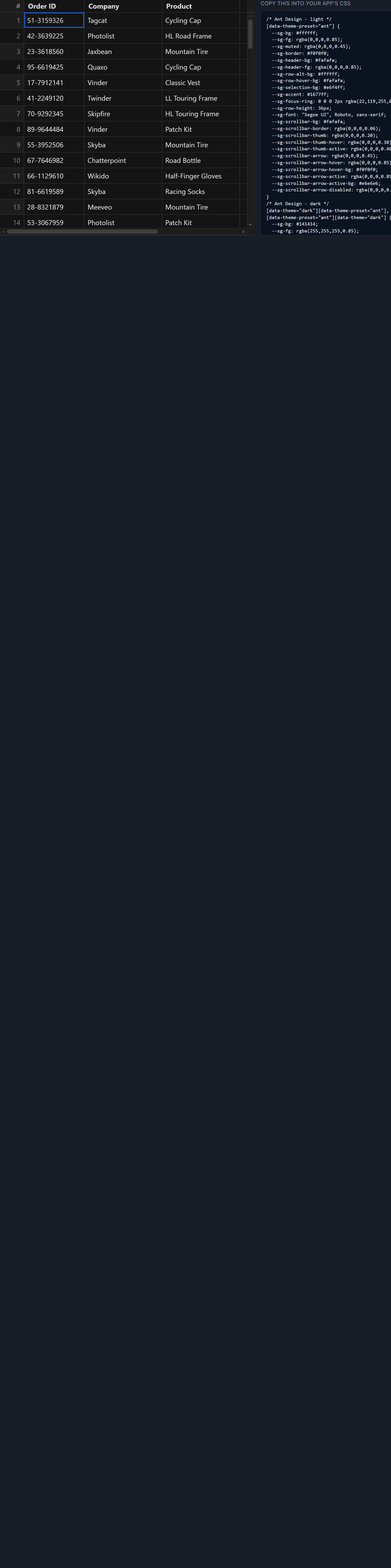
shadcn-svelte stores its palette as bare HSL channels: --background holds 0 0% 100% in light mode, not hsl(0 0% 100%). The bridge between the two systems is a single CSS block that wraps those channels in hsl() at the point of assignment.
The token bridge
Scope the mapping to a wrapper element rather than :root so it only affects grids inside that element. If you need the same theme for every grid on the site, move it to :root in app.css.
/* Grid wrapper - one block does both light and dark */
.sg-wrapper {
  --sg-bg:                    hsl(var(--background));
  --sg-fg:                    hsl(var(--foreground));
  --sg-border:                hsl(var(--border));
  --sg-header-bg:             hsl(var(--muted));
  --sg-header-fg:             hsl(var(--foreground));
  --sg-row-alt-bg:            hsl(var(--muted) / 0.3);
  --sg-row-hover-bg:          hsl(var(--accent));
  --sg-selection-bg:          hsl(var(--primary) / 0.15);
  --sg-accent:                hsl(var(--primary));
  --sg-focus-ring:            0 0 0 2px hsl(var(--ring));
  --sg-scrollbar-bg:          hsl(var(--background));
  --sg-scrollbar-thumb:       hsl(var(--muted-foreground) / 0.4);
  --sg-scrollbar-thumb-hover: hsl(var(--muted-foreground) / 0.6);
  --sg-font:                  var(--font-sans, sans-serif);
  --sg-radius:                var(--radius);
  --sg-row-height:            40px;
}
Because shadcn already overrides its tokens under .dark, every --sg-* value defined this way updates automatically when .dark is toggled on the <html> element. No JavaScript listener, no Svelte reactive statement. The cascade handles it.
One trap to avoid: writing --sg-accent: var(--primary) without the hsl() wrapper passes bare HSL channels directly to the grid, which expects a complete color value. The result is a color that browsers treat as invalid - you get transparent or the property is ignored. Always wrap.
A real-world orders table
Here is a full component: 2,000 seeded rows, sortable and filterable columns, a shadcn toolbar, and a row-actions column that renders a shadcn Button inside each cell.
<script lang="ts">
  import {
    SvGrid,
    tableFeatures,
    rowSortingFeature,
    columnFilteringFeature,
    rowPaginationFeature,
    renderSnippet,
    type ColumnDef,
    type SvGridApi,
  } from '@svgrid/grid'
  import { Button } from '$lib/components/ui/button'
  import { Input }  from '$lib/components/ui/input'
  import { Badge }  from '$lib/components/ui/badge'

  type Order = {
    id: string
    customer: string
    amount: number
    status: 'pending' | 'shipped' | 'delivered' | 'cancelled'
    date: string
  }

  // Deterministic seeded data - no fetch required for the demo
  function seedOrders(n: number): Order[] {
    let s = 7
    const rng = () => { s = (s * 9301 + 49297) % 233280; return s / 233280 }
    const statuses: Order['status'][] = ['pending', 'shipped', 'delivered', 'cancelled']
    return Array.from({ length: n }, (_, i) => ({
      id:       'ORD-' + String(1000 + i),
      customer: 'Customer ' + String(Math.floor(rng() * 500) + 1),
      amount:   Math.round(rng() * 9900 + 100),
      status:   statuses[Math.floor(rng() * 4)]!,
      date:     new Date(Date.now() - Math.floor(rng() * 365) * 86_400_000)
                  .toISOString().slice(0, 10),
    }))
  }

  const rows = $state<Order[]>(seedOrders(2_000))
  let api    = $state<SvGridApi | null>(null)
  let query  = $state('')

  const features = tableFeatures({
    rowSortingFeature,
    columnFilteringFeature,
    rowPaginationFeature,
  })

  // Declare the snippet before buildColumns references it
  function handleEdit(row: Order) {
    console.log('edit', row.id)
  }

  const columns: ColumnDef<Order>[] = [
    { id: 'id',       field: 'id',       header: 'Order',    width: 110, pinned: 'left' },
    { id: 'customer', field: 'customer', header: 'Customer', width: 200 },
    { id: 'amount',   field: 'amount',   header: 'Amount',   width: 120, type: 'number' },
    { id: 'status',   field: 'status',   header: 'Status',   width: 130, cell: StatusCell },
    { id: 'date',     field: 'date',     header: 'Date',     width: 130 },
    { id: 'actions',  header: '',        width: 80, cell: RowActions },
  ]

  function onSearch() {
    if (query.length >= 2) {
      api?.setFilter('customer', { operator: 'contains', value: query })
    } else {
      api?.setFilter('customer', null)
    }
  }
</script>

{#snippet StatusCell({ value }: { value: Order['status'] })}
  <Badge variant={value === 'delivered' ? 'default' : value === 'cancelled' ? 'destructive' : 'secondary'}>
    {value}
  </Badge>
{/snippet}

{#snippet RowActions({ row }: { row: Order })}
  <Button variant="ghost" size="sm" onclick={() => handleEdit(row)}>Edit</Button>
{/snippet}

<style>
  .sg-wrapper {
    --sg-bg:                    hsl(var(--background));
    --sg-fg:                    hsl(var(--foreground));
    --sg-border:                hsl(var(--border));
    --sg-header-bg:             hsl(var(--muted));
    --sg-header-fg:             hsl(var(--foreground));
    --sg-row-alt-bg:            hsl(var(--muted) / 0.3);
    --sg-row-hover-bg:          hsl(var(--accent));
    --sg-selection-bg:          hsl(var(--primary) / 0.15);
    --sg-accent:                hsl(var(--primary));
    --sg-focus-ring:            0 0 0 2px hsl(var(--ring));
    --sg-font:                  var(--font-sans, sans-serif);
    --sg-radius:                var(--radius);
    --sg-row-height:            40px;
    height: 600px;
    display: flex;
    flex-direction: column;
    gap: 0.5rem;
  }
</style>

<div class="sg-wrapper">
  <div class="flex items-center gap-2">
    <Input
      placeholder="Search customer..."
      bind:value={query}
      oninput={onSearch}
      class="h-8 w-64"
    />
    <Button variant="outline" size="sm" onclick={() => api?.clearAllFilters()}>
      Clear filters
    </Button>
    <Button variant="outline" size="sm" onclick={() => api?.setPageSize(50)}>
      50 / page
    </Button>
  </div>

  <SvGrid
    {features}
    {columns}
    data={rows}
    sortable
    filterable
    pageable
    showFilterRow={true}
    onApiReady={(a) => { api = a }}
    class="flex-1 overflow-hidden rounded-md border border-[hsl(var(--border))]"
  />
</div>
Svelte 5 hoists snippet declarations within the component, so StatusCell and RowActions can be referenced in columns even though the columns array is assigned before the snippet syntax in the file. The renderSnippet import is not needed here because we are assigning snippet references directly to the cell field.
How the cascade eliminates the dark mode problem
The cascade resolution order matters: shadcn registers tokens on :root, overrides them under .dark (or whatever class your theme switcher uses), and .sg-wrapper inherits from whichever context it lives in. The hsl(var(--background)) value inside .sg-wrapper always resolves to whatever --background is in the current theme context - light or dark.
SvGrid reads --sg-* from the DOM at paint time, not once at mount. That means if your app supports dynamic theme switching mid-session - a user clicking a toggle button - the grid repaints with the new values without any intervention from your application code. You do not need to call any API method or trigger a re-render.
This also means you can nest grids inside differently themed containers. If one section of your layout is always dark (a monitoring panel, for example), you can apply .dark to that container and grids inside it will pick up the dark palette even if the rest of the page is in light mode.
Border radius and overflow
One layout detail that catches people: if you apply border-radius to the grid wrapper and forget overflow: hidden, the grid's internal scroll container will bleed outside the rounded corners under virtualization. With 2,000 rows the virtual scroll container is tall enough that the corners become visible on some browsers.
The class="flex-1 overflow-hidden rounded-md" on the <SvGrid> element handles this cleanly. Alternatively, set it on .sg-wrapper if you want the rounding to apply to the toolbar as well.
Using the alpha channel syntax carefully
The token bridge uses hsl(var(--muted) / 0.3) for alternating row backgrounds. This only works when --muted stores bare HSL channels. If you upgrade shadcn-svelte and a token switches to OKLCH or a hex value, that syntax will silently produce an invalid color - usually transparent black. Open DevTools and check the computed value of --sg-row-alt-bg after any shadcn upgrade. The fix is usually switching from hsl(var(--token) / alpha) to oklch(var(--token) / alpha) to match whatever format the token now uses.
shadcn-svelte has been gradually migrating to OKLCH in recent releases. If you start a new project today, check the format of --primary in app.css before writing the bridge - it may already be oklch(...) rather than bare HSL channels.
Conditional cell formatting without extra components
The Badge component in StatusCell is a fine choice for status columns, but if you want to avoid the extra import and keep things closer to plain HTML, SvGrid also has a conditionalFormat field on ColumnDef:
import type { ColumnDef } from '@svgrid/grid'

const statusColumn: ColumnDef<Order> = {
  id: 'status',
  field: 'status',
  header: 'Status',
  width: 130,
  conditionalFormat: [
    {
      condition: ({ value }) => value === 'delivered',
      style: { color: 'hsl(var(--primary))', fontWeight: '600' },
    },
    {
      condition: ({ value }) => value === 'cancelled',
      style: { color: 'hsl(var(--destructive))', textDecoration: 'line-through' },
    },
    {
      condition: ({ value }) => value === 'pending',
      style: { color: 'hsl(var(--muted-foreground))' },
    },
  ],
}
The inline styles also use hsl(var(...)) against shadcn tokens, so they update with the theme too. This is lighter than a snippet-rendered component for simple cases where you just need color differentiation.
For full shadcn badge styling inside the grid you do want the snippet approach shown above - but it is good to know both options exist.
Related reading
- SvGrid drops into your shadcn-svelte app
- Using SvGrid with Flowbite Svelte
- Using SvGrid with Skeleton UI
- Theming SvGrid with Tailwind CSS v4
- Using SvGrid with TanStack Query in Svelte
Tagged: Theming, Design systems