Custom Cell Renderers with Svelte Snippets
Use Svelte 5 snippets to render badges, progress bars, and action buttons inside SvGrid cells - without breaking sort, filter, or keyboard navigation.
Most grids make you choose: use the built-in text renderer and get sort and filter for free, or write a custom cell and rewire everything yourself. SvGrid sidesteps this entirely. The renderSnippet helper takes a Svelte 5 snippet and a props object, returns a lightweight descriptor, and the grid's FlexRender component handles the rest - including keeping the raw field value available to the sort and filter pipeline regardless of what you paint on screen.
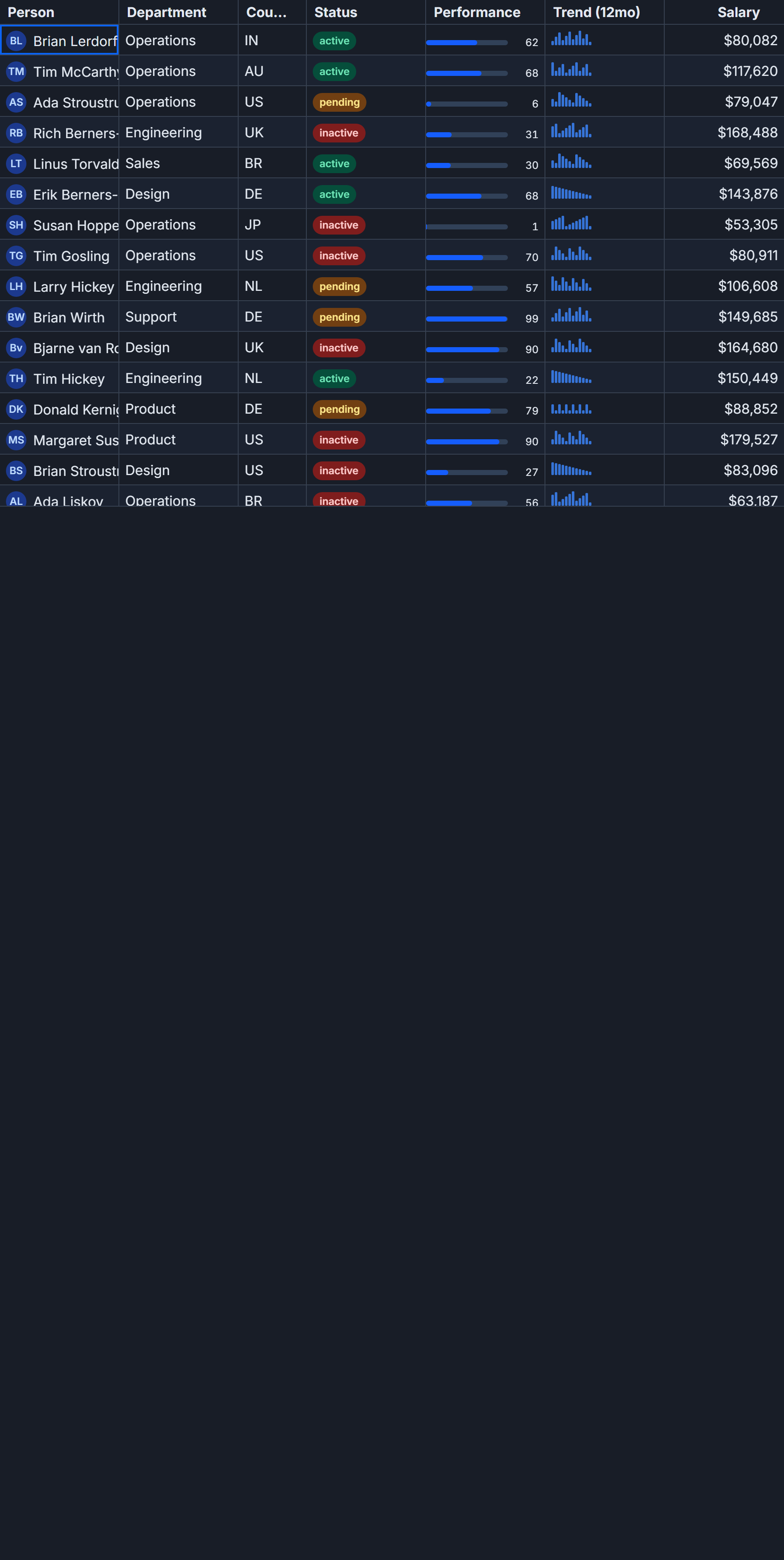
This is the architecture that makes custom renderers feel lightweight instead of a detour.
What the descriptor pattern actually does
When you write:
cell: (ctx) => renderSnippet(StatusBadge, { value: ctx.getValue() })
renderSnippet does not call the snippet. It returns a plain object - roughly { type: 'snippet', fn: StatusBadge, props: { value } }. The grid stores that descriptor in the cell's render slot. When the row scrolls into the viewport, FlexRender receives the descriptor and calls {@render descriptor.fn(descriptor.props)} inside its own template.
The consequence: your snippet runs inside the grid's Svelte render tree. It has access to Svelte context and transitions. But the raw accessor value the snippet never touches is what drives api.setSort, api.setFilter, and keyboard navigation. You can render a colored circle and the column still sorts alphabetically by the underlying string. No extra configuration needed.
A real example: task tracker with three custom columns
The scenario below has 120 rows, each with id, title, status ('todo' | 'in-progress' | 'done'), progress (0-100), and assignee. Three columns get custom renderers: a pill-style status badge, a progress bar with a percentage label, and an actions column with Edit and Delete buttons. The title and assignee columns stay as plain text.
<script lang="ts">
  import {
    SvGrid,
    tableFeatures,
    rowSortingFeature,
    rowSelectionFeature,
    renderSnippet,
    type ColumnDef,
    type CellContext,
    type SvGridApi,
  } from '@svgrid/grid'

  type Status = 'todo' | 'in-progress' | 'done'

  type Task = {
    id: number
    title: string
    status: Status
    progress: number
    assignee: string
  }

  const STATUS_COLOR: Record<Status, string> = {
    'todo':        '#64748b',
    'in-progress': '#f59e0b',
    'done':        '#10b981',
  }

  const features = tableFeatures({ rowSortingFeature, rowSelectionFeature })

  // seed data
  const NAMES = ['Alice', 'Bob', 'Carmen', 'Dmitri', 'Eva']
  const STATUSES: Status[] = ['todo', 'in-progress', 'done']
  const data: Task[] = Array.from({ length: 120 }, (_, i) => ({
    id: i + 1,
    title: `Task ${String(i + 1).padStart(3, '0')}`,
    status: STATUSES[i % 3],
    progress: Math.min(100, (i % 100) + 1),
    assignee: NAMES[i % NAMES.length],
  }))

  let api: SvGridApi | undefined

  function handleEdit(task: Task) {
    console.log('edit', task.id)
  }

  function handleDelete(task: Task) {
    if (!api) return
    api.applyTransaction({ remove: [task] })
  }

  const columns: ColumnDef<Task>[] = [
    { accessorKey: 'id',       header: '#',        size: 60  },
    { accessorKey: 'title',    header: 'Title',    size: 240 },
    { accessorKey: 'assignee', header: 'Assignee', size: 150 },
    {
      accessorKey: 'status',
      header: 'Status',
      size: 150,
      cell: (ctx: CellContext<Task, Status>) =>
        renderSnippet(StatusBadge, { value: ctx.getValue() }),
    },
    {
      accessorKey: 'progress',
      header: 'Progress',
      size: 180,
      cell: (ctx: CellContext<Task, number>) =>
        renderSnippet(ProgressBar, { value: ctx.getValue() }),
    },
    {
      id: 'actions',
      header: '',
      size: 140,
      enableSorting: false,
      cell: (ctx: CellContext<Task, unknown>) =>
        renderSnippet(ActionButtons, { row: ctx.row.original }),
    },
  ]
</script>

{#snippet StatusBadge(props: { value: Status })}
  <span style="
    display: inline-block;
    padding: 2px 10px;
    border-radius: 999px;
    font-size: 0.72rem;
    font-weight: 600;
    background: {STATUS_COLOR[props.value]}22;
    color: {STATUS_COLOR[props.value]};
    border: 1px solid {STATUS_COLOR[props.value]}55;
    white-space: nowrap;
  ">{props.value}</span>
{/snippet}

{#snippet ProgressBar(props: { value: number })}
  <div style="display:flex;align-items:center;gap:6px;width:100%;padding:0 4px">
    <div style="flex:1;height:6px;background:#e2e8f0;border-radius:3px;overflow:hidden">
      <div style="
        height: 100%;
        width: {props.value}%;
        background: #6366f1;
        border-radius: 3px;
        transition: width 120ms ease;
      "></div>
    </div>
    <span style="font-size:0.72rem;color:#64748b;width:28px;text-align:right">
      {props.value}%
    </span>
  </div>
{/snippet}

{#snippet ActionButtons(props: { row: Task })}
  <div style="display:flex;gap:6px">
    <button
      onclick={() => handleEdit(props.row)}
      style="padding:2px 10px;border-radius:4px;border:1px solid #6366f1;
             color:#6366f1;background:transparent;cursor:pointer;font-size:0.75rem"
    >Edit</button>
    <button
      onclick={() => handleDelete(props.row)}
      style="padding:2px 10px;border-radius:4px;border:1px solid #ef4444;
             color:#ef4444;background:transparent;cursor:pointer;font-size:0.75rem"
    >Delete</button>
  </div>
{/snippet}

<SvGrid
  {features}
  {data}
  {columns}
  height={560}
  rowHeight={42}
  sortable
  onApiReady={(a) => { api = a }}
/>
A few things worth paying attention to in that column definition:
ctx.row.original on the actions column gives you the full Task object, not just the cell value. That is how you pass sibling field data into a renderer without duplicating accessors or building a separate lookup.
enableSorting: false on the id-only actions column is required. There is no accessorKey, so the sort pipeline has nothing to compare. Without this flag, the sort icon still appears in the header and clicking it produces a silent no-op - technically harmless, confusing in practice.
Swapping snippets for components
Snippets are the right choice when the renderer is small and co-located with the grid definition. If you have a genuinely complex cell - one with its own local state, lifecycle hooks, or that you reuse across multiple grids - a full Svelte component is cleaner. The API is identical:
import { renderComponent } from '@svgrid/grid'
import StatusBadgeComponent from '$lib/StatusBadge.svelte'

// in column def:
{
  accessorKey: 'status',
  header: 'Status',
  size: 150,
  cell: (ctx) =>
    renderComponent(StatusBadgeComponent, { value: ctx.getValue() }),
}
renderComponent returns the same descriptor shape as renderSnippet, just with a different type field. FlexRender handles both. The practical difference is that component instantiation carries slightly more overhead than a snippet call, which starts to matter around 10,000+ visible cells with column virtualization scrolling fast. For typical grids with 50-100 visible rows, the difference is not measurable.
Conditional formatting without a custom renderer
If your only goal is color-coding cells based on value thresholds, you do not need a custom renderer at all. The conditionalFormat column option handles this with zero DOM overhead:
import { resolveCellFormat } from '@svgrid/grid'

const columns: ColumnDef<Task>[] = [
  {
    accessorKey: 'progress',
    header: 'Progress',
    size: 120,
    conditionalFormat: [
      { condition: ({ value }) => value < 30,  style: { color: '#ef4444', fontWeight: 'bold' } },
      { condition: ({ value }) => value >= 80, style: { color: '#10b981' } },
    ],
  },
]
The grid applies the first matching rule per cell. Rules are evaluated in order, so put the more specific conditions first. This is the right pattern for number ranges, date staleness indicators, and RAG status coloring where you just want a style change rather than a structural DOM change.
Performance notes for large datasets
Snippets run on every repaint of a visible cell. With virtualization active this is bounded to the rows in the viewport, but a few patterns add unnecessary cost:
- Constructing
new Intl.DateTimeFormat(...)or similar format objects inside the snippet body allocates on every render. Declare the formatter once in the outer<script>scope and reference it from the snippet. - Inline style strings are fine for under 500 visible rows. At scale, move to CSS classes and apply them by name. A snippet that appends
class="badge badge-done"to the DOM is faster than one that writes a full style attribute string per cell. - Avoid calling
$derivedor reactive computations from inside a snippet. Snippets run insideFlexRender's render tree, not the parent component's reactivity graph. Derived values that depend on per-row data belong in the props you pass torenderSnippet, not in the snippet body itself.
The mutating example above - the Delete button calling api.applyTransaction({ remove: [task] }) - shows how action renderers talk back to the grid. Capture the api reference via onApiReady, close over it in your handler, and the grid re-renders affected rows automatically. There is no need to manually update data or trigger a re-render.
Related reading
- Progress and Percentage Bar Cells in SvGrid
- A Right-Click Context Menu for Your Svelte Data Grid
- Cell Tooltips Done Right in a Data Grid
- Avatar and Image Cells in SvGrid
- An Actions Column (Edit, Delete) in SvGrid
Tagged: Custom cell renderers