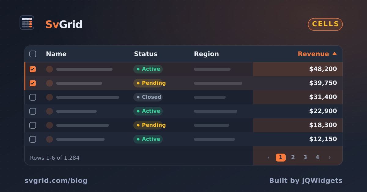
Status Badge Cells in SvGrid
Turn a plain text status column into colored, accessible pill badges without breaking sort, filter, or virtualization - using SvGrid's snippet cell renderer.
Every support dashboard has a status column. Every status column starts as plain text. And every developer eventually looks at a table full of "active", "pending", "closed" strings and adds colored pills. The trick is doing it without breaking sort, filter, or anything else the grid manages for you.
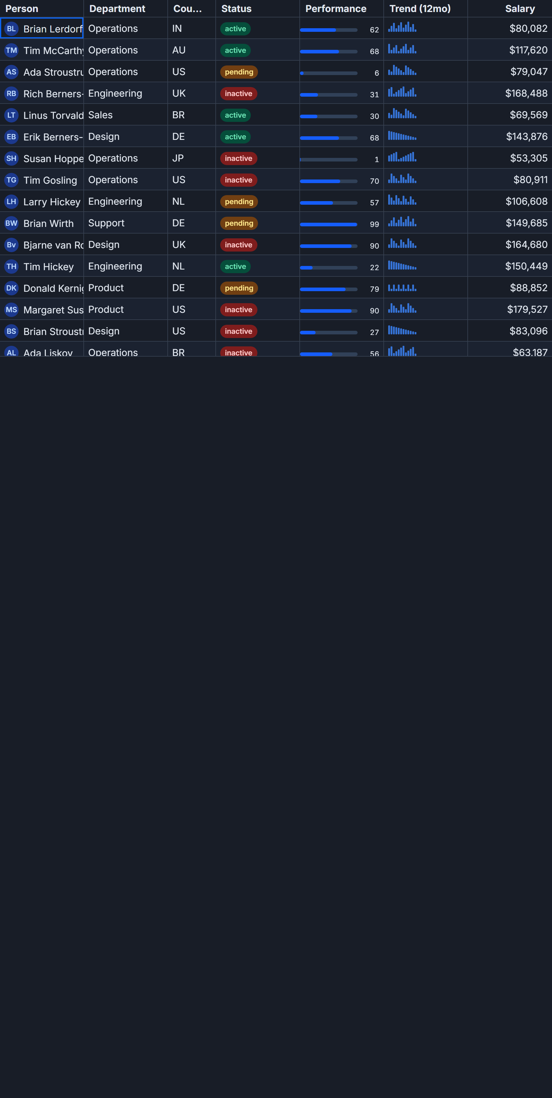
SvGrid's cell property on a column definition accepts a Svelte 5 snippet. That snippet renders into the cell's DOM slot on each paint cycle. The grid's sort and filter pipeline never touches rendered output - it reads the raw accessor value from field or fieldFn. That separation is what makes custom badge cells clean: the grid does grid things, the snippet does display things, and they do not interfere with each other.
Separating display from data
Before writing a single component, define the badge metadata outside any component. This is the single source of truth for how a status value maps to a label and a color.
// lib/status-meta.ts
export type TicketStatus = 'active' | 'pending' | 'on_hold' | 'closed'

export const STATUS_META: Record<
  TicketStatus,
  { label: string; color: string }
> = {
  active:  { label: 'Active',   color: '#34d399' },
  pending: { label: 'Pending',  color: '#fbbf24' },
  on_hold: { label: 'On Hold',  color: '#818cf8' },
  closed:  { label: 'Closed',   color: '#94a3b8' },
}
Keep this in its own module. The column definition imports it, the snippet imports it, and any server-side code that needs to validate status values can import it too. Adding a fifth status is one line here and zero lines anywhere else.
Do not fold the label into the column's fieldFn. If fieldFn: (row) => STATUS_META[row.status].label returns "Active" instead of "active", the Excel-style filter will list "Active" as the filter option but try to match it against rows whose stored value is "active". Users filter, see no results, and assume the filter is broken. Always keep the accessor returning the stored value and put display formatting in the renderer.
The badge column
Here is the full ticket grid with the status badge column wired in:
<script lang="ts">
  import SvGrid, {
    tableFeatures,
    rowSortingFeature,
    columnFilteringFeature,
    rowPaginationFeature,
    type ColumnDef,
    type SvGridApi,
  } from '@svgrid/grid'
  import { STATUS_META, type TicketStatus } from '$lib/status-meta'

  type Ticket = {
    id: number
    subject: string
    assignee: string
    status: TicketStatus
    createdAt: number
  }

  const statusKeys = Object.keys(STATUS_META) as TicketStatus[]

  const data: Ticket[] = Array.from({ length: 500 }, (_, i) => ({
    id: i + 1,
    subject: `Ticket #${String(i + 1).padStart(5, '0')}`,
    assignee: ['Alice', 'Bob', 'Carol', 'Dan'][i % 4]!,
    status: statusKeys[i % statusKeys.length]!,
    createdAt: Date.now() - i * 60_000,
  }))

  const features = tableFeatures({
    rowSortingFeature,
    columnFilteringFeature,
    rowPaginationFeature,
  })

  const columns: ColumnDef<typeof features, Ticket>[] = [
    { id: 'id',        field: 'id',        header: 'ID',       width: 70 },
    { id: 'subject',   field: 'subject',   header: 'Subject',  width: 280 },
    { id: 'assignee',  field: 'assignee',  header: 'Assignee', width: 140 },
    {
      id: 'status',
      field: 'status',
      header: 'Status',
      width: 130,
      cell: statusCell,
      // Human-readable labels in the filter dropdown
      filterValueFormatter: (val) =>
        STATUS_META[val as TicketStatus]?.label ?? String(val),
    },
    {
      id: 'createdAt',
      field: 'createdAt',
      header: 'Created',
      width: 170,
      cell: ({ value }) => new Date(value as number).toLocaleString(),
    },
  ]

  let api: SvGridApi | undefined

  function onApiReady(a: SvGridApi) {
    api = a
  }
</script>

{#snippet statusCell({ value }: { value: TicketStatus })}
  {@const meta = STATUS_META[value] ?? { label: value, color: '#94a3b8' }}
  <span
    class="badge"
    style="--badge-color: {meta.color}"
    role="status"
    aria-label={meta.label}
  >
    <span class="dot" aria-hidden="true"></span>
    {meta.label}
  </span>
{/snippet}

<SvGrid
  {data}
  {columns}
  sortable
  filterable
  pageable
  showFilterRow={true}
  virtualization={true}
  {onApiReady}
/>

<style>
  .badge {
    display: inline-flex;
    align-items: center;
    gap: 6px;
    padding: 2px 10px;
    border-radius: 999px;
    font-size: 13px;
    font-weight: 500;
    white-space: nowrap;
    color: var(--badge-color);
    background: color-mix(in srgb, var(--badge-color) 14%, transparent);
  }

  .dot {
    width: 6px;
    height: 6px;
    border-radius: 50%;
    background: var(--badge-color);
    flex-shrink: 0;
  }
</style>
A few things in that column definition are worth calling out.
filterValueFormatter is display-only. It tells the filter dropdown to show "Active" instead of "active" when the user opens the column's filter panel. The underlying filter predicate still runs against the raw stored value. Sort order is unaffected because filterValueFormatter is never consulted during sorting.
The cell property on the status column points directly at the {#snippet statusCell} declared below the script block. SvGrid mounts the snippet into the cell DOM node and re-renders it whenever the row's data changes. A ?? fallback inside the snippet means unknown status values render as gray text instead of nothing - useful when a new status arrives from the API before you've updated STATUS_META.
color-mix(in srgb, var(--badge-color) 14%, transparent) computes a tinted background without storing a second color per status. In dark mode, transparent resolves to whatever the document background is, so the tint automatically adapts. This works in Chrome 111+, Firefox 113+, and Safari 16.2+. For older Electron or WebView2 targets, pre-compute background hex values with alpha and store them in STATUS_META instead.
Updating badges at runtime
The grid is rendering snippets, not static HTML, so changing a row's status triggers an immediate repaint. Use the API's transaction method to avoid a full data swap:
// Transition ticket #42 from 'pending' to 'active'
function resolveTicket(id: number) {
  if (!api) return

  const rows = api.getData() as Ticket[]
  const target = rows.find((r) => r.id === id)
  if (!target) return

  api.applyTransaction({
    update: [{ ...target, status: 'active' }],
  })
}

// Bulk close all on-hold tickets
function closeOnHold() {
  if (!api) return

  const rows = api.getData() as Ticket[]
  const updates = rows
    .filter((r) => r.status === 'on_hold')
    .map((r) => ({ ...r, status: 'closed' as TicketStatus }))

  api.applyTransaction({ update: updates })
}

// Read back which statuses are currently visible after filtering
function getVisibleStatuses(): Set<TicketStatus> {
  if (!api) return new Set()
  const visible = api.getDisplayedRows() as Ticket[]
  return new Set(visible.map((r) => r.status))
}
applyTransaction patches individual rows in the internal data store and marks the affected cells dirty. Only those cells re-render - the rest of the 500-row grid stays untouched. For a streaming use case where status changes arrive over a WebSocket, calling applyTransaction per message is the right pattern. Calling api.getData() and reassigning the full array every time is unnecessary and noticeably slower at scale.
Accessibility notes
The role="status" on the badge <span> is appropriate when the badge reflects a live-updating value that users should be aware of without shifting focus. For a purely decorative indicator in a table cell, role="img" with an aria-label is also reasonable. The dot element carries aria-hidden="true" because the text label already conveys the full meaning to assistive technology - a redundant "green dot" announcement adds noise.
SvGrid's cell container preserves role="gridcell" on the wrapper element, so screen readers navigating with arrow keys see the snippet content as the cell's text content. You do not need to add any ARIA attributes at the grid level.
If your app needs to support Windows High Contrast Mode, add a forced-colors: active media query that swaps the badge background for a solid ButtonFace and the text color to ButtonText. The color-mix tint will collapse to a near-invisible wash in High Contrast Mode without this override.
When to skip the snippet and use conditional formatting instead
Snippets are the right tool when the badge needs interactive elements, dynamic structure, or anything beyond text and color. For a simpler case - just changing text color and background based on a value - SvGrid's conditionalFormat on the column definition is lighter and requires no snippet at all:
{
  id: 'status',
  field: 'status',
  header: 'Status',
  width: 130,
  conditionalFormat: [
    {
      condition: ({ value }) => value === 'active',
      style: { color: '#34d399', fontWeight: '600' },
    },
    {
      condition: ({ value }) => value === 'pending',
      style: { color: '#fbbf24', fontWeight: '600' },
    },
    {
      condition: ({ value }) => value === 'closed',
      style: { color: '#94a3b8' },
    },
  ],
}
This produces colored text with no DOM overhead beyond the cell's existing elements. It does not give you the pill shape, but for dense tables where every pixel of vertical rhythm matters it is often the better tradeoff. If a designer later wants the pill, swapping conditionalFormat for a snippet is a small, contained change.
The snippet approach shown above is the right default when you want a badge with a distinct visual shape, a dot indicator, accessible labeling, or runtime color logic that goes beyond static conditions.
Related reading
- Sparkline Cells in a Svelte Data Grid
- Progress and Percentage Bar Cells in SvGrid
- Avatar and Image Cells in SvGrid
- An Actions Column (Edit, Delete) in SvGrid
- Cell Tooltips Done Right in a Data Grid
Tagged: Cells, Custom cell renderers