Progress and Percentage Bar Cells in SvGrid
Build in-cell progress bars in your Svelte 5 data grid - with color thresholds, accessible markup, and sorting that still works.
Raw numbers in a data grid are hard to scan. A column full of values like 73, 12, 98, 41 tells you almost nothing at a glance - you have to read each one and carry context from cell to cell. A bar changes that. You see 98 as "basically done" and 12 as "barely started" before your brain even processes the digits.
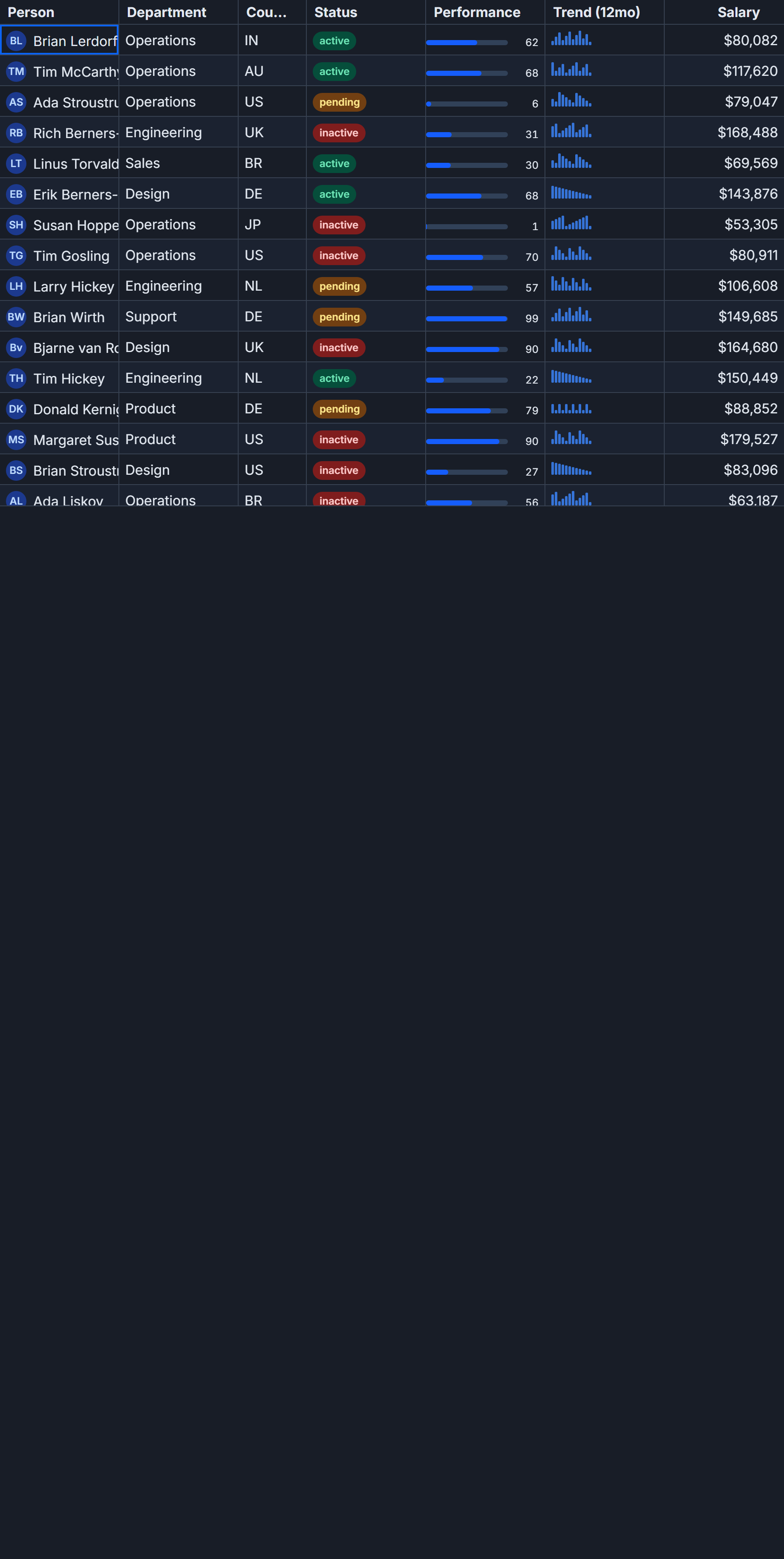
SvGrid cells accept any Svelte snippet, so a progress bar is just HTML and a couple of CSS rules. The trick is knowing which concerns belong to the cell renderer and which belong to the column definition - get that boundary wrong and you lose sorting, filtering, and conditional formatting.
The bar lives in the snippet, the value lives in the field
This is the only rule worth internalizing before writing any custom cell: the column's field or accessorFn owns the value. The snippet owns the presentation. If you compute or transform the value inside your snippet, you break every feature that reads the column's value - sorting, filtering, column stats, copy-to-clipboard.
Here is the correct pattern:
<script lang="ts">
  import SvGrid, { renderSnippet, type ColumnDef } from '@svgrid/grid'

  type Row = { task: string; progress: number }

  const data: Row[] = [
    { task: 'Data migration', progress: 87 },
    { task: 'UI redesign', progress: 34 },
    { task: 'API integration', progress: 100 },
    { task: 'QA testing', progress: 12 },
    { task: 'Documentation', progress: 61 },
  ]
</script>

{#snippet ProgressCell(p: { value: number })}
  {@const pct = Math.max(0, Math.min(100, p.value))}
  <div
    class="progress-track"
    role="progressbar"
    aria-valuenow={pct}
    aria-valuemin={0}
    aria-valuemax={100}
    aria-label="{pct}% complete"
  >
    <div class="progress-fill" style="width:{pct}%"></div>
    <span class="progress-label">{pct}%</span>
  </div>
{/snippet}

{@const columns: ColumnDef[] = [
  { id: 'task', field: 'task', header: 'Task', width: 200 },
  {
    id: 'progress',
    field: 'progress',
    header: 'Progress',
    width: 160,
    cell: (ctx) => renderSnippet(ProgressCell, { value: ctx.getValue<number>() }),
  },
]}

<SvGrid {data} {columns} sortable />
The column reads from field: 'progress', so clicking the header sorts by the real number. The snippet receives the value and renders the bar. These concerns never mix.
Styling the track and fill
CSS variables from SvGrid's token set keep the bar consistent with whatever theme is active:
.progress-track {
  position: relative;
  height: 16px;
  border-radius: 8px;
  background: color-mix(in srgb, var(--sg-fg) 8%, transparent);
  overflow: hidden;
  margin: 0 4px;
}

.progress-fill {
  height: 100%;
  border-radius: 8px;
  background: var(--sg-accent);
  transition: width 150ms ease;
}

.progress-label {
  position: absolute;
  inset: 0;
  display: flex;
  align-items: center;
  justify-content: center;
  font-size: 11px;
  font-weight: 600;
  color: var(--sg-fg);
  mix-blend-mode: difference;
}
mix-blend-mode: difference on the label keeps the text readable whether it sits on the filled portion or the empty track. If you find blend modes unreliable in your target browsers, use two overlapping spans instead - one clipped to the fill region and one for the empty region, each with a contrasting color.
Color thresholds
A single-color bar is better than a number. A threshold-colored bar is better still. Color maps progress to status: green means on track, amber means at risk, red means blocked. You can drive this entirely from the snippet, since color is presentation:
{#snippet ThresholdBar(p: { value: number })}
  {@const pct = Math.max(0, Math.min(100, p.value))}
  {@const color =
    pct >= 80 ? 'var(--color-success, #22c55e)' :
    pct >= 40 ? 'var(--color-warning, #f59e0b)' :
                'var(--color-danger,  #ef4444)'}

  <div
    class="progress-track"
    role="progressbar"
    aria-valuenow={pct}
    aria-valuemin={0}
    aria-valuemax={100}
    aria-label="{pct}% complete"
  >
    <div class="progress-fill" style="width:{pct}%; background:{color}"></div>
    <span class="progress-label">{pct}%</span>
  </div>
{/snippet}
The thresholds are expressed as plain numbers - easy to adjust, easy to read. If your threshold boundaries come from server config or user preferences, pull them in through a prop or a context store rather than hardcoding them.
When you want SvGrid's conditional formatting instead
If you want the whole cell - background, text color, font weight - to change based on the value, the conditionalFormat column option is the cleaner path. It avoids writing threshold logic inside your snippet:
import { resolveCellFormat, type ColumnDef } from '@svgrid/grid'

const columns: ColumnDef[] = [
  {
    id: 'progress',
    field: 'progress',
    header: 'Progress',
    width: 160,
    cell: (ctx) => renderSnippet(ProgressCell, { value: ctx.getValue<number>() }),
    conditionalFormat: [
      {
        condition: ({ value }) => value < 40,
        style: { color: '#ef4444', fontWeight: '700' },
      },
      {
        condition: ({ value }) => value >= 80,
        style: { color: '#16a34a' },
      },
    ],
  },
]
The conditional format applies to the cell wrapper, so it affects the label text and can tint the cell background independently of the bar fill. Use it when the visual state should be obvious even before the bar width registers, such as a status overview where users scan the label color more than the bar length.
Stacked and segmented variants
Some use cases need a segmented bar - completed, in-progress, and blocked as three colored segments in one cell. The data shape changes (you need three fields or a structured value), but the rendering principle stays the same:
{#snippet SegmentedBar(p: { done: number; inProgress: number; blocked: number })}
  {@const total = p.done + p.inProgress + p.blocked}
  {@const pDone = total > 0 ? (p.done / total) * 100 : 0}
  {@const pActive = total > 0 ? (p.inProgress / total) * 100 : 0}
  {@const pBlocked = total > 0 ? (p.blocked / total) * 100 : 0}

  <div class="seg-track" role="img" aria-label="Done {p.done}, In progress {p.inProgress}, Blocked {p.blocked}">
    <div class="seg done"   style="width:{pDone}%"></div>
    <div class="seg active" style="width:{pActive}%"></div>
    <div class="seg blocked" style="width:{pBlocked}%"></div>
  </div>
{/snippet}
.seg-track { display: flex; height: 14px; border-radius: 7px; overflow: hidden; gap: 1px; }
.seg       { height: 100%; }
.seg.done    { background: #22c55e; }
.seg.active  { background: #f59e0b; }
.seg.blocked { background: #ef4444; }
For segmented bars the field on the column still matters - point it at whichever sub-value you want to sort by. If you want to sort by "done count", set field: 'done' and the accessor pulls from the right property.
One thing to watch with virtualization
SvGrid virtualizes rows by default. When a row scrolls out of view its DOM node is reused. If your progress bar uses a CSS transition on width, you may briefly see the fill animate from the previous row's value to the new one as cells are recycled. This is usually imperceptible at normal scroll speeds, but if it bothers you, either remove the transition or reset it on mount:
{#snippet ProgressCell(p: { value: number })}
  {@const pct = Math.max(0, Math.min(100, p.value))}
  <div class="progress-track" ...>
    <div
      class="progress-fill"
      style="width:{pct}%; transition: none"
    ></div>
  </div>
{/snippet}
Removing the transition entirely is the pragmatic call for most grids. Reserve animated bars for dashboards where rows do not scroll - where you are showing live updates to a fixed set of items and the animation communicates that a value just changed.
Progress bars are one of those additions that take ten minutes to build and immediately make a grid feel like a product rather than a spreadsheet. The pattern scales from a single completion column to a full project-tracking view with segment bars, threshold colors, and sorted-by-value headers.
Related reading
- Status Badge Cells in SvGrid
- Sparkline Cells in a Svelte Data Grid
- Cell Tooltips Done Right in a Data Grid
- Avatar and Image Cells in SvGrid
- An Actions Column (Edit, Delete) in SvGrid
Tagged: Cells, Custom cell renderers