Sparkline Cells in a Svelte Data Grid
Show inline trend sparklines inside grid cells using SvGrid's built-in sparkline column property - no charting library needed, just a field that holds a number array.
A single latest value almost always lies. A revenue figure of $142k is neutral until you know it was $380k four weeks ago. Showing the full series as a sparkline next to the number tells that story instantly, and it takes about four lines of column definition to wire up in SvGrid.
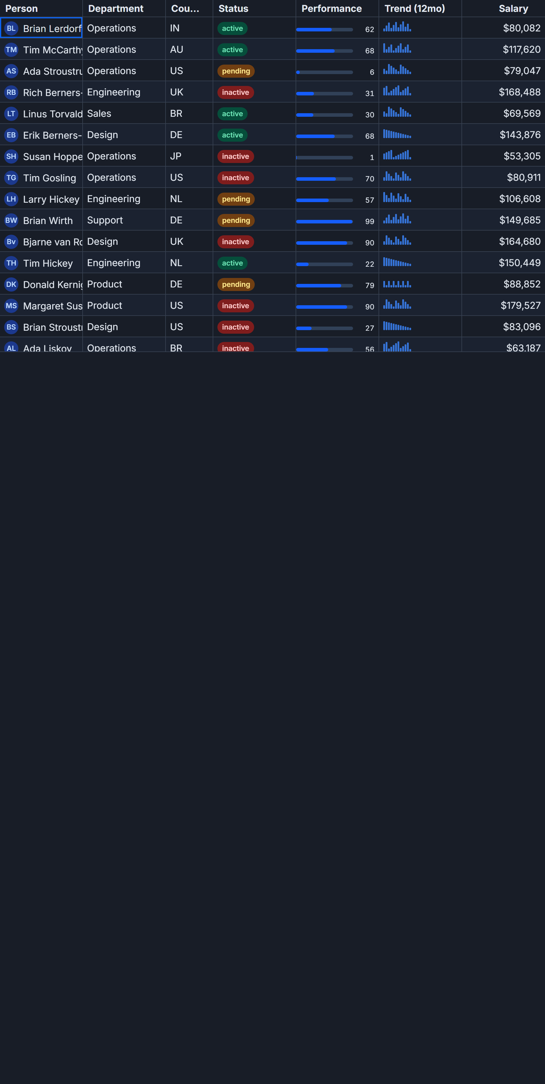
The sparkline property on ColumnDef is the entire API surface. Point it at a field that holds a number[], pick a type, and the grid handles the rest - SVG generation, min/max normalization, virtualization-aware rendering, all of it.
What you actually get from buildSparkline
SvGrid ships buildSparkline as a named export from @svgrid/grid. When the grid sees a sparkline key on a column definition it calls this function internally. The function normalizes the array to a 0-1 range, generates either a polyline path (line and area types) or a set of <rect> elements (bar type), and returns raw SVG markup. That markup drops into the cell through the same renderSnippet pathway used by fully custom cells.
Three types are available:
'line'- a stroked polyline connecting each data point'area'- the same polyline but filled to the baseline'bar'- vertical bars whose height is proportional to each value relative to the series range
Color defaults to --sg-accent from the grid's CSS token system if you leave it unset. Passing an explicit hex or CSS value overrides it. One thing to know early: color: 'var(--sg-accent)' will not resolve at build time. If you want a color that follows the active theme, omit the color key entirely.
A product dashboard with four sparkline columns
Here is a complete working example - a product table where each row carries four separate time-series arrays. The setup includes seeded fake data so the demo stays reproducible across hot reloads.
<script lang="ts">
  import SvGrid, { tableFeatures, rowSortingFeature, type ColumnDef } from '@svgrid/grid'

  const features = tableFeatures({ rowSortingFeature })

  type Row = {
    id: number
    product: string
    revenue: number[]   // 16 weekly readings, ~$k
    volume: number[]    // 12 weekly unit counts
    delta: number[]     // 14 signed week-over-week changes
    streak: number[]    // 14 win/loss signals: +1 or -1
  }

  // Seeded LCG so results are identical on every reload
  let seed = 0x2f6e2b1
  function rnd() {
    seed = (seed * 1664525 + 1013904223) >>> 0
    return seed / 0xffffffff
  }
  function series(n: number, base: number, swing: number): number[] {
    const out: number[] = []
    let v = base
    for (let i = 0; i < n; i++) {
      v += (rnd() - 0.45) * swing
      out.push(Math.round(v))
    }
    return out
  }
  function signs(n: number): number[] {
    return Array.from({ length: n }, () => (rnd() > 0.42 ? 1 : -1))
  }

  const PRODUCTS = [
    'Industrial PLC', 'Cordless driver', 'Stainless rivets', 'Aluminum stock',
    'Wire rope', 'Hardwood pallet', 'I/O module', 'Torque wrench',
    'Steel sheet', 'Drum, 55 gal', 'Bearing set', 'Hydraulic hose',
  ]

  const rows: Row[] = PRODUCTS.map((product, id) => ({
    id,
    product,
    revenue: series(16, 100, 40),
    volume:  series(12, 50, 60).map((v) => Math.max(0, v)),
    delta:   series(14, 0, 30),
    streak:  signs(14),
  }))

  const columns: ColumnDef<typeof features, Row>[] = [
    { field: 'product', header: 'Product', width: 180 },
    {
      field: 'revenue',
      header: 'Revenue (line)',
      width: 160,
      align: 'center',
      sparkline: { type: 'line' },
    },
    {
      field: 'revenue',
      id: 'revenue-area',
      header: 'Revenue (area)',
      width: 160,
      align: 'center',
      sparkline: { type: 'area', color: '#0ea5e9' },
    },
    {
      field: 'volume',
      header: 'Volume (bar)',
      width: 160,
      align: 'center',
      sparkline: { type: 'bar', color: '#a78bfa' },
    },
    {
      field: 'delta',
      header: 'Delta (line)',
      width: 160,
      align: 'center',
      sparkline: { type: 'line', color: '#f97316' },
    },
    {
      field: 'streak',
      header: 'Win/Loss (bar)',
      width: 160,
      align: 'center',
      sparkline: { type: 'bar' },
    },
  ]
</script>

<div style="height: 480px;">
  <SvGrid {features} {rows} {columns} rowHeight={40} />
</div>
That is the complete component. No external SVG library, no <canvas> wrangling, no manual coordinate math.
Notice the two revenue columns: one renders as a line, one as an area, both reading the same field. The second column needs an explicit id: 'revenue-area' - without it, the grid deduplicates by field key and silently drops one of the two definitions. Any time you put the same field on more than one column, assign a unique id.
Sorting on array fields
This is the most common mistake with sparkline columns. If rowSortingFeature is active and the user clicks a sparkline column header, the sort compares the raw number[] values - which means it stringifies them and sorts lexicographically. The result looks random.
The fix is to provide a custom sort function on the column definition:
const columns: ColumnDef<typeof features, Row>[] = [
  {
    field: 'revenue',
    header: 'Revenue',
    width: 160,
    align: 'center',
    sparkline: { type: 'line' },
    sortingFn: (a, b) =>
      (a.original.revenue.at(-1) ?? 0) - (b.original.revenue.at(-1) ?? 0),
  },
  // ...rest of columns
]
This sorts by the most recent value in the series, which is usually what the user expects when clicking a trend column. You could also sort by average, by total, or by the slope of a linear regression over the series - all valid depending on what the sparkline represents.
If you want a sortable numeric column to appear alongside the sparkline without duplicating the visual, add a hidden column:
const columns: ColumnDef<typeof features, Row>[] = [
  {
    id: 'revenue-sort',
    field: 'revenue',
    header: '',
    width: 0,
    visible: false,
    getValue: (row) => row.revenue.at(-1) ?? 0,
  },
  {
    field: 'revenue',
    header: 'Revenue',
    width: 160,
    align: 'center',
    sparkline: { type: 'line' },
    // Users sorting this column will trigger the hidden column's comparator
    // if you wire sortField: 'revenue-sort' here
    sortField: 'revenue-sort',
  },
]
Edge cases worth knowing before you ship
Flat series. When every value in the array is identical, the min/max range collapses to zero and buildSparkline maps all points to the vertical midpoint. You get a horizontal line at 50% height. That is technically correct behavior, but users sometimes report it as a rendering bug. Either normalize your data to exclude flat series, or add a tooltip that surfaces the raw value so users understand what they are looking at.
Row height. The SVG renders into a fixed internal height of 24 px with 2 px top and bottom padding. Setting rowHeight below 28 px will clip the sparkline. For practical readability, 36-40 px is the comfortable range - enough that the trend shape is readable without the row feeling oversized.
Accessibility. Every sparkline SVG is rendered with aria-hidden="true". The raw array is not announced by screen readers by default, which is intentional - a 16-element number array as an ARIA label would be noise. If the column needs to be accessible, pair it with a sibling column that surfaces a derived value (last reading, percent change, trend direction) as plain text. Mark that sibling as header: '' and set a screen-reader-only label with a CSS utility class if the visual pairing makes it obvious.
Works with all row model features. The sparkline property is a cell-rendering concern only. It is orthogonal to grouping, pagination, server-side data sources, and row expanding. As long as the row's field value is a number[] when the cell renders, the sparkline works regardless of how rows were fetched or organized.
Combining sparklines with conditional formatting
A pattern that works well: use conditionalFormat on a derived numeric column to add a heatmap background, and put the sparkline in the adjacent column. The user gets both the trend shape and the magnitude context at the same time.
import { resolveCellFormat } from '@svgrid/grid'

const columns: ColumnDef<typeof features, Row>[] = [
  {
    id: 'revenue-latest',
    field: 'revenue',
    header: 'Latest',
    width: 80,
    getValue: (row) => row.revenue.at(-1) ?? 0,
    conditionalFormat: [
      { condition: ({ value }) => value < 60,  style: { background: '#fecaca' } },
      { condition: ({ value }) => value >= 120, style: { background: '#bbf7d0' } },
    ],
  },
  {
    field: 'revenue',
    id: 'revenue-spark',
    header: 'Trend',
    width: 140,
    align: 'center',
    sparkline: { type: 'area' },
  },
]
The Latest column shows the scalar with red/green background. The Trend column next to it shows the history. Together they answer both "where is it now" and "how did it get here."
The live demo for this feature is at /demos/140-sparkline-cells, showing all four sparkline types with the seeded data from this post. The implementation lives in packages/grid/src/sparkline.ts - under 150 lines, no dependencies outside the grid itself.
Related reading
- Progress and Percentage Bar Cells in SvGrid
- Avatar and Image Cells in SvGrid
- An Actions Column (Edit, Delete) in SvGrid
- Cell Tooltips Done Right in a Data Grid
- Avoiding Layout Thrash in Custom Grid Cells
Tagged: Cells, Custom cell renderers