Render Your First Svelte Data Grid in Under 5 Minutes
A step-by-step guide to adding a fast, accessible data grid to a Svelte 5 app with SvGrid - data, columns, and the features you get for free.
The first time I needed a table in a Svelte 5 app I started hand-rolling a <table> out of habit, then caught myself: sorting, keyboard navigation, accessibility, every bit of it was going to be mine to write and maintain. You really do not have to. SvGrid gets you a production-ready data grid in about fifteen lines, with all of that already handled.
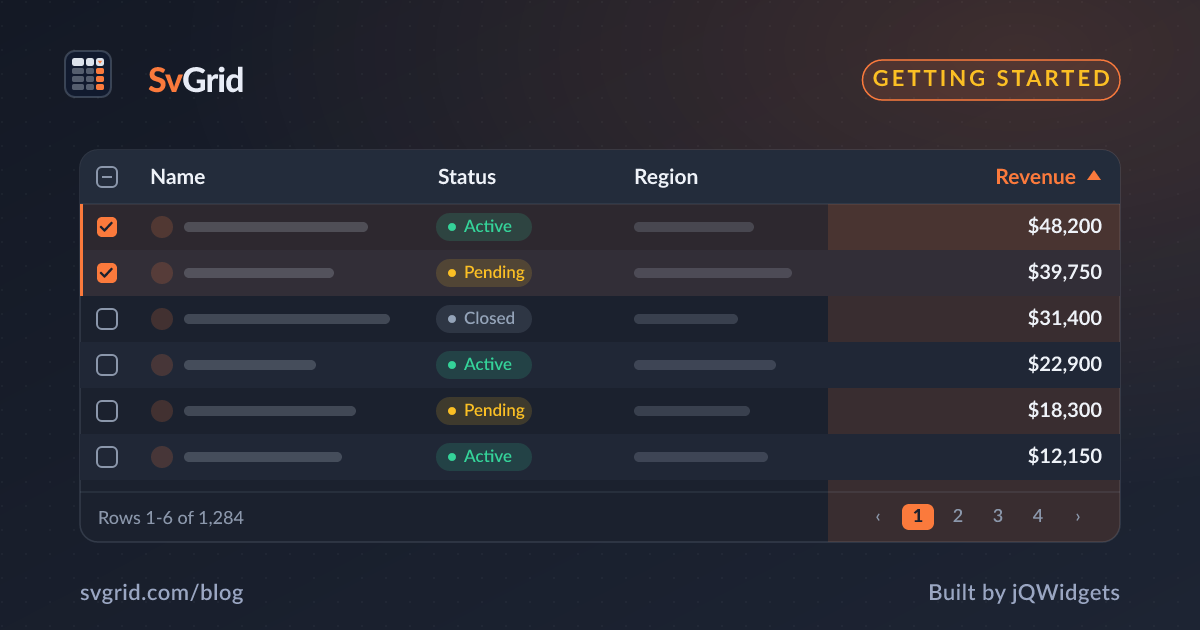
 The SvGrid quick-start demo: sorting, selection, and inline editing out of the box.
Install
npm add sv-grid-community
SvGrid Community is MIT-licensed and free for commercial use. There is no license key and no row-count cap.
The minimum grid
Pass two props: data (your rows) and columns (how to read and label each field).
<script lang="ts">
  import { SvGrid, type ColumnDef } from 'sv-grid-community'

  type Person = { firstName: string; age: number; status: string }

  const rows: Person[] = [
    { firstName: 'Ada',   age: 36, status: 'active' },
    { firstName: 'Linus', age: 54, status: 'active' },
    { firstName: 'Grace', age: 85, status: 'inactive' },
  ]

  const columns: ColumnDef<{}, Person>[] = [
    { field: 'firstName', header: 'First name' },
    { field: 'age',       header: 'Age' },
    { field: 'status',    header: 'Status' },
  ]
</script>

<SvGrid data={rows} columns={columns} />
That is a complete, working grid.
What you get for free
Even this tiny example ships:
- A semantic table with WAI-ARIA
role="grid",role="row", androle="gridcell"on every node. - Keyboard navigation: arrow keys move the active cell, Home/End jump to row edges, Ctrl+Home and Ctrl+End jump to the grid corners.
- A focus ring on the active cell and click-to-select.
- Auto-sized columns and the default
--sg-*theme with zebra rows, hover, and selection styles.
What comes next
Sorting, filtering, pagination, grouping, and editing are opt-in. You turn them on by registering features:
<script lang="ts">
  import { SvGrid, tableFeatures, rowSortingFeature, columnFilteringFeature } from 'sv-grid-community'

  const features = tableFeatures({ rowSortingFeature, columnFilteringFeature })
</script>

<SvGrid data={rows} columns={columns} features={features} filterMode="menu" />
Only register what you use - each feature is roughly 1-2 KB gzipped.
A more realistic example
The three-row table above proves the API; a real screen needs a few more pieces. Here is a grid with typed data, formatted columns, sorting, filtering, and pagination - still under thirty lines.
<script lang="ts">
  import {
    SvGrid,
    tableFeatures,
    rowSortingFeature,
    columnFilteringFeature,
    rowPaginationFeature,
    type ColumnDef,
  } from 'sv-grid-community'

  type Employee = {
    id: string
    name: string
    department: string
    salary: number
    startedAt: string // ISO date
  }

  let rows = $state<Employee[]>(/* ...load from your API... */ [])

  const columns: ColumnDef<{}, Employee>[] = [
    { field: 'name',       header: 'Name' },
    { field: 'department', header: 'Department' },
    { field: 'salary',     header: 'Salary', align: 'right', format: { type: 'currency', currency: 'USD' } },
    { field: 'startedAt',  header: 'Started', format: { type: 'date', pattern: 'y-m-d' } },
  ]

  const features = tableFeatures({
    rowSortingFeature,
    columnFilteringFeature,
    rowPaginationFeature,
  })
</script>

<SvGrid
  data={rows}
  columns={columns}
  features={features}
  filterMode="menu"
  showPagination={true}
  pageSize={25}
/>
A few things worth noticing:
- The
salarycolumn uses the built-in currency formatter, so it displays as$84,000but still sorts numerically. Formatting on the column - not inside an accessor - is what keeps the data pipeline correct. rowsis a Svelte$statearray. Push to it, splice it, or replace it, and the grid updates.- You added three features and two props, and got sortable headers, an Excel-style filter menu, and a pager.
Sizing the grid correctly
The most common first-day issue is a grid with no height. Virtualization needs a viewport to compute, so give the grid a bounded container. In a flex layout, that means flex: 1 plus min-height: 0:
<div style="display:flex; flex-direction:column; height:100vh;">
  <header>My toolbar</header>
  <div style="flex:1; min-height:0;">
    <SvGrid data={rows} columns={columns} />
  </div>
</div>
Without min-height: 0, flex children refuse to shrink, the grid grows past the viewport, and you get a second scrollbar instead of smooth internal scrolling.
Reacting to what the user does
When something outside the grid needs to know about a change - a "12 selected" pill, a URL that reflects the current sort, an analytics event - use the observable callbacks. The grid still owns its state; it just tells you when it changes.
<SvGrid
  data={rows}
  columns={columns}
  features={features}
  onSortingChange={(s) => (sorting = s)}
  onFiltersChange={(f) => (filters = f.columns)}
/>
Where to go next
From here, the natural next steps are:
- Make cells editable with validation
- Add Excel-style filtering
- Render 100,000 rows smoothly
- Drive the grid from your server
Each builds on the same data + columns + features shape you just learned.
Frequently asked questions
How do I add a data grid to a Svelte 5 app?
Install sv-grid-community, import SvGrid, and pass data and columns. A full grid is about fifteen lines, and sorting plus accessibility are on by default.
Is SvGrid free for commercial use?
Yes. sv-grid-community is MIT-licensed with no row cap or license key. The optional sv-grid-pro pack adds export, import, pivot, and AI features under a separate license.