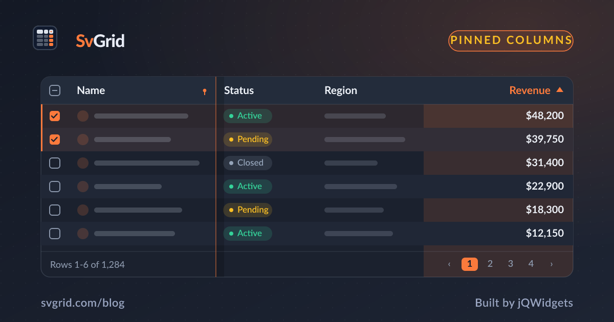
Pinned (Frozen) Columns for Wide Svelte Data Grids
How to pin identity and action columns in SvGrid so users never lose their place while scrolling wide tables - declarative config, runtime API, and the tradeoffs that matter.
Most usability problems in data grids trace back to the same root cause: the user loses context. Pinned columns solve the specific case where a table is wider than the viewport. You pin the row identity on the left and the action buttons on the right, and everything between them scrolls freely. It sounds simple, but the implementation details - when to use it, how many columns to pin, how to change pinning at runtime - are where people run into trouble.
Why wide tables break without it
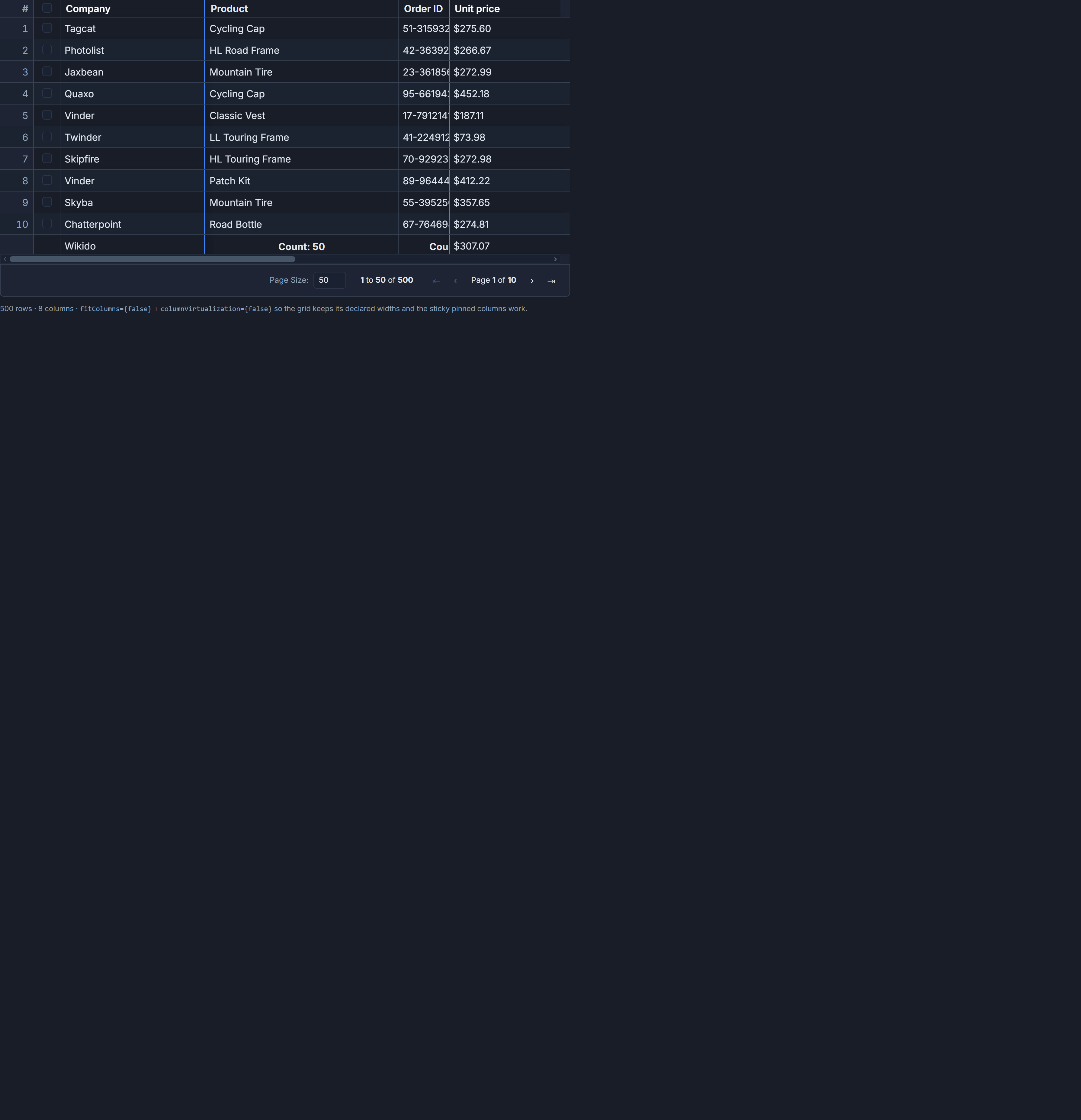
Picture an orders dashboard: company name, order ID, product, country, sell date, quantity, in-stock flag, and unit price. At comfortable widths that is around 1,800 pixels of declared column width. On a 1440-pixel screen, scrolling right to inspect unit price means the company column has already left the viewport. The user is now looking at a row with no label, which makes editing or clicking "Delete" genuinely risky.
The fix is two pinned properties - one on company, one on actions. Forty characters of config, zero layout code.
Declarative pinning in the column definition
The pinned property on a ColumnDef accepts 'left', 'right', or nothing at all. Pinned-left columns always render leftmost as a group, pinned-right always rightmost - their position in the columns array controls order within each group, not their visual side.
Here is the full column definition for the orders example, with correct widths set on the pinned columns:
import {
  tableFeatures,
  rowSortingFeature,
  columnFilteringFeature,
  rowSelectionFeature,
  type ColumnDef,
} from '@svgrid/grid'
import type { Order } from '../shared/seed'

const features = tableFeatures({
  rowSortingFeature,
  columnFilteringFeature,
  rowSelectionFeature,
})

const columns: ColumnDef<typeof features, Order>[] = [
  {
    field:  'company',
    header: 'Company',
    width:  200,
    pinned: 'left',      // always visible, anchors row identity
  },
  {
    field:  'orderId',
    header: 'Order ID',
    width:  160,
  },
  {
    field:  'product',
    header: 'Product',
    width:  300,
  },
  {
    field:  'country',
    header: 'Country',
    width:  180,
  },
  {
    field:   'sellDate',
    header:  'Sell date',
    width:   200,
    format:  { type: 'date', pattern: 'y-m-d' },
  },
  {
    field:  'quantity',
    header: 'Quantity',
    width:  140,
    format: { type: 'number', options: { maximumFractionDigits: 0 } },
  },
  {
    field:  'inStock',
    header: 'In stock',
    width:  130,
  },
  {
    field:   'price',
    header:  'Unit price',
    width:   170,
    format:  { type: 'currency', currency: 'USD' },
  },
  {
    id:     'actions',
    header: '',
    width:  120,
    pinned: 'right',     // Edit/Delete always reachable
    cell:   actionsCell,
  },
]
Two things here that bite people if they skip them. First, always set an explicit width on pinned columns. A pinned column without one falls back to whatever the default is - often 100px - and a company name at 100px truncates badly. Second, keep the total pinned width reasonable. Pinning 5 of 8 columns leaves only 3 columns in the scrollable center, and the horizontal scrollbar may disappear entirely because there is nothing to scroll. Two or three pinned columns is the practical ceiling for most layouts.
The component
Wiring the columns into SvGrid itself is straightforward. The grid handles the layered rendering internally:
<script lang="ts">
  import SvGrid, { renderSnippet, type SvGridApi } from '@svgrid/grid'
  import { makeOrders, type Order } from '../shared/seed'

  // columns defined above, imported or declared here
  let rows = $state<Order[]>(makeOrders(500))
  let api = $state<SvGridApi | undefined>()
</script>

{#snippet actionsCell({ row })}
  <button class="btn-sm" onclick={() => api?.startEditing(row.index, 'company')}>
    Edit
  </button>
  <button class="btn-sm danger" onclick={() => {}}>
    Delete
  </button>
{/snippet}

<SvGrid
  {features}
  {columns}
  data={rows}
  height={560}
  onApiReady={(g) => { api = g }}
/>
SvGrid splits the column list into three positioned layers - left-pinned, scrollable center, right-pinned. The outer two sit at left: 0 and right: 0 with a higher z-index and a box-shadow on the inner edge to mark the scroll boundary. The center layer scrolls under them. Pinned columns are always rendered (no virtualization needed for two columns) while the center columns go through createColumnVirtualizer - so a grid with 80 unpinned columns only renders the 12 to 15 currently visible. In practice a 500-row, 100-column table with two pinned columns runs without perceptible lag on mid-range hardware.
Changing pinning at runtime
Static column definitions cover most use cases. When you need a "Freeze column" item in a context menu, or a settings panel where each user can customize their view, the imperative API is the right path.
// Read current pinning state for all columns
const current = api.getColumnPinning()
// Returns an object like:
// { company: 'left', orderId: false, price: false, actions: 'right', ... }

// Pin 'country' to the left without touching anything else
api.setColumnPinning({ ...current, country: 'left' })

// Unpin 'country' again
api.setColumnPinning({ ...current, country: false })

// Programmatic "freeze first N columns" utility
function freezeFirstN(n: number) {
  const ids = columns.map(c => c.id ?? c.field ?? '')
  const pinning = Object.fromEntries(
    ids.map((id, i) => [id, i < n ? 'left' : false])
  )
  api.setColumnPinning(pinning)
}
One thing to be careful about: setColumnPinning expects the full pinning map, not a partial diff. Always spread the current state from getColumnPinning() and override only the key you want to change. Passing { country: 'left' } without the spread will silently unpin everything else.
Also, do not mutate the columns prop directly after mount expecting pinning to re-apply. That path does not trigger a layout recalculation. The API method is the only correct way to change pinning after the grid has initialized.
When to pin the checkbox column
If you are using rowSelectionFeature with a checkbox column, pin it left alongside the identity column. A floating checkbox that scrolls away with the center content makes row selection essentially inaccessible on wide grids. The pattern is straightforward:
const columns: ColumnDef<typeof features, Order>[] = [
  {
    id:     'select',
    header: selectAllSnippet,
    width:  48,
    pinned: 'left',    // checkbox must stay visible
    cell:   rowCheckboxSnippet,
  },
  {
    field:  'company',
    header: 'Company',
    width:  200,
    pinned: 'left',
  },
  // ... rest of columns
]
Both select and company are pinned left. They render in array order within the left group, so select comes first. This keeps selection and row identity together at the left edge, which is where users expect them.
Saving pinning state across sessions
Column pinning is part of the grid's serializable view state. If you want pinning choices to survive a page reload - as part of a named view or just via localStorage - api.getState() includes pinning and api.setState() restores it:
// On unmount or beforeunload, persist state
const state = api.getState()
localStorage.setItem('orders-grid-state', JSON.stringify(state))

// On mount, restore
const saved = localStorage.getItem('orders-grid-state')
if (saved) {
  api.setState(JSON.parse(saved))
}
For multi-view scenarios where different user roles want different pinning defaults, createNamedViews with localStorageViews is a cleaner solution - it handles serialization, naming, and switching in one API.
Pinning inside column groups
Column groups (hierarchical headers) work with pinning, but the behavior is at the leaf-column level, not the group level. If you have a group "Order details" spanning orderId, product, and sellDate, and you want orderId pinned, add pinned: 'left' to the orderId leaf column only. The group header spans whatever subset of its children fall in the left-pinned layer. If you pin half the children left and leave the other half unpinned, the group header splits across the layer boundary - which usually looks wrong. Either pin all children in a group or none of them.
The reference demo for this feature is at /demos/25-column-pinning. For pinning combined with complex grouped headers, the Gantt demo at /demos/45-gantt-chart is worth examining - it pins several task-metadata columns while a multi-month timeline scrolls right.