Column pinning
Pinning sticks a column to the left or right edge of the viewport so it does not scroll horizontally with the rest.
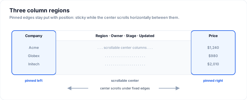
Live demo - pin Company left, Price right, scroll the middle:
Through the column menu
Every column header has a menu (the ⋮ button). The menu has "Pin left" /
"Pin right" / "Unpin" items.
Programmatically
SvGridApi exposes setColumnPinning and getColumnPinning for
read / write from outside the grid:
The examples on this page run against these rows:
<script lang="ts">
  import { SvGrid, type GridColumns } from '@svgrid/grid'

  type Person = {
    id: number
    name: string
    department: string
    city: string
    age: number
    salary: number
  }

  const people: Person[] = [
    { id: 1, name: 'Ada Lovelace',   department: 'Engineering', city: 'London',   age: 36, salary: 142000 },
    { id: 2, name: 'Grace Hopper',   department: 'Engineering', city: 'New York', age: 45, salary: 168000 },
    { id: 3, name: 'Linus Torvalds', department: 'Platform',    city: 'Portland', age: 54, salary: 155000 },
    { id: 4, name: 'Radia Perlman',  department: 'Networking',  city: 'Seattle',  age: 49, salary: 161000 },
    { id: 5, name: 'Barbara Liskov', department: 'Platform',    city: 'Boston',   age: 52, salary: 172000 },
  ]

  let rows = $state<Person[]>(people)
  const data = people

  const columns: GridColumns<Person> = [
    { field: 'name',       header: 'Name',       width: 200 },
    { field: 'department', header: 'Department', width: 150 },
    { field: 'city',       header: 'City',       width: 140 },
    { field: 'age',        header: 'Age',        width: 90 },
    { field: 'salary',     header: 'Salary',     width: 130, format: { type: 'currency', currency: 'USD' } },
  ]
</script>
<script lang="ts">
  import type { SvGridApi } from '@svgrid/grid'
  let api = $state<SvGridApi<typeof features, Person> | null>(null)
</script>

<SvGrid {data} {columns} features={features}
  onApiReady={(next) => (api = next)} />

<button onclick={() => api?.setColumnPinning({ left: ['company'], right: ['actions'] })}>
  Pin company left, actions right
</button>
<button onclick={() => api?.setColumnPinning({ left: [], right: [] })}>
  Unpin all
</button>
For initial pinning at mount, use the initialColumnPinning prop on
<SvGrid>:
<SvGrid {data} {columns} features={features}
  initialColumnPinning={{ left: ['company'], right: ['actions'] }} />
getColumnPinning() returns { left: string[]; right: string[] } -
the array order is the visible order along the pinned edge.
Rendering
- Pinned-left columns sit at the start of the visible row, with
position: sticky; left: <offset>px; z-index: 3. - Pinned-right columns sit at the end of the visible row, with
position: sticky; right: <offset>px; z-index: 3. - Offsets cascade - second-left column sits at the cumulative width of the first.
Styling
Pinned columns are visually differentiated from the scrollable middle through three layered cues:
- A distinct background tint so the pinned strip reads as "frozen" even before you scroll.
- A 1-pixel divider on the inside edge (the side facing the scrollable region) and a soft drop shadow that fades into the scroll area.
- A bolder header font weight so the frozen header reads as part of the grid chrome.
All three cues are driven by CSS custom properties. Override them to match your design system:
| Token | Default | Used for |
|---|---|---|
--sg-pinned-bg |
color-mix(in oklab, var(--sg-header-bg) 92%, var(--sg-accent) 8%) |
Body cells in pinned columns |
--sg-pinned-header-bg |
color-mix(in oklab, var(--sg-header-bg) 86%, var(--sg-accent) 14%) |
Header cells in pinned columns |
--sg-pinned-divider |
var(--sg-border) |
The 1-pixel inside-edge line |
--sg-pinned-shadow-color |
rgba(15, 23, 42, 0.22) |
The drop shadow into the scroll area |
Keep the pinned background opaque. When you override
--sg-pinned-bgwithcolor-mix, the two percentages must sum to 100%. If they add up to less (e.g.60% + 20% = 80%), CSS scales the result's alpha down to0.8- the pinned column turns semi-transparent and the scrolling middle columns bleed through it. Always pair the percentages asN%/(100 - N)%.
The fallbacks compute a subtle accent-tinted background from your existing header background, so a pinned column never looks identical to the rest of the grid even if you don't set anything. That works well for a low-chroma accent. If yours is saturated, the derived tint can get loud enough to compete with your selection colour - name a neutral fill instead and let the divider and shadow carry the boundary:
.themed-host {
  --sg-pinned-bg:           var(--sg-row-alt-bg);
  --sg-pinned-header-bg:    var(--sg-header-bg);
  --sg-pinned-divider:      var(--sg-border);
  --sg-pinned-shadow-color: rgba(94, 72, 52, 0.18);
}
To opt out of the tint and match the body exactly:
.themed-host {
  --sg-pinned-bg:        var(--sg-bg);
  --sg-pinned-header-bg: var(--sg-header-bg);
}
Or to make pinned columns very obvious - useful for high-density financial grids where the user must instantly know which side is frozen:
.themed-host {
  --sg-pinned-bg:        color-mix(in oklab, var(--sg-bg) 80%, var(--sg-accent) 20%);
  --sg-pinned-header-bg: color-mix(in oklab, var(--sg-bg) 70%, var(--sg-accent) 30%);
  --sg-pinned-divider:   var(--sg-accent);
}
Hover, selection, and zebra rows
The pinned tint sits under the hover, selection, and zebra row
backgrounds via stacked linear-gradient paints. That means:
- Hovering a row in a pinned cell shows the pinned tint with the hover overlay on top - the user still sees the row highlight.
- Selecting a row layers the selection colour over the pinned tint.
- Zebra rows re-paint the pinned cell so the alternating row background doesn't leak through the pin.
You don't need to override anything for these states to work; they
follow --sg-row-hover-bg, --sg-selection-bg, and the pinned tokens
automatically.
Multiple pinned columns
Multiple pins are stacked in the order they were pinned. The first-pinned column is the outermost.
Gotchas
- Pinning plus column virtualization is supported, but the pinned columns are always rendered (they never enter the virtualized window).
- If you have so many pinned columns that they exceed the viewport width there is no horizontal scrollbar within the pinned regions - the user loses access to the non-pinned middle. Pin only "anchor" columns (identifier, action, status) and keep the count single-digit.
Try it
Pinning is a grid-level prop naming column ids, not a flag on the column. Scroll the grid sideways: Name stays at the left edge, Salary at the right.
<SvGrid
  data={people}
  {columns}
  initialColumnPinning={{ left: ['name'], right: ['salary'] }}
/>
Pinning both edges
Pinned columns stay put while the middle scrolls. Narrow the browser and the two pinned columns hold their edges while Department and City pan between them.
<SvGrid
  data={people}
  {columns}
  initialColumnPinning={{ left: ['name'], right: ['salary'] }}
  sortable
/>
See also
- Column state
SvGridApireference -setColumnPinning/getColumnPinningsignatures.
Related articles
- Multi-Level (Grouped) Column Headers in SvGrid - Band related columns under a shared parent header using SvGrid's nested column definition - how to nest, pin, combine with sorting and filtering, and when NOT to use grouping.
- A Custom Column Header Menu in SvGrid - Build a per-column header menu for sort, hide, pin, and custom actions using header snippets and your own dropdown component.
- A Column Show/Hide Toggle in SvGrid - Build a column chooser panel that lets users show or hide columns at runtime, with persistence across page loads and a guard against hiding everything.