Building an IoT Sensor Dashboard in Svelte
How to build a live IoT sensor dashboard with SvGrid - high-frequency updates, sparkline trends, threshold alerts, and stale-device detection that all stay smooth at scale.
A factory floor with 800 sensors reporting every two seconds gives you 1,600 row updates per second. A naive grid implementation will drop frames, leak memory, or just lock the browser. The grid has to be smarter than a spreadsheet.
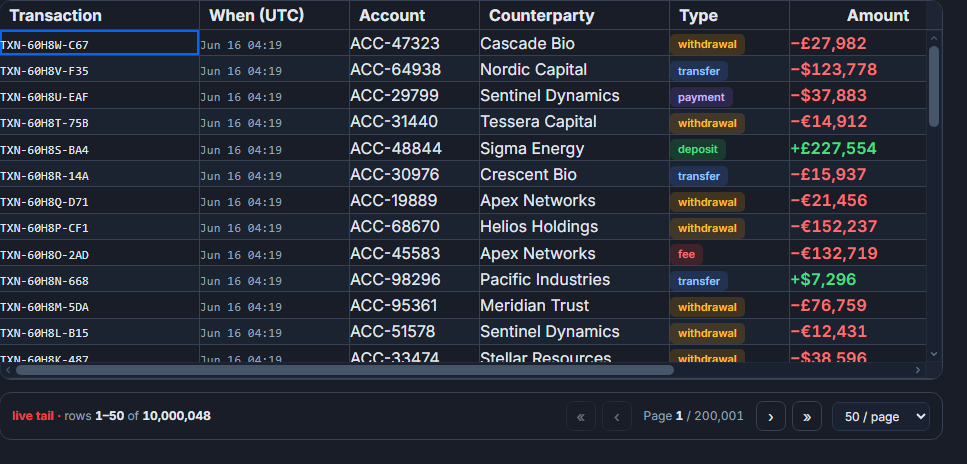 A live, updating dashboard grid in SvGrid.
This post walks through the actual architecture for an IoT dashboard: batched updates keyed by device ID, sparkline cells tracking recent history, conditional formatting for threshold breaches, and stale-sensor detection. These are the pieces that distinguish a real production dashboard from a demo.
Why raw websocket events will wreck your frame rate
The instinct is to wire a WebSocket directly to the grid: message arrives, call api.applyTransaction({ update: [row] }), done. This works fine at a handful of updates per second. It falls apart when sensors report fast enough that you're calling applyTransaction 50 times between two animation frames.
The fix is a pending-updates map keyed by sensor ID. New readings overwrite old ones in the map, and a single requestAnimationFrame callback drains the whole map in one transaction per frame. You never render more than once per frame regardless of update volume.
import { type SvGridApi } from '@svgrid/grid'

let api: SvGridApi

// called by your WebSocket message handler
const pending = new Map<string, SensorRow>()
let flushScheduled = false

function onReading(reading: SensorRow) {
  pending.set(reading.id, reading)
  if (!flushScheduled) {
    flushScheduled = true
    requestAnimationFrame(flush)
  }
}

function flush() {
  flushScheduled = false
  if (!api || pending.size === 0) return

  const updates = [...pending.values()]
  pending.clear()

  api.applyTransaction({ update: updates })
}
With 800 sensors all firing at 2 Hz, you still only call applyTransaction 60 times per second, each batch containing however many updates arrived since the last frame. The grid renders once, not 1,600 times.
Column layout for sensor data
The column structure matters. Sensor dashboards are scanned visually, so information density and visual hierarchy both need attention.
import SvGrid from '@svgrid/grid'
import {
  type ColumnDef,
  tableFeatures,
  rowSortingFeature,
  columnFilteringFeature,
  rowSelectionFeature,
  buildSparkline,
  resolveCellFormat,
} from '@svgrid/grid'

type SensorRow = {
  id: string
  name: string
  zone: string
  value: number
  unit: string
  history: number[]
  status: 'ok' | 'warning' | 'critical'
  lastSeen: number // unix ms
}

const features = tableFeatures({
  rowSortingFeature,
  columnFilteringFeature,
  rowSelectionFeature,
})

const columns: ColumnDef<typeof features, SensorRow>[] = [
  {
    id: 'name',
    field: 'name',
    header: 'Sensor',
    width: 200,
    pinned: 'left',
  },
  {
    id: 'zone',
    field: 'zone',
    header: 'Zone',
    width: 120,
  },
  {
    id: 'value',
    field: 'value',
    header: 'Reading',
    width: 110,
    type: 'number',
    cell: valueCellSnippet,
    conditionalFormat: [
      {
        condition: ({ row }) => row.original.status === 'critical',
        style: { color: '#c0392b', fontWeight: 'bold' },
      },
      {
        condition: ({ row }) => row.original.status === 'warning',
        style: { color: '#e67e22' },
      },
    ],
  },
  {
    id: 'trend',
    field: 'history',
    header: 'Trend',
    width: 120,
    cell: ({ value }) => buildSparkline(value, { color: '#3b82f6', height: 28 }),
  },
  {
    id: 'status',
    field: 'status',
    header: 'Status',
    width: 100,
    cell: statusCellSnippet,
  },
  {
    id: 'lastSeen',
    field: 'lastSeen',
    header: 'Last Seen',
    width: 130,
    cell: lastSeenCellSnippet,
  },
]
Pin the sensor name left so it stays anchored while users scroll through data columns. The trend sparkline renders inline from the rolling history array - every update appends the new value and trims the oldest, so the cell always shows the last N readings without extra state.
Threshold alerts with conditional row styling
Color alone is not enough for alerts - about 8% of men have some form of color blindness, and dashboards are often viewed in bright ambient light. Pair color with a status badge.
{#snippet statusCellSnippet({ value })}
  <span
    class="status-badge"
    class:ok={value === 'ok'}
    class:warning={value === 'warning'}
    class:critical={value === 'critical'}
  >
    {#if value === 'critical'}
      Critical
    {:else if value === 'warning'}
      Warning
    {:else}
      OK
    {/if}
  </span>
{/snippet}

{#snippet valueCellSnippet({ value, row })}
  <span>{value} {row.original.unit}</span>
{/snippet}

{#snippet lastSeenCellSnippet({ value })}
  {@const age = Date.now() - value}
  {@const isStale = age > 30_000}
  <span class:stale={isStale}>
    {isStale ? `${Math.round(age / 1000)}s ago` : 'live'}
  </span>
{/snippet}

<style>
  .status-badge { padding: 2px 8px; border-radius: 4px; font-size: 0.8em; }
  .ok    { background: #d1fae5; color: #065f46; }
  .warning  { background: #fef3c7; color: #92400e; }
  .critical { background: #fee2e2; color: #7f1d1d; }
  .stale { color: #9ca3af; font-style: italic; }
</style>
For threshold logic, compute status when processing each incoming reading - that way the grid only stores the derived value and the conditional format check is a simple string comparison. Don't put the threshold comparison inside the cell renderer; that runs on every render.
Stale-sensor detection
A sensor that stops reporting is itself a failure mode - often more critical than a high reading, because a dead sensor means you have no visibility into that zone. The lastSeen timestamp handles this. Set a background interval to touch the grid with a status recalculation pass every 10-15 seconds, which flags any sensor that has not reported in your staleness threshold (typically 30s to 2 minutes depending on the sensor's expected report interval).
// Recompute stale status periodically, independent of incoming readings
setInterval(() => {
  const now = Date.now()
  const staleThreshold = 30_000

  const updates = api.getData()
    .filter(row => now - row.lastSeen > staleThreshold && row.status !== 'stale')
    .map(row => ({ ...row, status: 'stale' as const }))

  if (updates.length > 0) {
    api.applyTransaction({ update: updates })
  }
}, 10_000)
This keeps the staleness state in the grid's data layer rather than in a parallel reactive store, which means sorting by status will correctly sort stale sensors alongside critical and warning ones.
Keeping critical sensors visible
Once you have status data, let users sort critical sensors to the top. Call this on initial load and expose it as a button for operators who want to see the worst-case view:
function pinCriticalToTop() {
  api.setSort('status', 'asc') // 'critical' < 'ok' < 'warning' alphabetically - adjust to your sort order
}

// Or use a custom sort comparator if your order is critical -> warning -> ok
function showWorstFirst() {
  const order = { critical: 0, warning: 1, stale: 2, ok: 3 }
  api.setSort('status', 'asc', {
    compareFn: (a, b) => (order[a] ?? 4) - (order[b] ?? 4),
  })
}
Scale considerations
Virtualization handles the rendering side - even with 5,000 sensors, only the visible rows are in the DOM at any time. The batched-update pattern above handles the JavaScript side. The third constraint is memory: rolling history arrays that grow without bound will eventually exhaust heap. Cap them explicitly when you push new readings.
For very large sensor fleets grouped by zone or building, keep live updates scoped to the currently visible group. Expand the zone in the grid and subscribe to that zone's feed; collapse it and unsubscribe. Server-side grouping with createServerDataSource works well here - paginate by zone, push live updates only for the active page.
import { createServerDataSource } from '@svgrid/grid'

const ds = createServerDataSource({
  fetch: async ({ page, pageSize, sort, filters }) => {
    const params = new URLSearchParams({
      page: String(page),
      size: String(pageSize),
      zone: activeZone,
    })
    const json = await fetch(`/api/sensors?${params}`).then(r => r.json())
    return { rows: json.data, total: json.total }
  },
})
The combination of batched RAF updates, sparkline history cells, conditional status formatting, and stale-device detection covers most of what makes an IoT dashboard genuinely useful to the operators watching it. Each piece is independent - you can start with just the batched updates and add sparklines and alerts incrementally.
Related reading
- Building a Real-Time Trading Grid in Svelte
- Building a Logistics / Fleet Tracking Grid in Svelte
- Building a SaaS Billing and Usage Table in Svelte
- Building a Project / Task Board with a Svelte Data Grid
- Building an Order Management Dashboard in Svelte
Tagged: Real-time data