Headless Core or Render Component? Choosing the Right SvGrid API
SvGrid gives you two surfaces - a headless pipeline and a drop-in component. Here is a practical guide to picking the right one and knowing when to use both together.
Most grids give you one API. SvGrid gives you two, and the choice between them shapes how much flexibility you carry into the future.
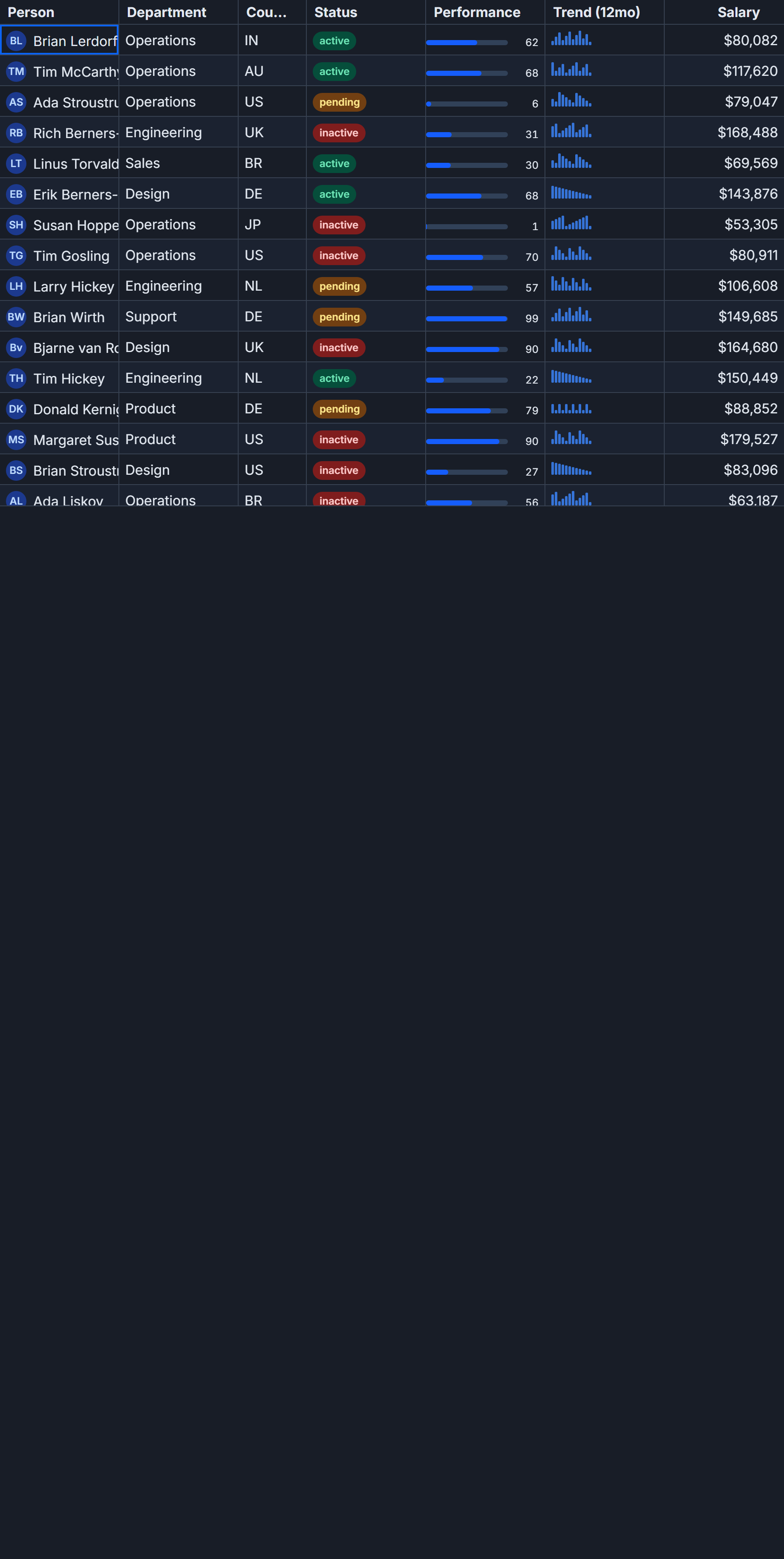
createGrid is the headless engine. It runs the row model pipeline - sorting, filtering, grouping, pagination - and hands you reactive state you can render however you want. <SvGrid> is the render component. It wraps the same engine, adds a full table UI, and exposes an imperative API through onApiReady. Same data layer, very different surface area.
The question is not which one is better. It is which one matches what you are actually building.
Two entry points, one pipeline
Start with <SvGrid> if the output is a table. That describes most use cases: admin panels, dashboards, data exports, reporting views. You declare columns, pass data, flip a few props, and the component handles DOM structure, keyboard navigation, accessibility attributes, column resizing, and filter menus. The onApiReady callback gives you an escape hatch when you need to drive the grid imperatively.
<!-- TicketGrid.svelte -->
<script lang="ts">
  import SvGrid, {
    tableFeatures,
    rowSortingFeature,
    columnFilteringFeature,
    rowPaginationFeature,
    rowSelectionFeature,
    type ColumnDef,
    type SvGridApi,
  } from '@svgrid/grid'

  type Ticket = {
    id: string
    title: string
    assignee: string
    status: 'open' | 'in_progress' | 'blocked' | 'done'
    priority: 'low' | 'med' | 'high' | 'urgent'
    estimateHours: number
  }

  const features = tableFeatures({
    rowSortingFeature,
    columnFilteringFeature,
    rowPaginationFeature,
    rowSelectionFeature,
  })

  const columns: ColumnDef<typeof features, Ticket>[] = [
    { id: 'id',            field: 'id',            header: 'ID',        width: 80  },
    { id: 'title',         field: 'title',         header: 'Title',     width: 280 },
    { id: 'assignee',      field: 'assignee',      header: 'Assignee',  width: 180 },
    { id: 'status',        field: 'status',        header: 'Status',    width: 130 },
    { id: 'priority',      field: 'priority',      header: 'Priority',  width: 110 },
    { id: 'estimateHours', field: 'estimateHours', header: 'Est. hrs',  width: 90, type: 'number' },
  ]

  const data = $state<Ticket[]>([
    { id: 't01', title: 'Onboarding wizard',        assignee: 'Ada Lovelace',      status: 'in_progress', priority: 'high',   estimateHours: 12 },
    { id: 't02', title: 'Stripe webhook retry',     assignee: 'Linus Torvalds',    status: 'open',        priority: 'urgent', estimateHours: 6  },
    { id: 't03', title: 'Search index migration',   assignee: 'Grace Hopper',      status: 'blocked',     priority: 'med',    estimateHours: 16 },
    { id: 't04', title: 'Dark mode polish',         assignee: 'Margaret Hamilton', status: 'done',        priority: 'low',    estimateHours: 4  },
    { id: 't05', title: 'Audit log retention',      assignee: 'Donald Knuth',      status: 'in_progress', priority: 'high',   estimateHours: 8  },
  ])

  let api = $state<SvGridApi<typeof features, Ticket> | null>(null)
</script>

<div class="toolbar">
  <button onclick={() => api?.clearAllFilters()}>Clear filters</button>
  <button onclick={() => api?.selectAllRows()}>Select all</button>
  <button onclick={() => console.log(api?.getSelectedRows())}>Log selection</button>
</div>

<SvGrid
  {data}
  {columns}
  {features}
  sortable
  filterable
  pageable
  showFilterRow={true}
  rowHeight={36}
  onApiReady={(ready) => { api = ready }}
/>
That is the 90% case. You get everything for the price of one component import.
When the table layout is the wrong shape
The render component owns its DOM. That is a feature until it is not. If your design calls for kanban columns, a card grid, a tree of expandable panels, or a mobile layout that is nothing like a table - the component is working against you.
This is where createGrid earns its place. The headless engine runs the identical sort and filter pipeline but returns reactive row state you iterate yourself. Here is the same ticket data rendered as priority-colored cards:
<!-- TicketCards.svelte - headless approach, custom layout -->
<script lang="ts">
  import {
    createGrid,
    tableFeatures,
    rowSortingFeature,
    columnFilteringFeature,
    type ColumnDef,
  } from '@svgrid/grid'

  type Ticket = {
    id: string
    title: string
    assignee: string
    status: string
    priority: string
    estimateHours: number
  }

  const features = tableFeatures({
    rowSortingFeature,
    columnFilteringFeature,
  })

  const columns: ColumnDef<typeof features, Ticket>[] = [
    { id: 'title',         field: 'title',         header: 'Title'    },
    { id: 'assignee',      field: 'assignee',      header: 'Assignee' },
    { id: 'status',        field: 'status',        header: 'Status'   },
    { id: 'priority',      field: 'priority',      header: 'Priority' },
    { id: 'estimateHours', field: 'estimateHours', header: 'Est. hrs' },
  ]

  const grid = createGrid({
    data: $state([
      { id: 't01', title: 'Onboarding wizard',      assignee: 'Ada Lovelace',      status: 'in_progress', priority: 'high',   estimateHours: 12 },
      { id: 't02', title: 'Stripe webhook retry',   assignee: 'Linus Torvalds',    status: 'open',        priority: 'urgent', estimateHours: 6  },
      { id: 't03', title: 'Search index migration', assignee: 'Grace Hopper',      status: 'blocked',     priority: 'med',    estimateHours: 16 },
      { id: 't04', title: 'Dark mode polish',       assignee: 'Margaret Hamilton', status: 'done',        priority: 'low',    estimateHours: 4  },
      { id: 't05', title: 'Audit log retention',    assignee: 'Donald Knuth',      status: 'in_progress', priority: 'high',   estimateHours: 8  },
    ]),
    columns,
    features,
    options: {
      sorting: { state: $state([{ id: 'estimateHours', desc: true }]) },
    },
  })

  // grid.getDisplayedRows() is reactive - updates when sort/filter state changes
  const rows = $derived(grid.getDisplayedRows())

  function sortByEstimate() {
    const current = grid.getState().sorting?.[0]
    const desc = current?.id === 'estimateHours' ? !current.desc : false
    grid.setState({ sorting: [{ id: 'estimateHours', desc }] })
  }
</script>

<div class="controls">
  <button onclick={sortByEstimate}>Toggle estimate sort</button>
</div>

<div class="card-grid">
  {#each rows as row (row.id)}
    <div class="card" data-priority={row.original.priority}>
      <strong>{row.original.title}</strong>
      <span class="sub">{row.original.assignee}</span>
      <div class="meta">
        <span>{row.original.status}</span>
        <span>{row.original.estimateHours} hrs</span>
      </div>
    </div>
  {/each}
</div>

<style>
  .card-grid { display: grid; grid-template-columns: repeat(auto-fill, minmax(220px, 1fr)); gap: 1rem; }
  .card      { padding: 1rem; border: 1px solid var(--sg-border, #e2e8f0); border-radius: 6px; display: flex; flex-direction: column; gap: 0.35rem; }
  .card[data-priority="urgent"] { border-left: 3px solid #f87171; }
  .card[data-priority="high"]   { border-left: 3px solid #fb923c; }
  .meta      { display: flex; justify-content: space-between; font-size: 0.8rem; color: #64748b; }
</style>
The sort state is managed by the engine. The urgent/high border styling, the card layout, the responsive grid - all yours. You did not fight a slot system or override component CSS to get here.
Sharing column definitions across both
The strongest argument for understanding both APIs is that columns and features are completely portable between them. Build them once, use them in a table view and a mobile card view without duplication:
// ticket-grid-config.ts - shared between table and card views
import {
  tableFeatures,
  rowSortingFeature,
  columnFilteringFeature,
  rowSelectionFeature,
  type ColumnDef,
} from '@svgrid/grid'

export type Ticket = {
  id: string
  title: string
  assignee: string
  status: 'open' | 'in_progress' | 'blocked' | 'done'
  priority: 'low' | 'med' | 'high' | 'urgent'
  estimateHours: number
}

export const features = tableFeatures({
  rowSortingFeature,
  columnFilteringFeature,
  rowSelectionFeature,
})

export const columns: ColumnDef<typeof features, Ticket>[] = [
  { id: 'id',            field: 'id',            header: 'ID',       width: 80  },
  { id: 'title',         field: 'title',         header: 'Title',    width: 280 },
  { id: 'assignee',      field: 'assignee',      header: 'Assignee', width: 180 },
  { id: 'status',        field: 'status',        header: 'Status',   width: 130 },
  { id: 'priority',      field: 'priority',      header: 'Priority', width: 110 },
  { id: 'estimateHours', field: 'estimateHours', header: 'Est. hrs', width: 90, type: 'number' },
]
Your desktop view imports features and columns into <SvGrid>. Your mobile view imports the same exports into a createGrid call. Same filtering behavior, same sort logic, completely different markup. That is the payoff of the layered architecture.
The case for mixing both in one page
A common pattern that trips people up: you want a table but also a summary panel above it that shows aggregate values - things like total estimate hours, blocked ticket count, filtered row count. The <SvGrid> component does not expose a slot for this kind of derived display.
The answer is not to switch to headless entirely. Use <SvGrid> for the table, and drive the summary from the imperative API:
<script lang="ts">
  import SvGrid, { type SvGridApi } from '@svgrid/grid'
  import { features, columns, type Ticket } from './ticket-grid-config'

  let api = $state<SvGridApi<typeof features, Ticket> | null>(null)

  const summary = $derived.by(() => {
    if (!api) return { count: 0, totalHours: 0, blocked: 0 }
    const rows = api.getDisplayedRows() as Ticket[]
    return {
      count: rows.length,
      totalHours: rows.reduce((sum, r) => sum + r.estimateHours, 0),
      blocked: rows.filter(r => r.status === 'blocked').length,
    }
  })

  const data = $state<Ticket[]>([ /* ... */ ])
</script>

<div class="summary-bar">
  <span>{summary.count} tickets</span>
  <span>{summary.totalHours} total hrs</span>
  <span>{summary.blocked} blocked</span>
</div>

<SvGrid
  {data}
  {columns}
  {features}
  sortable
  filterable
  onApiReady={(ready) => { api = ready }}
/>
The $derived.by block re-runs whenever api.getDisplayedRows() returns a new reference - which happens after every filter or sort change. The summary stays in sync without a separate data pipeline.
Picking one when you are starting fresh
If the output is a table and the design looks like a table, start with <SvGrid>. You will cover most features without writing markup. Use onApiReady for the imperative calls you inevitably need - sorting programmatically on page load, clearing filters from a toolbar, exporting selected rows.
Move to createGrid when you need a layout the component cannot express: card views, kanban boards, tree panels, mobile-first designs that abandon the table metaphor entirely. The migration cost is low because the data layer - columns, features, options - moves over unchanged. You are only replacing the rendering surface.
The rare case is a large application that needs both simultaneously on the same screen. That works: instantiate createGrid for the headless state, pass its output to a custom layout, and keep a <SvGrid> elsewhere on the page pointed at the same data. The two instances do not share state by default, but you can synchronize them by passing the same $state reference as data.
Related reading
- The Headless UI Pattern - Separating Logic from Presentation
- Bundle Size of Svelte Data Grids - How to Compare
- Saved Views - Persist Grid Layout and Filters
- Building a SaaS Billing and Usage Table in Svelte
- Row Drag-and-Drop Reordering in a Svelte Data Grid
Tagged: Architecture