The Headless UI Pattern - Separating Logic from Presentation
How SvGrid splits the row-model pipeline from rendering, and when you actually want to reach past the default table and drive the headless layer directly.
Most data grid libraries give you one thing: a table. If your designer wants the same sorted, filtered dataset rendered as cards on mobile, or as a Kanban board, or as a chart, you are copying data out of the grid and managing a second stateful list yourself. That second list drifts. The headless pattern eliminates the drift by making the row-model pipeline independent of the renderer.
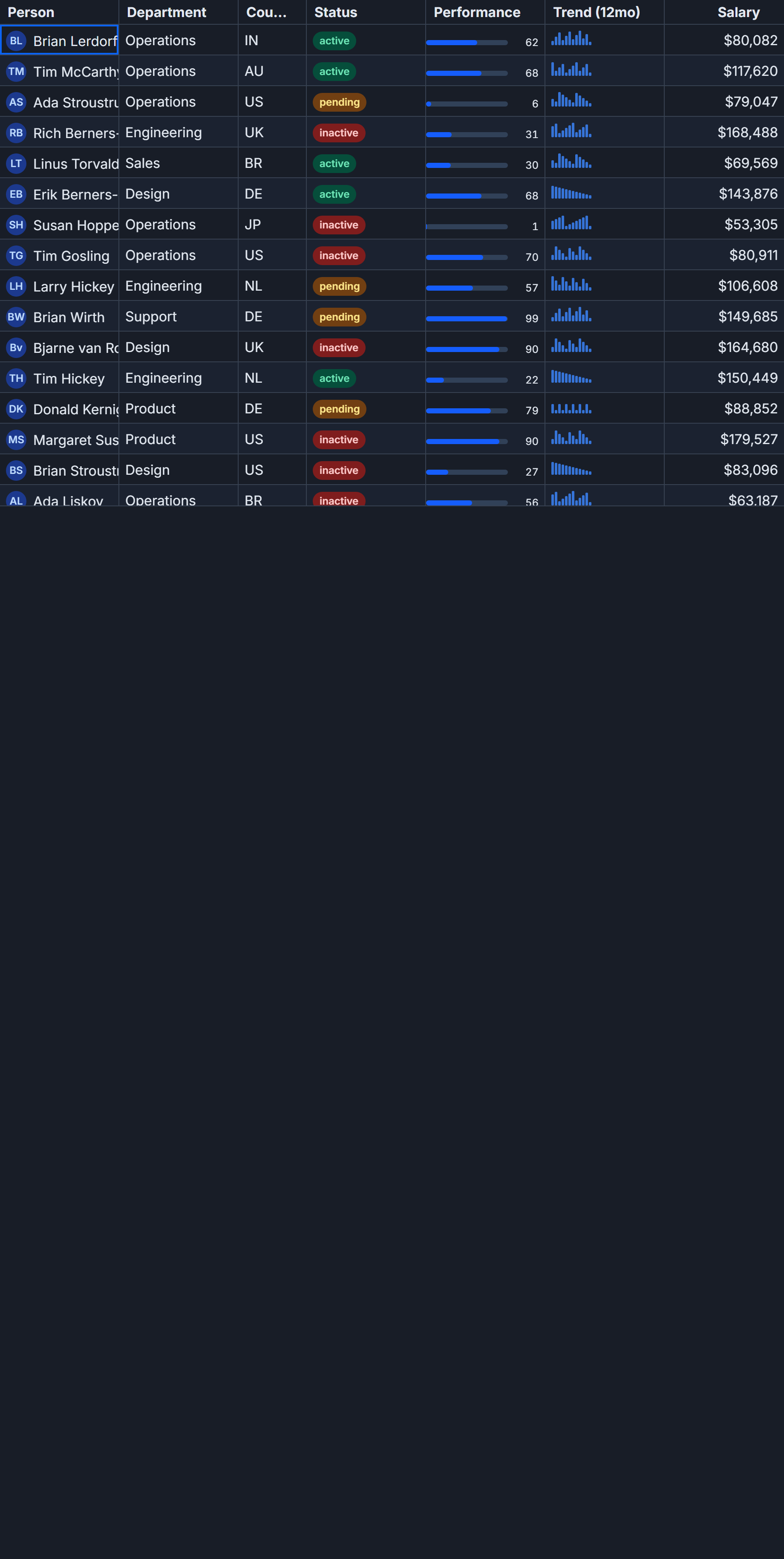
SvGrid formalizes this with two distinct layers. The lower layer - createGrid, tableFeatures, the feature composition - is pure data pipeline. It sorts, filters, paginates, and tracks selection state. No DOM, no markup, no component lifecycle. The upper layer - <SvGrid> the Svelte component - is a render target that sits on top of that same pipeline and handles accessibility, keyboard navigation, and virtualization.
You can use just the upper layer and never think about the lower one. You can also bypass the component entirely and drive the pipeline from plain TypeScript. The more interesting case is using both at once.
The pipeline as a first-class object
The entry point for the headless layer is tableFeatures. It is a type-level composer: you pass in the feature modules you need, and it returns a typed object that controls what methods and state fields the resulting grid instance exposes.
import {
  tableFeatures,
  rowSortingFeature,
  columnFilteringFeature,
  rowSelectionFeature,
  rowPaginationFeature,
  type ColumnDef,
} from '@svgrid/grid'

type Priority = 'low' | 'med' | 'high' | 'urgent'

type Ticket = {
  id: string
  title: string
  assignee: string
  status: 'open' | 'in_progress' | 'blocked' | 'done'
  priority: Priority
  estimateHours: number
  dueDate: string
}

// features is a typed descriptor - it has no runtime state yet.
const features = tableFeatures({
  rowSortingFeature,
  columnFilteringFeature,
  rowSelectionFeature,
  rowPaginationFeature,
})

const columns: ColumnDef<typeof features, Ticket>[] = [
  { id: 'id',            field: 'id',            header: 'ID',         width: 70 },
  { id: 'title',         field: 'title',         header: 'Title',      width: 240 },
  { id: 'assignee',      field: 'assignee',      header: 'Assignee',   width: 160 },
  { id: 'status',        field: 'status',        header: 'Status',     width: 130 },
  { id: 'priority',      field: 'priority',      header: 'Priority',   width: 100 },
  { id: 'estimateHours', field: 'estimateHours', header: 'Est. hours', width: 100 },
  { id: 'dueDate',       field: 'dueDate',       header: 'Due date',   width: 120 },
]
features carries no state. It is a plain object you can define at module scope and share across components. State lives in the grid instance you create later, not in the feature descriptor.
Two renderers, one pipeline
The practical use case for the headless layer is maintaining a single row-model while rendering it more than one way. Here is a ticket tracker where the table view and a card view share the same sort, filter, and selection state. When you sort by priority in the table and switch to cards, the cards arrive in the same order. When you select a row in the card view, the table row is highlighted when you switch back.
<script lang="ts">
  import {
    SvGrid,
    createGrid,
    tableFeatures,
    rowSortingFeature,
    columnFilteringFeature,
    rowSelectionFeature,
    type ColumnDef,
    type SvGridApi,
  } from '@svgrid/grid'

  type Priority = 'low' | 'med' | 'high' | 'urgent'
  type Ticket = {
    id: string; title: string; assignee: string
    status: 'open' | 'in_progress' | 'blocked' | 'done'
    priority: Priority; estimateHours: number; dueDate: string
  }

  const features = tableFeatures({
    rowSortingFeature,
    columnFilteringFeature,
    rowSelectionFeature,
  })

  const columns: ColumnDef<typeof features, Ticket>[] = [
    { id: 'id',            field: 'id',            header: 'ID',         width: 70 },
    { id: 'title',         field: 'title',         header: 'Title',      width: 240 },
    { id: 'assignee',      field: 'assignee',      header: 'Assignee',   width: 160 },
    { id: 'status',        field: 'status',        header: 'Status',     width: 130 },
    { id: 'priority',      field: 'priority',      header: 'Priority',   width: 100 },
    { id: 'estimateHours', field: 'estimateHours', header: 'Est. hours', width: 100 },
    { id: 'dueDate',       field: 'dueDate',       header: 'Due date',   width: 120 },
  ]

  const PRIO_COLOR: Record<Priority, string> = {
    low: '#64748b', med: '#d97706', high: '#ea580c', urgent: '#dc2626',
  }

  let rows = $state<Ticket[]>([
    { id: 't01', title: 'Onboarding wizard',      assignee: 'Ada Lovelace',    status: 'in_progress', priority: 'high',   estimateHours: 12, dueDate: '2026-07-15' },
    { id: 't02', title: 'Stripe webhook retry',   assignee: 'Linus Torvalds',  status: 'open',        priority: 'urgent', estimateHours: 6,  dueDate: '2026-07-10' },
    { id: 't03', title: 'Search index migration', assignee: 'Grace Hopper',    status: 'blocked',     priority: 'med',    estimateHours: 16, dueDate: '2026-07-22' },
    { id: 't04', title: 'Dark mode polish',       assignee: 'Ada Lovelace',    status: 'done',        priority: 'low',    estimateHours: 4,  dueDate: '2026-07-02' },
    { id: 't05', title: 'Audit log retention',    assignee: 'Donald Knuth',    status: 'in_progress', priority: 'high',   estimateHours: 8,  dueDate: '2026-07-18' },
    { id: 't06', title: 'Postgres pool tuning',   assignee: 'Edsger Dijkstra', status: 'in_progress', priority: 'urgent', estimateHours: 14, dueDate: '2026-07-12' },
  ])

  let api = $state<SvGridApi<typeof features, Ticket> | null>(null)

  // Read the processed rows out of the shared grid instance.
  // This is the headless layer - same pipeline, different output.
  let displayedRows = $derived.by(() => api?.getDisplayedRows().map(r => r.original) ?? [])
  let selectedIds   = $derived.by(() => new Set(api?.getSelectedRows().map(r => r.id) ?? []))

  let view = $state<'table' | 'cards'>('table')

  function toggleCard(id: string) {
    api?.selectRows([id])
  }
</script>

<div class="toolbar">
  <button class:active={view === 'table'} onclick={() => (view = 'table')}>Table</button>
  <button class:active={view === 'cards'} onclick={() => (view = 'cards')}>Cards</button>
  <span>{selectedIds.size} selected</span>
</div>

{#if view === 'table'}
  <SvGrid
    {features}
    {columns}
    data={rows}
    height={380}
    sortable
    filterable
    showFilterRow={true}
    onApiReady={(a) => (api = a)}
  />
{:else}
  <div class="card-grid">
    {#each displayedRows as ticket (ticket.id)}
      <button
        class="card"
        class:selected={selectedIds.has(ticket.id)}
        onclick={() => toggleCard(ticket.id)}
      >
        <div class="card-header">
          <span class="card-id">{ticket.id}</span>
          <span class="card-priority" style:color={PRIO_COLOR[ticket.priority]}>
            {ticket.priority.toUpperCase()}
          </span>
        </div>
        <p class="card-title">{ticket.title}</p>
        <div class="card-meta">
          <span>{ticket.assignee}</span>
          <span>{ticket.status.replace('_', ' ')}</span>
          <span>{ticket.estimateHours}h - due {ticket.dueDate}</span>
        </div>
      </button>
    {/each}
  </div>
{/if}
The cards are not a second data source. They read from api.getDisplayedRows(), which is the same processed snapshot the table renders. If you apply a filter through the table's filter row before switching to cards, only the matching tickets appear in the card grid. The pipeline ran once; both renderers read the result.
What the API layer adds
The api object returned via onApiReady is worth calling out separately because it is not just a proxy to the internal state - it is an imperative interface that works from outside any component.
A common pattern is wiring sort controls outside the grid: a priority sort button in a toolbar that the card view still respects.
// All of these write to the shared grid state, whether the table
// or the card view is currently mounted.
api.setSort('priority', 'desc')
api.setFilter('assignee', { operator: 'equals', value: 'Ada Lovelace' })
api.clearAllFilters()
api.setPage(2)
api.setPageSize(25)
api.getPageInfo() // { pageIndex, pageSize, pageCount, total }

// Selection crosses both views.
api.selectRows(['t01', 't03'])
api.getSelectedRows() // returns the actual row objects

// State snapshots let you persist and restore the full view configuration.
const savedState = api.getState()
// ... later or on next page load ...
api.setState(savedState)
api.getState() and api.setState() are especially useful in the dual-renderer case. You can persist the user's sort and filter preferences to localStorage, restore them on page load, and both the table and card views will initialize in the correct state without any special handling per renderer.
Where headless costs you
The pattern has a real tradeoff: accessibility. The <SvGrid> component ships with ARIA grid roles, roving tab-index management, keyboard navigation (arrow keys, Home/End, Page Up/Down), and screen-reader announcements for sort state changes. When you render a custom card layout using the headless API, none of that comes for free.
For a card grid that needs keyboard navigation, you need to manage focus yourself - probably via a tabindex on each card and arrow-key handlers on the container. For selection announced to screen readers, you need aria-selected on each card. This is not complicated, but it is work you do not do when you use <SvGrid> directly.
My rule of thumb: use <SvGrid> as the primary view, and reach into the headless layer for secondary renderers where the data relationship matters more than full accessibility. A sidebar summary panel, a sparkline row, a Kanban column count - these are good headless consumers. A fully independent alternative table is not, because you would want all the accessibility work twice.
The headless layer also has no opinion about virtualization. <SvGrid> virtualizes rows by default above a configurable row threshold. A custom card renderer iterates displayedRows as a plain array. For datasets under a few thousand rows this is fine. For 50,000 records, you need to bring your own virtual scroll or paginate via api.setPageSize(50) and drive page navigation manually.
Related reading
- Headless Core or Render Component? Choosing the Right SvGrid API
- What Is a Headless Data Grid?
- Why We Bet on Svelte 5 Runes for a High-Performance Data Grid
- Web Components - Write Once, Use in React, Vue, and Angular
Tagged: Headless core, Architecture