Web Components & Custom Elements
Ship SvGrid as a framework-agnostic web component and use the Svelte 5 data grid in React, Vue, Angular, or plain HTML - no Svelte required in the host app.
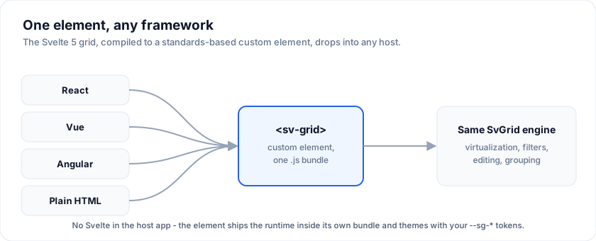
SvGrid is authored in Svelte 5, but Svelte compiles to standards-based
custom elements.
@svgrid/grid-wc publishes two of them, prebuilt: drop in one <script> tag
and use <sv-grid> like any built-in element. If you searched for a "web
component data grid" or a "framework-agnostic Svelte table", this is the
integration path.
Start here
| Page | What it covers |
|---|---|
| React, Vue or Angular | Start here if you use one. A running project in about thirty seconds, and 27 examples you can open and edit. |
| Quick start | The CDN path, and the attribute-vs-property rule that trips everyone up once. |
<sv-grid> reference |
Every property, attribute and event. Generated from the grid's own types. |
| Shadow DOM | <sv-grid-shadow>, for pages whose CSS you do not control. |
| React | The @svgrid/grid-wc/react component, and why React 18 needs it. |
| Vue | The @svgrid/grid-wc/vue component - no isCustomElement config, no .prop modifiers. |
| Angular | The @svgrid/grid-wc/angular standalone component, with typed inputs and outputs. |
| TypeScript | Typing the element, its properties and its events. |
| Enterprise features | Excel / PDF export, import, print and pivot from a non-Svelte host - and the two views that need a Svelte-aware bundler. |
| Limitations | What cannot cross the boundary, and why. |
Framework wrappers
The package ships a component for each of the three big frameworks, generated from the same types as the element, as subpath imports:
| Framework | Import |
|---|---|
| React | import { SvGrid } from '@svgrid/grid-wc/react' |
| Vue | import { SvGrid } from '@svgrid/grid-wc/vue' |
| Angular | import { SvGridComponent } from '@svgrid/grid-wc/angular' |
Each framework is an OPTIONAL peer dependency, so a plain-HTML consumer never installs any of them, and each wrapper is a couple of KB that reuses the one element bundle rather than shipping a second copy of the grid.
Start here for the thirty-second path and nine runnable examples per framework - each one opens as a full editable project, with no local setup.
Why a custom element
- Use it anywhere. React, Vue, Angular, Solid, Astro, Rails/Laravel
server-rendered pages, or a plain
<script>tag. The browser treats<sv-grid>like any built-in element. - One bundle, no framework lock-in. Ship a single file to a CDN; consumers
add one
<script type="module">and a tag. - The whole grid. 98 properties and 20 events, so virtualization,
Excel-style filters, inline editing, grouping, tree data, pinning, pagination
and the enterprise features are all reachable - not a hand-picked subset. The
surface is generated from
<SvGrid>'s ownPropstype and CI fails if the two drift. Exactly two props are left out, and the reference says why.
If your team is on Svelte 5, use the component directly (First grid) - the custom element exists to reach non-Svelte hosts, and it costs you the Svelte runtime to do it.
Quick look
<script type="module" src="https://unpkg.com/@svgrid/grid-wc"></script>

<sv-grid id="grid" sortable filterable pageable page-size="25"
         style="display:block;height:420px"></sv-grid>

<script type="module">
  const grid = document.getElementById('grid')
  // Arrays and objects are properties; primitives can be attributes.
  grid.columns = [{ field: 'name', header: 'Name' }, { field: 'role', header: 'Role' }]
  grid.data = [{ name: 'Ada', role: 'Engineering' }, { name: 'Alan', role: 'Research' }]
  grid.addEventListener('cellvaluechange', (e) => console.log(e.detail))
</script>
Full walkthrough in Quick start.
Building your own element
The published package is the recommended path, but the wrapper is about sixty
lines and you may want a narrower surface, your own tag name, or extra
behaviour. The source is packages/grid-wc/src in the repository:
sv-grid-element.svelte is the light-DOM wrapper, GridBody.svelte is the part
both elements share, and scripts/generate-surface.mjs writes the prop and
event declarations from <SvGrid>'s Props type.
See also
- Enterprise features from the element - export, import, print and pivot need no Svelte in your build; the board and scheduler views do.
- Tailwind integration - the full
--sg-*token list.
Related articles
- Web Components - Write Once, Use in React, Vue, and Angular - How to wrap SvGrid as a custom element, wire it across React, Vue, and Angular, and avoid the three interop traps that bite every team the first time.
- 15 Years of UI Components - The Story Behind jQWidgets and Smart UI - How a team spent 15 years shipping data grids - from jQuery widgets in 2011 to web components to a Svelte 5 native grid - and what actually changed each time.
- Progress and Percentage Bar Cells in SvGrid - Build in-cell progress bars in your Svelte 5 data grid - with color thresholds, accessible markup, and sorting that still works.