Columns hierarchy & manager
The pattern for grids with too many columns to fit on screen at once. A side-panel "column manager" exposes the column tree to the user: they pick what's visible, what gets collapsed into a one-cell summary, and what order leaves appear in within each group.
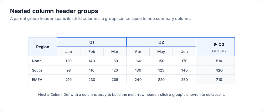
Try it live - drag a leaf chip between siblings, click a group's chevron to collapse it into a summary column, toggle a checkbox to hide:
What it builds on
Two existing engine capabilities power this:
- Nested column groups. A
ColumnDefwithcolumns: [...]produces multi-row headers automatically; see Column groups. - Dynamic columns. The
columnsprop is a regular array; passing a$derivedarray makes it reactive. The grid swaps the column tree in place on every change.
The "hierarchy manager" is just a Svelte component you write that
mutates a piece of $state describing which groups are open + which
leaves are visible. The derived columns array reflects that state.
Data model
The state has one entry per group:
type GroupTreeState = {
  id: string
  visible: boolean                       // whole-group hide
  collapsed: boolean                     // collapsed to one summary column
  leafOrder: string[]                    // leaf ids, in display order
  leafVisible: Record<string, boolean>   // per-leaf hide
}

let treeState = $state<GroupTreeState[]>(initialTree())
Initial state walks your fixed group definitions and turns every leaf
into visible: true. From then on, every interaction in the side
panel produces a new array (no mutation in place - Svelte 5 prefers
reassignment).
Deriving the column tree
The grid's columns are a $derived from the tree state plus your
fixed column specs:
const columnTree = $derived.by((): ColumnDef<F, Row>[] => {
  const out: ColumnDef<F, Row>[] = []
  for (const g of treeState) {
    if (!g.visible) continue
    const spec = GROUPS.find((s) => s.id === g.id)!
    if (g.collapsed) {
      // One synthetic column showing the group's summary.
      out.push({
        id: `summary_${g.id}`,
        header: `${spec.label} · summary`,
        width: 200,
        cell: (ctx) => renderSnippet(SummaryCell, {
          row: ctx.row.original,
          groupId: g.id,
        }),
      })
      continue
    }
    // Otherwise: emit the group as a real nested column group.
    const visibleLeaves = g.leafOrder
      .map((id) => spec.leaves.find((l) => l.id === id)!)
      .filter((l) => g.leafVisible[l.id])
    if (visibleLeaves.length === 0) continue
    out.push({
      id: `group_${g.id}`,
      header: spec.label,
      columns: visibleLeaves.map(buildLeaf),
    })
  }
  return out
})
buildLeaf is a small helper that maps your fixed leaf spec
({ id, field, label, width }) into a ColumnDef. For columns whose
display is a custom snippet, dispatch by id and emit the corresponding
cell: renderSnippet(...).
Group "summary" cells
When the user collapses a group, you don't usually want it to vanish - the user wants to see one representative value for it. The Engagement group in the demo collapses to a health pill; Deal value collapses to the ARR; Account collapses to the company name plus an industry / region sub-line.
The summary cell snippet takes a groupId prop and switches on it:
{#snippet SummaryCell(props: { row: Deal; groupId: string })}
  {#if props.groupId === 'value'}
    <span class="flex flex-col">
      <span class="font-bold tabular-nums">{fmtMoney(props.row.arr)}</span>
      <span class="text-xs text-muted tabular-nums">{props.row.probability}% prob</span>
    </span>
  {:else if props.groupId === 'engagement'}
    <HealthPill health={props.row.health} />
  {/if}
{/snippet}
Side-panel UI
Three things the user controls per group:
| Control | What it does |
|---|---|
Chevron (▶) |
Toggle collapsed. Group becomes 1 column, or expands back. |
| Group checkbox | Toggle visible. Hides the whole group. |
| Leaf checkbox | Toggle leafVisible[id]. Hides one column. |
Drag-and-drop within a group reorders leaves:
function onDrop(e: DragEvent, groupId: string, targetLeafId: string) {
  e.preventDefault()
  if (!drag || drag.groupId !== groupId) return
  const group = treeState.find((g) => g.id === groupId)!
  const fromIx = group.leafOrder.indexOf(drag.leafId)
  const toIx = group.leafOrder.indexOf(targetLeafId)
  if (fromIx < 0 || toIx < 0 || fromIx === toIx) return
  const next = group.leafOrder.slice()
  next.splice(fromIx, 1)
  next.splice(toIx, 0, drag.leafId)
  treeState = treeState.map((g) =>
    g.id === groupId ? { ...g, leafOrder: next } : g,
  )
}
The demo restricts drag to same-group reorder because cross-group drag
would change the semantic grouping (a "Deal value · Stage" mix doesn't
make sense). If your data model allows cross-group moves, drop the
drag.groupId === groupId guard.
Persistence
The tree state is a plain JS object - feed it into your Saved views pipeline and the user's column layout follows them across sessions:
// Save
saveView({ ...currentView, columnTree: treeState })
// Restore
treeState = view.columnTree ?? initialTree()
For multi-user / shared layouts, store under a per-team key alongside your other config.
Performance
Re-deriving columnTree runs at 0.1 ms even for 40-leaf trees on a
modern machine; the cost is dominated by the grid's column-rebuild
work afterward (1-2 ms). Mutating the tree state at interactive rates
(drag-resize over time) is fine.
Composing with the rest of the grid
- Sort + filter apply to whatever columns are visible. Collapsing a group hides its leaves; their filters disappear from the menu but are NOT cleared - re-expand the group and they're still active. If that's surprising for your users, clear the leaf filters as part of the collapse handler.
- Pinned columns are recorded per leaf id - they re-pin automatically when the leaf becomes visible again.
- Saved views should serialise
treeStatealongside sort + filter.
Nested header groups
A group is a column with columns instead of a field, and it nests as deep as
you need. The header row count follows the deepest branch, so a two-level group
next to a plain column lines up without spacers.
<script lang="ts">
  import { SvGrid, type GridColumns, type SvGridApi } from '@svgrid/grid'

  type Person = {
    id: number
    name: string
    department: string
    city: string
    age: number
    salary: number
    joined: string
  }

  const people: Person[] = [
    { id: 1, name: 'Ada Lovelace',   department: 'Engineering', city: 'London',   age: 36, salary: 142000, joined: '2021-03-01' },
    { id: 2, name: 'Grace Hopper',   department: 'Engineering', city: 'New York', age: 45, salary: 168000, joined: '2019-07-15' },
    { id: 3, name: 'Linus Torvalds', department: 'Platform',    city: 'Portland', age: 54, salary: 155000, joined: '2020-01-20' },
    { id: 4, name: 'Radia Perlman',  department: 'Networking',  city: 'Seattle',  age: 49, salary: 161000, joined: '2022-09-05' },
    { id: 5, name: 'Barbara Liskov', department: 'Platform',    city: 'Boston',   age: 52, salary: 172000, joined: '2018-11-11' },
  ]

  const columns: GridColumns<Person> = [
    { field: 'name', header: 'Name', width: 180 },
    {
      header: 'Employment',
      columns: [
        { field: 'department', header: 'Department', width: 150 },
        {
          header: 'Compensation',
          columns: [
            { field: 'salary', header: 'Salary', width: 130,
              format: { type: 'currency', currency: 'USD' } },
            { field: 'joined', header: 'Since', width: 120 },
          ],
        },
      ],
    },
    { field: 'city', header: 'City', width: 130 },
  ]
</script>

<SvGrid data={people} {columns} sortable />
Groups and pinning together
Pinning names a leaf column, not a group. Pin a leaf and its group header travels with it - which is why the pinned region can show a header spanning one column.
<script lang="ts">
  import { SvGrid, type GridColumns, type SvGridApi } from '@svgrid/grid'

  type Person = {
    id: number
    name: string
    department: string
    city: string
    age: number
    salary: number
    joined: string
  }

  const people: Person[] = [
    { id: 1, name: 'Ada Lovelace',   department: 'Engineering', city: 'London',   age: 36, salary: 142000, joined: '2021-03-01' },
    { id: 2, name: 'Grace Hopper',   department: 'Engineering', city: 'New York', age: 45, salary: 168000, joined: '2019-07-15' },
    { id: 3, name: 'Linus Torvalds', department: 'Platform',    city: 'Portland', age: 54, salary: 155000, joined: '2020-01-20' },
    { id: 4, name: 'Radia Perlman',  department: 'Networking',  city: 'Seattle',  age: 49, salary: 161000, joined: '2022-09-05' },
    { id: 5, name: 'Barbara Liskov', department: 'Platform',    city: 'Boston',   age: 52, salary: 172000, joined: '2018-11-11' },
  ]

  const columns: GridColumns<Person> = [
    {
      header: 'Identity',
      columns: [
        { field: 'name', header: 'Name', width: 170 },
        { field: 'city', header: 'City', width: 130 },
      ],
    },
    {
      header: 'Employment',
      columns: [
        { field: 'department', header: 'Department', width: 160 },
        { field: 'salary', header: 'Salary', width: 140,
          format: { type: 'currency', currency: 'USD' } },
      ],
    },
  ]
</script>

<SvGrid data={people} {columns} initialColumnPinning={{ left: ['name'] }} />
See also
- Column groups - the nested-header primitive this pattern uses.
- Saved views - persisting the tree state across sessions.
- State maintenance - undo / redo for tree changes.
- Demo #54 Columns hierarchy
- the reference implementation.
Related articles
- Multi-Level (Grouped) Column Headers in SvGrid - Band related columns under a shared parent header using SvGrid's nested column definition - how to nest, pin, combine with sorting and filtering, and when NOT to use grouping.
- A Custom Column Header Menu in SvGrid - Build a per-column header menu for sort, hide, pin, and custom actions using header snippets and your own dropdown component.
- A Column Show/Hide Toggle in SvGrid - Build a column chooser panel that lets users show or hide columns at runtime, with persistence across page loads and a guard against hiding everything.