What to Look for in a Svelte 5 UI Component Library
A practical comparison of shadcn-svelte, Skeleton, Flowbite-Svelte, Bits UI, Melt UI, and SvGrid UI - covering Svelte 5 runes support, headless cores, accessibility, theming, and install models.
Picking a Svelte UI component library is a longer decision than it looks. The obvious axis - "does it have a date picker?" - matters less than four things that only surface after you are six months in: whether the library treats Svelte 5 runes as a first-class citizen, how far you can push the theming system before it fights you, how accessible the components actually are under measurement rather than marketing, and whether the install model lets you patch a broken component without forking the entire package.
This post compares the main options by those four criteria, names where each one genuinely wins, and is honest about the trade-offs. If your app is centred on a data grid, there is a fifth criterion at the end that changes the recommendation.
The five criteria before you pick a Svelte UI kit
Svelte 5 runes support. "Svelte 5 compatible" can mean "we added a shim and it mostly works." What you want to know is whether the internals use $state, $derived, and $props - or whether they still go through a store adapter that adds an extra reactive layer and occasionally double-fires. You find out by looking at the source, not the README badge.
Headless core. Some libraries render everything; others expose only logic and let you write the markup. A headless core means you can integrate with your own design system without fighting the library's class names or DOM structure. A render-only library means you are on their visual rails permanently.
Accessibility depth. WCAG compliance is not binary. A library can pass an axe-devtools scan while still failing keyboard-only navigation on a combobox or not managing focus correctly in a modal. The meaningful check is: does the library implement the WAI-ARIA patterns for the component type, and does it handle edge cases like focus trapping and live-region announcements?
Theming model. CSS variable tokens you can override in one stylesheet are the workable model. Tailwind class composition is a legitimate alternative if your whole team already lives in Tailwind. Component-level inline style props are a warning sign - they almost always leave some corner of the design uncontrollable.
Install model: package vs copy-in. Installing a dependency means the library's authors control how your components are structured. Copying source files into your repo means you own the code, you can modify it freely, and upgrades are manual diffs rather than semver bumps. Neither is strictly better; they suit different risk profiles.
The real options, honest
shadcn-svelte
The copy-in model taken to its logical conclusion. You run a CLI command and the component source lands in your src/lib/components/ui directory. You own it completely from that moment. Svelte 5 support is solid - the port tracks Svelte's rune APIs closely, and the primitives underneath (Bits UI, covered below) are rune-native.
Where it wins: taste. The components look good by default, the visual system is coherent, and because you own the code you can make anything you want without forking the library. The CSS variable layer is well-thought-out. TypeScript coverage is thorough.
The honest cost: upgrades require diffing source files manually, and if you add 30 components the maintenance surface grows. The component count is also narrower than Flowbite - you get what a typical SaaS app needs, not every exotic input type.
Skeleton
Tailwind-native, which means it is a pleasure if your whole stack is Tailwind and friction if it is not. The design system is opinionated and coherent - theme customization works through Tailwind config rather than CSS variables, which is either ideal or inconvenient depending on your setup.
Svelte 5 support: Skeleton v3 was rebuilt targeting Svelte 5 and uses runes throughout. It is one of the cleaner migrations in the ecosystem.
Where it wins: if you want a design system that works end-to-end in Tailwind - tokens, dark mode, component variants - Skeleton is the most complete implementation of that approach in the Svelte world. The documentation is good.
The honest cost: the Tailwind dependency is load-bearing. If you are not already committed to Tailwind v4, adding it for a component library is a significant decision.
Flowbite-Svelte
The widest component count of any option here. If you need a specific component - a timeline, a stepper, a mega-menu, a rating widget - Flowbite-Svelte probably has it. It is also Tailwind-based and draws from the Flowbite design system, so the visual language is consistent across a large surface area.
Where it wins: breadth. Teams building internal tools with diverse component needs often reach for Flowbite precisely because the alternative is stitching together multiple libraries.
The honest cost: the Svelte 5 migration has been incremental, and some components lagged behind. Accessibility depth is variable - the common components are fine, but rarer widgets have had reported keyboard navigation gaps. Worth auditing the specific components you need before committing.
Bits UI and Melt UI
These are headless primitive libraries: they give you behavior, ARIA attributes, and keyboard handling, and you write every pixel of the DOM and styling yourself. Bits UI is the more actively maintained of the two currently and is the foundation shadcn-svelte builds on. Melt UI pioneered the model in the Svelte ecosystem and still has some components Bits UI has not caught up to.
Where they win: when you are building a design system from scratch and need complete control over markup. The accessibility implementation in both is serious - they track WAI-ARIA patterns carefully, which is harder to do in a render library.
The honest cost: every component you add requires you to write and maintain the markup. For a design-system team this is a feature; for a team that needs to ship a date picker by Thursday it is friction.
A note on the SvelteKit UI library question
Most of the libraries above work identically in SvelteKit and in plain Svelte. The install-model question gets slightly more interesting with server-side rendering: copy-in components are easy to audit for SSR issues because you own the source, while package-based libraries occasionally ship something that accesses window at import time. Bits UI and Skeleton have both had SSR-related issues in their histories; both addressed them. It is worth checking the issue tracker for the component types you care about before committing.
Where SvGrid's UI layer fits
SvGrid ships a substantial collection of UI components as part of @svgrid/grid - not as a separate package, but as components the grid itself uses that you can reach directly. That includes form inputs, overlays, navigation primitives, and a lot more:
import {
  SvButton,
  SvTextInput,
  SvModal,
  SvPopover,
  SvTooltip,
  SvDateTimePicker,
  SvMultiSelect,
  SvTabs,
  SvDrawer,
  SvContextMenu,
  type MultiSelectOption,
} from '@svgrid/grid'
The theming is CSS-variable-based, consistent with the grid's own theming system, and works in dark mode without additional configuration. The components use Svelte 5 runes internally.
Here is a realistic form panel using SvGrid UI components - the kind of thing that sits next to a data grid in an admin screen:
<script lang="ts">
  import {
    SvField,
    SvTextInput,
    SvMultiSelect,
    SvDateTimePicker,
    SvButton,
    SvModal,
    SvToaster,
    toast,
    type MultiSelectOption,
  } from '@svgrid/grid'

  let open = $state(false)
  let name = $state('')
  let email = $state('')
  let roles = $state<Array<string | number>>([])
  let startDate = $state<Date | null>(null)

  const roleOptions: MultiSelectOption[] = [
    { value: 'admin', label: 'Admin' },
    { value: 'editor', label: 'Editor' },
    { value: 'viewer', label: 'Viewer' },
    { value: 'billing', label: 'Billing' },
  ]

  function submit() {
    if (!name || !email) {
      toast({ title: 'Missing fields', description: 'Name and email are required.', type: 'error' })
      return
    }
    toast({ title: 'User saved', description: `${name} added successfully.`, type: 'success' })
    open = false
  }
</script>

<SvButton onclick={() => (open = true)}>Add User</SvButton>

<SvModal bind:open title="Add user" width={480}>
  <div class="form-body">
    <SvField label="Full name" required>
      <SvTextInput bind:value={name} placeholder="Ada Lovelace" />
    </SvField>

    <SvField label="Email address" required>
      <SvTextInput bind:value={email} type="email" placeholder="[email protected]" />
    </SvField>

    <SvField label="Roles">
      <SvMultiSelect bind:value={roles} options={roleOptions} placeholder="Select roles..." />
    </SvField>

    <SvField label="Start date">
      <SvDateTimePicker bind:value={startDate} />
    </SvField>

    <div class="actions">
      <SvButton variant="ghost" onclick={() => (open = false)}>Cancel</SvButton>
      <SvButton onclick={submit}>Save user</SvButton>
    </div>
  </div>
</SvModal>

<SvToaster />

<style>
  .form-body { display: flex; flex-direction: column; gap: 1rem; padding: 1rem; }
  .actions { display: flex; justify-content: flex-end; gap: 0.5rem; margin-top: 0.5rem; }
</style>
The overlays demo shows the modal, popover, and tooltip components working together in a realistic layout, and the input editors demo covers the full range of form inputs with validation states.
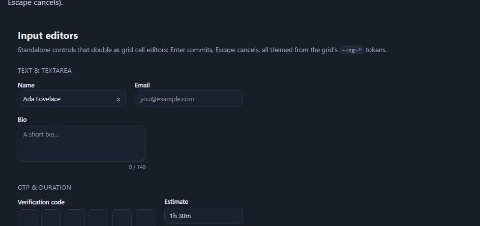
The full component catalogue is in the SvGrid UI components docs.
Where SvGrid UI wins clearly: when a data grid is the centrepiece and you need peripheral UI - toolbars, filter panels, detail modals, context menus - that shares the same theme tokens and accessibility implementation as the grid itself. You add one dependency and the entire surface is consistent.
Where it is a harder sell: if your app has no grid at all, reaching for @svgrid/grid to get a button component is the wrong trade. The package is not tiny. For a design-system-first project without a grid, shadcn-svelte or Bits UI is the more honest recommendation.
A working comparison
| Library | Svelte 5 runes | Headless option | Theming model | Install | Best fit |
|---|---|---|---|---|---|
| shadcn-svelte | Yes (Bits UI base) | Via Bits UI | CSS vars | Copy-in | Design system teams, ownership priority |
| Skeleton | Yes (v3+) | No | Tailwind config | Package | Tailwind-first teams |
| Flowbite-Svelte | Partial | No | Tailwind | Package | Widest component breadth |
| Bits UI | Yes | Fully headless | Yours | Package | Building a design system |
| Melt UI | Yes | Fully headless | Yours | Package | Max control, niche components |
| SvGrid UI | Yes | Grid headless core | CSS vars | Package | Grid-centred apps |
The "best fit" column is doing real work here. The main mistake teams make is picking by component count - Flowbite wins that race - rather than by how the library will behave in eighteen months when a component needs a behavior the library author did not anticipate. Headless libraries (Bits UI, Melt UI, the copy-in model of shadcn-svelte) give you the escape hatch. Render libraries require you to wait for a PR to merge.
Here is a minimal example pulling from SvGrid UI to show what the import surface looks like in practice when you need a few general-purpose components alongside a grid:
<script lang="ts">
  import {
    SvGrid,
    SvButton,
    SvContextMenu,
    SvPopover,
    SvDrawer,
    tableFeatures,
    rowSortingFeature,
    columnFilteringFeature,
    renderSnippet,
    type ColumnDef,
    type SvGridApi,
  } from '@svgrid/grid'

  type User = { id: number; name: string; email: string; role: string; status: string }

  const features = tableFeatures([rowSortingFeature, columnFilteringFeature])

  let gridApi = $state<SvGridApi<typeof features, User> | null>(null)
  let drawerOpen = $state(false)
  let selectedUser = $state<User | null>(null)

  const columns: ColumnDef<typeof features, User>[] = [
    { field: 'name',   header: 'Name',   width: 200 },
    { field: 'email',  header: 'Email',  width: 250 },
    { field: 'role',   header: 'Role',   width: 120 },
    { field: 'status', header: 'Status', width: 120 },
  ]

  const rows: User[] = [
    { id: 1, name: 'Ada Lovelace',  email: '[email protected]',  role: 'Admin',  status: 'Active' },
    { id: 2, name: 'Grace Hopper',  email: '[email protected]', role: 'Editor', status: 'Active' },
    { id: 3, name: 'Alan Turing',   email: '[email protected]',  role: 'Viewer', status: 'Inactive' },
  ]

  function openDetail(row: User) {
    selectedUser = row
    drawerOpen = true
  }
</script>

<div class="toolbar">
  <SvButton onclick={() => gridApi?.exportCsv()}>Export CSV</SvButton>
  <SvButton variant="outline" onclick={() => gridApi?.selectAllRows()}>Select all</SvButton>
</div>

<SvGrid
  data={rows}
  {columns}
  features={features}
  filterMode="menu"
  selectionMode="row"
  containerHeight="400px"
  onRowClick={(row) => openDetail(row.original)}
  onApiReady={(api) => (gridApi = api)}
/>

<SvDrawer bind:open={drawerOpen} title={selectedUser?.name ?? ''} placement="right" width={360}>
  {#if selectedUser}
    <p><strong>Email:</strong> {selectedUser.email}</p>
    <p><strong>Role:</strong> {selectedUser.role}</p>
    <p><strong>Status:</strong> {selectedUser.status}</p>
  {/if}
</SvDrawer>

<style>
  .toolbar { display: flex; gap: 0.5rem; margin-bottom: 0.75rem; }
</style>
The point of that snippet is not that the code is clever - it is straightforward. The point is that SvButton, SvDrawer, and SvGrid share one import, one theme, and one accessibility implementation. If your application looks like this, you get a consistent surface without gluing two libraries together.
What actually decides it
Component libraries are not interchangeable utilities. The install model shapes how your team relates to the code for years: a copy-in model means your components are yours to fix at 11pm on a Friday without waiting for a merge; a package dependency means you get upgrades for free until the API changes. The headless question shapes whether you can change a design decision without touching the library at all.
If the grid is the app, SvGrid UI is the straightforward answer. If the grid is one screen in a larger product, and your team already has a design system commitment - to Tailwind, to shadcn, to Bits UI - bring SvGrid into that system rather than replacing it.