SvGrid UI
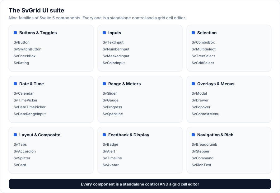
SvGrid UI is the Svelte 5 component suite that ships in the free
@svgrid/grid package - 70+ buttons, inputs, pickers, overlays, and layout
primitives, each with its own tutorial page. Every one is two things at once:
- a standalone control you can drop into any Svelte app, and
- a grid cell editor - the same component SvGrid mounts when you edit a cell.
That dual nature is the point: the grid stays the flagship, and its editor kit is also a full component library you can use on its own. Every component is theme-driven, accessible, and dependency-free (see below). Try them live under the SvGrid Editors switcher in the examples gallery, or jump straight to any component's tutorial in the catalogue.
Quick start with the CLI.
npx @svgrid/ui try calendaropens any component in a sandbox in your browser;npx @svgrid/ui add calendardrops a ready-to-edit starter into your app (and installs the dep). See Add components with the CLI.
Design principles
- Theme-driven. Every component styles itself from the grid's
--sg-*theme tokens (--sg-accent,--sg-bg,--sg-fg,--sg-border,--sg-radius,--sg-focus-ring, ...). Pick any preset theme and the components follow - no per-component theming needed. - Accessible. Each control maps to its WAI-ARIA APG pattern (listbox, combobox, radiogroup, slider, tabs, tree, ...) with full keyboard support and roving tabindex where the pattern calls for it.
- Controlled or bound. Components take a
valueand emitonChange, and the value is$bindable- so<SvTextInput bind:value={name} />works too (the editors, plusSvMultiSelect/SvTreeSelect/SvGridSelect). Overlay controls additionally emitonCommit/onCancelso the grid can save or cancel an edit. - Portalled overlays. Dropdown-style controls render their panel to
<body>(carrying the theme tokens with them) so they are never clipped by the grid's scroll container. - Dependency-free. Icons are inline SVG; the date engine, mask engine and country data are plain TypeScript. No external UI or date libraries.
The catalogue
Every component has its own tutorial page - what it is, a live demo, the full props table, common patterns, and accessibility notes. The overview link on each group heading is the at-a-glance rollup.
The grid
SvGrid - the data grid and the hero component of the suite. Every component below also works as a cell editor inside it.
Buttons & toggles
SvButton · SvButtonGroup · SvRepeatButton · SvToggleButton · SvSwitchButton · SvCheckBox · SvRadioGroup · SvRating
Inputs
SvTextInput · SvTextArea · SvNumberInput · SvPasswordInput · SvMaskedInput · SvPhoneInput · SvColorInput · SvOtpInput · SvDurationInput · SvTagsInput
Selection
SvListBox · SvDropDownList · SvComboBox · SvAutoComplete · SvMultiSelect · SvTreeSelect · SvGridSelect · SvGridDropdown · SvCountryInput
Date & time
SvCalendar · SvTimePicker · SvDateTimePicker · SvDateRangeInput
Range & meters
SvSlider · SvGauge · SvProgress · SvCircularProgress · SvSparkline · SvStat
Overlays & menus
SvPopover · SvTooltip · SvModal · SvDrawer · SvToaster · SvContextMenu · SvMenu · SvMenuList
Layout & composite
SvTabs · SvAccordion · SvSplitter · SvDockLayout · SvDockManager · SvCard · SvDivider · SvScrollArea · SvGridChart · SvChartPanes · SvForm · SvField · SvFileUpload · SvCollapsible · Layout primitives (SvStack · SvGroup · SvSimpleGrid) · Typography (SvTitle · SvText · SvAnchor · SvBlockquote · SvMark · SvList) · Display primitives (SvKbd · SvCode · SvAspectRatio · SvVisuallyHidden)
Feedback & display
SvBadge · SvSkeleton · SvAlert · SvEmptyState · SvChip · SvTimeline · SvAvatar · SvAvatarGroup · SvCarousel · SvSpinner · SvLoadingOverlay · SvResult
Navigation & rich
SvBreadcrumb · SvPagination · SvStepper · SvNavPane · SvTree · SvCommand · SvTour · SvRichText
As grid cell editors
The date/time controls are the rich-by-default editors for date, datetime
and time columns:
<script>
  import { SvGrid } from '@svgrid/grid'
  const columns = [
    { field: 'due', header: 'Due', editorType: 'date' },      // -> SvCalendar popover
    { field: 'at', header: 'At', editorType: 'datetime' },    // -> SvDateTimePicker
    { field: 'start', header: 'Start', editorType: 'time' },  // -> SvTimePicker dial
  ]
</script>
To opt back out to the plain native inputs, use editorType: 'date-native',
'datetime-native' or 'time-native'.
Custom cell editors
Any component - a built-in Sv* control or one you author - can be mounted as a
cell editor by registering it under a type name, then naming that type on a
column. The grid hands it a uniform context: value plus onChange (update the
in-progress value), onCommit (save + stop editing) and onCancel (discard).
<script>
  import { SvGrid, registerCellEditor, SvRating } from '@svgrid/grid'

  // Map the grid's edit context onto the component's props.
  registerCellEditor('stars', {
    component: SvRating,
    props: (ctx) => ({ value: ctx.value, onChange: (v) => ctx.onCommit(v) }),
  })

  const columns = [{ field: 'score', header: 'Score', editorType: 'stars' }]
</script>
registerCellEditor(type, Component) uses the default mapping (spreads value,
onChange, onCommit, onCancel); pass a { component, props } object for a
custom mapping. Also available: getCellEditor, hasCellEditor,
unregisterCellEditor, registeredCellEditorTypes.
Built-in shortcuts. Call registerBuiltinEditors() once to register the
config-free editors so columns can use them by name straight away:
import { registerBuiltinEditors } from '@svgrid/grid'
registerBuiltinEditors() // enables editorType 'otp' and 'duration'

const columns = [
  { field: 'code', editorType: 'otp' },
  { field: 'estimate', editorType: 'duration' },
]
It's opt-in (so the components tree-shake when unused). Option/structured editors
(SvMultiSelect, SvTreeSelect, SvGridSelect) need their options/nodes/
columns, so register those yourself with a props mapping as shown above.
More examples
Login block
A two-column authentication page: a branded gradient panel beside a sign-in SvCard with social SvButtons, SvTextInput + SvPasswordInput (reveal), remember-me SvCheckBox, an "or" SvDivider and forgot-password link. Drops into any route as-is.
Open the live example: Login block (Blocks)
Sign-up block
A centered account-creation card: two-up name fields, work email, a password with the live strength meter, a plan SvSegmented switch, terms SvCheckBox and a benefits rail. Submit fires a promise toast. Pure UI-kit.
Open the live example: Sign-up block (Blocks)
Two-factor / OTP block
The verification step of a sign-in flow: SvOtpInput (6 digits, auto-advance + onComplete), a resend cooldown timer, and the waiting -> verifying -> verified states. Enter 000000 to see the error path.
Analytics dashboard block
A full overview page: a range SvSegmented + actions header, a KPI grid (SvStat + SvSparkline), a revenue bar panel, a recent-activity SvTimeline and a top-products list with SvProgress bars. No grid dependency.
App shell block
A complete application layout: a SvNavPane sidebar with sections + badges, a top bar with SvBreadcrumb, search and an account SvMenu, and a routed content area. Nav swaps the page; the toggle collapses the rail to an icon rail.
Pricing block
A three-tier plan grid with a monthly/annual SvSegmented toggle (annual applies the discount live), a highlighted "most popular" card, per-plan feature SvLists with check marks, and a CTA SvButton on each.
Open the live example: Pricing block (Blocks)
Live examples
- Login block - A two-column authentication page: a branded gradient panel beside a sign-in SvCard with social SvButtons, SvTextInput + SvPasswordInput (reveal), remember-me SvCheckBox, an "or" SvDivider and forgot-password link. Drops into any route as-is.
- Sign-up block - A centered account-creation card: two-up name fields, work email, a password with the live strength meter, a plan SvSegmented switch, terms SvCheckBox and a benefits rail. Submit fires a promise toast. Pure UI-kit.
- Two-factor / OTP block - The verification step of a sign-in flow: SvOtpInput (6 digits, auto-advance + onComplete), a resend cooldown timer, and the waiting -> verifying -> verified states. Enter 000000 to see the error path.
- Analytics dashboard block - A full overview page: a range SvSegmented + actions header, a KPI grid (SvStat + SvSparkline), a revenue bar panel, a recent-activity SvTimeline and a top-products list with SvProgress bars. No grid dependency.
- App shell block - A complete application layout: a SvNavPane sidebar with sections + badges, a top bar with SvBreadcrumb, search and an account SvMenu, and a routed content area. Nav swaps the page; the toggle collapses the rail to an icon rail.
- Pricing block - A three-tier plan grid with a monthly/annual SvSegmented toggle (annual applies the discount live), a highlighted "most popular" card, per-plan feature SvLists with check marks, and a CTA SvButton on each.
Related articles
- What to Look for in a Svelte 5 UI Component Library - A practical comparison of shadcn-svelte, Skeleton, Flowbite-Svelte, Bits UI, Melt UI, and SvGrid UI - covering Svelte 5 runes support, headless cores, accessibility, theming, and install models.