Integrated charts
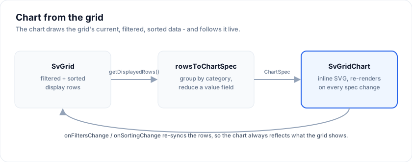
SvGrid can chart its own data with no external charting library. Two pieces:
SvGridChart- a component that renders aChartSpecas inline SVG (bar, line, area, pie, scatter / bubble) with axes, hover tooltips, a clickable legend that toggles series (or pie slices) on and off, reference lines, a time axis, and a visually-hidden data table for screen readers.rowsToChartSpec(rows, opts)- aggregates flat rows (group by a category field, reduce a value field) into aChartSpec, with optional sorting and top-N + "Other" bucketing.
Feed it api.getDisplayedRows() and the chart reflects the grid's current,
filtered, sorted data - the "chart from the grid" enterprise feature.
The examples on this page import from @svgrid/grid:
<script lang="ts">
  import { SvGrid, SvGridChart } from '@svgrid/grid'
</script>
<script lang="ts">
  import { SvGrid, SvGridChart, rowsToChartSpec, type SvGridApi } from '@svgrid/grid'

  let api: SvGridApi<F, Row> | null = null
  let displayed = $state<Row[]>(rows)
  const sync = () => (displayed = (api?.getDisplayedRows() as Row[]) ?? rows)

  const spec = $derived(
    rowsToChartSpec(displayed, { type: 'bar', category: 'region', value: 'revenue', reduce: 'sum' }),
  )
</script>

<SvGrid {data} {columns} {features} sortable filterable
  onApiReady={(a) => { api = a; sync() }}
  onFiltersChange={sync} onSortingChange={sync} />

<SvGridChart {spec} />
rowsToChartSpec
| Option | Meaning |
|---|---|
type |
'bar' | 'line' | 'area' | 'pie' | 'scatter' |
category |
Field whose distinct values become the x-axis / slices. |
value |
Numeric field, or an array of fields (one series each). |
series |
Pivot field: one series per distinct value of it. |
reduce |
'sum' (default), 'avg', or 'count'. |
stacked |
Stack the series instead of grouping them. |
stacked100 |
Stack to 100% - each category normalized to its total. |
sort |
'value-desc' | 'value-asc' | 'category' | 'none'. |
topN |
Keep the top N categories, bucket the rest into "Other". |
otherLabel |
Label for the bucket (default 'Other'). |
width / height |
SVG viewBox size. |
Three multi-series shapes:
rowsToChartSpec(rows, { type: 'bar', category: 'region', value: 'revenue' })            // 1 series
rowsToChartSpec(rows, { type: 'bar', category: 'region', value: ['revenue', 'cost'] })  // 2 series
rowsToChartSpec(rows, { type: 'bar', category: 'region', value: 'sales', series: 'product' }) // pivot
Building a spec yourself
SvGridChart takes any ChartSpec. Per-series type and axis give you combo
charts and a secondary Y axis; stacked stacks bars/areas; innerRadius turns a
pie into a donut; yAxisTitle / y2AxisTitle / xAxisTitle label the axes.
Negative values drop below a zero baseline automatically, and null / NaN
values break the line (a gap) instead of dropping it to zero.
const spec: ChartSpec = {
  type: 'bar',
  stacked: false,
  categories: ['Q1', 'Q2', 'Q3', 'Q4'],
  series: [
    { label: 'Revenue', values: [120, 140, 90, 180] },                 // bars, left axis
    { label: 'Margin %', values: [0.31, 0.28, 0.22, 0.35], type: 'line', axis: 'right' }, // line, right axis
  ],
}
// donut:  { type: 'pie', innerRadius: 0.6, categories, series: [...] }
The geometry helper buildChart(spec) is exported too, if you want the raw SVG
primitives for a custom renderer.
Reference / target lines
referenceLines draws horizontal goal / average / SLA lines across the plot.
Each entry stretches the axis domain so the line is always in view:
const spec: ChartSpec = {
  type: 'bar', categories: ['Q1', 'Q2', 'Q3', 'Q4'],
  series: [{ label: 'Revenue', values: [120, 140, 90, 180] }],
  referenceLines: [{ value: 150, label: 'Target', axis: 'left', color: '#ef4444', dashed: true }],
}
Number format, currency and locale
valueFormat picks the shape of every number the chart draws - the value axis,
tooltips, data labels and reference lines:
{ valueFormat: 'currency' } // 'number' | 'currency' | 'percent' | 'compact'
By itself that formats in the chart's own compact style, and currency means a
$. Add currency (an ISO 4217 code) and locale (BCP-47) to format through
Intl.NumberFormat instead:
{ valueFormat: 'currency', currency: 'EUR', locale: 'de-DE' }
Setting either one switches the whole chart over, so separators, the decimal
mark and the compact suffixes follow the locale rather than English. Leaving
both unset keeps the original output exactly, which is deliberate: Intl's
compact form is not the same string even for en-US (1.2K, capitalised), so
formatting everything through it would restyle every axis already drawn.
A grid inherits this. localization.locale is the chart's default locale, so a
grid that is already localized gets a localized chart without repeating itself,
and charting.locale overrides it when the two really should differ:
<SvGrid
  {data} {columns}
  localization={{ locale: 'de-DE' }}
  charting={{ valueFormat: 'currency', currency: 'EUR' }}
/>
Currency has no such default, because only the application knows what the
numbers are denominated in. Ask for valueFormat: 'currency' without one and
the chart falls back to USD rather than refusing to draw.
100% stacked
stacked100: true (implies stacked) normalizes each category to its own
total, so the axis runs 0..100% and every column fills the plot height -
ideal for reading composition / share. Tooltips and labels still show the
original values.
Scatter / bubble
type: 'scatter' plots two numeric measures against each other. Each series
carries points: [{ x, y, r?, label? }]; an optional r becomes the bubble
radius (scaled across the data). One series per group colours the points.
const spec: ChartSpec = {
  type: 'scatter', categories: [],
  xAxisTitle: 'Spend', yAxisTitle: 'Revenue',
  series: [
    { label: 'EMEA', values: [], points: [{ x: 12_000, y: 80_000, r: 18, label: 'Ada' }] },
    { label: 'APAC', values: [], points: [{ x: 30_000, y: 140_000, r: 33, label: 'Grace' }] },
  ],
}
Horizontal bars
orientation: 'horizontal' swaps the axes: categories run down the left, bars
grow rightward. It suits long category labels (rep names, product names) that
would otherwise crowd / rotate on a vertical x-axis. Grouped, stacked, 100%,
data labels, and reference lines (which become vertical) all work. Only applies
when every series is a bar - combo / line / area fall back to vertical.
const spec: ChartSpec = {
  type: 'bar', orientation: 'horizontal',
  categories: ['Ada', 'Grace', 'Margaret', 'Linus'],
  series: [{ label: 'Revenue', values: [120, 90, 140, 80] }],
  referenceLines: [{ value: 110, label: 'Avg' }],   // drawn as a vertical line
}
Time axis
xType: 'time' treats categories as dates: x positions are spaced by actual
time (irregular gaps render proportionally, not evenly) and the axis shows real
date ticks. Works with line / area / bar.
rowsToChartSpec(rows, { type: 'line', category: 'date', value: 'sessions', series: 'channel' })
// then: spec.xType = 'time'
Ordinal dates, for data with gaps
xType: 'ordinal-time' also reads categories as dates, but spaces them
evenly and uses the dates only for the tick labels.
Use it whenever the gaps in your data are not meaningful. On a true time axis a series of trading sessions or business days opens a hole over every weekend three times as wide as a working day, which tells the reader nothing except that Saturday exists.
spec.xType = 'ordinal-time'
Candlestick and OHLC
Set ohlc on the series alongside values:
const spec: ChartSpec = {
  type: 'candlestick',            // or 'ohlc' for tick bars
  xType: 'ordinal-time',          // skip the days the market was shut
  categories: rows.map((r) => r.date),
  series: [{
    label: 'ACME',
    values: rows.map((r) => r.c), // the CLOSES - see below
    ohlc: rows.map((r) => ({ o: r.o, h: r.h, l: r.l, c: r.c })),
    overlay: 'sma:10',            // a moving average, for free
  }],
}
A rising bar draws hollow and a falling one filled, so direction reads from the
shape as well as the colour. candleColors overrides the pair. A null entry
in ohlc is a day with no session and draws nothing.
Put the closing prices in values too. Everything that reads a series
generically reads values: the tooltip, the CSV export, the screen-reader
table, and overlay. Filling it in is what lets a price series carry a moving
average or export to CSV without a line of candle-specific code.
Give volume its own pane rather than the price chart's right axis. Both axes
share the full plot height, so a right-axis volume series climbs up through the
candles: technically correct, and unreadable. A second short chart over the
same categories and the same xType is what a trading screen actually does,
and the two stay in register because they share the axis mode.
Candlesticks are cartesian, so zoom, the brush mini-map, the crosshair tooltip and keyboard navigation all work. The price axis is not pinned to zero the way a bar chart's is, so a series trading between 180 and 195 uses the whole plot instead of a fifth of it.
The other chart types
Everything below reads the same categories + series shape as a bar chart,
so you can switch type and keep the rest of the spec. They are all reachable
from the built-in panel too, where the picker offers whichever ones your
current columns can actually feed.
Waterfall
Running total, with bars that step up and down from where the last one left
off. waterfallTotals marks the bars that are subtotals: those reset the
running sum and span from zero.
{ type: 'waterfall', categories, series: [{ label: 'P&L', values }],
  waterfallTotals: [false, false, false, true] }
Only the first series is drawn: a waterfall is one running sequence, so a split-by has nothing to add.
Funnel
Stages narrowing to a conclusion. Each segment carries its own conversion and drop-off, so the chart answers "where did they go" rather than just "how many". Sort descending unless the data is already in stage order.
Radar
One spoke per category, one polygon per series. Good for comparing a handful of things across the same handful of measures; poor above about eight spokes, where the shape stops being readable.
Heat map
Series become rows, categories become columns, and each cell is coloured by
value. colorScale picks the ramp: 'sequential' runs one hue from min to
max, 'diverging' runs cold to warm around zero, or pass your own array of
two or more hex colours.
A heat map needs a split-by: without one it has a single row.
Open the live example: Heatmap chart (Charts)
Tree map
Nested rectangles sized by value, laid out squarified so the shapes stay close
to square and remain comparable. Pass treemap as a hierarchy, or let the
panel build one from a group-by plus an optional split-by.
Only positive values have an area, so zero and negative leaves are dropped.
Sankey
Flows between nodes. sankeyNodes names them and sankeyLinks carries
{ source, target, value }. From the panel, group-by is the source and
split-by is the target.
Calendar
A year of days, GitHub-style: one cell per day, coloured by value.
calendarValues takes { date: 'YYYY-MM-DD', value } samples and missing
days render blank. calendarStart / calendarEnd set the window; by default
it spans the data.
Gauge
A single number on a semicircle dial.
{ type: 'gauge', categories: [], series: [],
  gaugeValue: 99.82, gaugeMin: 0, gaugeMax: 100, gaugeUnit: '%',
  gaugeTarget: 99.9,
  gaugeRanges: [
    { from: 0,  to: 70, color: '#ef4444' },
    { from: 70, to: 99.9, color: '#f59e0b' },
    { from: 99.9, to: 100, color: '#16a34a' },
  ] }
Bands are half-open [from, to), so a value sitting exactly on a boundary
belongs to the band that boundary opens. They are drawn as a thin reference
ring inside the dial rather than on the value arc: the arc is the reading, the
bands only say what the scale means, and a band covering most of the scale
should not look like a full dial.
Box plot
The one chart here that answers "how spread out" rather than "how much", which
is the question an average hides. ChartSeries.boxes carries a five-number
summary per category, and values holds the medians alongside it, so tooltips,
CSV export and overlays keep working with no box-specific code.
import { boxStats, rowsToBoxSpec } from '@svgrid/grid'

// One sample -> one summary, with the usual 1.5 IQR whisker rule.
boxStats([120, 130, 140, 150, 900])
// { min: 120, q1: 130, median: 140, q3: 150, max: 150, outliers: [900] }

// Per group, straight from rows. This is what the chart panel calls.
const spec = rowsToBoxSpec(rows, { category: 'region', value: 'ms' })
min and max are the whisker ends, not the extremes of the sample:
whiskers stop at the last observation inside the fence, and anything past it
comes back in outliers to be drawn as individual points. A category with no
observations returns null and is left as a gap rather than a box at zero.
Pass series for side-by-side boxes per group. In the grid's own panel, Box
plot is the one type that ignores the Aggregate control, because it does its own
reduction - sum | avg | count has nothing to say about a distribution.
Error bars
Not a chart type. ChartSeries.errors annotates whatever mark the series
already draws, so a bar, line, area or scatter series grows whiskers without
changing its type:
{
  type: 'bar',
  categories: ['eu-west', 'us-east'],
  series: [{
    label: 'Mean',
    values: [120, 140],
    // A number is a symmetric +/- margin.
    errors: [12, 34],
    // Or set both ends explicitly: errors: [{ lo: 108, hi: 132 }, ...]
  }],
}
null skips one entry and still draws its mark. The value axis stretches to
cover the whiskers, so a bar with a wide interval cannot clip at the top of the
plot.
Drawing your own marks
Two snippets let you draw into the chart's own coordinate space. underlay
paints beneath the built-in marks, overlay above them:
<script lang="ts">
  import { SvChart, type ChartSpec } from '@svgrid/grid'

  const spec: ChartSpec = {
    type: 'line',
    categories: ['Mon', 'Tue', 'Wed', 'Thu', 'Fri'],
    series: [{ label: 'Latency', values: [120, 180, 140, 260, 150] }],
  }
  const budget = 200
</script>

<SvChart {spec}>
  {#snippet underlay({ geo, yOf })}
    <!-- Everything over budget, shaded. -->
    {#if yOf}
      <rect
        x={geo.plot.x}
        y={geo.plot.y}
        width={geo.plot.w}
        height={Math.max(0, yOf(budget) - geo.plot.y)}
        fill="tomato"
        fill-opacity="0.08"
      />
    {/if}
  {/snippet}

  {#snippet overlay({ xOf, yOf })}
    <!-- A ring around the worst day. -->
    {#if xOf && yOf}
      <circle cx={xOf(3)} cy={yOf(260)} r="7" fill="none" stroke="tomato" stroke-width="2" />
    {/if}
  {/snippet}
</SvChart>
This is the extension point instead of a registry of custom series types: a chart mark is markup, so drawing one should be markup too.
Both snippets receive { geo, xOf, yOf, scales }. geo is the full
ChartGeometry - every laid-out bar,
line point, tick and plot rectangle. xOf(i) is the pixel x at the centre of
category i (fractional indices interpolate), and yOf(value, axis?) is the
pixel y for a value on the left or right axis.
Take the scales from here rather than recomputing them. The domain a chart was
drawn against is nice-rounded, stretched to include zero for bar charts and to
cover any reference lines - reproducing that from the raw data is guesswork, and
being a few pixels out reads as a rendering bug. chartScales(geo) is exported
if you need the same functions outside a snippet:
import { buildChart, chartScales } from '@svgrid/grid'

const geo = buildChart(spec)
const sc = chartScales(geo) // null for pie / gauge / treemap / sankey / radar / funnel / calendar
sc?.xInvert(240) // which category is at x=240
sc?.yInvert(80)  // what value is at y=80
xOf and yOf are null on the types with no cartesian axes, which is also
how you can tell whether plot coordinates mean anything for the current type.
The overlay is drawn below the crosshair and the hit layer on purpose, so whatever you add cannot swallow tooltips, keyboard navigation or drill clicks.
Large series
A chart with more categories than the plot has pixels adapts on its own, with nothing to configure. Below about 4px per category:
- Dots collapse to the hovered one. The line path still draws every point - no data is dropped - but at that spacing the dots overlap into a band that hides the line they are meant to mark.
- Hit zones collapse from one rect per category to a single surface that works out the index from the cursor. Arrow keys still step point by point.
- Axis labels thin to whatever fits, first category always labelled. This applies at any density, not only past the threshold.
- The screen-reader table is capped, and its caption says so ("first 1000 of 100000 rows"). A table with a row per point is not an accessible version of a chart; nobody traverses that.
Measured on a 20,000-point line chart in Chromium: 63,024 DOM nodes and 4,711 ms
before, 3,072 nodes and 617 ms after. The engine was never the bottleneck -
buildChart handles 100,000 points in about 140 ms - it was four separate
things that emitted one node per category.
Bar charts are not thinned: a line still shows its shape without dots, but bars
are the data, so dropping them would draw an empty chart. Several thousand
sub-pixel bars still render correctly and still merge into a solid block, which
is a good sign you want topN, a coarser group-by, or zoomable.
Charting from the grid, without a spec
charting puts the whole thing behind one prop: the grid grows a Chart button
and a panel that derives its spec from the displayed rows.
<SvGrid {data} {columns} charting />
<SvGrid {data} {columns} charting={{ position: 'right', crossFilter: true }} />
The panel lets a reader pick the chart type, the group-by, an optional
split-by, the measure, the aggregate and the number format, plus stacking,
100%, horizontal bars, donut, data labels, a log axis, a date axis and the
series palette. Everything it offers is a ChartingConfig field, so anything
a reader can reach you can also preset.
Cross-filtering
crossFilter: true turns a click on a chart category into a grid filter, and
the panel grows a Clear filter button. It applies to the types where a clicked
mark maps back to exactly one value of the charted dimension, so it is off for
gauge, scatter and sankey - on a sankey a clicked target would otherwise
filter the source column and empty the grid.
Interactivity
SvGridChart is interactive by default:
- Unified tooltip + crosshair - hovering a category column shows a vertical crosshair and a single tooltip listing every series' value at that category (with color swatches), so multi-series and combo charts read at a glance. Pie slices keep a per-slice tooltip.
- Legend toggle + isolate - clicking a legend chip hides/shows that series (or pie slice); double-clicking isolates it (shows only that one, click again to restore). Hovering a chip dims the others. The chart re-scales to the visible data; colors stay stable.
- Scatter tooltip - hovering a bubble shows its x / y (and label).
- Legend overflow - a wide pivot (many series) collapses the legend to the first 10 chips with a "+N more" toggle, so it never floods the chart.
- Data labels -
dataLabelsdraws the value on each bar / point / slice. - Drill-down -
onSelect({ category, series, value })fires when a bar / point / slice is clicked. Wire it toapi.setFacetFilter(...)to filter the grid to the clicked category - the "click the chart to drill the grid" loop.
<SvGridChart {spec}
  dataLabels                                  // value labels on each element
  formatValue={(v) => `$${compact(v)}`}       // tooltips, labels, AND Y-axis ticks
  onSelect={(s) => api.setFacetFilter('region', [s.category])} // drill the grid
  legend={true}                               // clickable legend; default true
  interactive={false}                         // opt out of tooltips + toggling
/>
formatValue is applied to tooltips, data labels, and the Y-axis ticks, so
they stay consistent - keep it compact (e.g. $2M, not $2,000,000).
Letting readers pin their own notes
annotations in the spec are yours. annotatable hands the same thing to the
reader: it adds an Annotate toggle to the toolbar, and while that is on,
picking a category fires onAnnotate and clicking an existing marker fires
onAnnotationRemove.
The chart does not store them. It owns the gesture - which you cannot build from outside, because drag is already zoom and click is already drill - and hands you back the data point. Where the notes live and whether they outlive a reload is yours to decide:
<script lang="ts">
  import { SvChart, type ChartAnnotation, type ChartSpec } from '@svgrid/grid'

  let notes = $state<ChartAnnotation[]>([])
  const base: ChartSpec = {
    type: 'line',
    categories: ['Mon', 'Tue', 'Wed', 'Thu', 'Fri'],
    series: [{ label: 'Errors', values: [4, 6, 31, 8, 5] }],
  }
  const spec = $derived({ ...base, annotations: notes })
</script>

<SvChart
  {spec}
  annotatable
  onAnnotate={(at) => (notes = [...notes, { at: { category: at.category }, label: `${at.value}` }])}
  onAnnotationRemove={(i) => (notes = notes.filter((_, n) => n !== i))}
/>
What comes back is a data point, not a pixel: { category, index, value }.
A note anchored to a category stays on its data when the chart is re-sorted,
re-filtered or zoomed, which is the whole reason not to hand back coordinates.
It works from the keyboard for the same reason. Annotate mode takes over the category gesture rather than adding one of its own, and the category hit zones already navigate with arrow keys - so pinning a note is Tab, arrow, Enter. A marker is focusable while the mode is on, and Enter removes it.
Export
Download the rendered chart as a standalone SVG or a PNG. Pass the chart's
wrapper element (or its <svg>):
<div bind:this={chartEl}><SvGridChart {spec} /></div>

<button onclick={() => downloadChartSvg(chartEl, 'chart.svg')}>SVG</button>
<button onclick={() => downloadChartPng(chartEl, 'chart.png', { scale: 2 })}>PNG</button>
chartToSvgString / chartToPngBlob return the data if you want to upload it
instead. The export inlines the live theme colors, so it matches what's on
screen.
CSV
chartSpecToCsv(spec) writes the data behind the picture: one row per category,
one column per series. A series carrying more than one number per category
widens rather than losing them:
| Series shape | Columns |
|---|---|
plain values |
<label> |
ohlc |
<label> Open, High, Low, Close |
boxes |
<label> Min, Q1, Median, Q3, Max, Outliers |
errors |
<label>, <label> Low, <label> High |
Scatter has no categories, so it exports one row per point instead
(Series, X, Y, Size, Label).
chartCsvExportable(spec) answers whether there is anything to write, without
building it - which is what the panel's CSV menu item is disabled on. Sankey,
treemap, gauge and calendar have no rectangular data and still export nothing.
Notes
- Pure SVG - no canvas, no dependency, SSR-safe, and it inherits the grid's
--sg-*theme tokens. - Accessible - every chart renders a visually-hidden
<table>of the same data, wired to the SVG viaaria-describedby, so screen readers get the numbers, not just "chart". - Zoom, a brush mini-map, crosshair tooltips, drag-to-select drill-through and
fifteen chart types all ship here, so reaching for a separate charting
library is rarely the shortcut it looks like. If you already have one, demos
73-chartjs-syncand77-smart-chartshow how to pipegetDisplayedRows()into it.
See the live Integrated charts
demo, or the Chart wizard panel -
a pick-a-chart dialog whose type-gallery thumbnails are themselves live
SvGridChart previews.
More examples
Scatter / bubble chart
A scatter plot maps two numeric measures (x vs y); a bubble chart adds a third via dot radius. type: scatter with series points [{ x, y, r }]. Spend vs revenue, sized by deals, coloured by region, with an average-revenue reference line. Filter the grid and the cloud re-plots.
Time-series chart (date axis)
xType: time spaces points by ACTUAL time - irregular date gaps render proportionally - and shows real date ticks. A referenceLines target/SLA line spans the plot; toggle 100% stacked to read each day as a share of its total. Line, stacked area, or stacked bar.
Chart zoom + brush mini-map
Drag a rectangle over a 180-day series to zoom in; double-click resets. A compact brush below shows the full range with a draggable window - drag the body to pan, edges to resize. Pairs with the crosshair tooltip + PNG/SVG export.
Heatmap chart
type: heatmap renders a colored grid (one cell per row/column) from the same categories + series shape. Choose a sequential or diverging color ramp; cell text auto-contrasts black/white. Filter the grid Channel column and the heatmap re-renders.
Open the live example: Heatmap chart (Charts)
Analytics: trend, log, drill
Four story-telling chart features at once: overlay (SMA/EMA/linear regression), annotations pinned at named events, yScale: log for wide-range data, and onDrill that filters the grid to the rowIds of the clicked category. Click any day to drill.
Color-blind-safe pattern fills
patternFallback: true layers a texture (stripe / crosshatch / dots / diagonal) on every series so two series with similar hues still read as distinct in grayscale or for readers with color-vision deficiency. Works on bars and area stacks.
Forecast: smooth + confidence band
smooth: true bends the polyline into a monotone cubic curve that still passes through every point but flows between them. upperValues + lowerValues shade a translucent envelope around the forecast for at-a-glance uncertainty. 12 weeks actuals + 8 weeks forecast.
Waterfall (signed P&L)
type: waterfall renders each bar starting where the previous one ended. waterfallTotals marks subtotal/total bars that span from 0. Bars colour-code by sign (green / red); total bars get a neutral slate. Connector lines link bar tops so the cumulative trend reads at a glance.
Streaming chart (rolling window)
Hit Start - prices stream in at 4 Hz. The buffer holds the last 60 ticks; older points drop off the left as new ones appear on the right. Re-aggregates via rowsToChartSpec so smoothing, brush, zoom all stay in play.
Funnel chart (signup conversion)
type: funnel renders strictly-decreasing values as a stack of trapezoids. Each segment shows conversion vs. the top of the funnel inline; hover for the step drop-off. Click a segment to record a drill selection.
Radar chart (product comparison)
type: radar plots each category as a spoke; every series draws a polygon connecting its values across the spokes. Shared scale makes two products read against each other directly. Click the legend to isolate one.
Calendar heatmap (year of days)
type: calendar renders a GitHub-commit-style 7-row x ~53-column grid. Each cell shaded by its value; days with no value render as outlined blanks so missing data reads as missing. Filter the grid Type column and the heatmap re-aggregates.
Tree-map (sales by region·category)
The canonical BI tree-map: revenue broken down hierarchically into nested rectangles - bigger value = bigger rectangle. The squarified algorithm keeps every cell close to a square so labels stay readable. Switch the drill order (Region → Category vs. Category → Region) to compare the same data two ways.
Sankey diagram (user flow)
type: sankey lays nodes out in columns by longest-path depth and renders flow links as bezier ribbons whose width = link value in pixels. User journey from acquisition channel through onboarding to outcome. Hover any ribbon for the source -> target value.
Live examples
- Candlestick / OHLC - Candlestick and OHLC price marks with an ordinal date axis. ChartSeries.ohlc carries the four prices while values keeps the closes, so the CSV export, the screen-reader table and a 10-day moving average all work with no candle-specific code. Toggle the axis: a real time axis opens a gap over every weekend, an ordinal one spaces sessions evenly and still labels them by date. The strip under the plot is the chart brush: drag its window to pan, drag an edge to resize.
- Waterfall (signed P&L) - type: waterfall renders each bar starting where the previous one ended. waterfallTotals marks subtotal/total bars that span from 0. Bars colour-code by sign (green / red); total bars get a neutral slate. Connector lines link bar tops so the cumulative trend reads at a glance.
- Funnel chart (signup conversion) - type: funnel renders strictly-decreasing values as a stack of trapezoids. Each segment shows conversion vs. the top of the funnel inline; hover for the step drop-off. Click a segment to record a drill selection.
- Radar chart (product comparison) - type: radar plots each category as a spoke; every series draws a polygon connecting its values across the spokes. Shared scale makes two products read against each other directly. Click the legend to isolate one.
- Heatmap chart - type: heatmap renders a colored grid (one cell per row/column) from the same categories + series shape. Choose a sequential or diverging color ramp; cell text auto-contrasts black/white. Filter the grid Channel column and the heatmap re-renders.
- Tree-map (sales by region·category) - The canonical BI tree-map: revenue broken down hierarchically into nested rectangles - bigger value = bigger rectangle. The squarified algorithm keeps every cell close to a square so labels stay readable. Switch the drill order (Region → Category vs. Category → Region) to compare the same data two ways.
- Sankey diagram (user flow) - type: sankey lays nodes out in columns by longest-path depth and renders flow links as bezier ribbons whose width = link value in pixels. User journey from acquisition channel through onboarding to outcome. Hover any ribbon for the source -> target value.
- Calendar heatmap (year of days) - type: calendar renders a GitHub-commit-style 7-row x ~53-column grid. Each cell shaded by its value; days with no value render as outlined blanks so missing data reads as missing. Filter the grid Type column and the heatmap re-aggregates.
- Gauge dial (KPI dashboard) - type: gauge renders a semicircle with track + value arcs, optional red/amber/green range bands, and a target tick. Click any row in the KPI grid to drive the dial; bands auto-flip direction based on whether higher or lower is better.
- Box plot + error bars - Distribution rather than average: box plots with the 1.5 IQR whisker rule and individual outliers, next to the same data as a bar chart of the means with error bars. two regions with nearly identical means sit side by side in the bars and look nothing alike in the boxes. boxStats() summarises a raw sample, rowsToBoxSpec() does it per group, and ChartSeries.errors annotates any existing mark without changing its type.
- Built-in charting (one prop) - Turn on the built-in Chart panel with a single charting prop - no external library. Pick Group by / Value, choose a type, filter a column or click a bar, and the chart re-aggregates over the grid's current (filtered / sorted) rows live.
- Scatter / bubble chart - A scatter plot maps two numeric measures (x vs y); a bubble chart adds a third via dot radius. type: scatter with series points [{ x, y, r }]. Spend vs revenue, sized by deals, coloured by region, with an average-revenue reference line. Filter the grid and the cloud re-plots.
- Time-series chart (date axis) - xType: time spaces points by ACTUAL time - irregular date gaps render proportionally - and shows real date ticks. A referenceLines target/SLA line spans the plot; toggle 100% stacked to read each day as a share of its total. Line, stacked area, or stacked bar.
- Chart zoom + brush mini-map - Drag a rectangle over a 180-day series to zoom in; double-click resets. A compact brush below shows the full range with a draggable window - drag the body to pan, edges to resize. Pairs with the crosshair tooltip + PNG/SVG export.
- Analytics: trend, log, drill - Four story-telling chart features at once: overlay (SMA/EMA/linear regression), annotations pinned at named events, yScale: log for wide-range data, and onDrill that filters the grid to the rowIds of the clicked category. Click any day to drill.
- Color-blind-safe pattern fills - patternFallback: true layers a texture (stripe / crosshatch / dots / diagonal) on every series so two series with similar hues still read as distinct in grayscale or for readers with color-vision deficiency. Works on bars and area stacks.
- Forecast: smooth + confidence band - smooth: true bends the polyline into a monotone cubic curve that still passes through every point but flows between them. upperValues + lowerValues shade a translucent envelope around the forecast for at-a-glance uncertainty. 12 weeks actuals + 8 weeks forecast.
- Streaming chart (rolling window) - Hit Start - prices stream in at 4 Hz. The buffer holds the last 60 ticks; older points drop off the left as new ones appear on the right. Re-aggregates via rowsToChartSpec so smoothing, brush, zoom all stay in play.
- Integrated charts (no deps) - Chart the grid data with no external charting library. SvGridChart renders a ChartSpec; rowsToChartSpec aggregates the grid current (filtered/sorted) rows into one. Bar, line, area, pie - plus 100% stacked, top-N + Other, an average reference line, and double-click-to-isolate a series. Filter the grid and the chart re-aggregates live.
- Chart wizard (from the grid) - Grid on the left, chart wizard on the right. The wizard builds a chart from the grid rows via rowsToChartSpec: pick the type from a gallery (whose thumbnails are themselves live mini SvGridChart instances), choose group-by + measure + aggregation, and a palette. Column, Bar (horizontal), Line, Area, Pie with stacked / 100% variants. Drag a cell range or tick row checkboxes to chart just the selection; otherwise the whole filtered / sorted set re-aggregates live.
Related articles
- SvGrid Tips and Tricks: Get More from Your Svelte Data Grid - Practical SvGrid tips - fitColumns, cellFlash, Kanban board mode, server-side data, theming tokens and headless rendering - each with a code snippet and docs link.