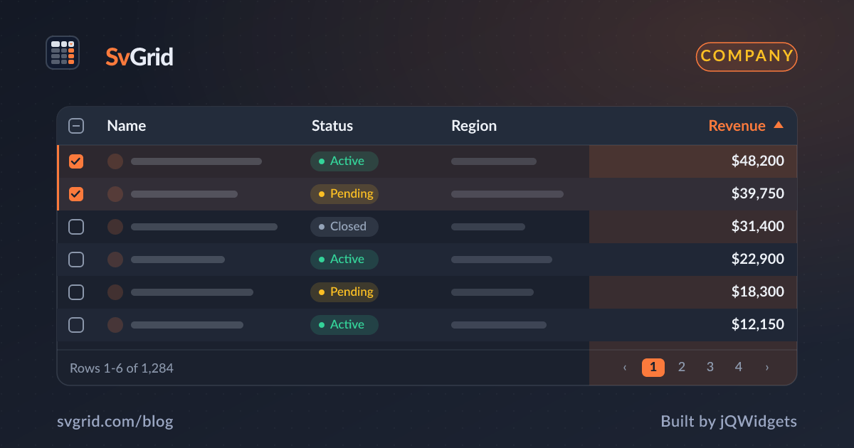
Introducing SvGrid - A Native Svelte 5 Data Grid from jQWidgets
SvGrid is a headless-first data grid built specifically for Svelte 5 runes. Here is what it does differently, why the architecture matters, and how to get started in under ten minutes.
Most data grids you find on npm were built for React. Some were ported to Vue, and a handful have Svelte adapters bolted on after the fact. Those adapters share a common smell: they wrap an internal state machine in a Svelte store and then spend most of their code syncing the two. Any time Svelte's reactivity and the grid's reactivity disagree, you lose - and you debug it by reading two systems at once.
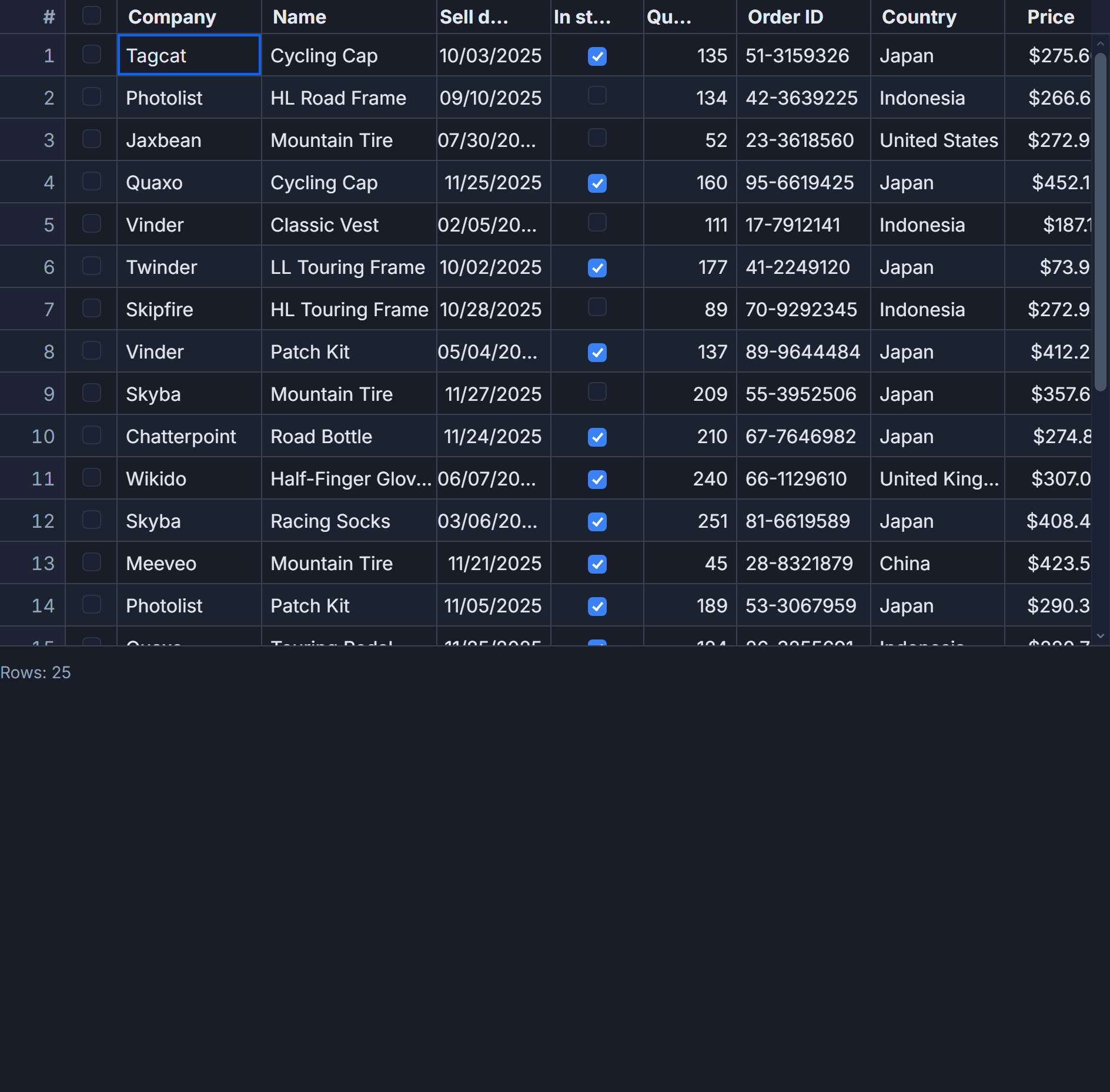
SvGrid is the grid we built after deciding that approach was not fixable. It runs on Svelte 5 runes natively. There is no adapter layer, no store bridge, and no internal event bus to sync against. $state, $derived, and $effect go all the way down.
What "headless-first" actually means here
The core of SvGrid is a row-model pipeline built out of $derived values. You feed it data and a feature set; it gives back a reactive array of rows in the order determined by current sort, filter, group, and pagination state. Each stage is a pure transformation:
raw rows
  -> sorted rows
  -> filtered rows
  -> grouped rows
  -> paginated rows
  -> expanded rows
Only the stages downstream of a change re-run. Flip a filter? The sort result is cached. Change a page? The filter result is reused. This is not a clever optimization - it falls out naturally from how $derived works in Svelte 5.
The render component (<SvGrid />) sits on top of that pipeline and adds two virtualizers: one for rows and one for columns. But you can skip the render component entirely and consume the pipeline directly via createSvGrid. Your own scroll container, your own cell markup, the same sort and filter logic.
A working grid in fifteen lines
Install the package:
pnpm add @svgrid/grid
Then a basic grid component looks like this:
<script lang="ts">
  import SvGrid, {
    tableFeatures,
    rowSortingFeature,
    columnFilteringFeature,
    rowSelectionFeature,
    type ColumnDef,
    type SvGridApi,
    type TableFeatures,
  } from '@svgrid/grid'

  type Row = { id: number; name: string; role: string; salary: number }

  const features = tableFeatures({
    rowSortingFeature,
    columnFilteringFeature,
    rowSelectionFeature,
  })

  const data: Row[] = [
    { id: 1, name: 'Alice',   role: 'Engineer', salary: 120_000 },
    { id: 2, name: 'Bernard', role: 'Designer',  salary: 98_000  },
    { id: 3, name: 'Carla',   role: 'PM',        salary: 105_000 },
  ]

  const columns: ColumnDef<typeof features, Row>[] = [
    { field: 'name',   header: 'Name',   width: 160 },
    { field: 'role',   header: 'Role',   width: 120 },
    { field: 'salary', header: 'Salary', width: 120, type: 'number' },
  ]

  let api = $state<SvGridApi<typeof features, Row> | null>(null)
</script>

<SvGrid
  {data}
  {columns}
  {features}
  sortable
  filterable
  height={320}
  onApiReady={(a) => { api = a }}
/>
One thing that trips people up immediately: features must be declared outside the component function (or at module scope). Writing features={tableFeatures({ rowSortingFeature })} inline as a JSX-style prop expression creates a new object on every render cycle, which causes the grid to tear down and rebuild its internal state continuously. Declare it once, pass it by reference.
The imperative API and when to use it
The <SvGrid /> component handles most interaction through its props and events. But for toolbar buttons, keyboard shortcuts, and cross-component coordination you often need the imperative SvGridApi. You get it through onApiReady, and it stays valid for the lifetime of the component.
Here is a realistic toolbar that sorts, filters, and exports:
<script lang="ts">
  import SvGrid, {
    tableFeatures,
    rowSortingFeature,
    columnFilteringFeature,
    rowSelectionFeature,
    type ColumnDef,
    type SvGridApi,
  } from '@svgrid/grid'

  type Employee = {
    id: number; firstName: string; lastName: string
    department: string; salary: number; performance: number
  }

  const features = tableFeatures({
    rowSortingFeature,
    columnFilteringFeature,
    rowSelectionFeature,
  })

  let api = $state<SvGridApi<typeof features, Employee> | null>(null)
  let selectedCount = $state(0)

  const columns: ColumnDef<typeof features, Employee>[] = [
    { field: 'firstName',   header: 'First',       width: 130, editable: true },
    { field: 'lastName',    header: 'Last',        width: 130, editable: true },
    { field: 'department',  header: 'Department',  width: 150 },
    {
      field: 'salary',
      header: 'Salary',
      width: 130,
      type: 'number',
      format: { type: 'currency', currency: 'USD', options: { maximumFractionDigits: 0 } },
      conditionalFormat: [
        { condition: ({ value }) => value > 150_000, style: { color: 'green', fontWeight: 'bold' } },
        { condition: ({ value }) => value < 70_000,  style: { color: 'red' } },
      ],
    },
    {
      field: 'performance',
      header: 'Score',
      width: 90,
      type: 'number',
    },
  ]

  function onSelectionChange() {
    selectedCount = api?.getSelectedRows().length ?? 0
  }

  function filterHighPerformers() {
    api?.setFilter('performance', { operator: 'greaterThan', value: '85' })
  }

  function sortBySalaryDesc() {
    api?.setSort('salary', 'desc')
  }

  function resetView() {
    api?.clearAllFilters()
    api?.setSort('firstName', 'asc')
  }
</script>

<div class="toolbar">
  <button onclick={filterHighPerformers}>High performers only</button>
  <button onclick={sortBySalaryDesc}>Sort by salary</button>
  <button onclick={resetView}>Reset</button>
  <button onclick={() => api?.autosizeAllColumns()}>Autosize</button>
  <span>{selectedCount} selected</span>
</div>

<SvGrid
  data={employees}
  {columns}
  {features}
  sortable
  filterable
  editable
  rowSelection="multiple"
  showFilterRow={true}
  height={480}
  onApiReady={(a) => { api = a }}
  onSelectionChange={onSelectionChange}
/>
getDisplayedRows() returns rows in the current sort and filter order. If you are building a "select all visible rows" button, that is the right source. If you need the unmodified source data, read back the array you passed to the data prop. Mixing the two in one operation (summing getDisplayedRows() but updating the source array by index) produces off-by-one errors that are unpleasant to debug.
Server-side data when the dataset does not fit in the browser
For tens or hundreds of thousands of rows you do not want to send everything to the client. createServerDataSource plugs into the same data prop and intercepts sort, filter, and pagination state changes to call your backend with the right parameters:
import { createServerDataSource } from '@svgrid/grid'

const ds = createServerDataSource({
  fetch: async ({ page, pageSize, sort, filters }) => {
    const params = new URLSearchParams({
      page:     String(page),
      size:     String(pageSize),
      sort:     sort.map(s => `${s.id}:${s.desc ? 'desc' : 'asc'}`).join(','),
      filters:  JSON.stringify(filters),
    })
    const res  = await fetch(`/api/employees?${params}`)
    const json = await res.json()
    return { rows: json.data, total: json.total }
  },
})

// Then pass it as the data prop:
// <SvGrid data={ds} {columns} {features} pageable />
The row-model stages that operate on already-fetched data are bypassed automatically when a server data source is active. Sorting and filtering happen on your server; the grid handles pagination controls, loading state, and rendering.
Theming without framework coupling
SvGrid exposes its visual knobs as CSS custom properties. There is no theme object, no provider component, and no import you need to call. Override the tokens anywhere in your CSS cascade:
.my-grid-wrapper {
  --sg-bg:        #0f172a;
  --sg-fg:        #e2e8f0;
  --sg-accent:    #6366f1;
  --sg-header-bg: #1e293b;
  --sg-border:    #334155;
  --sg-radius:    4px;
  --sg-cell-px:   12px;
  --sg-thead-h:   40px;
}
That is the full dark-mode override. No Tailwind plugin needed, no CSS-in-JS, no build step. If your app already uses a design token system, you map your existing tokens to --sg-* once and every grid in the app inherits the theme.
What ships free and what requires a license
@svgrid/grid is MIT. No row cap, no license key, no banner in community mode. You can ship it in a commercial product today.
@svgrid/enterprise adds Excel/PDF/CSV export, import, print layouts, pivot tables, and the AI data assistant. That package requires a license key for production use. The key goes in one place - installEnterprise({ licenseKey }) before the grid mounts - and all enterprise features activate automatically from that point on.
The MCP server (@svgrid/mcp) is separate and gives Claude, Cursor, and other AI coding tools a live index of the real API surface. In practice this means autocomplete suggestions reference actual exported names like tableFeatures, createServerDataSource, and rowDropZone rather than plausible-sounding inventions. It runs as a local process and connects to your editor over stdio.
The full API reference, demo source files, and migration guides are in the docs at /docs. The demos at /demos are the fastest way to see a specific feature wired up end to end.
Related reading
- Render Your First Svelte Data Grid in Under 5 Minutes
- Multi-Column Sorting in a Svelte Data Grid
- Why the World Needed Another Grid
- 15 Years of UI Components - The Story Behind jQWidgets and Smart UI
- The Idea - Svelte 5 Deserves a Data Grid Built for It
- SvGrid vs jqxGrid (jQWidgets) - the comparison page, with a source and date for every claim