A Custom Column Header Menu in SvGrid
Build a per-column header menu for sort, hide, pin, and custom actions using header snippets and your own dropdown component.
Most grids have column header menus. Most implementations look like an afterthought - a tiny click target, no keyboard navigation, hard-coded to three actions. The column header API in SvGrid is a snippet, which means you get full Svelte rendering there. You can put anything in a column header, including a properly-built context menu with real keyboard behavior and whatever actions make sense for your app.
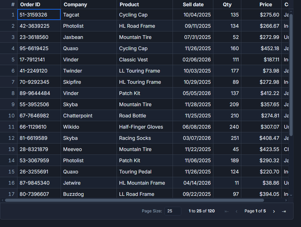 Column layout and visibility controls in SvGrid.
How column headers accept custom content
Each column definition accepts a header property. You can pass a plain string or a render function that returns a snippet. When you need interactive content - a sort indicator that's also a button, a draggable resize handle, or a menu trigger - the render function form is what you reach for.
<script lang="ts">
  import SvGrid, { renderSnippet, type ColumnDef } from '@svgrid/grid'

  type Row = { id: number; name: string; role: string; department: string }

  let myApi: ReturnType<typeof import('@svgrid/grid').createGrid> | undefined

  const columns: ColumnDef<any, Row>[] = [
    {
      id: 'name',
      field: 'name',
      width: 200,
      header: (ctx) => renderSnippet(HeaderWithMenu, {
        label: 'Name',
        columnId: 'name',
      }),
    },
    {
      id: 'role',
      field: 'role',
      width: 150,
      header: (ctx) => renderSnippet(HeaderWithMenu, {
        label: 'Role',
        columnId: 'role',
      }),
    },
    {
      id: 'department',
      field: 'department',
      width: 180,
      header: (ctx) => renderSnippet(HeaderWithMenu, {
        label: 'Department',
        columnId: 'department',
      }),
    },
  ]
</script>
The renderSnippet helper bridges Svelte 5 snippets into the render slot. You pass it a snippet reference and any props - from there, it's just a Svelte component.
Building the header snippet
The snippet gets the label and column ID as props, renders the visible text, and places a trigger button at the right edge. The button opens a positioned menu stored in a piece of reactive state.
<script lang="ts">
let activeMenu = $state<{
columnId: string
x: number
y: number
buttonEl: HTMLElement
} | null>(null)
function openMenu(columnId: string, e: MouseEvent) {
const btn = e.currentTarget as HTMLElement
const rect = btn.getBoundingClientRect()
activeMenu = {
columnId,
x: rect.left,
y: rect.bottom + 4,
buttonEl: btn,
}
}
function closeMenu() {
activeMenu?.buttonEl.focus()
activeMenu = null
}
</script>
{#snippet HeaderWithMenu(p: { label: string; columnId: string })}
<span class="col-header">
<span class="col-label">{p.label}</span>
<button
class="col-menu-trigger"
aria-label="Column options for {p.label}"
aria-haspopup="menu"
aria-expanded={activeMenu?.columnId === p.columnId}
onclick={(e) => openMenu(p.columnId, e)}
>
⋮
</button>
</span>
{/snippet}
<style>
.col-header {
display: flex;
align-items: center;
justify-content: space-between;
width: 100%;
gap: 4px;
}
.col-label {
flex: 1;
overflow: hidden;
text-overflow: ellipsis;
white-space: nowrap;
}
.col-menu-trigger {
flex-shrink: 0;
padding: 2px 4px;
border: none;
background: transparent;
cursor: pointer;
border-radius: 3px;
opacity: 0.6;
font-size: 1rem;
line-height: 1;
}
.col-menu-trigger:hover,
.col-menu-trigger:focus-visible {
opacity: 1;
background: var(--sg-accent, #e0e7ff);
outline: 2px solid var(--sg-accent, #6366f1);
outline-offset: 1px;
}
</style>
Storing a reference to the trigger button is deliberate: when the menu closes, focus returns to the button that opened it. Without this, keyboard users lose their place in the document.
Wiring the dropdown to real grid actions
The menu renders absolutely positioned over the grid. Each item calls api methods directly - no separate state sync needed.
{#if activeMenu}
  <div
    class="col-dropdown"
    role="menu"
    style="left: {activeMenu.x}px; top: {activeMenu.y}px"
    onkeydown={(e) => {
      if (e.key === 'Escape') closeMenu()
      if (e.key === 'ArrowDown') {
        const items = e.currentTarget.querySelectorAll('[role=menuitem]')
        const idx = Array.from(items).indexOf(document.activeElement as HTMLElement)
        ;(items[Math.min(idx + 1, items.length - 1)] as HTMLElement).focus()
        e.preventDefault()
      }
      if (e.key === 'ArrowUp') {
        const items = e.currentTarget.querySelectorAll('[role=menuitem]')
        const idx = Array.from(items).indexOf(document.activeElement as HTMLElement)
        ;(items[Math.max(idx - 1, 0)] as HTMLElement).focus()
        e.preventDefault()
      }
    }}
  >
    <button role="menuitem" onclick={() => {
      myApi?.setSort(activeMenu!.columnId, 'asc')
      closeMenu()
    }}>Sort A to Z</button>

    <button role="menuitem" onclick={() => {
      myApi?.setSort(activeMenu!.columnId, 'desc')
      closeMenu()
    }}>Sort Z to A</button>

    <hr />

    <button role="menuitem" onclick={() => {
      myApi?.setColumnPinning({ left: [activeMenu!.columnId] })
      closeMenu()
    }}>Pin left</button>

    <button role="menuitem" onclick={() => {
      myApi?.setColumnPinning({ left: [] })
      closeMenu()
    }}>Unpin</button>

    <hr />

    <button role="menuitem" onclick={() => {
      myApi?.setColumnVisible(activeMenu!.columnId, false)
      closeMenu()
    }}>Hide column</button>
  </div>
{/if}
Close the menu on outside clicks by adding a svelte:window listener that checks whether the click target is inside the dropdown:
<svelte:window onclick={(e) => {
  if (activeMenu && !(e.target as HTMLElement).closest('.col-dropdown')) {
    closeMenu()
  }
}} />
Column-specific menu items
Not every column needs the same menu. A calculated column probably should not have a "sort" option. A column with a fixed role in the layout should not offer "hide". The pattern handles this cleanly: pass a menuItems prop alongside the label in renderSnippet, and filter what appears.
{#snippet HeaderWithMenu(p: {
label: string
columnId: string
allowSort?: boolean
allowPin?: boolean
allowHide?: boolean
})}
<span class="col-header">
<span class="col-label">{p.label}</span>
<button
class="col-menu-trigger"
aria-label="Column options for {p.label}"
onclick={(e) => openMenu(p.columnId, e, {
allowSort: p.allowSort ?? true,
allowPin: p.allowPin ?? true,
allowHide: p.allowHide ?? true,
})}
>
⋮
</button>
</span>
{/snippet}
Then inside openMenu, store the capabilities alongside the column ID. The dropdown reads them and conditionally renders each group.
Keyboard navigation and focus management
The ArrowDown / ArrowUp handling above covers the basics, but there are two other things worth getting right:
Initial focus: when the menu opens, move focus to the first item. A $effect watching activeMenu handles this:
$effect(() => {
  if (activeMenu) {
    // wait one tick for the DOM to render
    Promise.resolve().then(() => {
      const first = document.querySelector<HTMLElement>('.col-dropdown [role=menuitem]')
      first?.focus()
    })
  }
})
Tab out: if the user presses Tab inside the menu, close it. Add Tab to the onkeydown handler in the dropdown.
This is the minimum to make the menu genuinely keyboard-accessible rather than just technically focusable. If you're building for an enterprise context where accessibility audits matter, also add aria-orientation="vertical" to the dropdown and make sure each separator has role="separator".
When to use this pattern vs. the built-in toolbar
SvGrid has a column visibility panel (the toolbar approach from column visibility toggle) that's fine for power users who want to manage many columns at once. The per-column header menu is for users who think column-first - they see the data in a column, decide they want it sorted, and act from there without going to a toolbar.
Both can coexist. The toolbar for bulk visibility management, the header menu for in-context sort, pin, and filter actions. Where they overlap - say, hide column - make sure both update the same underlying state so neither gets out of sync.