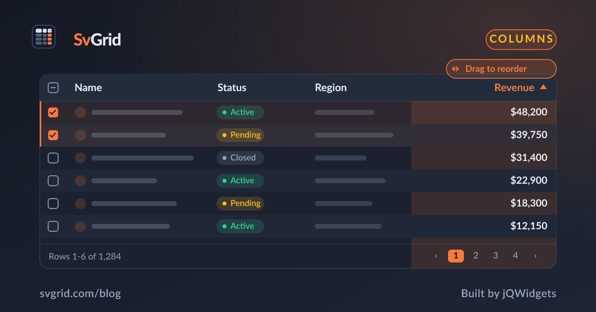
A Column Show/Hide Toggle in SvGrid
Build a column chooser panel that lets users show or hide columns at runtime, with persistence across page loads and a guard against hiding everything.
Most data-heavy apps have too many columns to display comfortably. Sales reps care about pipeline value and close date; finance cares about margin and invoice status. Trying to satisfy everyone with a single column layout is a losing trade - you end up with a table so wide it requires horizontal scrolling, or so narrow each cell is useless.
The solution is obvious but the implementation varies a lot between grid libraries. Some give you an API call. Some require a special plugin. Some make you reach into internal state. SvGrid's model makes it simpler than any of those: the grid renders whatever columns array you pass it. Column visibility is just array filtering.
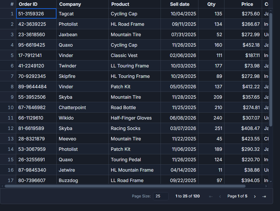 Column layout and visibility controls in SvGrid.
The reactive column filter
Define your full column set once as a plain constant. Keep a separate $state map tracking which column ids are visible. Then derive the active columns array from it:
<script lang="ts">
  import SvGrid, { tableFeatures, rowSortingFeature, columnFilteringFeature, type ColumnDef } from '@svgrid/grid'

  type Row = { id: number; name: string; status: string; region: string; revenue: number; margin: number; closeDate: string }

  const features = tableFeatures({ rowSortingFeature, columnFilteringFeature })

  const allColumns: ColumnDef<typeof features, Row>[] = [
    { id: 'name',      field: 'name',      header: 'Name',       width: 200, pinned: 'left' },
    { id: 'status',    field: 'status',    header: 'Status',     width: 120 },
    { id: 'region',    field: 'region',    header: 'Region',     width: 130 },
    { id: 'revenue',   field: 'revenue',   header: 'Revenue',    width: 130, type: 'number' },
    { id: 'margin',    field: 'margin',    header: 'Margin %',   width: 110, type: 'number' },
    { id: 'closeDate', field: 'closeDate', header: 'Close Date', width: 140 },
  ]

  let visible = $state<Record<string, boolean>>(
    Object.fromEntries(allColumns.map((c) => [c.id!, true]))
  )

  const columns = $derived(allColumns.filter((c) => visible[c.id!]))

  let data = $state<Row[]>([/* your rows */])
</script>

<SvGrid {data} {columns} {features} sortable filterable />
When you flip a key in visible, Svelte's reactivity recomputes columns and the grid re-renders with the new column set. No grid API call needed. The pinned name column will always appear as long as you want it to.
A column chooser panel
The UI for toggling visibility can be as simple or as elaborate as you need. Here is a dropdown panel approach - a button that reveals a checklist. The disabled attribute prevents the user from hiding the last remaining column:
<script lang="ts">
  let panelOpen = $state(false)

  function visibleCount() {
    return Object.values(visible).filter(Boolean).length
  }

  function showAll() {
    for (const key of Object.keys(visible)) {
      visible[key] = true
    }
  }
</script>

<div class="toolbar">
  <button onclick={() => (panelOpen = !panelOpen)}>
    Columns ({visibleCount()}/{allColumns.length})
  </button>

  {#if panelOpen}
    <div class="chooser-panel">
      <div class="chooser-header">
        <span>Visible columns</span>
        <button onclick={showAll}>Show all</button>
      </div>

      {#each allColumns as col}
        {@const colId = col.id!}
        {@const isOnlyVisible = visibleCount() === 1 && visible[colId]}
        <label class:dimmed={isOnlyVisible}>
          <input
            type="checkbox"
            bind:checked={visible[colId]}
            disabled={isOnlyVisible}
          />
          {typeof col.header === 'string' ? col.header : colId}
        </label>
      {/each}
    </div>
  {/if}
</div>

<SvGrid {data} {columns} {features} sortable filterable />

<style>
  .toolbar { position: relative; display: flex; gap: 0.5rem; margin-bottom: 0.75rem; }
  .chooser-panel {
    position: absolute;
    top: 100%;
    left: 0;
    z-index: 10;
    background: var(--sg-bg, #fff);
    border: 1px solid var(--sg-border, #ddd);
    border-radius: var(--sg-radius, 6px);
    padding: 0.75rem;
    min-width: 180px;
    box-shadow: 0 4px 12px rgba(0,0,0,0.1);
  }
  .chooser-header {
    display: flex;
    justify-content: space-between;
    align-items: center;
    margin-bottom: 0.5rem;
    font-size: 0.75rem;
    color: var(--sg-fg, #333);
  }
  label { display: flex; align-items: center; gap: 0.5rem; padding: 0.25rem 0; font-size: 0.875rem; cursor: pointer; }
  label.dimmed { opacity: 0.4; cursor: not-allowed; }
</style>
The "Show all" button is important. Users who hide columns and come back to the grid after a week may not remember what they hid. Always give them an escape hatch.
Persisting the choice across page loads
The visibility map is plain JSON, which means localStorage handles it trivially. A thin wrapper that loads on mount and saves on every change:
<script lang="ts">
  import { onMount } from 'svelte'

  const STORAGE_KEY = 'grid-column-visibility'

  // Restore saved state or fall back to all visible
  const savedState = typeof localStorage !== 'undefined'
    ? JSON.parse(localStorage.getItem(STORAGE_KEY) ?? 'null')
    : null

  let visible = $state<Record<string, boolean>>(
    savedState ?? Object.fromEntries(allColumns.map((c) => [c.id!, true]))
  )

  // Keep the stored value in sync
  $effect(() => {
    localStorage.setItem(STORAGE_KEY, JSON.stringify(visible))
  })

  // If a new column is added to allColumns that isn't in saved state, default it to visible
  onMount(() => {
    for (const col of allColumns) {
      if (!(col.id! in visible)) {
        visible[col.id!] = true
      }
    }
  })
</script>
The onMount guard handles schema evolution - when you add a new column to allColumns after users have saved a visibility map, the new column appears visible by default rather than being silently hidden because its key wasn't in localStorage.
If you need server-side persistence (synced across devices, tied to a user account), the approach is the same: load the map from your API on mount, patch it with any new column ids, and debounce-save changes back.
Where this fits with named views
If your app already uses SvGrid's named views feature, column visibility should flow through that system rather than a standalone localStorage key. Named views capture the full view state including which columns are shown. The standalone approach above is the right call when you want column visibility only, without committing to the broader named-views feature.
One thing to watch: pinned columns
Pinned columns (left or right) deserve special treatment in your chooser. If a user hides all pinned-left columns but the grid still has a pinned-right action column, the layout looks odd but still works. The more common mistake is hiding an anchor column that other columns reference - for example, hiding id when you have row-level action buttons that need it. Guard against that by either always keeping identity columns in allColumns without a checkbox, or by adding a required: true flag to your column definition and excluding those from the toggle UI.
The reactive filter pattern scales to dozens of columns without performance concerns - $derived only recomputes when visible changes, and even then the work is just an array filter. This is one of those cases where the simplest approach is also the correct one.