What Makes a Data Table Accessible? (WCAG)
Semantic markup, WAI-ARIA grid roles, keyboard navigation, and the WCAG criteria that matter most for interactive data tables and grids.
Accessibility audits on data tables fail in predictable ways. After reviewing dozens of failed compliance reports, the same five issues appear almost every time: missing header relationships, no keyboard navigation, invisible focus indicators, icon-only buttons with no label, and color used as the only state signal. Fix those five and you pass most of WCAG 2.1 AA for tables.
Here is what each of those actually requires, and why a grid that ships accessibility as a default is worth paying attention to.
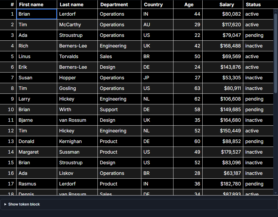 SvGrid with a high-contrast theme - both color modes are tested for contrast compliance.
Static table vs. interactive grid: different markup patterns
The first decision determines the rest of your implementation. These two things look similar but require different semantics:
A static data table presents information. Use native HTML: <table>, <thead>, <th scope="col">, <tbody>, and a <caption>. Screen readers derive row-column relationships from this structure automatically - no ARIA required if you get the HTML right.
An interactive data grid behaves like a spreadsheet: cells can be focused, edited, sorted, selected. For this pattern, WAI-ARIA specifies role="grid" on the container, role="row" on rows, role="columnheader" on header cells, and role="gridcell" on data cells. You also need a managed focus model - the whole grid is a single tab stop, with arrow keys moving focus between cells.
Using role="grid" on a purely static read-only table is wrong. Omitting it on something editable is also wrong. The behavior drives the choice.
SvGrid renders the full WAI-ARIA grid pattern when you add interactivity. A basic accessible setup looks like this:
<script>
  import SvGrid from '@svgrid/grid'
  import type { ColumnDef } from '@svgrid/grid'

  const columns: ColumnDef[] = [
    { id: 'name',       field: 'name',       header: 'Employee',   width: 200 },
    { id: 'department', field: 'department', header: 'Department', width: 160 },
    { id: 'salary',     field: 'salary',     header: 'Salary',     width: 120, type: 'number' },
    { id: 'status',     field: 'status',     header: 'Status',     width: 120 },
  ]

  const data = $state([
    { name: 'Priya Nair',    department: 'Engineering', salary: 120000, status: 'Active'   },
    { name: 'Marcus Webb',   department: 'Design',      salary: 95000,  status: 'Active'   },
    { name: 'Fatima Hassan', department: 'Finance',     salary: 108000, status: 'On Leave' },
  ])
</script>

<!--
  SvGrid renders role="grid", role="row", role="columnheader", role="gridcell"
  and manages the roving tabindex focus model automatically.
-->
<SvGrid
  {data}
  {columns}
  sortable
  enableCellSelection={true}
  rowHeight={36}
/>
The rendered output uses role="grid" with aria-label on the container, aria-sort on sortable column headers, and aria-selected on selected cells - without any extra configuration.
Keyboard navigation requirements
WCAG 2.1.1 (Keyboard, Level A) requires that all functionality is available from a keyboard. For a grid, that means more than just tab focus. The WAI-ARIA Authoring Practices define the expected behavior:
- Arrow keys navigate between cells
- Home and End move to the first or last cell in a row
- Ctrl+Home and Ctrl+End move to the first or last cell in the entire grid
- Page Up and Page Down scroll by visible rows
- Enter or F2 enters edit mode on an editable cell; Escape exits without saving
- Space toggles row selection when a selection feature is active
The roving tabindex pattern is critical here. The grid element itself gets tabindex="0". The currently active cell gets tabindex="0" and all others get tabindex="-1". This means a keyboard user tabs into the grid once, navigates with arrows, and tabs out - they do not tab through hundreds of cells.
SvGrid handles all of this internally, including preserving focus across virtualized scrolling. When rows are recycled during fast scrolling, the active cell stays focused. That is a harder implementation detail than it sounds - most DIY grids break it.
The WCAG criteria a grid touches most
Not every WCAG criterion applies to a data table, but these come up consistently in accessibility audits:
1.3.1 Info and Relationships (Level A) - Column headers must be programmatically associated with their data cells. For HTML tables, <th scope="col"> handles this. For ARIA grids, role="columnheader" combined with grid structure conveys the same information.
1.4.3 Contrast Minimum (Level AA) - Text needs a contrast ratio of at least 4.5:1 against its background, or 3:1 for large text. This applies to cell content, header labels, and any inline status indicators. SvGrid's CSS tokens let you override colors cleanly:
/* High contrast overrides for enterprise accessibility requirements */
:root {
  --sg-bg:         #ffffff;
  --sg-fg:         #000000;
  --sg-header-bg:  #1a1a1a;
  --sg-accent:     #0000cc;
  --sg-border:     #767676;
}
2.4.7 Focus Visible (Level AA) - The active cell needs a visible focus ring. Stripping outline: none without a replacement is the most common accessibility failure on data grids. SvGrid applies a visible focus style by default; if you override it for aesthetics, provide a visible alternative with at least 3:1 contrast against the surrounding color.
4.1.2 Name, Role, Value (Level A) - Every interactive control must expose its name, role, and current value to assistive technology. Sort buttons need aria-sort on the header. Checkboxes in selection columns need aria-checked. Custom action buttons need aria-label if they contain only an icon.
Custom cells and aria-label
The biggest accessibility risk in a grid is custom cell renderers. Any <button> or interactive control inside a cell needs to be a real interactive element - not a styled <div> with a click handler. Screen readers and keyboard users both depend on native semantics.
Icon-only buttons are particularly common in action columns. Always add an aria-label:
<script>
  import SvGrid from '@svgrid/grid'
  import type { ColumnDef } from '@svgrid/grid'

  function handleDelete(row: unknown) {
    // remove the row
  }

  function handleEdit(row: unknown) {
    // open edit dialog
  }
</script>

{#snippet actionsCell({ row })}
  <div class="cell-actions">
    <!-- aria-label is required; the icon alone gives screen readers nothing -->
    <button
      class="icon-btn"
      aria-label="Edit {row.name}"
      onclick={() => handleEdit(row)}
    >
      <svg aria-hidden="true" focusable="false"><!-- pencil icon --></svg>
    </button>
    <button
      class="icon-btn"
      aria-label="Delete {row.name}"
      onclick={() => handleDelete(row)}
    >
      <svg aria-hidden="true" focusable="false"><!-- trash icon --></svg>
    </button>
  </div>
{/snippet}

{#snippet statusCell({ value })}
  <!--
    Color alone is not enough (WCAG 1.4.1).
    Include the text label alongside any color indicator.
  -->
  <span class="status-badge status-{value.toLowerCase()}">
    {value}
  </span>
{/snippet}

<SvGrid
  {data}
  columns={[
    { id: 'name',    field: 'name',    header: 'Name',    width: 200 },
    { id: 'status',  field: 'status',  header: 'Status',  width: 120, cell: statusCell },
    { id: 'actions', header: 'Actions', width: 120, cell: actionsCell },
  ]}
  enableCellSelection={true}
  rowHeight={40}
/>
Note aria-hidden="true" and focusable="false" on the SVG icons. This prevents screen readers from reading the raw SVG path data and prevents IE11-era browsers from letting users tab into the SVG.
What cannot be patched in later
Accessibility is not a layer you add on top. A grid built without focus management, ARIA roles, and header relationships cannot be made compliant with a few attribute additions. The assumptions embedded in the interaction model are wrong throughout. You would be rebuilding the grid.
This is why the WAI-ARIA grid pattern needs to be the foundation, not the finish. Keyboard navigation shapes how focus state is stored and updated. The ARIA roles shape the DOM structure. Contrast requirements shape the design token system. None of these decisions can be made retroactively without breaking other things.
The practical side: if you are evaluating grids for a procurement process that includes accessibility compliance, test keyboard navigation before anything else. Tab into the grid, navigate with arrows, try to edit a cell, exit the grid. If any of those steps fail or require a mouse, the grid will not pass a WCAG audit regardless of what the documentation claims.
For SvGrid's keyboard shortcut reference and screen reader testing notes, see Keyboard Navigation and Accessibility.