Accessibility from the Ground Up
How SvGrid bakes WAI-ARIA roles and keyboard navigation into the core - not as a post-launch checkbox, but as a design constraint that shaped every feature.
Most grids add accessibility the same way a contractor adds a ramp to a building that was never designed for one: late, expensive, and never quite right. SvGrid made the opposite bet. Keyboard navigation and WAI-ARIA semantics were constraints from the first rendered row, which means every feature that followed had to fit the model instead of fighting it.
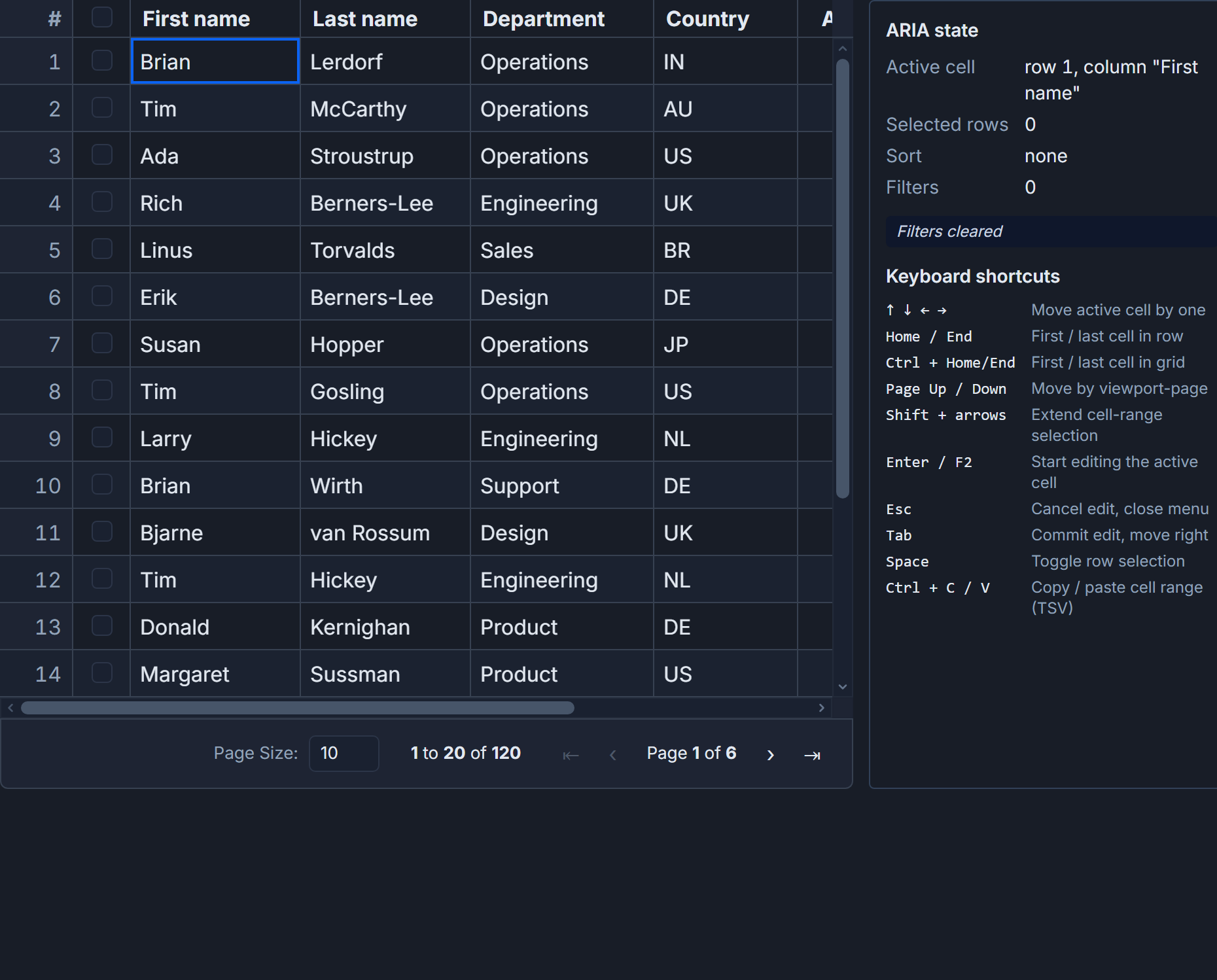 Keyboard navigation and accessibility in SvGrid.
Why retrofitting never works
The technical reason is focus management. A virtualized grid recycles DOM nodes as the user scrolls - the physical element that had focus a moment ago may no longer exist. If you design around that from the start, your focus tracking lives in state, not in the DOM, and you have a clean answer when a row scrolls out from under the cursor. If you add it later, you are patching over an assumption that ran deep through the codebase: that DOM position equals logical position.
Same problem with roles. A <div> grid that gets role="grid" added six months in still has the wrong element hierarchy in most places, and assistive technology reads that hierarchy, not just the top-level role. Starting from <table> with role="grid", role="row", role="columnheader", and role="gridcell" means screen readers get a coherent structure from the first render.
The discipline is simply: do not make accessibility something you add. Make it the shape of the thing.
The keyboard model
SvGrid uses a roving focus model - one cell owns the tab stop, arrow keys move it. This is the pattern the WAI-ARIA Authoring Practices Guide specifies for grids, and it matches what anyone who has used a spreadsheet already expects:
| Key | Behavior |
|---|---|
| Arrow keys | Move active cell |
| Home / End | Jump to row start / end |
| Ctrl+Home / Ctrl+End | Jump to grid corners |
| Page Up / Page Down | Move by viewport |
| F2 or Enter | Enter edit mode |
| Escape | Cancel edit / close |
| Tab | Move to next focusable element outside grid |
We did not invent anything here. The goal was to implement the pattern people carry from Excel and Google Sheets so there is nothing to unlearn. The discipline was making each new feature fit this map rather than carve out exceptions.
<script>
  import SvGrid from '@svgrid/grid'
  import type { ColumnDef } from '@svgrid/grid'

  const columns: ColumnDef[] = [
    { id: 'name',   field: 'name',   header: 'Name',   width: 180 },
    { id: 'role',   field: 'role',   header: 'Role',   width: 140 },
    { id: 'salary', field: 'salary', header: 'Salary', width: 110, type: 'number' },
    { id: 'status', field: 'status', header: 'Status', width: 100 },
  ]

  const data = [
    { name: 'Ada Lovelace',    role: 'Engineer',  salary: 140000, status: 'active' },
    { name: 'Grace Hopper',    role: 'Lead',      salary: 160000, status: 'active' },
    { name: 'Alan Turing',     role: 'Researcher',salary: 130000, status: 'inactive' },
  ]
</script>

<!--
  No aria-* attributes needed in the template.
  SvGrid renders role="grid", role="row", role="columnheader",
  role="gridcell" and manages the roving tabindex internally.
-->
<SvGrid
  {data}
  {columns}
  enableCellSelection={true}
  sortable
  editable
/>
The enableCellSelection prop activates the roving focus model. Without it the grid is still navigable by Tab through headers and cells, but cell-level arrow navigation requires an active cell selection state.
Keeping custom cells accessible
The grid can ship with correct semantics, but every custom cell renderer is a fresh opportunity to break them. The pattern we landed on is: use real HTML elements and let the browser handle the semantics.
<script>
  import SvGrid from '@svgrid/grid'
  import type { ColumnDef } from '@svgrid/grid'

  // A status badge - purely presentational, needs no ARIA extras
  // An action button - needs to be a real <button> so it gets focus
  // and Enter/Space activation for free

  const columns: ColumnDef[] = [
    { id: 'name',   field: 'name',   header: 'Name',   width: 180 },
    { id: 'status', field: 'status', header: 'Status', width: 120, cell: statusCell },
    { id: 'remove', header: 'Remove', width: 80,       cell: removeCell },
  ]

  function handleRemove(row: unknown) {
    console.log('remove', row)
  }
</script>

{#snippet statusCell({ value })}
  <!-- span with no role: correct, it is decorative text -->
  <span class="badge" class:active={value === 'active'}>{value}</span>
{/snippet}

{#snippet removeCell({ row })}
  <!--
    A real <button> gets:
    - focus during keyboard nav (it is a focusable child in the gridcell)
    - Enter/Space activation without JS
    - "button" role announcement by screen readers
    Use aria-label when the visible label is just an icon.
  -->
  <button
    class="icon-btn"
    aria-label="Remove {row.original.name}"
    onclick={() => handleRemove(row.original)}
  >
    ✕
  </button>
{/snippet}

<SvGrid {data} {columns} enableCellSelection={true} />
The rule is simple: badge or label? Plain element, no ARIA. Clickable control? Use a <button> or <a> so you get keyboard activation and role announcement for free. The one place to add an explicit label is icon-only buttons, where the visible content does not describe the action.
Virtualization and focus stability
Virtual scrolling is where accessibility often breaks. When rows scroll out of view their DOM nodes get recycled, and a naive implementation loses track of which cell is focused.
SvGrid tracks active cell position as row index and column id in state, not as a reference to a DOM node. When the virtualizer recycles a row, the active cell gets written to whichever DOM node now represents that logical position. From a screen reader's perspective the focused cell is always there; it just updates its content.
<script>
  import SvGrid from '@svgrid/grid'
  import { createServerDataSource } from '@svgrid/grid'
  import type { ColumnDef } from '@svgrid/grid'

  // 100 000 rows - all keyboard navigable
  const ds = createServerDataSource({
    fetch: async ({ page, pageSize, sort, filters }) => {
      const params = new URLSearchParams({
        page: String(page),
        size: String(pageSize),
      })
      const res = await fetch(`/api/employees?${params}`)
      const json = await res.json()
      return { rows: json.data, total: json.total }
    }
  })

  const columns: ColumnDef[] = [
    { id: 'id',         field: 'id',         header: 'ID',         width: 80  },
    { id: 'name',       field: 'name',        header: 'Name',       width: 200 },
    { id: 'department', field: 'department',  header: 'Department', width: 160 },
    { id: 'salary',     field: 'salary',      header: 'Salary',     width: 120, type: 'number' },
  ]
</script>

<!--
  virtualization defaults to true for server sources.
  Keyboard navigation works across the full 100 000-row set:
  Page Down scrolls and updates the DOM, active cell state
  tracks which logical row is active throughout.
-->
<SvGrid
  data={ds}
  {columns}
  pageable
  sortable
  enableCellSelection={true}
  rowHeight={36}
/>
Pressing Ctrl+End on this grid jumps to the last page and the last cell in the last row. The screen reader announces the cell value. That works because the jump is a state change that the virtualizer renders, not a DOM scroll that gets the focus lost in transit.
How we kept this from regressing
Every feature we shipped - grouping, inline editing, row expansion, column hiding - was a potential regression. Our test for each was: unplug the mouse. Tab into the grid, navigate to a row in a group, expand it with Enter, navigate into the expanded rows, edit a cell, commit with Tab, escape to cancel. If any step required the mouse, the feature was not done.
That sounds obvious. In practice it meant filing keyboard bugs during feature development, not after, which is a different kind of discipline than treating accessibility as a QA pass at the end.
What this enables
Strict keyboard and ARIA support is not just about screen reader users. It is also about power users who prefer the keyboard, enterprise buyers whose procurement has WCAG requirements, and products that run in kiosk or restricted environments where the mouse is unavailable. SvGrid passing that bar from the start means it goes into those products without an exception or a workaround.
The detailed keyboard reference - every key, every mode, behavior with and without selection - is in Keyboard Navigation and Accessibility in SvGrid.