# SvGrid UI
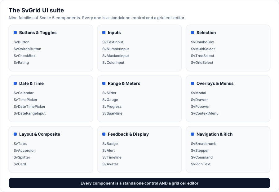
**SvGrid UI** is the Svelte 5 component suite that ships in the free
`@svgrid/grid` package - 70+ buttons, inputs, pickers, overlays, and layout
primitives, each with its own tutorial page. Every one is **two things at once**:
1. a **standalone control** you can drop into any Svelte app, and
2. a **grid cell editor** - the same component SvGrid mounts when you edit a cell.
That dual nature is the point: the grid stays the flagship, and its editor kit is
also a full component library you can use on its own. Every component is
theme-driven, accessible, and dependency-free (see below). Try them live under the
**SvGrid Editors** switcher in the examples gallery, or jump straight to any
component's tutorial in [the catalogue](#the-catalogue).
> **Quick start with the CLI.** `npx @svgrid/ui try calendar` opens any component
> in a sandbox in your browser; `npx @svgrid/ui add calendar` drops a ready-to-edit
> starter into your app (and installs the dep). See [Add components with the CLI](https://svgrid.com/docs/help/ui-components/cli/).
## Design principles
- **Theme-driven.** Every component styles itself from the grid's `--sg-*` theme
tokens (`--sg-accent`, `--sg-bg`, `--sg-fg`, `--sg-border`, `--sg-radius`,
`--sg-focus-ring`, ...). Pick any preset theme and the components follow - no
per-component theming needed.
- **Accessible.** Each control maps to its WAI-ARIA APG pattern (listbox, combobox,
radiogroup, slider, tabs, tree, ...) with full keyboard support and roving
tabindex where the pattern calls for it.
- **Controlled or bound.** Components take a `value` and emit `onChange`, and the
value is `$bindable` - so `` works too (the
editors, plus `SvMultiSelect` / `SvTreeSelect` / `SvGridSelect`). Overlay controls
additionally emit `onCommit` / `onCancel` so the grid can save or cancel an edit.
- **Portalled overlays.** Dropdown-style controls render their panel to ``
(carrying the theme tokens with them) so they are never clipped by the grid's
scroll container.
- **Dependency-free.** Icons are inline SVG; the date engine, mask engine and
country data are plain TypeScript. No external UI or date libraries.
## The catalogue
Every component has its own tutorial page - what it is, a live demo, the full
props table, common patterns, and accessibility notes. The overview link on each
group heading is the at-a-glance rollup.
### [The grid](https://svgrid.com/docs/getting-started/)
[SvGrid](https://svgrid.com/docs/getting-started/) - the data grid and the hero component of the
suite. Every component below also works as a cell editor inside it.
### [Buttons & toggles](https://svgrid.com/docs/help/ui-components/buttons/)
[SvButton](https://svgrid.com/docs/help/ui-components/sv-button/) · [SvButtonGroup](https://svgrid.com/docs/help/ui-components/sv-button-group/) ·
[SvRepeatButton](https://svgrid.com/docs/help/ui-components/sv-repeat-button/) · [SvToggleButton](https://svgrid.com/docs/help/ui-components/sv-toggle-button/) ·
[SvSwitchButton](https://svgrid.com/docs/help/ui-components/sv-switch-button/) · [SvCheckBox](https://svgrid.com/docs/help/ui-components/sv-check-box/) ·
[SvRadioGroup](https://svgrid.com/docs/help/ui-components/sv-radio-group/) · [SvRating](https://svgrid.com/docs/help/ui-components/sv-rating/)
### [Inputs](https://svgrid.com/docs/help/ui-components/inputs/)
[SvTextInput](https://svgrid.com/docs/help/ui-components/sv-text-input/) · [SvTextArea](https://svgrid.com/docs/help/ui-components/sv-text-area/) ·
[SvNumberInput](https://svgrid.com/docs/help/ui-components/sv-number-input/) · [SvPasswordInput](https://svgrid.com/docs/help/ui-components/sv-password-input/) ·
[SvMaskedInput](https://svgrid.com/docs/help/ui-components/sv-masked-input/) · [SvPhoneInput](https://svgrid.com/docs/help/ui-components/sv-phone-input/) ·
[SvColorInput](https://svgrid.com/docs/help/ui-components/sv-color-input/) · [SvOtpInput](https://svgrid.com/docs/help/ui-components/sv-otp-input/) ·
[SvDurationInput](https://svgrid.com/docs/help/ui-components/sv-duration-input/) · [SvTagsInput](https://svgrid.com/docs/help/ui-components/sv-tags-input/)
### [Selection](https://svgrid.com/docs/help/ui-components/selection/)
[SvListBox](https://svgrid.com/docs/help/ui-components/sv-list-box/) · [SvDropDownList](https://svgrid.com/docs/help/ui-components/sv-drop-down-list/) ·
[SvComboBox](https://svgrid.com/docs/help/ui-components/sv-combo-box/) · [SvAutoComplete](https://svgrid.com/docs/help/ui-components/sv-auto-complete/) ·
[SvMultiSelect](https://svgrid.com/docs/help/ui-components/sv-multi-select/) · [SvTreeSelect](https://svgrid.com/docs/help/ui-components/sv-tree-select/) ·
[SvGridSelect](https://svgrid.com/docs/help/ui-components/sv-grid-select/) · [SvGridDropdown](https://svgrid.com/docs/help/ui-components/sv-grid-dropdown/) ·
[SvCountryInput](https://svgrid.com/docs/help/ui-components/sv-country-input/)
### [Date & time](https://svgrid.com/docs/help/ui-components/date-time/)
[SvCalendar](https://svgrid.com/docs/help/ui-components/sv-calendar/) · [SvTimePicker](https://svgrid.com/docs/help/ui-components/sv-time-picker/) ·
[SvDateTimePicker](https://svgrid.com/docs/help/ui-components/sv-date-time-picker/) · [SvDateRangeInput](https://svgrid.com/docs/help/ui-components/sv-date-range-input/)
### [Range & meters](https://svgrid.com/docs/help/ui-components/range/)
[SvSlider](https://svgrid.com/docs/help/ui-components/sv-slider/) · [SvGauge](https://svgrid.com/docs/help/ui-components/sv-gauge/) · [SvProgress](https://svgrid.com/docs/help/ui-components/sv-progress/) ·
[SvCircularProgress](https://svgrid.com/docs/help/ui-components/sv-circular-progress/) · [SvSparkline](https://svgrid.com/docs/help/ui-components/sv-sparkline/) ·
[SvStat](https://svgrid.com/docs/help/ui-components/sv-stat/)
### [Overlays & menus](https://svgrid.com/docs/help/ui-components/overlays/)
[SvPopover](https://svgrid.com/docs/help/ui-components/sv-popover/) · [SvTooltip](https://svgrid.com/docs/help/ui-components/sv-tooltip/) · [SvModal](https://svgrid.com/docs/help/ui-components/sv-modal/) ·
[SvDrawer](https://svgrid.com/docs/help/ui-components/sv-drawer/) · [SvToaster](https://svgrid.com/docs/help/ui-components/sv-toaster/) ·
[SvContextMenu](https://svgrid.com/docs/help/ui-components/sv-context-menu/) · [SvMenu](https://svgrid.com/docs/help/ui-components/sv-menu/) · [SvMenuList](https://svgrid.com/docs/help/ui-components/sv-menu-list/)
### [Layout & composite](https://svgrid.com/docs/help/ui-components/layout/)
[SvTabs](https://svgrid.com/docs/help/ui-components/sv-tabs/) · [SvAccordion](https://svgrid.com/docs/help/ui-components/sv-accordion/) · [SvSplitter](https://svgrid.com/docs/help/ui-components/sv-splitter/) ·
[SvDockLayout](https://svgrid.com/docs/help/ui-components/sv-dock-layout/) · [SvDockManager](https://svgrid.com/docs/help/ui-components/sv-dock-manager/) ·
[SvCard](https://svgrid.com/docs/help/ui-components/sv-card/) · [SvDivider](https://svgrid.com/docs/help/ui-components/sv-divider/) · [SvScrollArea](https://svgrid.com/docs/help/ui-components/sv-scroll-area/) ·
[SvGridChart](https://svgrid.com/docs/help/ui-components/sv-grid-chart/) · [SvChartPanes](https://svgrid.com/docs/help/ui-components/sv-chart-panes/) · [SvForm](https://svgrid.com/docs/help/ui-components/sv-form/) · [SvField](https://svgrid.com/docs/help/ui-components/sv-field/) ·
[SvFileUpload](https://svgrid.com/docs/help/ui-components/sv-file-upload/) · [SvCollapsible](https://svgrid.com/docs/help/ui-components/sv-collapsible/) ·
[Layout primitives](https://svgrid.com/docs/help/ui-components/sv-layout-primitives/) (SvStack · SvGroup · SvSimpleGrid) ·
[Typography](https://svgrid.com/docs/help/ui-components/sv-typography/) (SvTitle · SvText · SvAnchor · SvBlockquote · SvMark · SvList) ·
[Display primitives](https://svgrid.com/docs/help/ui-components/sv-display-primitives/) (SvKbd · SvCode · SvAspectRatio · SvVisuallyHidden)
### [Feedback & display](https://svgrid.com/docs/help/ui-components/feedback/)
[SvBadge](https://svgrid.com/docs/help/ui-components/sv-badge/) · [SvSkeleton](https://svgrid.com/docs/help/ui-components/sv-skeleton/) · [SvAlert](https://svgrid.com/docs/help/ui-components/sv-alert/) ·
[SvEmptyState](https://svgrid.com/docs/help/ui-components/sv-empty-state/) · [SvChip](https://svgrid.com/docs/help/ui-components/sv-chip/) · [SvTimeline](https://svgrid.com/docs/help/ui-components/sv-timeline/) ·
[SvAvatar](https://svgrid.com/docs/help/ui-components/sv-avatar/) · [SvAvatarGroup](https://svgrid.com/docs/help/ui-components/sv-avatar-group/) · [SvCarousel](https://svgrid.com/docs/help/ui-components/sv-carousel/) ·
[SvSpinner](https://svgrid.com/docs/help/ui-components/sv-spinner/) · [SvLoadingOverlay](https://svgrid.com/docs/help/ui-components/sv-loading-overlay/) · [SvResult](https://svgrid.com/docs/help/ui-components/sv-result/)
### [Navigation & rich](https://svgrid.com/docs/help/ui-components/navigation/)
[SvBreadcrumb](https://svgrid.com/docs/help/ui-components/sv-breadcrumb/) · [SvPagination](https://svgrid.com/docs/help/ui-components/sv-pagination/) ·
[SvStepper](https://svgrid.com/docs/help/ui-components/sv-stepper/) · [SvNavPane](https://svgrid.com/docs/help/ui-components/sv-nav-pane/) · [SvTree](https://svgrid.com/docs/help/ui-components/sv-tree/) ·
[SvCommand](https://svgrid.com/docs/help/ui-components/sv-command/) · [SvTour](https://svgrid.com/docs/help/ui-components/sv-tour/) · [SvRichText](https://svgrid.com/docs/help/ui-components/sv-rich-text/)
## As grid cell editors
The date/time controls are the **rich-by-default** editors for `date`, `datetime`
and `time` columns:
```svelte
```
To opt back out to the plain native inputs, use `editorType: 'date-native'`,
`'datetime-native'` or `'time-native'`.
## Custom cell editors
Any component - a built-in `Sv*` control or one you author - can be mounted as a
cell editor by registering it under a type name, then naming that type on a
column. The grid hands it a uniform context: `value` plus `onChange` (update the
in-progress value), `onCommit` (save + stop editing) and `onCancel` (discard).
```svelte
```
`registerCellEditor(type, Component)` uses the default mapping (spreads `value`,
`onChange`, `onCommit`, `onCancel`); pass a `{ component, props }` object for a
custom mapping. Also available: `getCellEditor`, `hasCellEditor`,
`unregisterCellEditor`, `registeredCellEditorTypes`.
**Built-in shortcuts.** Call `registerBuiltinEditors()` once to register the
config-free editors so columns can use them by name straight away:
```ts
import { registerBuiltinEditors } from '@svgrid/grid'
registerBuiltinEditors() // enables editorType 'otp' and 'duration'
const columns = [
{ field: 'code', editorType: 'otp' },
{ field: 'estimate', editorType: 'duration' },
]
```
It's opt-in (so the components tree-shake when unused). Option/structured editors
(`SvMultiSelect`, `SvTreeSelect`, `SvGridSelect`) need their `options`/`nodes`/
`columns`, so register those yourself with a `props` mapping as shown above.
## More examples
### Login block
A two-column authentication page: a branded gradient panel beside a sign-in SvCard with social SvButtons, SvTextInput + SvPasswordInput (reveal), remember-me SvCheckBox, an "or" SvDivider and forgot-password link. Drops into any route as-is.
> Live demo: Login block - https://svgrid.com/demos/420-block-login/
### Sign-up block
A centered account-creation card: two-up name fields, work email, a password with the live strength meter, a plan SvSegmented switch, terms SvCheckBox and a benefits rail. Submit fires a promise toast. Pure UI-kit.
> Live demo: Sign-up block - https://svgrid.com/demos/421-block-signup/
### Two-factor / OTP block
The verification step of a sign-in flow: SvOtpInput (6 digits, auto-advance + onComplete), a resend cooldown timer, and the waiting -> verifying -> verified states. Enter 000000 to see the error path.
> Live demo: Two-factor / OTP block - https://svgrid.com/demos/422-block-otp/
### Analytics dashboard block
A full overview page: a range SvSegmented + actions header, a KPI grid (SvStat + SvSparkline), a revenue bar panel, a recent-activity SvTimeline and a top-products list with SvProgress bars. No grid dependency.
> Live demo: Analytics dashboard block - https://svgrid.com/demos/423-block-dashboard/
### App shell block
A complete application layout: a SvNavPane sidebar with sections + badges, a top bar with SvBreadcrumb, search and an account SvMenu, and a routed content area. Nav swaps the page; the toggle collapses the rail to an icon rail.
> Live demo: App shell block - https://svgrid.com/demos/424-block-app-shell/
### Pricing block
A three-tier plan grid with a monthly/annual SvSegmented toggle (annual applies the discount live), a highlighted "most popular" card, per-plan feature SvLists with check marks, and a CTA SvButton on each.
> Live demo: Pricing block - https://svgrid.com/demos/425-block-pricing/
---
SvGrid is the Svelte 5 data grid (`npm install @svgrid/grid`, MIT). This page: https://svgrid.com/docs/help/ui-components/index/ . All docs: https://svgrid.com/llms.txt