Kanban board mode
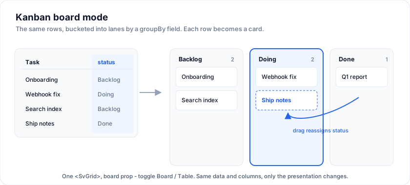
Set one board prop and the grid renders its rows as cards in horizontal
lanes instead of a table. It is the same <SvGrid>, the same data and
columns - only the presentation changes. Lanes are bucketed by a field;
dragging a card to another lane tells you to reassign that field on your own
data.
The minimum
Point board.groupBy at the field that decides the lane. With nothing else,
lanes are derived from the distinct values found in the data (first-seen
order), and each row renders as a default card built from your columns.
<SvGrid {data} {columns} board={{ groupBy: 'status' }} />
Ordered lanes, titles, colors, WIP limits
Pass an explicit lanes array to fix the order, give friendly titles, and add
an accent color or a work-in-progress limit. A lane id equals the groupBy
field value of the cards it holds; a lane with no cards shows a placeholder.
<SvGrid {data} {columns}
  board={{
    groupBy: 'status',
    lanes: [
      { id: 'backlog',     title: 'Backlog' },
      { id: 'in_progress', title: 'In progress', color: '#f59e0b', wipLimit: 3 },
      { id: 'review',      title: 'Review',      color: '#8b5cf6' },
      { id: 'done',        title: 'Done',        color: '#22c55e' },
    ],
  }} />
The lane header always shows its card count; when the count exceeds wipLimit
it is flagged (shown as count/limit). Set enforceWip to make the limit
hard - a drag or keyboard move that would push a lane past its limit is
rejected and the card snaps back (announced to screen readers).
<SvGrid {data} {columns}
  board={{ groupBy: 'status', enforceWip: true, lanes }} />
Lane summaries (roll-ups)
Pass laneSummary to show a per-lane total in the header - story points, a
dollar sum, anything. It receives the lane's cards (the current swimlane's when
swimlaneBy is set) and returns a short string. swimlaneSummary does the same
for a whole swimlane band.
<SvGrid {data} {columns}
  board={{
    groupBy: 'status',
    laneSummary: (rows) => `${rows.reduce((s, r) => s + r.points, 0)} pts`,
    swimlaneSummary: (rows) => `${rows.reduce((s, r) => s + r.points, 0)} pts`,
  }} />
Search, filter and sort
The board renders the grid's filtered and sorted row model, not the raw
data - so column filters, the grid's sort, and the built-in search box all flow
through to the lanes. A search box shows above the board by default; set
searchable: false to hide it, or searchPlaceholder to change its text.
<SvGrid {data} {columns} sortable
  board={{ groupBy: 'status', searchPlaceholder: 'Find a task...' }} />
Swimlanes
Set swimlaneBy to split the board into horizontal swimlane bands by a
second field. Each band shows the full lane set with only its own cards.
Dragging a card into a lane under a different band reassigns the swimlane field
too - onCardMove then carries fromSwimlane / toSwimlane. Add
collapsibleSwimlanes to let users fold a whole band via its header chevron.
<SvGrid {data} {columns}
  board={{
    groupBy: 'status',
    swimlaneBy: 'assignee',
    onCardMove: (e) => {
      e.row.status = e.toLane
      if (e.toSwimlane != null) e.row.assignee = e.toSwimlane
    },
  }} />
Collapsible lanes
Set collapsibleLanes and each lane header gets a chevron that collapses the
lane to a slim strip - handy for wide boards.
<SvGrid {data} {columns} board={{ groupBy: 'status', collapsibleLanes: true }} />
Card context menu
Provide cardMenu and right-clicking (or long-pressing) a card opens a context
menu. Return the items for that card; the ctx argument gives board-native
helpers - moveTo(laneId) and edit() - plus the lane list, so a "Move to"
submenu is a one-liner. Items use the same MenuItem shape as SvContextMenu
(label / icon / shortcut / children submenus / separator / onSelect).
<SvGrid {data} {columns}
  board={{
    groupBy: 'status',
    cardMenu: (row, ctx) => [
      { label: 'Edit', onSelect: ctx.edit },
      { label: 'Move to', children: ctx.lanes
          .filter((l) => l.id !== row.status)
          .map((l) => ({ label: l.title, onSelect: () => ctx.moveTo(l.id) })) },
      { separator: true },
      { label: 'Delete', onSelect: () => remove(row) },
    ],
  }} />
Lane context menu
Alongside cardMenu, laneMenu puts a menu on a lane header right-click.
Its ctx gives lane-native helpers - addCard(title?), toggleCollapse(),
plus the lane's cards and collapsed state.
<SvGrid {data} {columns}
  board={{ groupBy: 'status',
    laneMenu: (laneId, ctx) => [
      { label: 'Add card', onSelect: () => ctx.addCard() },
      { label: `Clear (${ctx.cards.length})`, onSelect: () => clearLane(laneId) },
    ] }} />
Facet filters, multi-select, flags & age
A cluster of "power" options, all on the built-in default card:
facets- a filter bar of chips (one per distinct value) for the listed fields; selecting chips filters the visible cards. Works with array fields (tags) too.selectable- click to select a card, Ctrl/Cmd-click to toggle, and dragging a selected card moves the whole selection.onSelectionChangereports the selected rows.flagField- a truthy field paints a red blocked corner.ageField- a created/started date renders a relative age badge (3d).
<SvGrid {data} {columns}
  board={{
    groupBy: 'status',
    facets: ['tags', 'assignee'],
    selectable: true,
    onSelectionChange: (rows) => (count = rows.length),
    flagField: 'blocked',
    ageField: 'created',
  }} />
Hierarchical cards (epics -> stories)
Point childrenField at a row's child rows and each card gains a children
count that expands to show its sub-cards inline, each with its own title
and groupBy value - the epic -> stories shape.
<SvGrid {data} {columns}
  board={{ groupBy: 'status', childrenField: 'stories' }} />
Reorderable lanes & runtime group-by
Set reorderableLanes to let users drag lane headers to reorder the
columns; the order is tracked (and saved with persistKey), and
onLaneReorder(orderedIds) fires. Because groupBy is reactive, you can also
switch the lane axis at runtime just by changing it - the board re-buckets
and resets card positions to the new field automatically. Set onLaneRename
and users can double-click a lane title to rename it inline.
<script>
  let groupBy = $state('status') // bind to a Status / Assignee / Priority selector
</script>

<SvGrid {data} {columns}
  board={{ groupBy, reorderableLanes: true, onCardMove: (e) => (row[groupBy] = e.toLane) }} />
Saving the board layout
Pass persistKey and the board saves its layout - card positions, order,
per-card edits, and collapsed lanes - to localStorage under that key, and
restores it on load. It needs getRowId so the saved keys line up with the
right rows after a reload.
<SvGrid {data} {columns}
  getRowId={(r) => String(r.id)}
  board={{ groupBy: 'status', persistKey: 'my-board' }} />
The layout is an overlay on top of your data, so if you also persist the data
itself (e.g. mirroring onCardMove to your store), the two stay in sync. To
persist somewhere other than localStorage, use onLayoutChange(layout) and
write it yourself; feed it back by seeding your data before mount. To reset,
clear the key and remount the board (e.g. Svelte's {#key}).
Virtualized lanes (large boards)
For boards with thousands of cards in a lane, set virtualized so each lane
only keeps the cards in view in the DOM. Windowing is fixed-height, so set
cardHeight to match your cards (default 76). Drag-and-drop, keyboard move,
and search all keep working - keyboard focus scrolls an off-screen card into
view before landing on it.
<SvGrid {data} {columns}
  board={{ groupBy: 'status', virtualized: true, cardHeight: 72 }} />
Because windowing assumes a uniform card height, keep your cards a consistent
size (or close to it) when virtualizing; leave virtualized off for boards
with a few hundred cards, where it isn't needed.
Moving cards
Moving cards is built in - you write no move code. Cards are draggable between lanes and within a lane (with a live insertion marker), and the board applies the move itself: it reassigns the lane and reorders, tracked as an overlay keyed by row id, without mutating your data.
onCardMove is an optional notification - it fires after each move so you
can persist to a backend, or mirror the new lane onto your own row if another
view (a table, a count) reads the same data:
<script>
  // Optional. The board already moved the card; this just syncs your store.
  function onCardMove(e) {
    // e = { row, fromLane, toLane, toIndex }
    e.row.status = e.toLane
  }
</script>

<SvGrid {data} {columns}
  getRowId={(r) => String(r.id)}
  board={{ groupBy: 'status', onCardMove }} />
Pass getRowId so the move overlay stays pinned to the right row across data
changes (adds/removes/re-sorts). Without it the board falls back to per-object
identity, which is fine until you replace the row objects wholesale.
Keyboard drag-and-drop
The board is fully keyboard operable, so drag-and-drop is not mouse-only. Focus a card and:
- Space / Enter - grab it (press again to drop).
- Arrow Left / Right - move it to the previous / next lane.
- Arrow Up / Down - reorder it within its lane.
- Escape - cancel and restore its original position.
Every step is announced through an ARIA live region for screen-reader users.
Editing cards
Set editable and the board gets a built-in card editor: double-click a
card (or press F2 while it is focused) to edit its fields inline. The
fields come from the columns that declare an editorType (or all fields if
none do), rendered as the matching input (text / number / date / checkbox).
Save writes to the board's edit overlay - the card updates immediately - and
fires onCardCommit with the changed fields, so you can persist:
<script>
  function onCardCommit(e) {
    // e = { row, changes, values } - the board already applied it
    Object.assign(e.row, e.values) // mirror onto your data / persist
  }
</script>

<SvGrid {data} {columns}
  board={{ groupBy: 'status', editable: true, onCardCommit }} />
Detail drawer
For a fuller editor, set drawer and opening a card shows a built-in
SvDrawer + SvForm rendered from your columns with the UI-kit editors
(text / date / select / number / colour / checkbox, chosen from each column's
editorType). true shows all fields; pass a config to pick a subset or
customize the drawer:
<SvGrid {data} {columns}
  board={{ groupBy: 'status', drawer: true, onCardCommit: (e) => save(e) }} />

<!-- only some fields, custom title / side -->
<SvGrid {data} {columns}
  board={{ groupBy: 'status',
    drawer: { fields: ['title', 'due', 'assignee'], title: (row) => row.title, side: 'right' } }} />
Saving applies the edit and fires onCardCommit. The drawer does not close
on an outside click (so opening a select or picker inside it, or a stray click,
never loses your edits) - close it with Save, Escape, or the × button. If
commentsField is set, the drawer also shows the comments thread (read /
write / delete) below the form.
Precedence: onCardEdit > drawer > the inline editable editor - so pass
onCardEdit if you'd rather open your own editor or route to a detail screen.
Custom cards
Omit card for the default card (title from the first column, then a few
meta rows). Pass a card snippet to render whatever you like - it receives the
row, so you can drop in avatars, chips, progress, or actions from the UI kit.
<SvGrid {data} {columns}
  board={{ groupBy: 'status', card: taskCard }} />

{#snippet taskCard(task)}
  <div class="font-semibold">{task.title}</div>
  <div class="row">
    <SvAvatar name={task.assignee} size={20} />
    <SvChip variant={task.priority === 'High' ? 'danger' : 'neutral'}>
      {task.priority}
    </SvChip>
  </div>
{/snippet}
You can also set titleField and cardFields to steer the default card
without writing a snippet.
Adding cards
Provide onCardAdd and each lane header gains a + button; it fires with the
lane id so you can append a new row in that lane. Add composer for a nicer
type-a-title box at the bottom of each lane - Enter calls
onCardAdd(laneId, title).
<SvGrid {data} {columns}
  board={{ groupBy: 'status', composer: true, onCardAdd: (lane, title) => addRow(lane, title) }} />
Card badges, tags, comments & cover
The default card can show a rich badge row without a custom snippet - point the board at your fields:
<SvGrid {data} {columns}
  board={{
    groupBy: 'status',
    labelsField: 'labels',           // tags: string[] or { text, color }[] (coloured chips)
    dueField: 'due',                 // Date | ISO string; red when overdue
    assigneesField: 'assignees',     // string | string[] -> avatar initials
    commentsField: 'comments',       // array (length) or number -> comment-count badge
    attachmentsField: 'attachments', // array or number -> attachment-count badge
    coverField: 'cover',             // a CSS colour -> strip across the card top
  }} />
labelsField is your tags - pass { text, color }[] for coloured chips.
These badges render on the default card and below a custom card snippet.
Comments are interactive: the comment badge expands an inline thread, and
the same thread appears in the detail drawer (a more discoverable place to
manage them). Pass commentsField (a BoardComment[] = { id, text, author?, at? }) plus onCommentAdd / onCommentDelete to let users write and delete
comments - update your data in the callbacks.
<SvGrid {data} {columns}
  board={{ groupBy: 'status', commentsField: 'comments',
    onCommentAdd: (row, text) => row.comments.push({ id: uid(), text, author: 'You' }),
    onCommentDelete: (row, id) => (row.comments = row.comments.filter((c) => c.id !== id)) }} />
A blocked card (one that can't move forward - waiting on a dependency) is
marked with flagField: a truthy value shows a red corner + a "Blocked" badge,
and a string value is used as the reason (badge tooltip). A blocked card is
locked from moving (drag + keyboard) until it is unblocked - so blocking
actually does something. Set flagBlocksMoves: false if you want a purely
visual flag that still allows moves.
Sub-tasks (checklists)
Point subtasks at a field holding BoardSubtask[] ({ id, title, done }) and
each card gets a progress chip + bar; expand it to tick items or add more. The
board tracks toggles/adds in its own overlay (your data is never mutated) and
fires onSubtaskToggle / onSubtaskAdd as notifications. Sub-task state is
included in persistKey so it survives a reload.
<SvGrid {data} {columns}
  getRowId={(r) => String(r.id)}
  board={{ groupBy: 'status', subtasks: 'items',
           onSubtaskToggle: (row, id, done) => …, onSubtaskAdd: (row, title) => … }} />
For a full-detail editor, wire onCardEdit to open an SvDrawer with the rest
of a card's fields (see demo 349).
BoardConfig
| Field | Type | Notes |
|---|---|---|
groupBy |
string |
Required. Field whose value buckets each row into a lane. |
lanes |
BoardLane[] |
Explicit, ordered lanes. Omit to derive from distinct values. |
card |
Snippet<[row]> |
Custom card body. Omit for the default card. |
onCardMove |
(e) => void |
Optional notification after a built-in move: { row, fromLane, toLane, toIndex }. Persist / mirror here. |
onCardAdd |
(laneId, title?) => void |
Add-card affordance (header +, or composer title). |
composer |
boolean |
Type-a-title quick-add box at the bottom of each lane. |
subtasks |
string |
Field of BoardSubtask[]; renders a checklist + progress on the card. |
onSubtaskToggle |
(row, id, done) => void |
Notified when a sub-task is toggled. |
onSubtaskAdd |
(row, title) => void |
Notified when a sub-task is added on the card. |
labelsField |
string |
Field of label strings / {text,color} -> chips on the card. |
dueField |
string |
Field of a due date -> badge (red when overdue). |
assigneesField |
string |
Field of assignee name(s) -> avatar(s) on the card. |
editable |
boolean |
Enables the built-in inline card editor (double-click / F2). |
onCardEdit |
(row) => void |
Open your own editor instead of the built-in one. |
drawer |
boolean | BoardDrawerConfig |
Built-in SvDrawer + SvForm detail editor; true = all fields, or { fields, title, side, size }. |
cardMenu |
(row, ctx) => MenuItem[] |
Card right-click menu; ctx = { lanes, moveTo, edit }. |
laneMenu |
(laneId, ctx) => MenuItem[] |
Lane-header right-click menu; ctx = { cards, collapsed, toggleCollapse, addCard }. |
facets |
string[] |
Fields shown as a facet filter-chip bar above the board. |
selectable |
boolean |
Card multi-select; dragging a selected card moves the whole selection. |
onSelectionChange |
(rows) => void |
Fires with the selected rows. |
flagField |
string |
Truthy -> "Blocked" badge + red corner (string = reason); locks the card from moving. |
flagBlocksMoves |
boolean |
Whether a blocked card is locked from moving. Defaults to true. |
ageField |
string |
A date -> a relative age badge (3d). |
childrenField |
string |
Child rows -> an expandable count of nested mini-cards. |
onCardCommit |
(e) => void |
Fires when the built-in editor saves: { row, changes, values }. |
laneSummary |
(rows, laneId) => string |
Per-lane header roll-up (points / $ total / count). |
swimlaneSummary |
(rows, swimId) => string |
Per-swimlane band roll-up. |
onLaneRename |
(laneId, title) => void |
Enable double-click inline lane rename. |
swimlaneBy |
string |
Second axis: split the board into swimlane bands by this field. |
collapsibleSwimlanes |
boolean |
Let users collapse a swimlane band via its header chevron. |
commentsField |
string |
BoardComment[] -> a comment badge that expands to a thread. |
onCommentAdd |
(row, text) => void |
Let users write comments (append to your data). |
onCommentDelete |
(row, commentId) => void |
Let users delete comments. |
attachmentsField |
string |
Array or number -> attachment-count badge. |
coverField |
string |
A CSS colour -> a strip across the card top. |
enforceWip |
boolean |
Reject moves that would push a lane past its wipLimit. |
collapsibleLanes |
boolean |
Let users collapse a lane to a strip via its header chevron. |
reorderableLanes |
boolean |
Let users drag lane headers to reorder columns (persisted). |
onLaneReorder |
(orderedIds) => void |
Fires after a lane drag-reorder. |
searchable |
boolean |
Show the built-in search box (default true). |
searchPlaceholder |
string |
Placeholder for the search box. |
virtualized |
boolean |
Window each lane (only in-view cards in the DOM) for very large boards. |
cardHeight |
number |
Estimated card height for virtualized windowing (default 76). |
persistKey |
string |
Save/restore the board layout to localStorage (needs getRowId). |
onLayoutChange |
(layout) => void |
Fires with the serializable layout on any change. |
titleField |
string |
Title on the default card (defaults to first column). |
cardFields |
string[] |
Meta rows on the default card (max 4). |
BoardLane = { id, title?, color?, wipLimit? }.
Notes
- The board themes purely from the grid's
--sg-*tokens - pick any preset and it follows. Set--sg-board-lane-wto change lane width. - Board mode replaces the table render, so table-only chrome (column headers,
the pagination footer, the filter row) does not apply while
boardis set. - Moving a card is tracked as an overlay on top of your data - the board never
mutates your rows. Mirror via
onCardMoveif other views must agree.
See also
- Row dragging - reorder rows and move them between grids.
- Mobile card view - the responsive grid/card pivot.
- Grouping & aggregation - the row-bucketing model board lanes reuse.