Production deployment
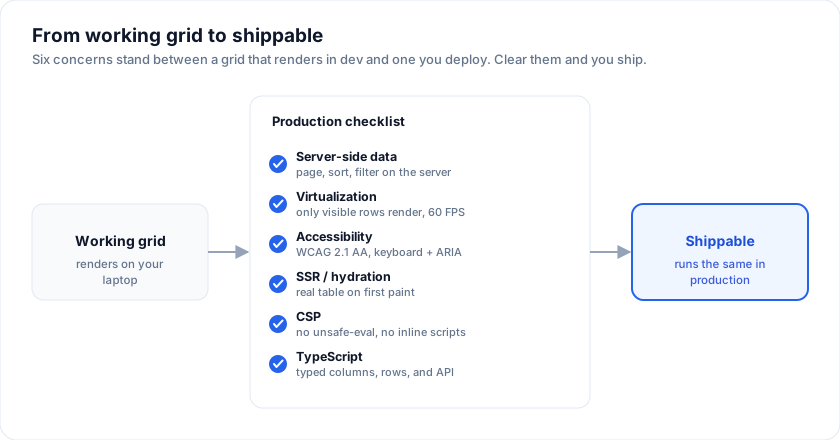
The checklist that turns "it works on my laptop" into "it ships". One page per concern; each concern is one paragraph + the code that matters.
Open the live example: Admin template (Getting Started)
1. Pin your versions
The examples on this page run against these rows:
<script lang="ts">
  import { SvGrid, type GridColumns } from '@svgrid/grid'

  type Person = {
    id: number
    name: string
    email: string
    department: string
    age: number
    salary: number
    city: string
    startDate: string
    active: boolean
  }

  const people: Person[] = [
    { id: 1, name: 'Ada Lovelace',   email: '[email protected]',   department: 'Engineering', age: 36, salary: 142000, city: 'London',   startDate: '2021-03-01', active: true },
    { id: 2, name: 'Grace Hopper',   email: '[email protected]', department: 'Engineering', age: 45, salary: 168000, city: 'New York', startDate: '2019-07-15', active: true },
    { id: 3, name: 'Linus Torvalds', email: '[email protected]', department: 'Platform',    age: 54, salary: 155000, city: 'Portland', startDate: '2020-01-20', active: false },
    { id: 4, name: 'Radia Perlman',  email: '[email protected]', department: 'Networking',  age: 49, salary: 161000, city: 'Seattle',  startDate: '2022-09-05', active: true },
    { id: 5, name: 'Barbara Liskov', email: '[email protected]', department: 'Platform',  age: 52, salary: 172000, city: 'Boston',   startDate: '2018-11-11', active: true },
  ]

  const columns: GridColumns<Person> = [
    { field: 'name',       header: 'Name',       width: 200 },
    { field: 'department', header: 'Department', width: 150 },
    { field: 'city',       header: 'City',       width: 140 },
    { field: 'age',        header: 'Age',        width: 90 },
    { field: 'salary',     header: 'Salary',     width: 130, format: { type: 'currency', currency: 'USD' } },
  ]
</script>
{
  "dependencies": {
    "@svgrid/grid": "1.0.0",
    "@svgrid/enterprise":       "1.0.0"
  }
}
Pre-1.0, prefer exact pins (no ^, no ~). The
changelog annotates breaking changes; the
API stability page names which exports are
under the semver promise.
2. Bundle size: what actually ships
Measured gzipped, with Svelte excluded as a peer dependency:
| What you import | Gzipped | Minified |
|---|---|---|
Headless core (createGrid + createCoreRowModel) |
~2 KB | ~7 KB |
Full <SvGrid> render component (everything) |
~77 KB | ~340 KB |
Add 9 KB gzipped for the render component's CSS. Charts, date/time
editors, menus, and export split into 64 KB total)
that load on demand. Re-measure with import() chunks (pnpm size.
The <SvGrid> component is batteries-included: virtualization, Excel-style
filters, inline editing, grouping, tree, master/detail, and accessibility are
all in that one import. For a smaller footprint, use the headless core and
render your own markup, registering only the features you need.
Enterprise adds per feature you import:
| Enterprise module | Approx KB | Peer deps |
|---|---|---|
exportGrid (csv/tsv/html) |
~6 KB | - |
| + xlsx | ~6 KB | jszip (loaded on first xlsx call) |
| ~9 KB | pdfmake (loaded on first pdf call) |
|
importData |
~7 KB | jszip (xlsx only) |
| AI helpers | ~3 KB | -. You bring your provider. |
createPivotModel |
~4 KB | - |
Use the subpath imports to avoid pulling features you don't use:
import { exportGrid }      from '@svgrid/enterprise/export'    // export only
import { createPivotModel } from '@svgrid/enterprise/pivot'    // pivot only
3. Peer dependencies
| Peer dep | When you need it | Install |
|---|---|---|
svelte |
Always. SvGrid renders against Svelte 5. | pnpm add svelte |
jszip |
xlsx export OR xlsx import. | pnpm add jszip |
pdfmake |
PDF export. | pnpm add pdfmake |
Both jszip and pdfmake are dynamic imports - the bundle splits and
loads them on the first call. Nothing ships in your initial chunk until
the user actually clicks "Export to xlsx".
4. Lazy-load Enterprise at route boundaries
If only one route in your app needs export, gate installEnterprise behind a
dynamic import so the rest of the app doesn't ship the Enterprise bundle:
<script lang="ts">
  import type { SvGridApi } from '@svgrid/grid'
  import type { EnterpriseGridApi } from '@svgrid/enterprise'

  let api = $state<SvGridApi<typeof features, Order> | null>(null)
  let pro = $state<EnterpriseGridApi<typeof features, Order> | null>(null)

  async function enablePro() {
    if (!api) return
    const { installEnterprise, setLicenseKey } = await import('@svgrid/enterprise')
    setLicenseKey(import.meta.env.VITE_SVPRO_KEY)
    pro = installEnterprise(api)
  }
</script>

<SvGrid {...} onApiReady={(next) => (api = next)} />

<button onclick={enablePro}>Enable export</button>
{#if pro}
  <button onclick={() => pro?.exportData({ format: 'xlsx' })}>⬇ XLSX</button>
{/if}
5. License the Enterprise pack
// main.ts (or +layout.svelte for SvelteKit)
import { setLicenseKey } from '@svgrid/enterprise'

if (import.meta.env.VITE_SVPRO_KEY) {
  setLicenseKey(import.meta.env.VITE_SVPRO_KEY)
}
Enterprise is soft-gated - it works unlicensed, but renders a small watermark + a one-time console nudge. Set the key once at app startup; both disappear.
Don't commit the key to source control. Inject via env (Vite reads
VITE_* variables at build time; SvelteKit reads $env/static/public).
For per-tenant deployments where each tenant has their own key, set the key inside the consumer's bootstrap, never inside the library package.
6. CSP-safe deployment
The recommended Content-Security-Policy header:
Content-Security-Policy:
  default-src 'self';
  script-src 'self';
  style-src 'self' 'unsafe-inline';
  img-src 'self' data:;
  font-src 'self' data:;
  connect-src 'self';
  frame-ancestors 'none';
  base-uri 'self';
  form-action 'self';
No 'unsafe-eval', no 'unsafe-inline' on script-src. SvGrid
Community + Enterprise run clean under this policy. Demo 16
includes a runtime self-check.
If you ship in an iframe (embedded analytics, dashboards), add
frame-ancestors to the host's CSP to allow the embed.
7. SSR
For SvelteKit:
// +page.server.ts
export async function load() {
  const rows = await db.query('select * from people limit 100')
  return { rows }
}
<!-- +page.svelte -->
<script lang="ts">
  import { SvGrid, tableFeatures, rowSortingFeature } from '@svgrid/grid'
  let { data } = $props()
  const features = tableFeatures({ rowSortingFeature })
</script>

<SvGrid data={data.rows} columns={columns} features={features} />
The first paint contains the data in a real <table> (good for SEO +
LCP). Hydration only attaches event listeners. See
demo 19 for a sandboxed
JS-disabled iframe that proves the markup is meaningful pre-hydration.
8. Performance budgets
Targets that have held up in production:
| Surface | Target | What you do if you miss it |
|---|---|---|
| Time to first row visible | < 200 ms | Lazy-load Enterprise. Defer non-critical columns. Smaller initial page. |
| Scroll FPS (10k rows, virtualized) | 60 FPS | Cap overscan. Avoid cell render functions that allocate per render. |
| Sort over 100k rows | < 60 ms | Set editorType on numeric / date columns so sortFns.number / sortFns.date get used instead of sortFns.auto. |
| Filter input → re-render | < 30 ms | Debounce server-side filters; the local filter UI is already ≤ 16 ms for 10k rows. |
| Export 10k rows to xlsx | < 1 s | Don't include columns you're going to hide. Use columns: [...] to project. |
The benchmarks page has the reproducible numbers.
9. Error boundaries
The render component throws on truly broken state (e.g. a field that
doesn't exist on any row). Wrap in a Svelte error boundary or guard
with if (rows.length === 0) for empty data. The grid's emptyMessage
prop covers the empty case without crashing.
<svelte:boundary>
  <SvGrid {data} {columns} {features} />

  {#snippet failed(error, reset)}
    <div class="error">Grid failed: {error.message}</div>
    <button onclick={reset}>Retry</button>
  {/snippet}
</svelte:boundary>
10. Monitoring + observability
The grid emits everything you'd want to observe via callbacks:
onSortingChange, onFiltersChange, onRowSelectionChange,
onCellValueChange. Wire them into your analytics / logging:
function track(event: string, payload: object) {
  // sentry, posthog, your own beacon - pick one
}

<SvGrid
  ...
  onSortingChange={(s)     => track('grid.sort',   { clauses: s })}
  onFiltersChange={(f)     => track('grid.filter', { columns: f.columns.length })}
  onCellValueChange={(e)   => track('grid.edit',   { column: e.columnId })}
/>
A production-shaped grid
Everything a real screen tends to turn on at once: virtualization for the row
count, a stable getRowId so selection survives a refetch, and the footer
totals people ask for on day two.
<script lang="ts">
  import { SvGrid, type GridColumns } from '@svgrid/grid'

  type Order = { id: string; customer: string; status: string; total: number }

  // Enough rows that virtualization is doing real work.
  const orders: Order[] = Array.from({ length: 500 }, (_, i) => ({
    id: 'A-' + String(1000 + i),
    customer: ['Northwind', 'Contoso', 'Fabrikam', 'Adventure'][i % 4]!,
    status: ['pending', 'shipped', 'delivered'][i % 3]!,
    total: 80 + ((i * 37) % 900),
  }))

  const columns: GridColumns<Order> = [
    { field: 'id',       header: 'Ref',      width: 110 },
    { field: 'customer', header: 'Customer', width: 170 },
    { field: 'status',   header: 'Status',   width: 130 },
    { field: 'total',    header: 'Total',    width: 130, summary: 'sum',
      format: { type: 'currency', currency: 'USD' } },
  ]
</script>

<SvGrid
  data={orders}
  {columns}
  getRowId={(r) => r.id}
  sortable
  filterable
  summary
  pageable
  pageSize={25}
/>
See also
- Why headless? - the architectural decision behind Community + Enterprise.
- API stability - the semver promise and what it covers.
- Security - peer-dep table, SBOM, vulnerability handling, data residency.
- Browser support - tested matrix, mobile, build tools.
Live examples
- Admin template - Self-contained admin app: sidebar + three pages (Dashboard, Orders w/ Enterprise export bar, Customers w/ inline edit). Read end-to-end in one file.
- CSP-compliant grid - No eval, no inline scripts. Documented CSP header + live runtime self-check.
- Server-side rendering - SvelteKit-style SSR with a sandboxed pre-hydration snapshot.