Mobile card view
On wide screens the grid is the grid. Under a viewport breakpoint
(by convention 720 px), the same $state array re-renders as
touch-friendly cards. Tap a card to expand it into an edit panel; the
write flows through api.setCellValue so dirty tracking, filtering,
and external observers see every edit identically, whether it came
from the desktop grid or from the mobile card.
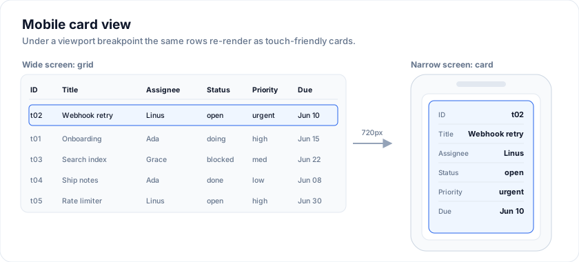
The headless engine is the single source of truth - filter, sort,
and selection state live on api, so swapping between viewport sizes
preserves the user's working set.
Open the live example: Mobile / responsive cards (Mobile & Responsive)
The quick win: the responsive prop
The full card pivot below is the right call when the mobile layout is
genuinely different from the table. But most grids just need to stay a
table and stop being unusable on a phone - pinned columns eating the
viewport, fitColumns crushing every column to nothing, no touch
scroll. For that, flip one opt-in prop:
The examples on this page run against these rows:
<script lang="ts">
  import { SvGrid, type GridColumns, type SvGridApi } from '@svgrid/grid'

  type Person = {
    id: number
    name: string
    department: string
    city: string
    age: number
    salary: number
  }

  const people: Person[] = [
    { id: 1, name: 'Ada Lovelace',   department: 'Engineering', city: 'London',   age: 36, salary: 142000 },
    { id: 2, name: 'Grace Hopper',   department: 'Engineering', city: 'New York', age: 45, salary: 168000 },
    { id: 3, name: 'Linus Torvalds', department: 'Platform',    city: 'Portland', age: 54, salary: 155000 },
    { id: 4, name: 'Radia Perlman',  department: 'Networking',  city: 'Seattle',  age: 49, salary: 161000 },
    { id: 5, name: 'Barbara Liskov', department: 'Platform',    city: 'Boston',   age: 52, salary: 172000 },
  ]

  const columns: GridColumns<Person> = [
    { field: 'name',       header: 'Name',       width: 190 },
    { field: 'department', header: 'Department', width: 150 },
    { field: 'city',       header: 'City',       width: 130 },
    { field: 'age',        header: 'Age',        width: 80 },
    { field: 'salary',     header: 'Salary',     width: 130, format: { type: 'currency', currency: 'USD' } },
  ]
</script>
<SvGrid data={rows} columns={columns} responsive={true} />
When the container measures narrower than the breakpoint (default
640 px), responsive does three things, and undoes them the moment the
container grows back:
- Suspends column pinning. Your
columnPinningstate is left untouched - reads are just routed through an empty pinning set while narrow, so a phone shows a normally scrollable table instead of two frozen columns and a 20 px sliver. Pins snap back on rotate/resize. - Suspends
fitColumns. Squeezing 8 columns into 320 px makes every one unreadable. Narrow mode falls back to natural column widths with horizontal scroll. - Marks the scroll container with
.sv-grid-narrowand enables momentum touch scrolling, so you can target mobile tweaks in your own CSS.
Set a custom breakpoint with the object form:
<SvGrid responsive={{ breakpoint: 768 }} ... />
Drop low-priority columns with hideBelow
Pair responsive with a per-column hideBelow (in px) to shed
secondary columns as the viewport narrows, keeping the columns that
matter:
const columns: ColumnDef<F, Row>[] = [
  { field: 'symbol', header: 'Symbol', width: 90 },              // always shown
  { field: 'last',   header: 'Last',   width: 90 },              // always shown
  { field: 'sector', header: 'Sector', width: 140, hideBelow: 700 },
  { field: 'volume', header: 'Volume', width: 115, hideBelow: 700 },
]
A column with hideBelow: 700 is dropped whenever the measured
container width is under 700 px, and reappears above it. hideBelow
only takes effect when the grid has responsive set; on a desktop-only
grid it is inert. Because the column is removed from layout (not merely
hidden), its width is reclaimed by the remaining columns.
This keeps the grid a real, sortable, editable grid on mobile - reach for the card pivot below only when you want a fundamentally different touch layout.
The pivot
Three pieces wire the responsive pivot together:
- A viewport observer that flips a
$stateboolean under the breakpoint. - A single
dataarray shared between the grid and the card list. - A single mutation function that writes through
api.setCellValuewhen the grid is mounted, or mutates the array directly when only the card list is mounted.
const MOBILE_MAX = 720
let isMobile = $state(false)

$effect(() => {
  isMobile = window.innerWidth <= MOBILE_MAX
  const onResize = () => (isMobile = window.innerWidth <= MOBILE_MAX)
  window.addEventListener('resize', onResize)
  return () => window.removeEventListener('resize', onResize)
})
Complete drop-in example
A ticket board that renders as a SvGrid on desktop and as a card list
on mobile. Both views write through the same setCell helper so the
data layer doesn't care which one is active.
<script lang="ts">
  import {
    SvGrid,
    tableFeatures,
    rowSortingFeature,
    columnFilteringFeature,
    type ColumnDef,
    type SvGridApi,
  } from '@svgrid/grid'

  type Status   = 'open' | 'in_progress' | 'blocked' | 'done'
  type Priority = 'low' | 'med' | 'high' | 'urgent'
  type Ticket = {
    id: string
    title: string
    assignee: string
    status: Status
    priority: Priority
    dueDate: string
    estimateHours: number
  }

  let rows = $state<Ticket[]>([
    { id: 't01', title: 'Onboarding wizard',     assignee: 'Ada Lovelace',   status: 'in_progress', priority: 'high',   dueDate: '2026-06-15', estimateHours: 12 },
    { id: 't02', title: 'Stripe webhook retry',  assignee: 'Linus Torvalds', status: 'open',        priority: 'urgent', dueDate: '2026-06-10', estimateHours: 6  },
    { id: 't03', title: 'Search index migration',assignee: 'Grace Hopper',   status: 'blocked',     priority: 'med',    dueDate: '2026-06-22', estimateHours: 16 },
  ])

  const features = tableFeatures({ rowSortingFeature, columnFilteringFeature })
  let api = $state<SvGridApi<typeof features, Ticket> | null>(null)

  // ---- Viewport ----------------------------------------------------------
  const MOBILE_MAX = 720
  let isMobile = $state(false)
  $effect(() => {
    isMobile = window.innerWidth <= MOBILE_MAX
    const onResize = () => (isMobile = window.innerWidth <= MOBILE_MAX)
    window.addEventListener('resize', onResize)
    return () => window.removeEventListener('resize', onResize)
  })

  // ---- The one mutation path ---------------------------------------------
  function setCell<K extends keyof Ticket>(rowId: string, field: K, value: Ticket[K]) {
    const ix = rows.findIndex((r) => r.id === rowId)
    if (ix === -1) return
    if (api) api.setCellValue(ix, field as string, value)
    else (rows[ix] as Ticket)[field] = value
  }

  // ---- Card expand state -------------------------------------------------
  let expandedId = $state<string | null>(null)

  const STATUS_OPTS: Status[]   = ['open', 'in_progress', 'blocked', 'done']
  const PRIO_OPTS:   Priority[] = ['low', 'med', 'high', 'urgent']

  const columns: ColumnDef<typeof features, Ticket>[] = [
    { field: 'id',            header: 'ID',       editorType: 'text',   width: 80,  editable: false },
    { field: 'title',         header: 'Title',    editorType: 'text',   width: 220 },
    { field: 'assignee',      header: 'Assignee', editorType: 'text',   width: 180 },
    { field: 'status',        header: 'Status',
      editorType: 'list', editorOptions: STATUS_OPTS as unknown as ReadonlyArray<string>, width: 140 },
    { field: 'priority',      header: 'Priority',
      editorType: 'list', editorOptions: PRIO_OPTS as unknown as ReadonlyArray<string>, width: 120 },
    { field: 'dueDate',       header: 'Due',      editorType: 'date',   width: 130 },
    { field: 'estimateHours', header: 'Est. h',   editorType: 'number', width: 100 },
  ]
</script>

<div style="height: 100%;">
  {#if isMobile}
    <!-- ─────────── CARD LIST (mobile) ─────────── -->
    <div style="height: 100%; overflow-y: auto; display: flex; flex-direction: column; gap: 8px;">
      {#each rows as r (r.id)}
        {@const open = expandedId === r.id}
        <article style="border: 1px solid #e2e8f0; border-radius: 12px; background: #fff;">
          <button
            type="button"
            onclick={() => (expandedId = open ? null : r.id)}
            style="width: 100%; text-align: left; border: 0; background: transparent; padding: 12px 14px; cursor: pointer;"
          >
            <div style="display: flex; gap: 8px; align-items: center; margin-bottom: 6px;">
              <code style="font-size: 11px; color: #64748b;">{r.id}</code>
              <span style="font-size: 10px; font-weight: 700; text-transform: uppercase; padding: 2px 8px; border-radius: 999px; background: #fee2e2; color: #991b1b;">
                {r.priority}
              </span>
            </div>
            <div style="font-weight: 600; font-size: 15px; color: #0f172a;">{r.title}</div>
            <div style="display: flex; gap: 12px; margin-top: 6px; font-size: 12px; color: #64748b;">
              <span>👤 {r.assignee}</span>
              <span>📅 {r.dueDate}</span>
              <span>⏱ {r.estimateHours}h</span>
            </div>
          </button>

          {#if open}
            <div style="border-top: 1px solid #e2e8f0; padding: 14px; background: #f8fafc; display: grid; grid-template-columns: repeat(2, 1fr); gap: 10px;">
              <label style="grid-column: 1 / -1;">
                Title
                <input type="text" value={r.title}
                  oninput={(e) => setCell(r.id, 'title', (e.currentTarget as HTMLInputElement).value)} />
              </label>
              <label>
                Status
                <select value={r.status}
                  onchange={(e) => setCell(r.id, 'status', (e.currentTarget as HTMLSelectElement).value as Status)}>
                  {#each STATUS_OPTS as s (s)}<option value={s}>{s}</option>{/each}
                </select>
              </label>
              <label>
                Priority
                <select value={r.priority}
                  onchange={(e) => setCell(r.id, 'priority', (e.currentTarget as HTMLSelectElement).value as Priority)}>
                  {#each PRIO_OPTS as p (p)}<option value={p}>{p}</option>{/each}
                </select>
              </label>
            </div>
          {/if}
        </article>
      {/each}
    </div>
  {:else}
    <!-- ─────────── GRID (desktop) ─────────── -->
    <SvGrid
      data={rows}
      columns={columns}
      features={features}
      enableInlineEditing={true}
      enableCellSelection={true}
      rowHeight={40}
      containerHeight="100%"
      fitColumns={true}
      onApiReady={(next) => (api = next)}
    />
  {/if}
</div>
Why the two-path mutation matters
The card view mounts only when the grid is unmounted. When the user
edits a field in card mode, api is null because the grid component
is not in the DOM. The setCell helper handles both cases:
function setCell<K extends keyof Ticket>(rowId: string, field: K, value: Ticket[K]) {
  const ix = rows.findIndex((r) => r.id === rowId)
  if (ix === -1) return
  if (api) api.setCellValue(ix, field as string, value)
  else (rows[ix] as Ticket)[field] = value
}
Why bother with both? Two reasons:
- When the grid is mounted,
api.setCellValuewrites through the grid's own copy of the data, so the change is reflected inapi.getData(), the rendered cells, and anything derived from them. Direct mutation of your$statearray does not reach the mounted grid's copy. - When the grid is unmounted,
apiisnull. Direct mutation is the only path that still updates the underlying$statearray.
Note that api.setCellValue is a programmatic write, not an edit
commit: it does not fire the onCellValueChange prop. That callback
belongs to the inline editor's commit path, so neither branch of
setCell above triggers it.
That makes the two modes consistent, but it means the grid prop is the
wrong place to hang your side effects. For identical observer
behavior in both modes, react to the $state array with a $effect
instead of using the onCellValueChange prop - both branches write to
data the effect can see.
A force-toggle for testing
Users on tablets sit awkwardly across the breakpoint; QA wants to verify both views without resizing. Add a manual override:
<script lang="ts">
  let forceView = $state<'auto' | 'grid' | 'cards'>('auto')
  const showCards = $derived(forceView === 'cards' || (forceView === 'auto' && isMobile))
</script>

<div role="group" aria-label="View mode">
  <button onclick={() => (forceView = 'auto')}  class:on={forceView === 'auto'}>Auto</button>
  <button onclick={() => (forceView = 'grid')}  class:on={forceView === 'grid'}>Grid</button>
  <button onclick={() => (forceView = 'cards')} class:on={forceView === 'cards'}>Cards</button>
</div>
Then drive the conditional render off showCards instead of isMobile.
Density parity
When the user toggles between views, density should not jolt. Match
rowHeight (grid) with the card height (cards):
<SvGrid rowHeight={96} ... />

<style>
  .card-head { height: 96px; }
</style>
A 96 px row is large for a desktop grid but matches a typical mobile card. If your grid is denser, pick a card height closer to your row height (e.g. 56 px for compact grids), and put the title + meta in one line.
Frequently asked questions
Is SvGrid responsive / mobile-friendly?
Yes, at two levels. The lightweight path is the built-in responsive prop: set
responsive={true} and, under the breakpoint (640 px by default), the grid
un-pins columns, suspends fitColumns, enables touch scrolling, and drops any
columns marked hideBelow - so it stays a real table without eating the
viewport. The heavier path is the card pivot: above a breakpoint (720 px by
convention) it renders as a normal grid; below it, the same $state data
re-renders as touch-friendly cards. Both are driven by one headless engine, so
edits and state stay in sync.
What is the difference between responsive and hideBelow?
responsive is a grid-level prop that turns on all the narrow-container
behavior (un-pinning, fitColumns suspension, touch scroll, the
.sv-grid-narrow class). hideBelow is a per-column number (px) that drops
that one column when the container is narrower than the value. hideBelow only
does anything when the grid also has responsive set.
How do edits on mobile cards stay consistent with the grid?
Card edits flow through api.setCellValue, the same path desktop grid edits use.
Dirty tracking, filtering, and external observers see every change identically
regardless of which view produced it.
Can I reuse the same data for a Kanban or card layout?
Yes. The headless engine can drive multiple views from one data source - the mobile card view and the Kanban demo are the same pattern with different rendering.
Try it
responsive measures the grid, not the window, so it fires for a grid in a
narrow panel on a wide screen too. Drag the divider: below the breakpoint the
hideBelow columns drop out.
<script lang="ts">
  const responsiveCols: GridColumns<Person> = [
    { field: 'name',       header: 'Name',       width: 190 },
    { field: 'department', header: 'Department', width: 150, hideBelow: 820 },
    { field: 'city',       header: 'City',       width: 130, hideBelow: 700 },
    { field: 'age',        header: 'Age',        width: 80,  hideBelow: 620 },
    { field: 'salary',     header: 'Salary',     width: 130, hideBelow: 560,
      format: { type: 'currency', currency: 'USD' } },
  ]
</script>

<div class="pane">
  <SvGrid data={people} columns={responsiveCols} responsive={{ breakpoint: 900 }} />
</div>

<style>
  /* Resizable, so the breakpoint is reachable without touching the window. */
  .pane { resize: horizontal; overflow: auto; min-width: 320px; max-width: 100%; }
</style>
See also
- Demo 81 - Mobile card view - full source with KPI strip, view-mode toggle, and per-priority colour bars
- Kanban board mode - the grid's built-in
boardprop renders rows as cards in lanes with drag-and-drop - Conditional form schema - if your card form needs declarative field-visibility rules