# Themes & styling
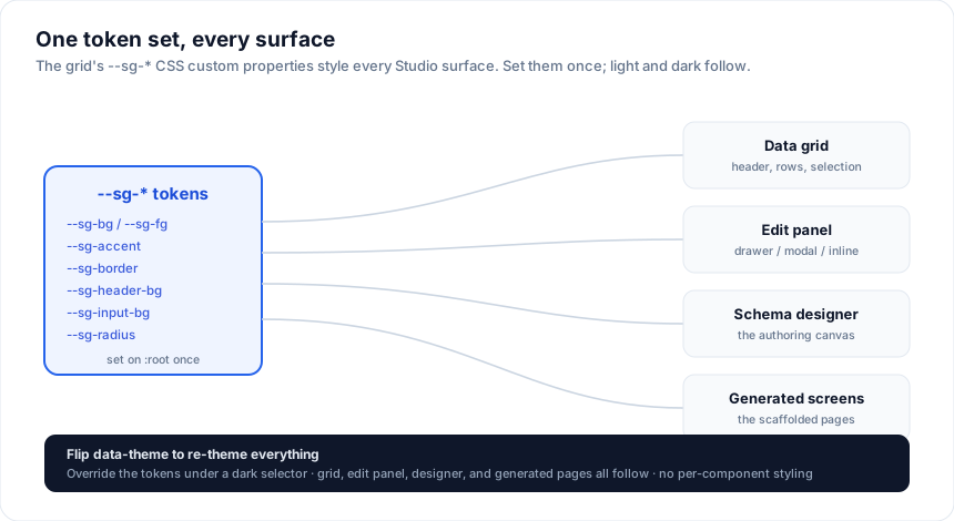
Every Studio surface - the grid, the edit panel (drawer / modal / inline), the
schema designer, and the generated screens - is styled with the grid's `--sg-*`
CSS custom properties. Set the tokens once and everything follows, including
light / dark. No per-component styling required.
## How it works
The components read tokens like `--sg-bg`, `--sg-fg`, and `--sg-accent` with
sensible light-mode fallbacks. Define the tokens on a wrapper (or `:root`) and
override them under a dark selector - the grid, forms, and generated pages all
pick them up.
```css
:root {
--sg-bg: #ffffff;
--sg-fg: #0f172a;
--sg-muted: #64748b;
--sg-border: #e2e8f0;
--sg-header-bg: #f1f5f9;
--sg-input-bg: #ffffff;
--sg-input-border: #cbd5e1;
--sg-accent: #2563eb;
--sg-on-accent: #ffffff;
--sg-radius: 10px;
}
[data-theme='dark'] {
--sg-bg: #181d27;
--sg-fg: #e2e8f0;
--sg-muted: #94a3b8;
--sg-border: #374151;
--sg-header-bg: #1e2433;
--sg-input-bg: #0f141c;
--sg-input-border: #374151;
--sg-accent: #3b82f6;
}
```
Toggle the theme by flipping `data-theme` (or swapping the token values) - the
edit modal, designer, and generated grid re-theme instantly.
### A runtime theme toggle
Flip `data-theme` on `` and every Studio surface re-themes with no component
re-render:
```svelte
```
Persist the choice (localStorage) and apply it before first paint to avoid a
flash - SvelteKit apps usually do this with a tiny inline script in `app.html` or
a root `+layout`.
## Key tokens
| Token | Used for |
| --- | --- |
| `--sg-bg` / `--sg-fg` | surface background / text |
| `--sg-muted` | secondary text (labels, hints) |
| `--sg-border` | borders, dividers |
| `--sg-header-bg` | grid header, panel header / footer bars |
| `--sg-input-bg` / `--sg-input-border` | form inputs |
| `--sg-accent` / `--sg-on-accent` | primary buttons, focus, selection |
| `--sg-row-hover-bg` | row hover |
| `--sg-radius` | corner radius |
The full token reference lives in [Layout & styling / tokens](https://svgrid.com/docs/help/tokens/).
## Matching your design system
Point the tokens at your design system's variables so Studio inherits your brand:
```css
:root {
--sg-bg: hsl(var(--background)); /* shadcn / Tailwind */
--sg-fg: hsl(var(--foreground));
--sg-accent: hsl(var(--primary));
--sg-border: hsl(var(--border));
--sg-radius: var(--radius);
}
```
The playground's [Theme Builder](https://svgrid.com/theme-builder) has ready
presets (shadcn, Material, Fluent, Carbon, and more) you can copy.
## Edit panel specifics
`SvGridEditPanel` also honors these tokens, so the drawer / modal match the grid
automatically. There is nothing extra to theme - the same tokens drive the
inputs, the primary Save button (`--sg-accent`), and the header / footer bars
(`--sg-header-bg`).
## Icons
Tokens change the grid's colours; the icon picker changes its glyphs. Select a
grid, open **Icons** in the inspector, and click **Customize icons** for the full
catalogue: sort arrows, the filter funnel, expanders, pager arrows, tool-panel
buttons, and one name per filter operator.
Each row takes either a character or markup:
- A character or emoji, typed straight in: `▲`, `→`, `⌄`.
- An inline `