SvGrid Cheat Sheet - The One-Page Quick Reference
Dense copy-paste reference for @svgrid/grid - install, column shapes, features, the imperative API, server-side data, custom cells, and theming tokens on one page.
Keep this open in a second tab. It covers the patterns you reach for most: column shapes, feature registration, the imperative API, server-side data, custom cells, and theming. Hand it to an AI assistant and it will write correct SvGrid code on the first try.
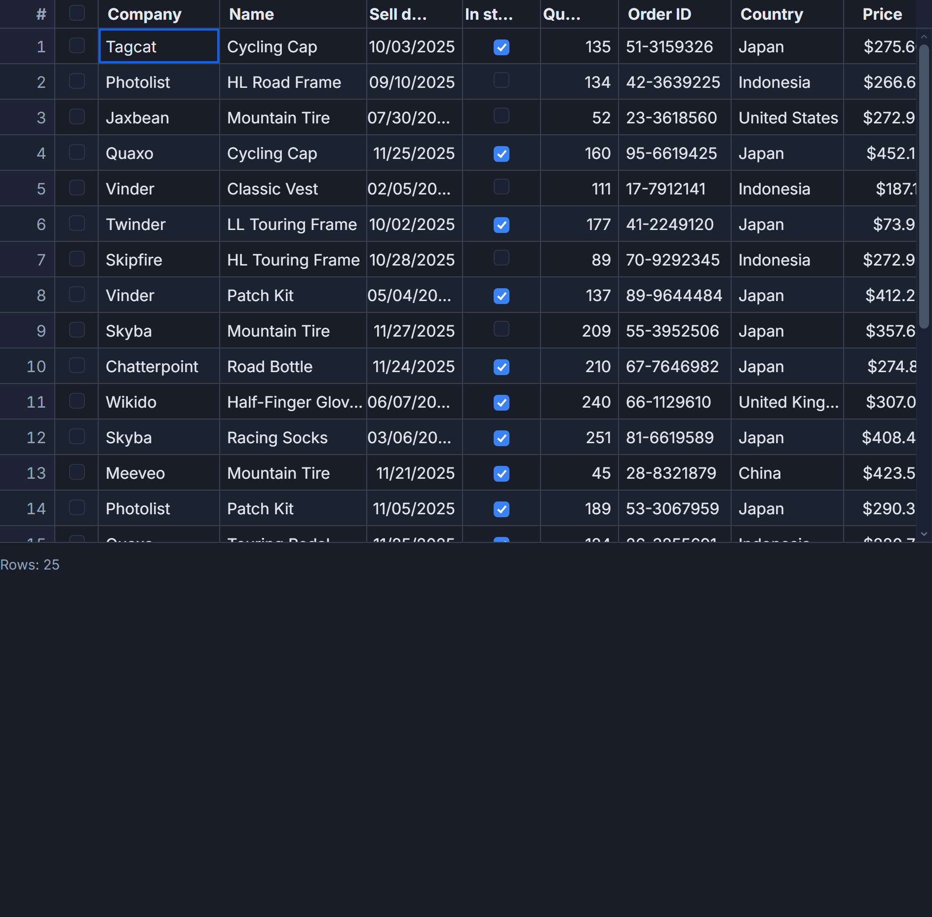 A SvGrid data grid with sorting, selection, and inline editing.
Install and minimal grid
npm add @svgrid/grid
Fifteen lines from zero to a working, accessible grid:
<script lang="ts">
  import SvGrid, { tableFeatures, rowSortingFeature, columnFilteringFeature, type ColumnDef } from '@svgrid/grid'

  interface Row { id: number; name: string; revenue: number; status: string }

  const features = tableFeatures({ rowSortingFeature, columnFilteringFeature })

  const columns: ColumnDef<typeof features, Row>[] = [
    { id: 'name',    field: 'name',    header: 'Name',    width: 200 },
    { id: 'revenue', field: 'revenue', header: 'Revenue', width: 130, type: 'number' },
    { id: 'status',  field: 'status',  header: 'Status',  width: 100 },
  ]

  let rows = $state<Row[]>([
    { id: 1, name: 'Acme Corp', revenue: 84200, status: 'active' },
    { id: 2, name: 'Globex',    revenue: 21000, status: 'churned' },
  ])
</script>

<SvGrid data={rows} {columns} {features} sortable filterable />
Column definition reference
// Accessor by field key
{ id: 'name', field: 'name', header: 'Name', width: 180 }

// Computed value (fieldFn replaces field; id is required)
{ id: 'full', header: 'Full Name', width: 220, fieldFn: (r) => `${r.first} ${r.last}` }

// Built-in formats: number | currency | percent | date | datetime
{ id: 'revenue', field: 'revenue', header: 'Revenue', format: { type: 'currency', currency: 'USD' } }
{ id: 'at',      field: 'createdAt', header: 'Created', format: { type: 'date', pattern: 'y-m-d' } }

// Pinned columns (left or right)
{ id: 'name',    field: 'name',    header: 'Name',    pinned: 'left' }
{ id: 'actions', header: 'Actions', width: 80,         pinned: 'right', cell: actionsSnippet }

// Editable - editor types: text | number | checkbox | date | datetime
{ id: 'price', field: 'price', header: 'Price', editable: true, editorType: 'number' }
{ id: 'active', field: 'active', header: 'Active', editable: true, editorType: 'checkbox' }

// Aggregates (shown in group footers)
{ id: 'sales', field: 'sales', header: 'Sales', aggregate: 'sum' }
Feature registration
Register only what you need. Tree-shaking removes the rest.
import {
  tableFeatures,
  rowSortingFeature,
  columnFilteringFeature,
  rowSelectionFeature,
  rowPaginationFeature,
  rowExpandingFeature,
  columnGroupingFeature,
} from '@svgrid/grid'

// Pick any subset
const features = tableFeatures({
  rowSortingFeature,
  columnFilteringFeature,
  rowSelectionFeature,
  rowPaginationFeature,
})
Pass features to both the column array type parameter and the <SvGrid> prop so TypeScript knows which state shapes are valid.
The component prop surface
<SvGrid
  {data}
  {columns}
  {features}
  sortable
  filterable
  showFilterRow={true}
  showGlobalFilter={true}
  editable
  enableCellSelection={true}
  groupable
  pageable
  pageSize={25}
  rowHeight={32}
  virtualization={true}
  onApiReady={(api) => { gridApi = api }}
  onCellValueChange={(e) => { rows[e.rowIndex] = { ...e.row, [e.columnId]: e.newValue } }}
  onSortingChange={(s) => console.log(s)}
  onFiltersChange={(f) => console.log(f)}
  onPaginationChange={(p) => console.log(p)}
  onRowSelectionChange={(state, selectedRows) => console.log(selectedRows)}
/>
Editing never mutates your data. onCellValueChange fires with { rowIndex, columnId, oldValue, newValue, row } - you decide how to persist it.
The imperative API
Get the API reference via onApiReady. Everything you might need to drive the grid programmatically:
let api: SvGridApi

// Sort and filter
api.setSort('revenue', 'desc')
api.setFilter('status', { operator: 'equals', value: 'active' })
api.setFilter('revenue', { operator: 'between', value: '1000', valueTo: '50000' })
api.clearAllFilters()

// Row mutations
api.addRow({ id: 99, name: 'New Corp', revenue: 0, status: 'active' })
api.removeRow(2)
api.applyTransaction({ add: [newRow], update: [updatedRow], remove: [oldRow] })

// Data access
api.getDisplayedRows()   // rows after sort/filter/group
api.getData()            // all rows
api.getSelectedRows()

// Selection
api.selectRows([1, 2, 3])
api.selectAllRows()
api.clearRowSelection()

// Columns
api.setColumnVisible('id', false)
api.setColumnWidth('name', 240)
api.autosizeAllColumns()
api.setColumnPinning({ left: ['name'], right: ['actions'] })

// Grouping and pagination
api.setGroupBy(['region', 'category'])
api.setPage(3)
api.nextPage()
api.setPageSize(50)
api.getPageInfo()        // { pageIndex, pageSize, pageCount, total }

// Groups
api.setRowExpanded('group:APAC', true)
api.expandAllGroups()
api.collapseAllGroups()

// View state - save and restore everything in one call
const snapshot = api.getState()
api.setState(snapshot)

// Editing
api.startEditing(4, 'name')
api.stopEditing()
api.undo()
api.redo()
api.canUndo()            // boolean

// Navigation
api.scrollToRow(50)
api.setActiveCell(4, 'revenue')
api.openFind()
api.setFindQuery('Acme')
Server-side data
Use createServerDataSource when your dataset is too large to load at once. The adapter handles page, sort, and filter parameters and keeps the grid in sync.
import SvGrid, {
  createServerDataSource,
  tableFeatures,
  rowSortingFeature,
  columnFilteringFeature,
  rowPaginationFeature,
} from '@svgrid/grid'

const features = tableFeatures({ rowSortingFeature, columnFilteringFeature, rowPaginationFeature })

const ds = createServerDataSource({
  fetch: async ({ page, pageSize, sort, filters }) => {
    const params = new URLSearchParams({
      page: String(page),
      size: String(pageSize),
    })
    if (sort.length) {
      params.set('sort', sort[0].id)
      params.set('dir', sort[0].desc ? 'desc' : 'asc')
    }
    const res = await fetch(`/api/accounts?${params}`)
    const json = await res.json()
    return { rows: json.data, total: json.total }
  },
})
<SvGrid data={ds} {columns} {features} pageable pageSize={50} />
Custom cells with Svelte 5 snippets
Snippets are the idiomatic way to render anything custom - badges, action buttons, sparklines. Define the snippet in the same component, then reference it in the column definition.
<script lang="ts">
  import SvGrid, { renderSnippet, type ColumnDef } from '@svgrid/grid'
  // ... features, rows, etc.

  const columns: ColumnDef<typeof features, Row>[] = [
    { id: 'name', field: 'name', header: 'Name', width: 200 },
    { id: 'status', field: 'status', header: 'Status', width: 120,
      cell: (ctx) => renderSnippet(statusCell, { value: ctx.getValue(), row: ctx.row.original })
    },
    { id: 'actions', header: '', width: 80, pinned: 'right',
      cell: (ctx) => renderSnippet(actionsCell, { row: ctx.row.original })
    },
  ]
</script>

{#snippet statusCell({ value, row }: { value: string; row: Row })}
  <span class="badge" class:active={value === 'active'} class:churned={value === 'churned'}>
    {value}
  </span>
{/snippet}

{#snippet actionsCell({ row }: { row: Row })}
  <button onclick={() => deleteRow(row.id)}>Delete</button>
{/snippet}

<SvGrid {data} {columns} {features} />
Conditional formatting
Apply per-cell styles based on the value without a custom cell snippet:
{
  id: 'revenue',
  field: 'revenue',
  header: 'Revenue',
  format: { type: 'currency', currency: 'USD' },
  conditionalFormat: [
    { condition: ({ value }) => value < 10000,  style: { color: 'var(--color-danger)', fontWeight: 'bold' } },
    { condition: ({ value }) => value >= 100000, style: { color: 'var(--color-success)' } },
  ],
}
Container sizing
Virtualization needs a bounded height. Wrap the grid in a flex container and let it fill the remaining space:
<div style="display:flex; flex-direction:column; height:100vh;">
  <header>My App</header>
  <div style="flex:1; min-height:0;">
    <SvGrid {data} {columns} {features} virtualization />
  </div>
</div>
min-height:0 is the one that trips people up. Without it, the flex child ignores its parent's constraint and the grid renders at full intrinsic height, defeating virtualization.
CSS design tokens
All visual properties are overridable without touching component internals:
.my-grid {
  --sg-bg:        #ffffff;
  --sg-fg:        #111827;
  --sg-accent:    #6366f1;
  --sg-header-bg: #f5f7fa;
  --sg-border:    #e4e7eb;
  --sg-radius:    4px;
  --sg-cell-px:   12px;
  --sg-thead-h:   40px;
}
Swap --sg-bg and --sg-fg for a dark theme. --sg-accent controls the selection highlight and active-cell ring.
Keyboard navigation
Arrows move the active cell. Home and End jump to the row edges; Ctrl+Home and Ctrl+End jump to the first and last cell in the grid. F2 or Enter enters edit mode on the focused cell. Esc cancels an in-progress edit. Tab commits the current edit and moves one cell to the right.